Steem[it] A11y (accessibility) Project
- make steem accessible to everyone

Intro
Hi!
I'll keep the introduction as short as possible. When using Steemit I've noticed that a lot of the design whilst good looking is completly awful to use with a screenreader or when navigating without a mouse, of course this is just a two of several examples of situations where the accessibility of the site is important. At first, this might sound like something far off and not unimportant for most users but I would argue the opposite.
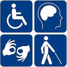
The first thing you read when loading the Steem homepage is that Steem is a blockchain-based social media platform that anyone can earn rewards, and subsequently it is implied that anyone should be able to use it. But that's not the only, or even the main reason as to why it is so important that it is accessible. It is of upmost importance that the web is open to everyone, without excluding the approximately 1 billion people [1] that experience some form of disability.
Presenting...
Thus I present to you, the Steem A11y Project.
The premise is trying to make Steem and especially Steemit accessible to everyone.
I understand that this isn't an easy task, making a website more accessible, especially with the size of Steemit isn't easy, but it is important. It will most probably require a community effort but it would be amazing if the staff at Steemit would be able to help as well. In the post I will try to outline the most important changes that have to be made both at a technical level and at a more general level. And I can't stress this enough, I will need help, and I know that I will probably make a few glaring errors or omissions in the list, but just hit me up with a message or leave a comment and I'll add it to the list!. (On a more jolly note, I actually wrote levels instead of errors, silly me...been playing too much World of Warcraft)
I'm starting off right away by also creating a pull-request over at GitHub to fix the first issue on the list.
The list
Fixed
- [Colors] Deuteranopia
- [Colors] Protanopia
- [Colors] Tritanopia
- Language attribute also might be good to be able to specify the language for the post/add internationalization
Fixed as part of the project
- Remove outline: none (Preliminary GitHub pull-request by me: https://github.com/steemit/steemit.com/pull/278)
Not fixed
Easy
- ARIA Landmars (ie. role="nav", role="search", role="article" etc.)
- Labels on all inputs, placeholders aren't enough!
- Contrast! The password reset page has grey text on a white background!
- Alt-text on images when using markdown (it is currently removed even if the alt-text is there in the post itself)
Medium
- Proper buttons, they are harder to style, but they are better semantically, examples are the upvote button
Hard
- Proper tab order for elements such as the navigation using inert (due to nav not being display: none when hidden) https://github.com/wicg/inert
Raise awareness!
Lastly, I want to ask you all to try to raise awareness. Disabilities aren't uncommon and making content more accessible isn't that difficult. You can help just by leaving an upvote so that more people see this post and maybe, just maybe they decide to help out. Thank you, I really mean it, for taking just a tiny bit of your time to read this.
~novium over and out.
