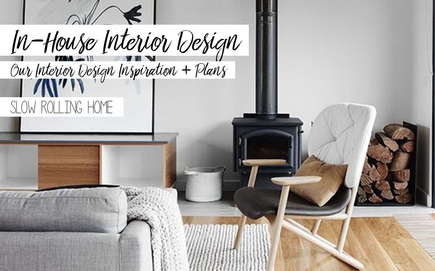
FOR MONTHS, WE'VE BEEN COLLECTING INSPIRATION FOR THE INTERIOR AND EXTERIOR DESIGN OF THE BUS
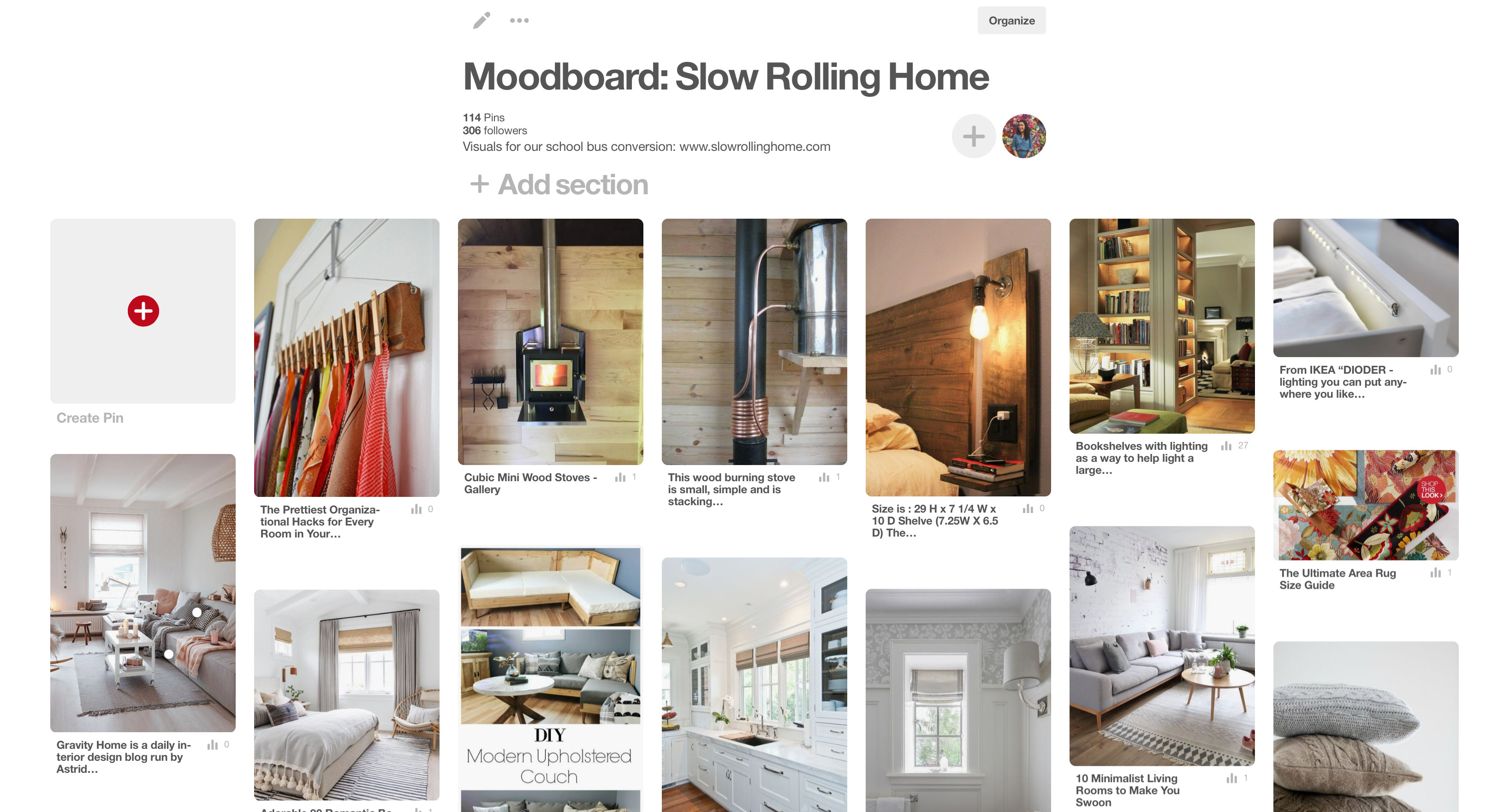
click the photo to visit the pinterest board
This Pinterest board is the culmination of that. It's a lot more than just interior design, though. We've included some appliance ideas, possible sustainability and resource-saving features, some space-saving designs, and the overall vibe we want for our house on wheels.
ROOTED IN MINIMALISM
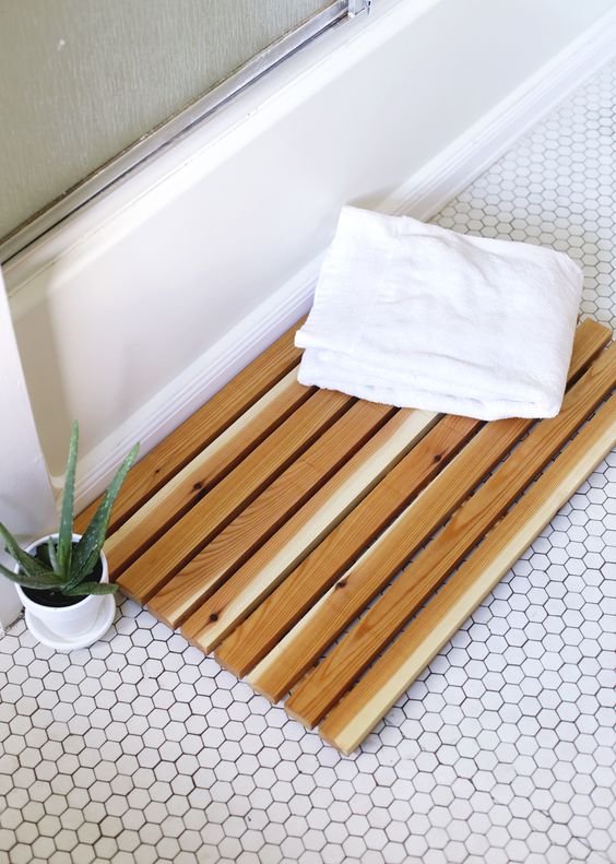
While we are fully aware that we will lack space like we're used to, the trap we don't want to fall into is that of creating so much storage that we cram our bus to the gills. In paring down our possession this year before the move, we saw that we could live with less, and that face continues to become apparent.
There's also a sense of peace in minimalism, both in practice and in appearance. The eye can rest when a space is uncluttered, and the imagination can run wild when undistracted by clusters of things, which always hold their own meaning. Here are some of our considerations when designing a minimalistic tiny space:
- Adventure gear: Rock climbing, hiking, biking, and all the accoutrement that makes the outdoors accessible.
- Weather gear: Rain, snow, scorching heat, hail, failure of our internal temperature control; when you're roaming endlessly, you have to be ready for anything!
- Kitchen tools: A chef, a baker, both avid makers. We can't live without the ability to create delicious, healthy meals and DIY products, so an array of tools is a must.
- Pet supplies: Food, toys, bedding, and care materials are essential when animals are involved. We want them to be just as, if not more comfortable than they were at home!
- Minor construction + mechanical tools: Breakdowns happen, and we want to be prepared for them.
- Our necessary live-aboard items: Clothes, self-care products, food, dishes, books, technology, linens, art supplies (okay, mine!), are what come to mind!
BRIGHT, AIRY, NATURAL TONES AND TEXTILES
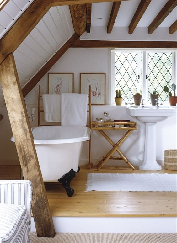
Primarily, a style preference, but white walls and light woods instill a sense of ease that I want to have everywhere we go. Such a small space with short ceilings can quickly seem cramped, dank, even uncomfortable. Playing to the excess of windows and the inexpensiveness of white paint makes this color scheme somewhat of a no-brainer.
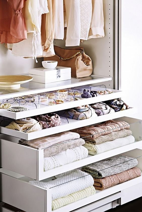
FUNCTIONAL STORAGE THAT HAPPENS TO BE SEXY
No cutting corners in the design of our interior space. Storage is so important, and just as important is the feel of the space. There's a delicate balance between hiding all of your storage behind flat panels or cabinets, which may make it seem barren and sterile, and having all open shelving where all you can see is clutter (and everything falls off the shelves while you drive).
My intent is to create a space that doesn't feel like a typical tiny home. Taking inspiration from the most gorgeous tiny homes and Airstreams I can find, pairing it with the idea behind the furniture from IKEA, the feel of old farmhouses, the comfort of a woodland cabin, and the flow of Japanese tea house.
Our layout is almost ready to publish! Stay tuned for the final design and more design resources I'm curating for our slow rolling home.
Here's the Slow Rolling Home in the snow this past week!

Hi, I'm Amelia! It's nice to meet you.
I'm a writer, minimalist, tiny home dweller, and maker living in East Tennessee, USA. My blog has lived at www.amelia-bartlett.com until I discovered Steemit, where I now post most of my work. To learn more about me, check out my introduction post, get up-to-date on my school bus tiny house conversion, and follow me for articles on slow living, sustainable fashion, self-expression, and quality curated resteems!
Proud member of

banner by @bearone

banner by @bearone


