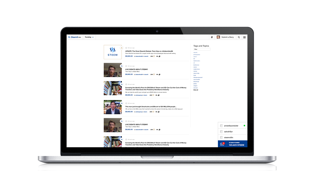
So, guys, i was wondering how Steemit could look like in near future. I'm decided to make design concept for Steemit website. I’m planning to develop this website soon more.
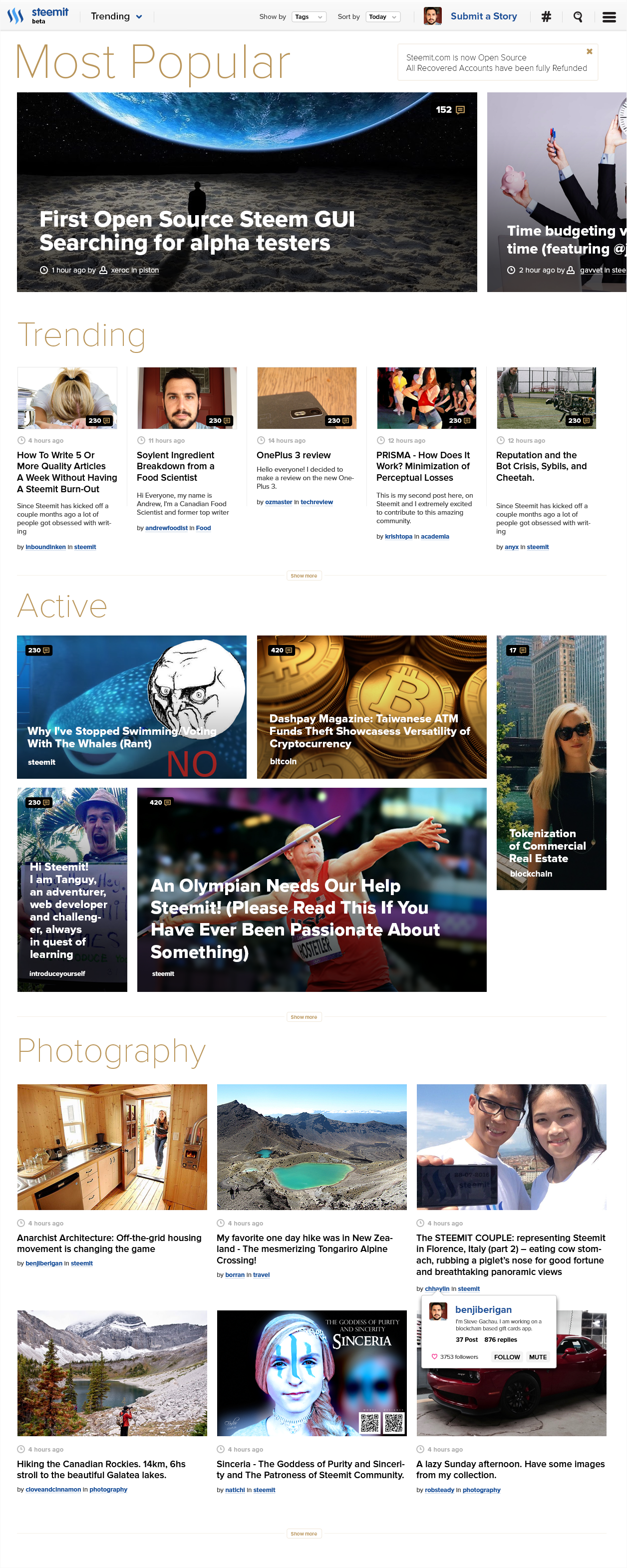
Website Main Screen
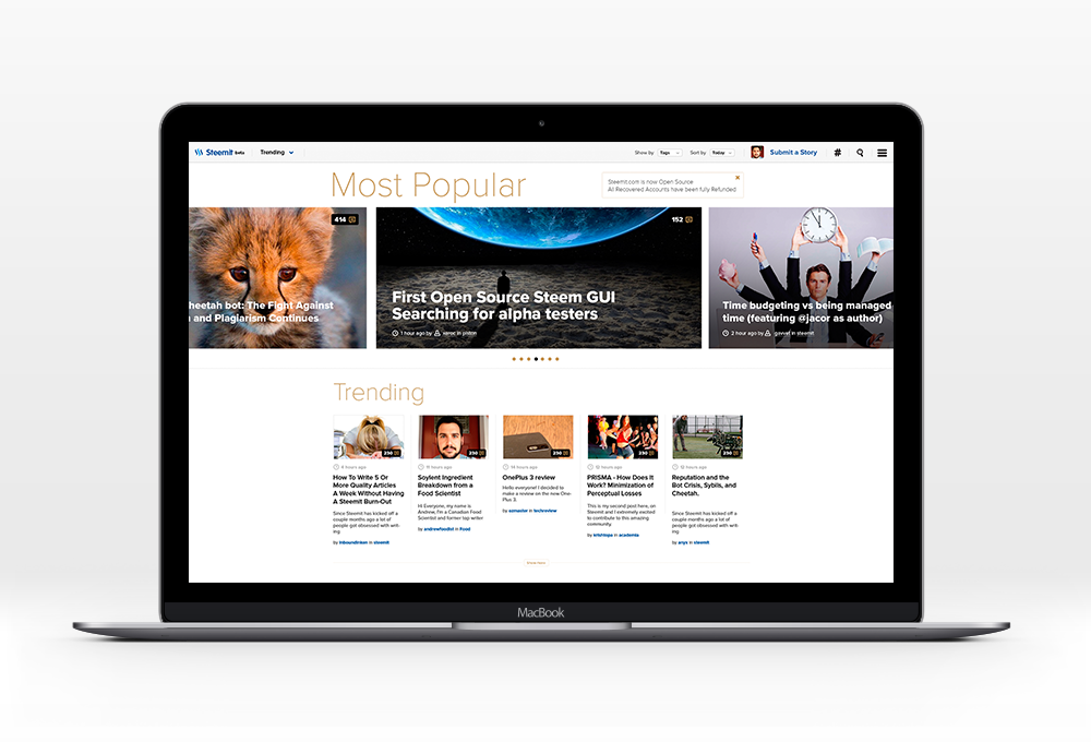
Active Post Block

One Tag Block

Dark Theme
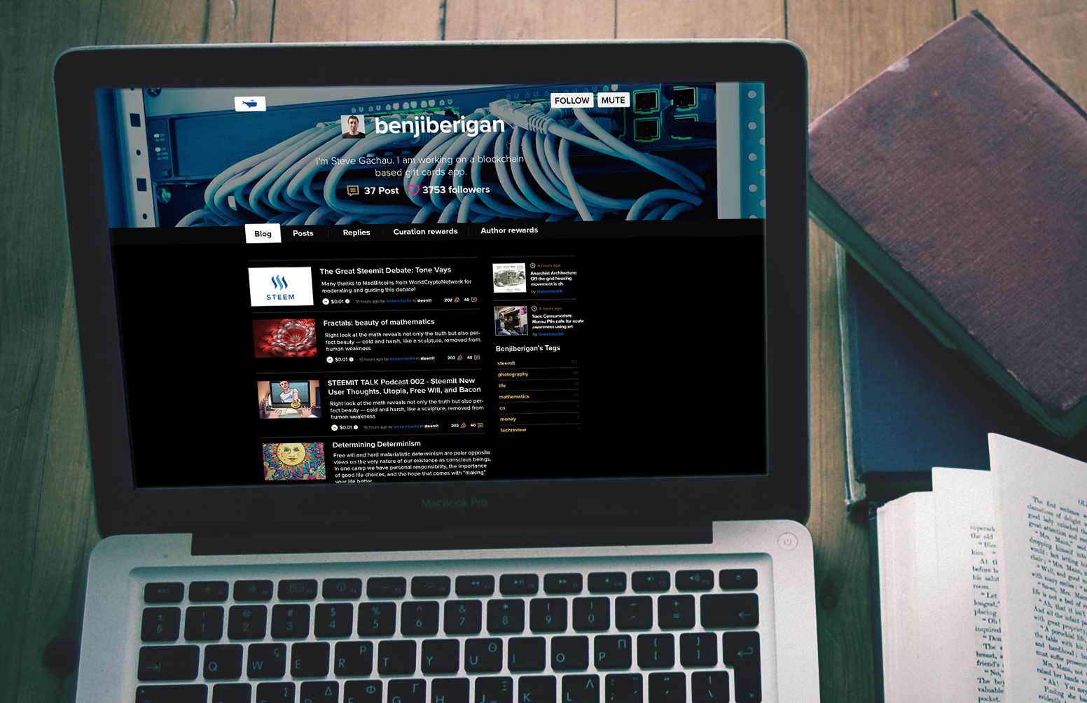

Minimal Theme
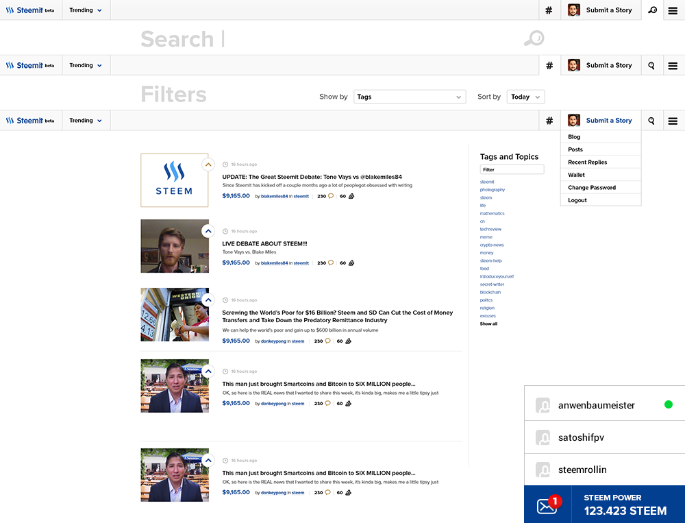
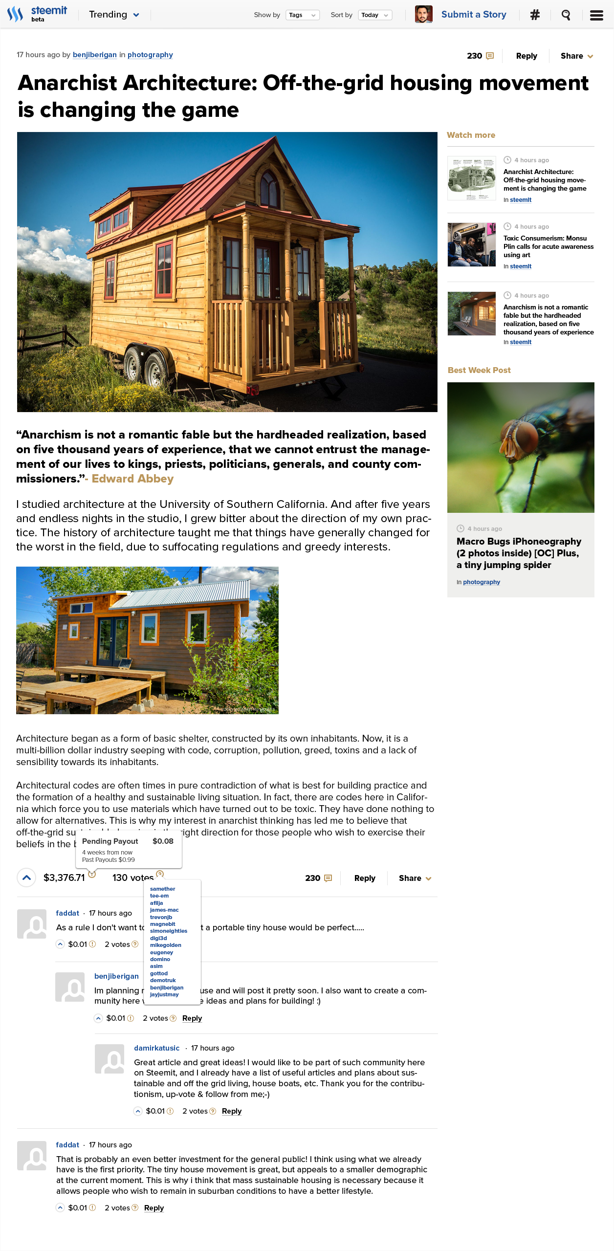
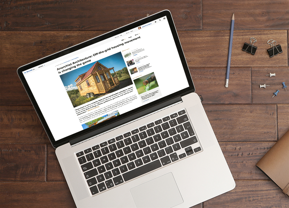
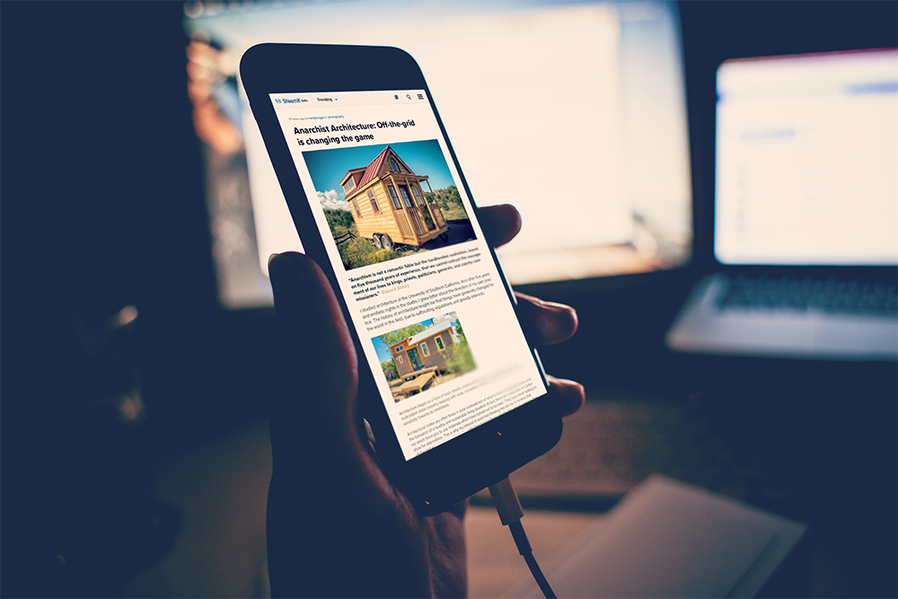
Post Single Page
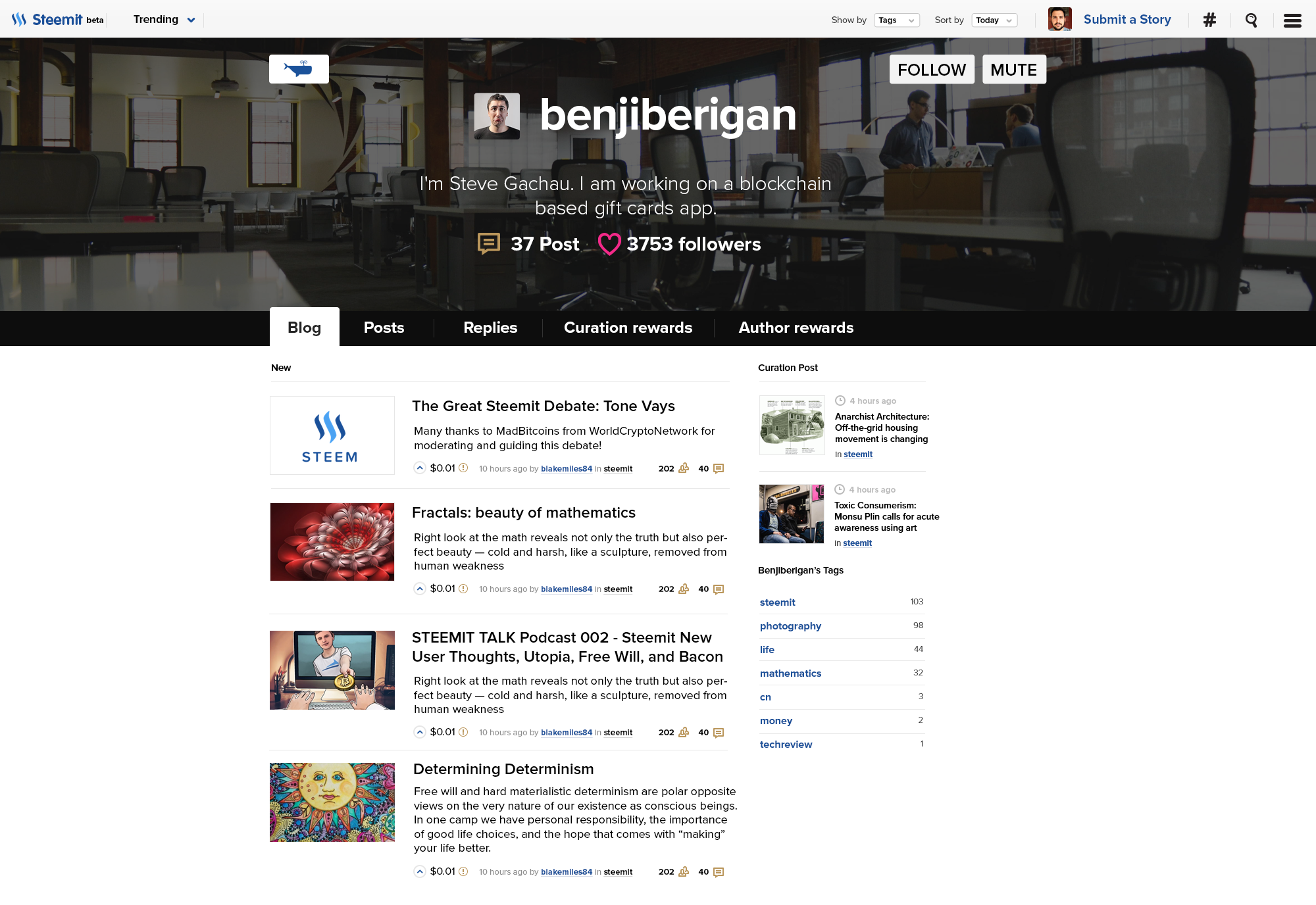
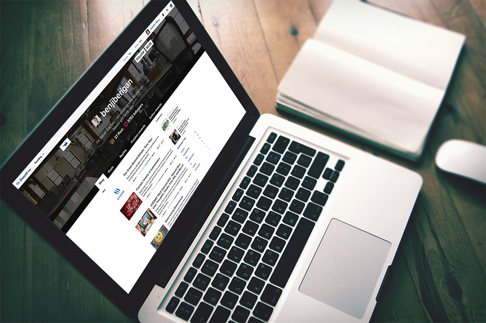
Profile Page
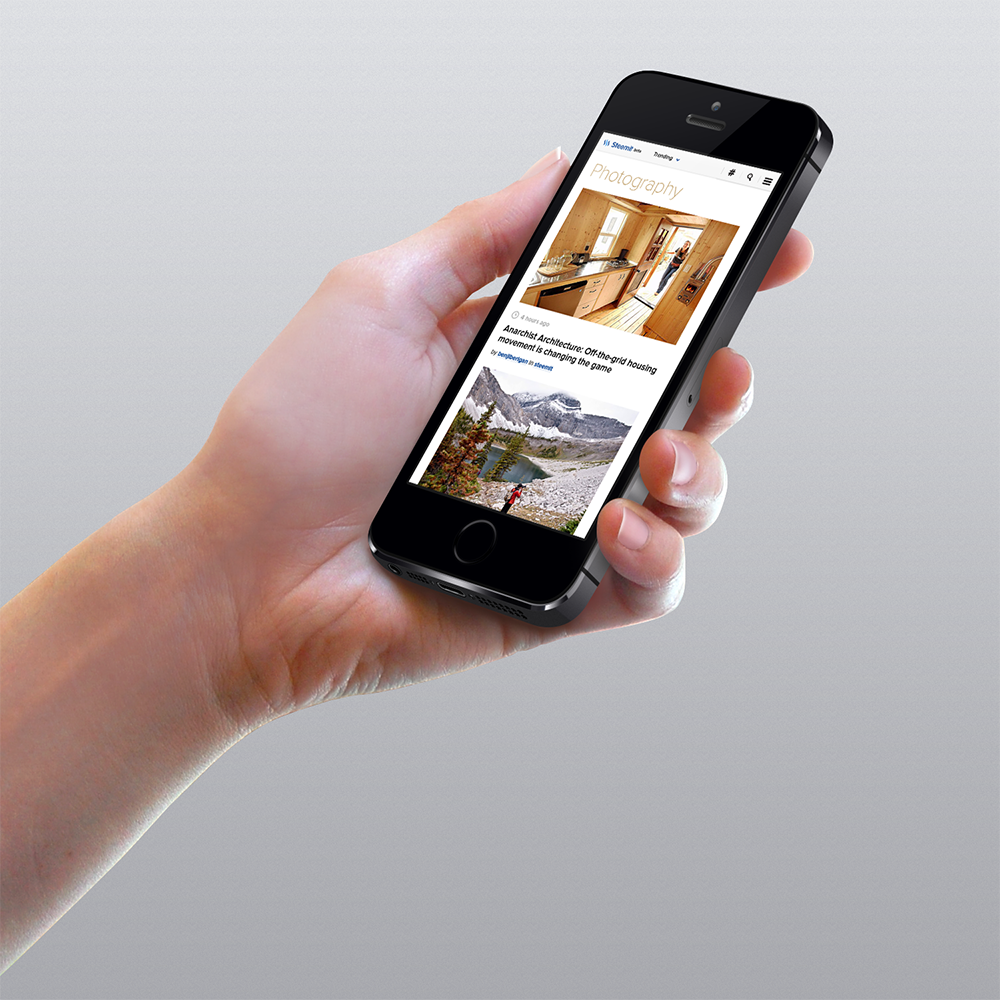
Mobile view
You can find high resolution picture here http://etherdesign.io/ below on the website.
How was it done? You need to keep all major things in place but make it look more awesome and convenient.
So what do we need? Redesign menu section to make it look solid. Make different grid for post thumbnails with the separate tags. Show what are the popular posts right now. All this little things important to make it look more joyful to communicate with. What do think? Should i continue? I wanted to make interface design for account panel and some other inner pages of Steemit website.
You can watch how it will done live on stream - http://etherdesign.io/stream I’m streaming all my design process so you can see it.
Thank’s for watching!
