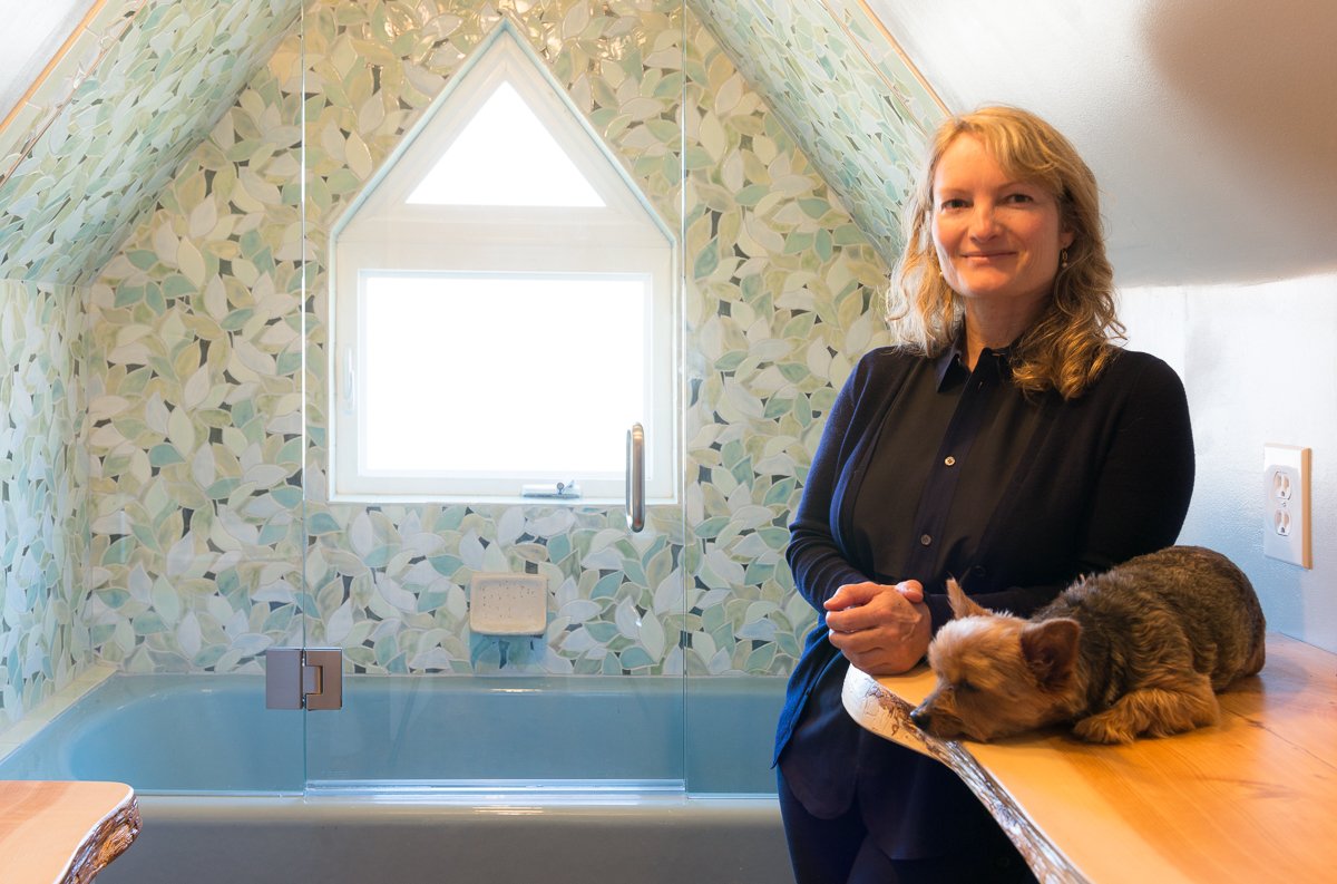
THE RIGHT TILE MAKES ALL THE DIFFERENCE.
Yes I'm biased as a tile artist, but I think after seeing this transformation, you'll agree.
When my client contacted me, she didn’t know exactly what kind of tile she wanted but she was sure
that she needed a room of her own.
She is a young single professional scientist who lives with a lot of people in her 1930’s Tudor. Amidst the hustle and bustle of her household, she craved a sanctuary but only had a closet room to work with. Her closet space is inside the tudor roof of the house and once emptied out, it felt more like a prison cell than a sanctuary.
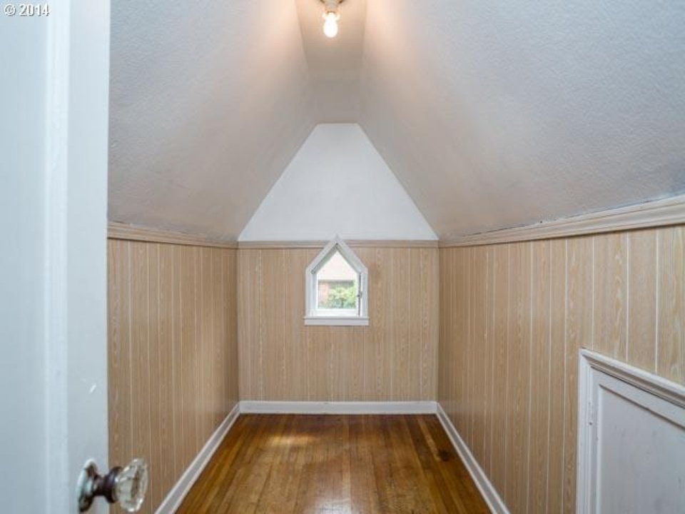
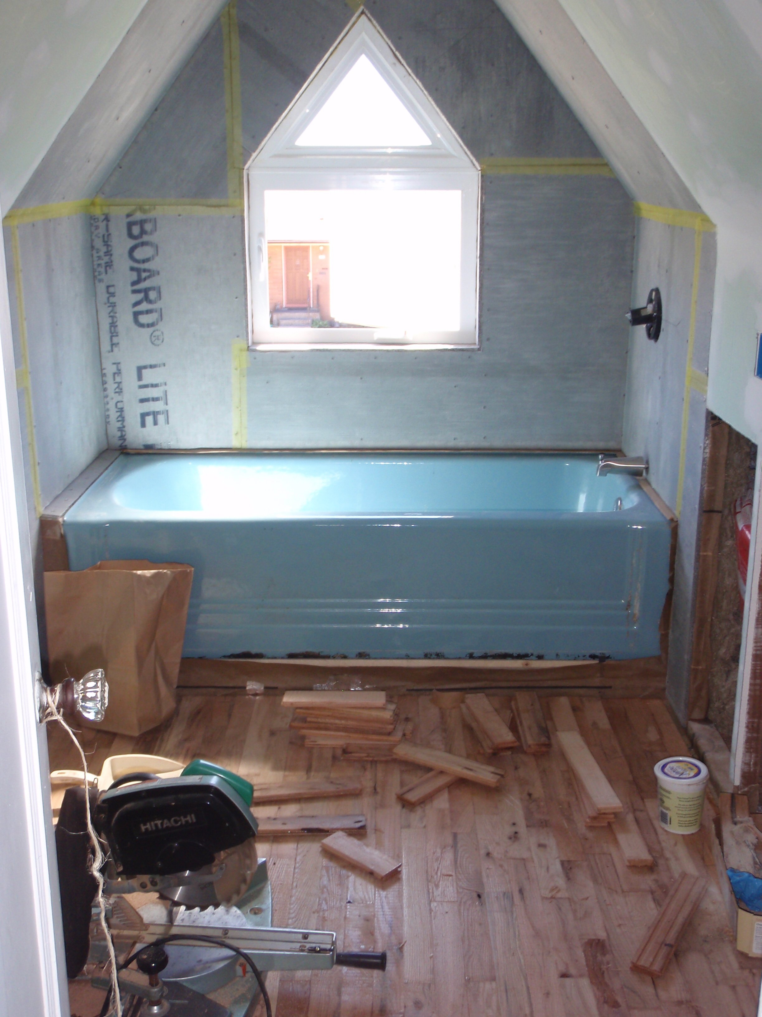
With her she small budget she decided to transform this attic closet into a bathroom. By using reclaimed wood for the floor and reclaimed fixtures, she had enough of a budget for a larger window, gorgeous raw edge wood counters and for some beautiful tile.
A great example of using a few nice items to make the room stunning rather than to spread the budget over everything and have a room that’s just fine but not special.
As always with tile there are so many options - geometric, organic, large or small scale tiles, mosaic, tiles with imagery, and for this room I recommended my Quince Tree design. Knowing that the space was small I knew that this design would serve perfectly in a light and somewhat bright palette.
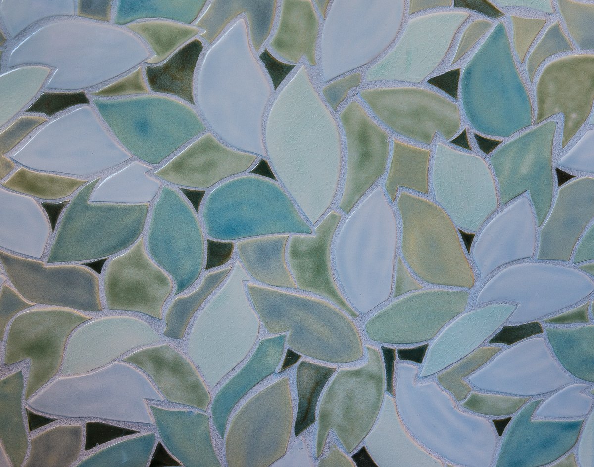
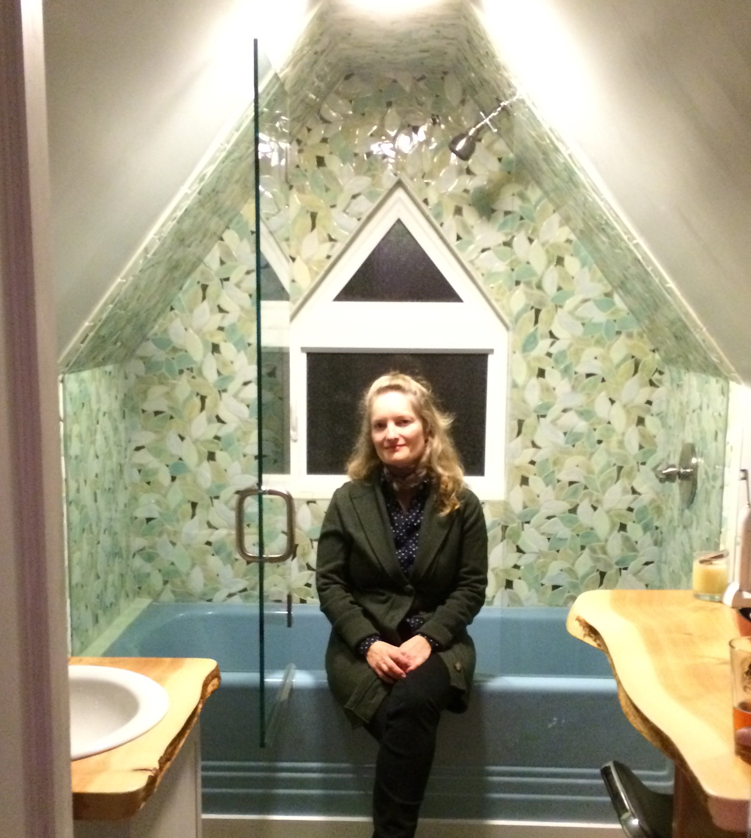
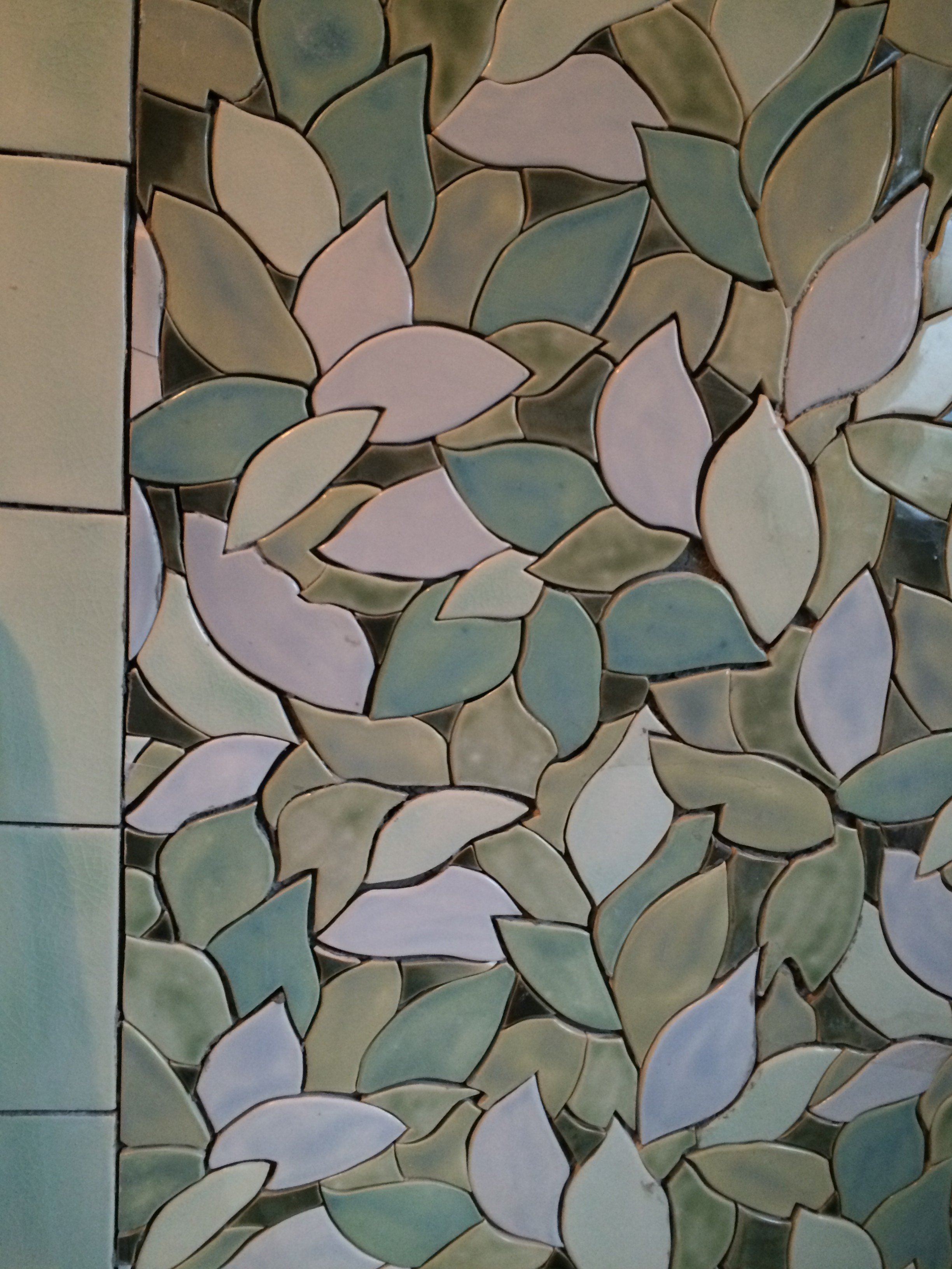
The Quince Tree a repeating design whose multi-hued leaves give the feeling of being immersed in nature. It’s a very adaptable design that always seems to look beautiful in any space from an outdoor kitchen to a fireplace surround. One of the reasons it works so well for this room in particular is because it repeats diagonally.
(see my previous post "Connecting nature, line and form" for more examples of this design in action)
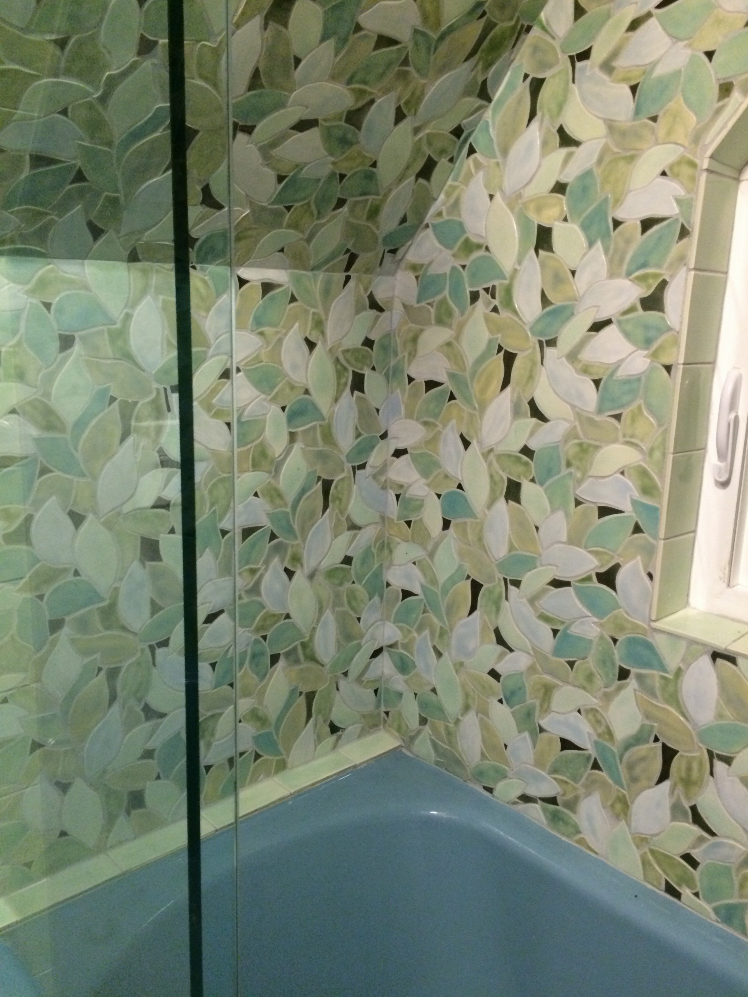
The diagonal repeat makes the design look more like a mural than a repeating pattern and the diagonal movement does this amazing thing - it tricks the eye into perceiving the room as larger. In this teensy room this makes all the difference.
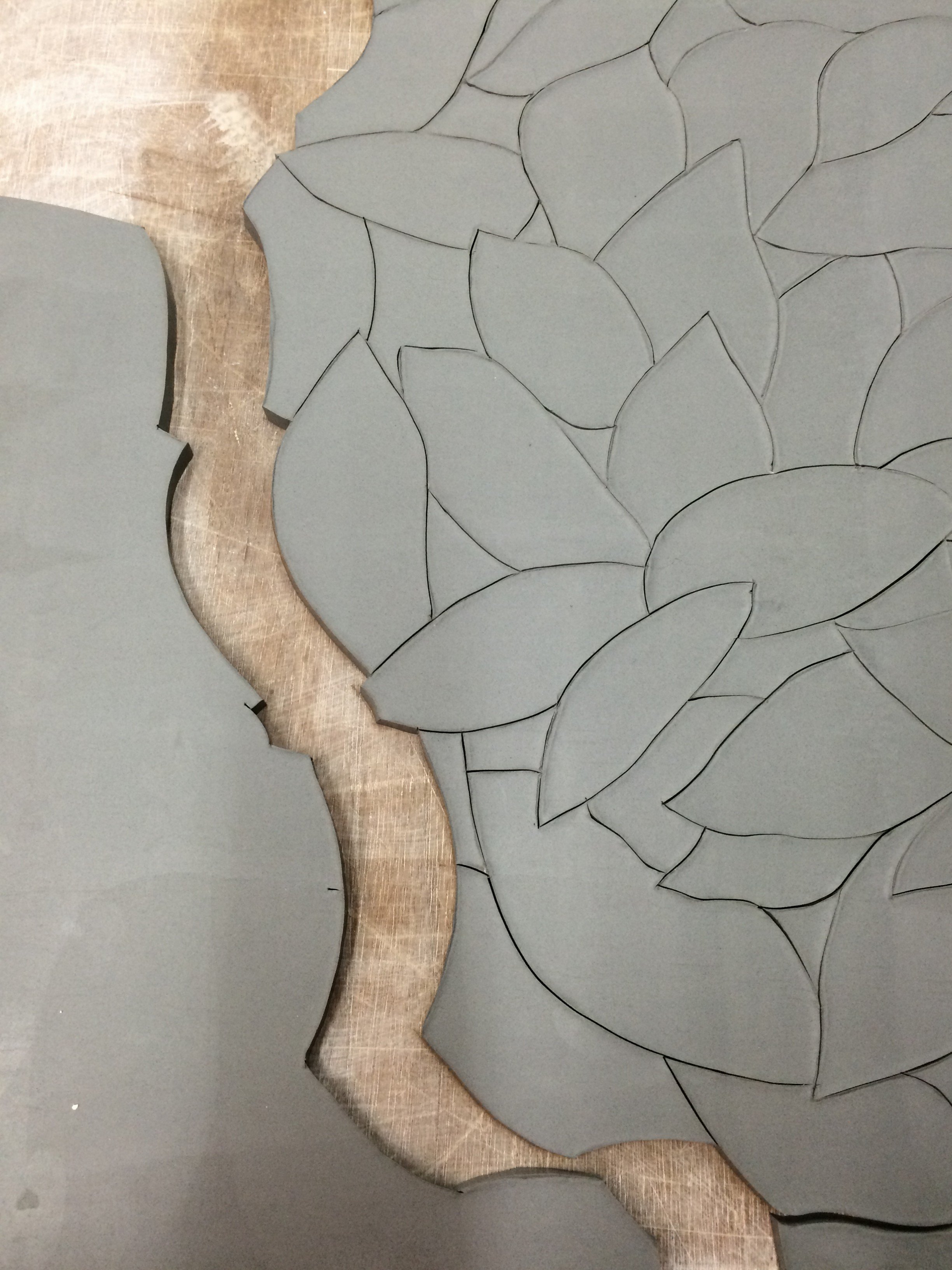
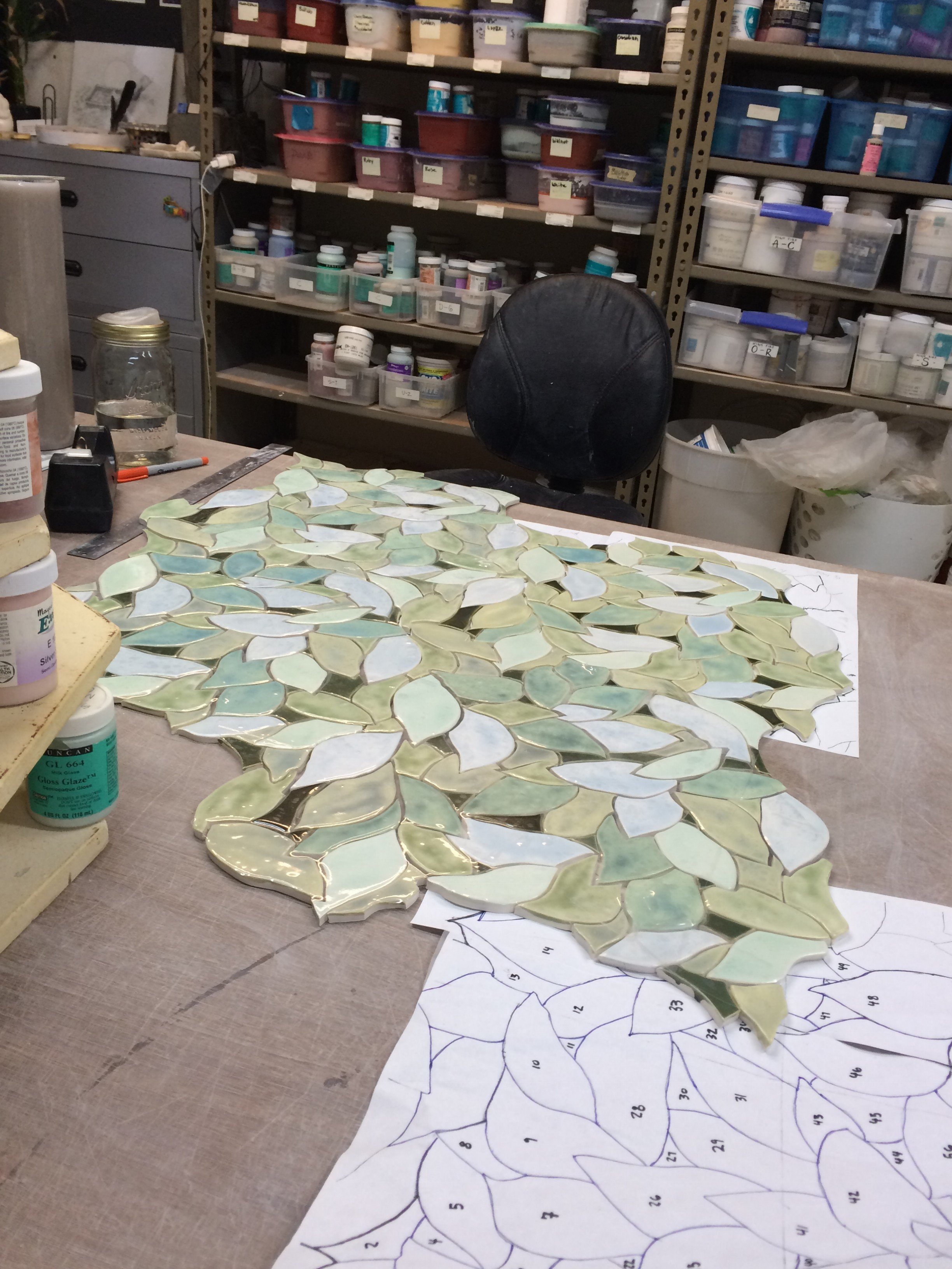
In manufactured tile, you generally don’t find this kind of large organic diagonal repeat because it’s just too fussy to mass produce. In my art studio, we can accommodate things like this and in fact specialize in doing so.
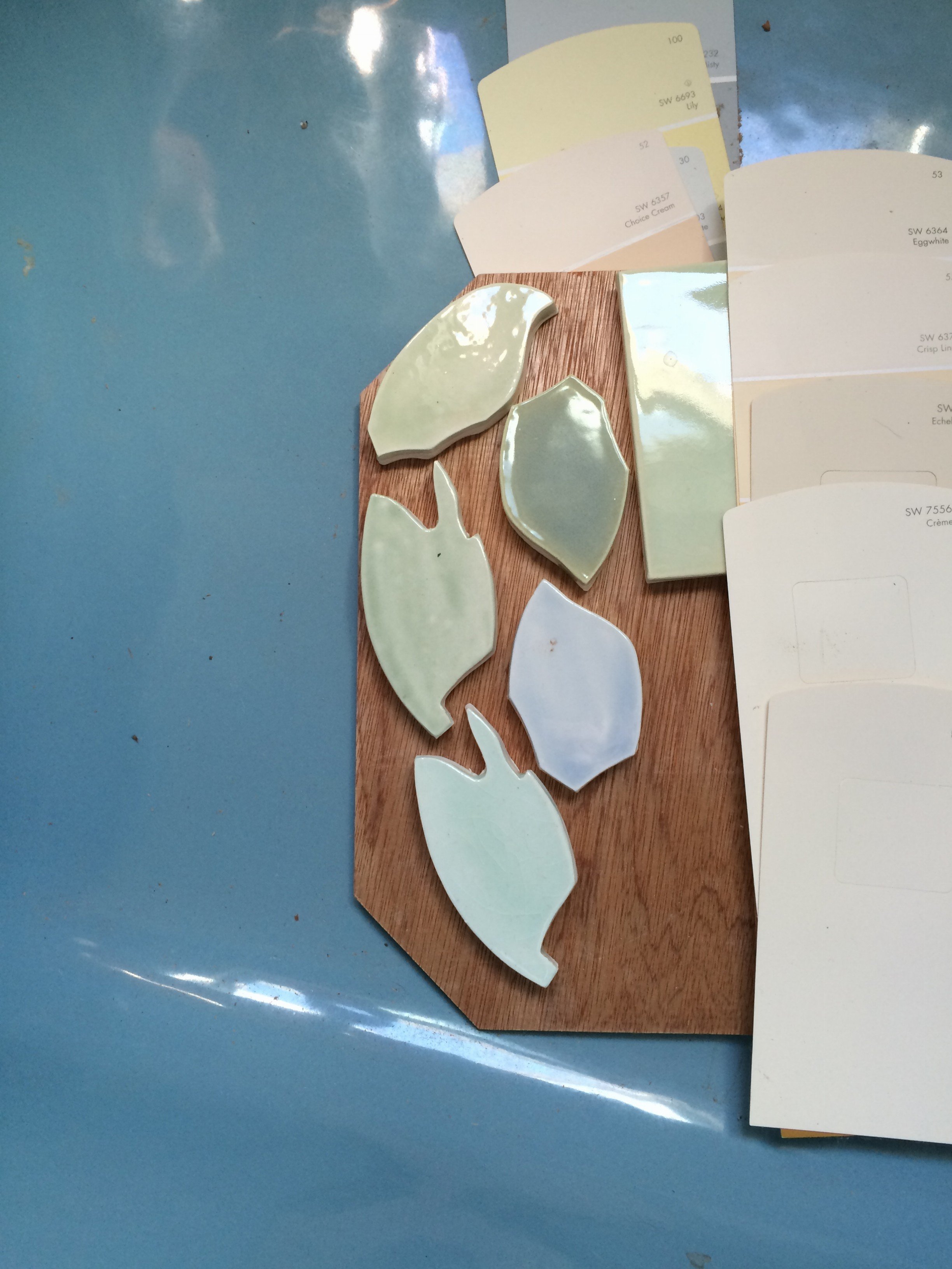
I chose these colors to harmonize with the reclaimed blue tub and to illuminate the space. The glazes are high gloss and this reflection expands the space and makes it feel more alive.
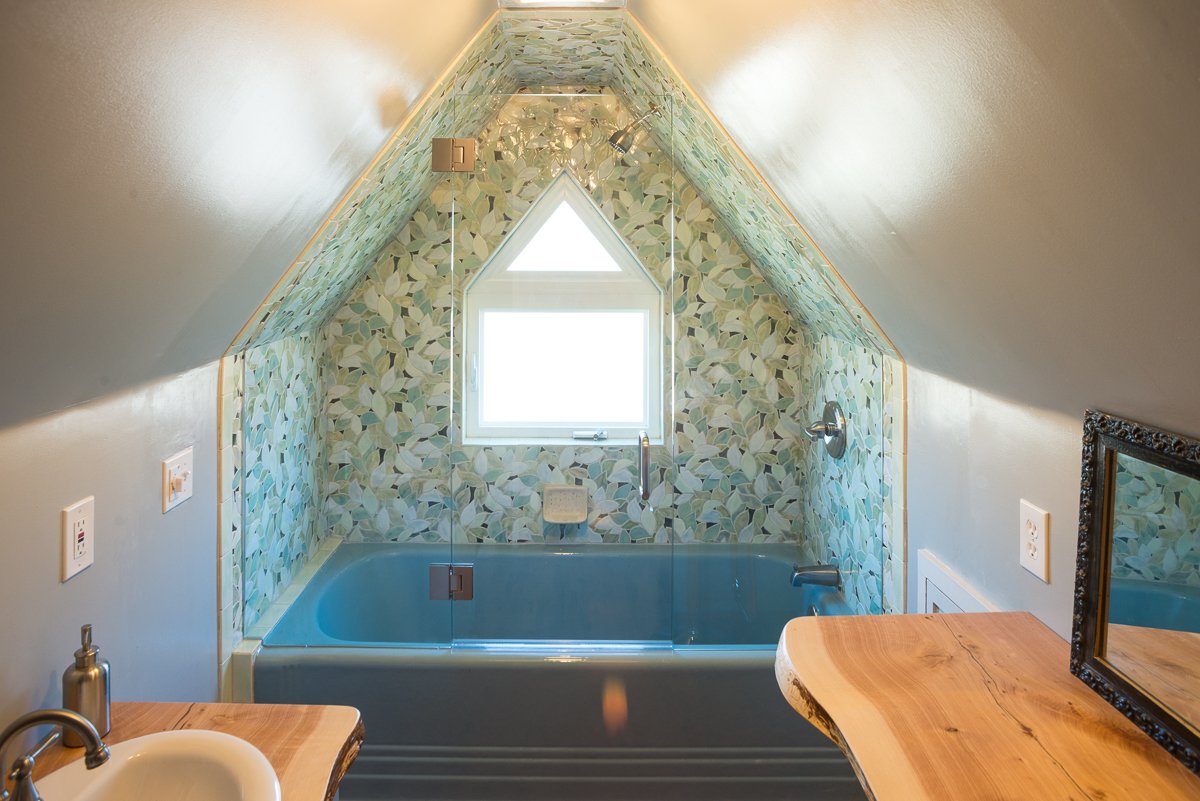
This room great example of how a few beautiful elements can transform a space, this was a tiny blah space and is now the best room in the house!
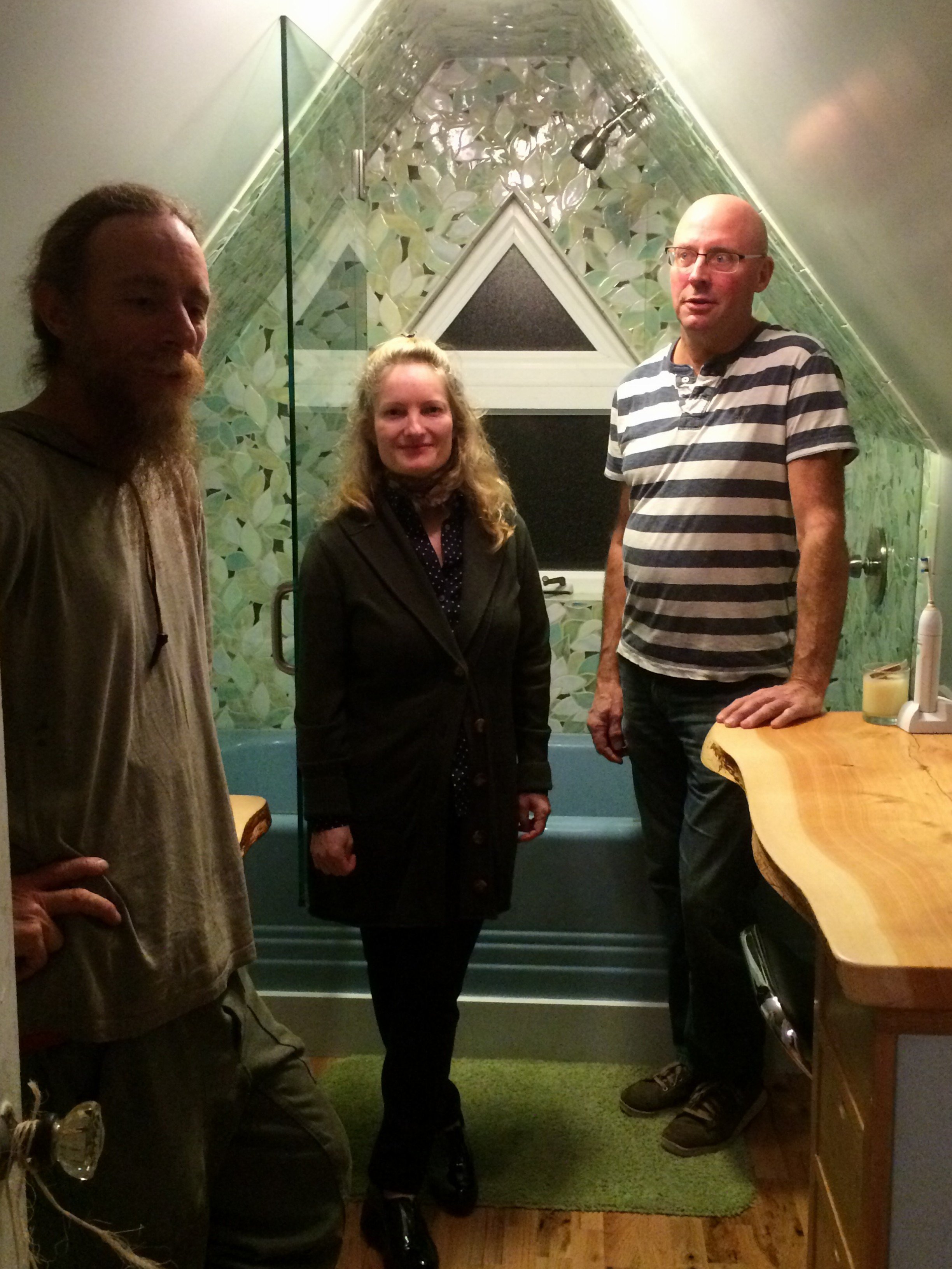
Woodworker Steven on the left, Tile setter Mike on the right
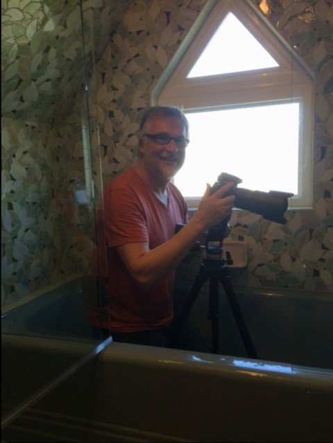
Lubosh my friend and photographer taking photos in a challenging space!
And just one more for fun - as always my Yorkie Lucy does everything with me.
