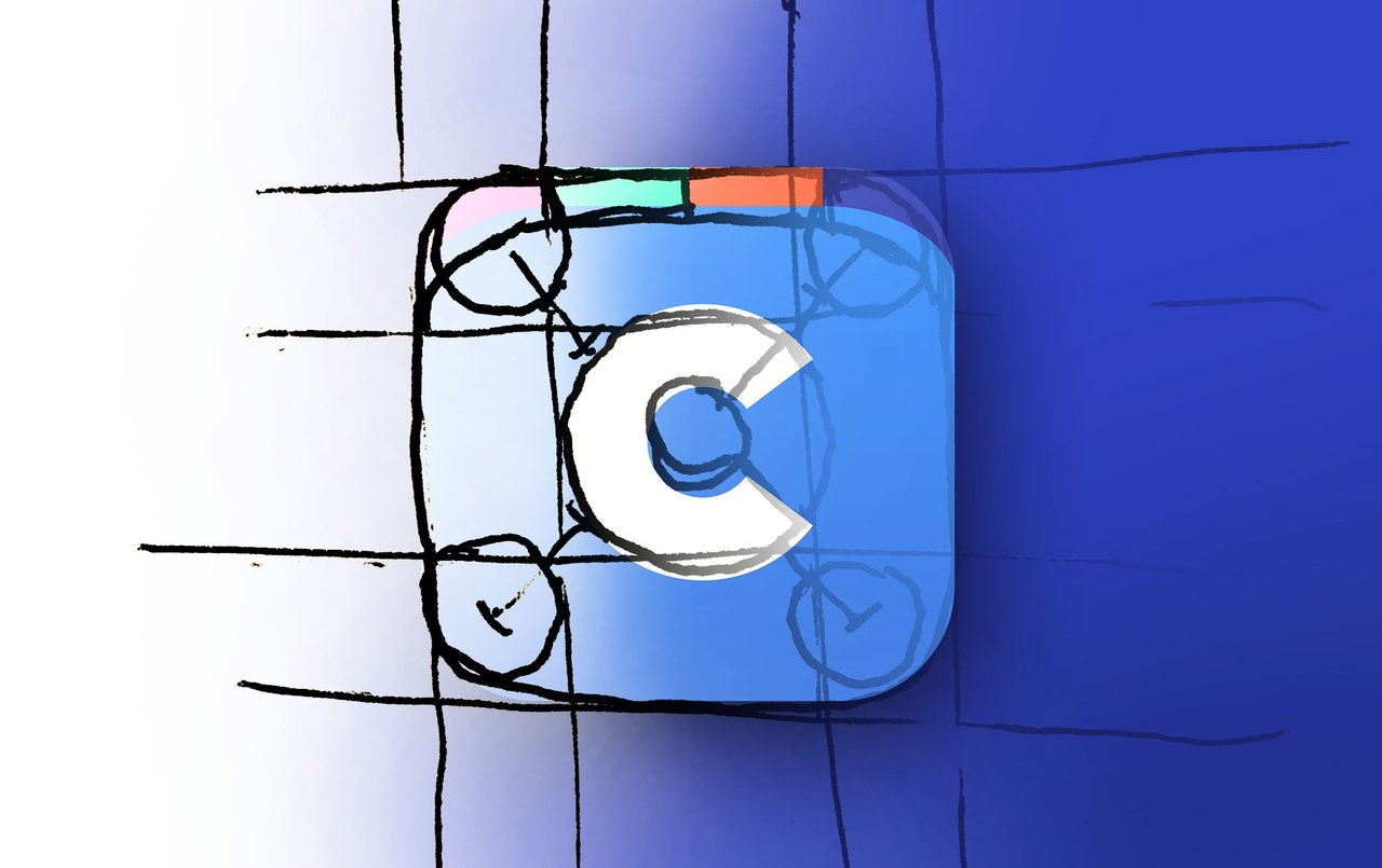
Making an App From Scratch
A couple of years ago, a friend and I decided it would be fun to build an app for the first time. We had discussed different app ideas in the past, as everyone seems to do, but this time we thought we had an idea that wouldn’t be too difficult to create. First off, let me tell you how wrong we were for thinking that. We redesigned and redeveloped our app countless times, trying to make it more perfect and more user-friendly each time.
The Big Idea
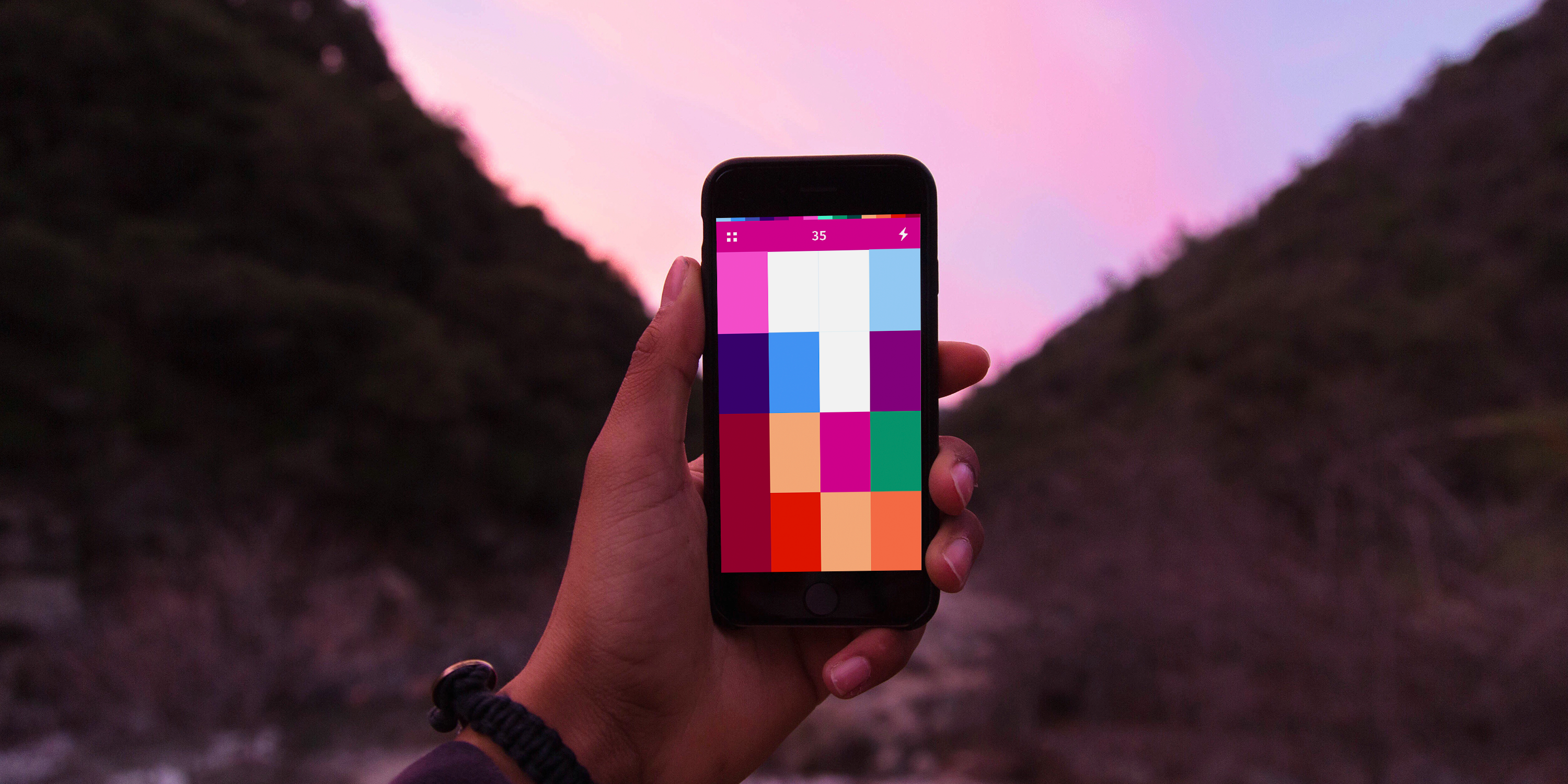
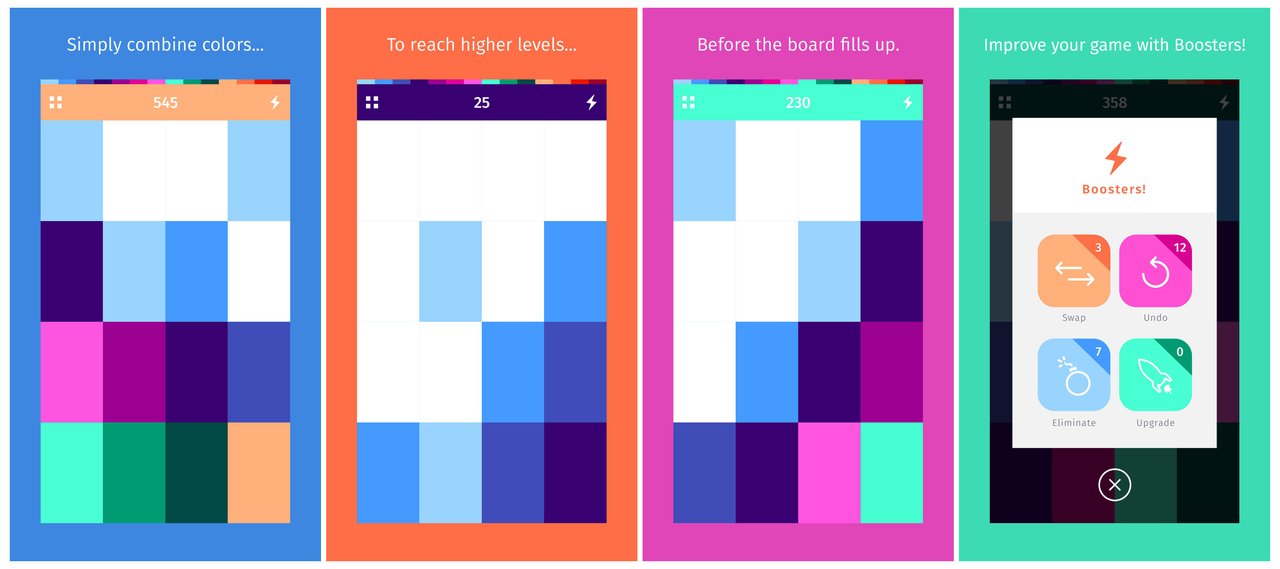
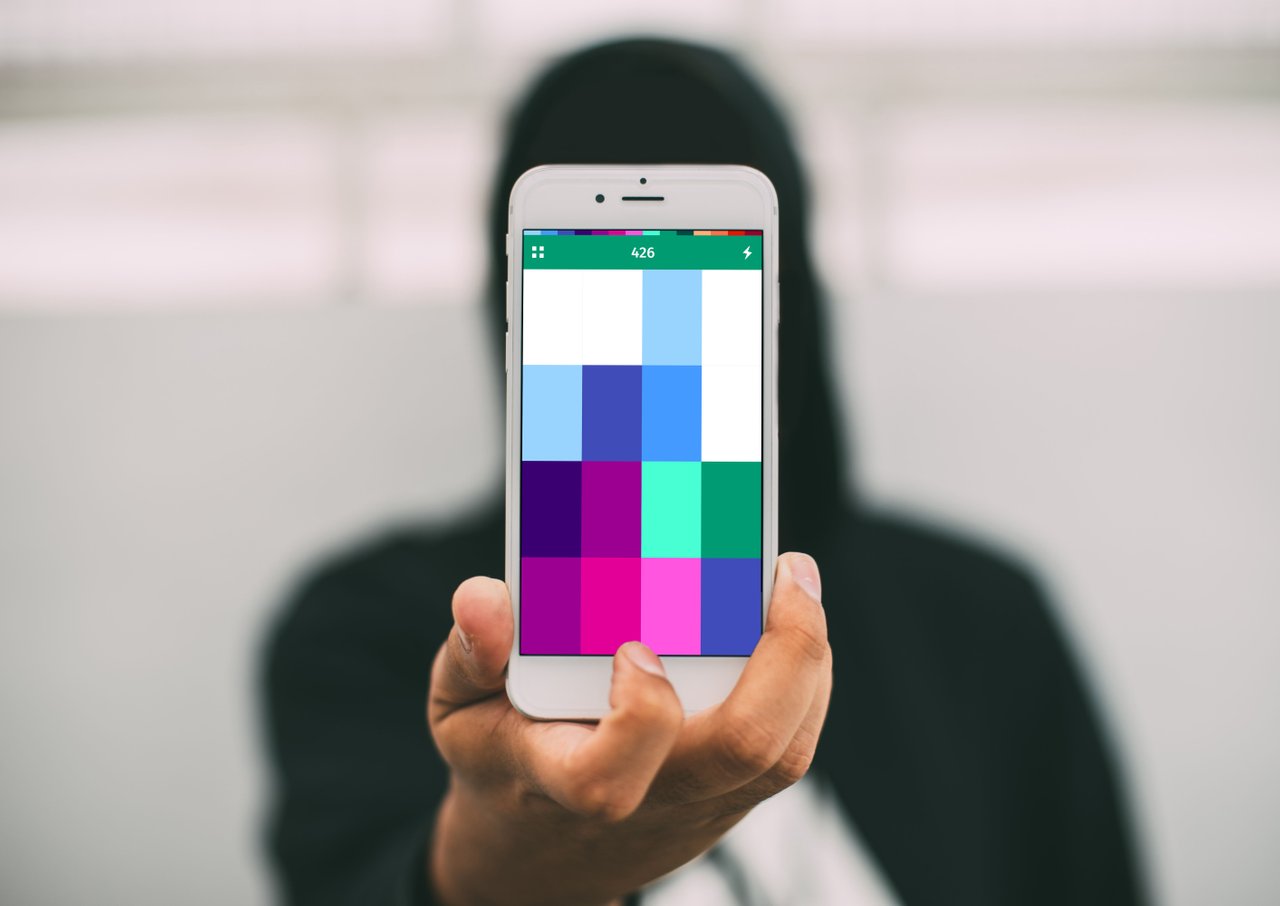
The app idea wasn’t genius or clever or groundbreaking or problem solving in any way. It was a game. But, it was a game that we thought didn’t quite exist. It involved a lot of strategy, creative thinking and skill, but it was also incredibly minimal, simple and beautiful. At least in our minds. The game itself only requires a swiping action from the user. By swiping left, right, up or down, the user can move tiles around the board. A new tile pops up after each swipe. When two tiles of the same color are aligned, they can be merged into a new color. The overall goal of the game is consolidating tiles by merging before the board fills up. There is a similar, we think, less intuitive game called 2048 that works in a similar way from a user interaction standpoint. In our game, COLORS, the more tiles you combine, the farther down the color spectrum you move.
Spectrum of Colors
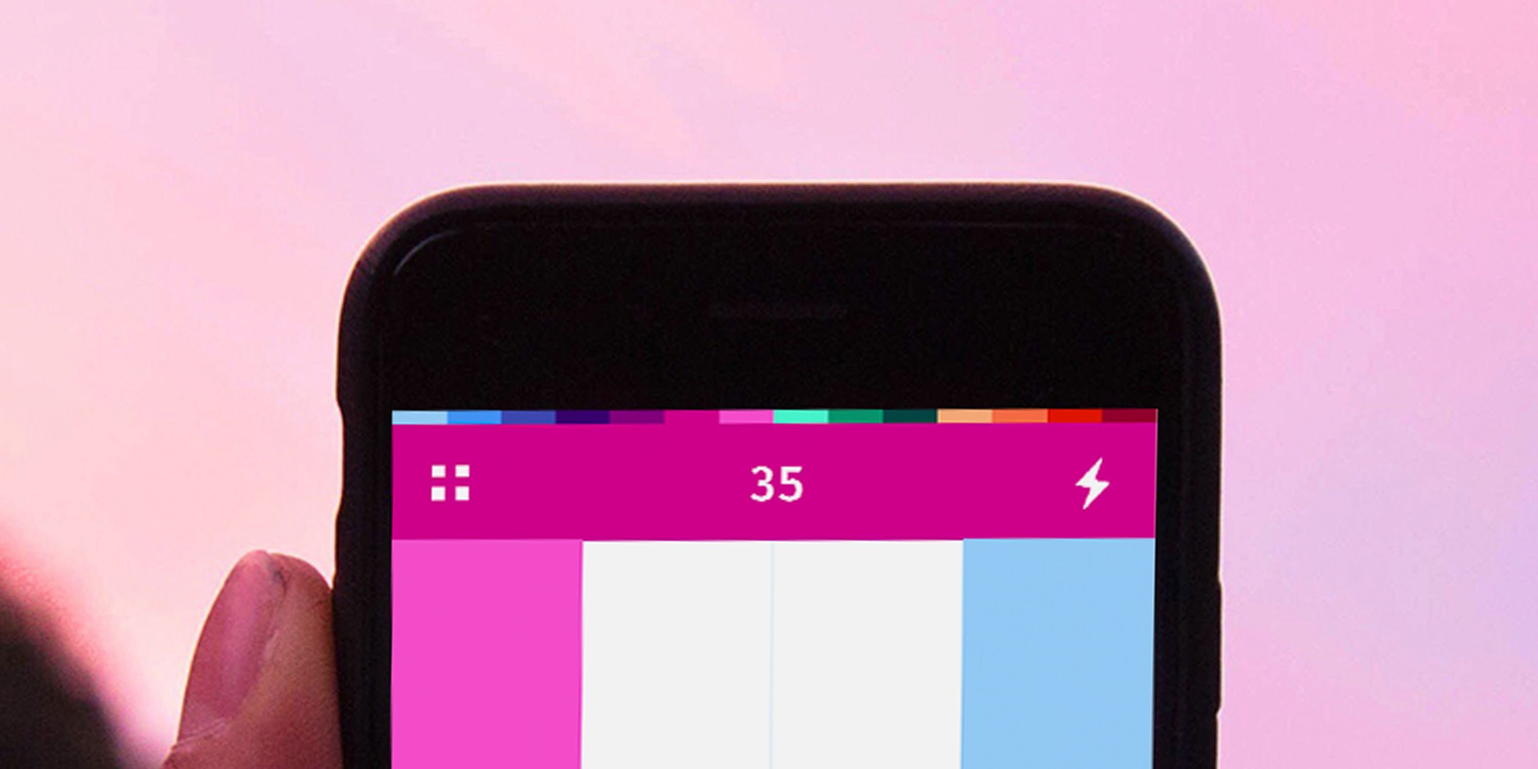
The spectrum of colors becomes completely intuitive after only a few plays. Give it a shot and I think you’ll see what I mean. The colored banner that displays the score and icons on top changes color to notify the user which color has been reached. Once two of the magenta color tiles are merged, the tile turns pink and the top bar also changes to pink.
Designing and Developing
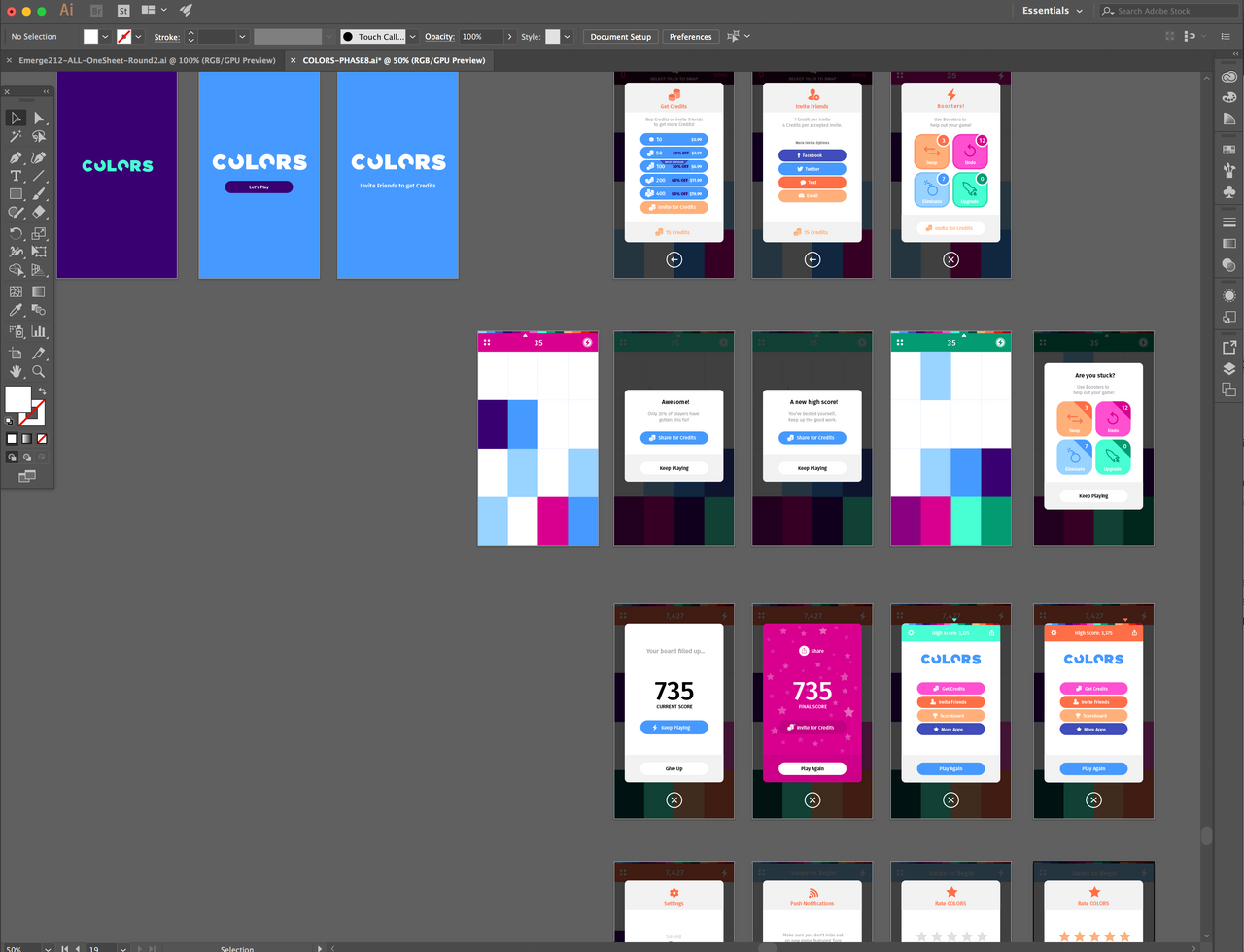
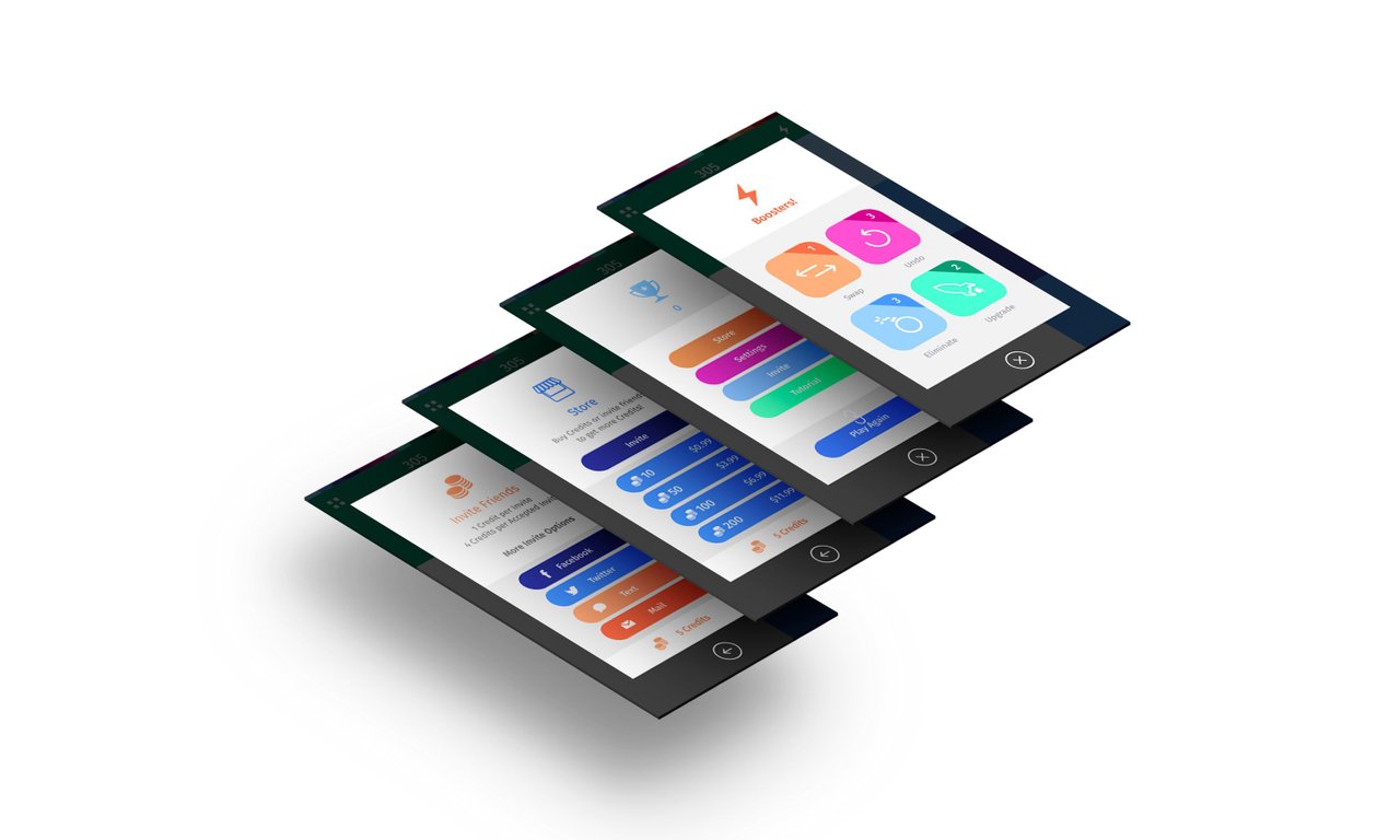
We set out designing the app in Illustrator, creating different layouts and graphics until we finally had something we liked. We brought on a developer who I knew from school and got started building what was only in our minds and in Illustrator at the time.
Minimal Does Not Mean Easy
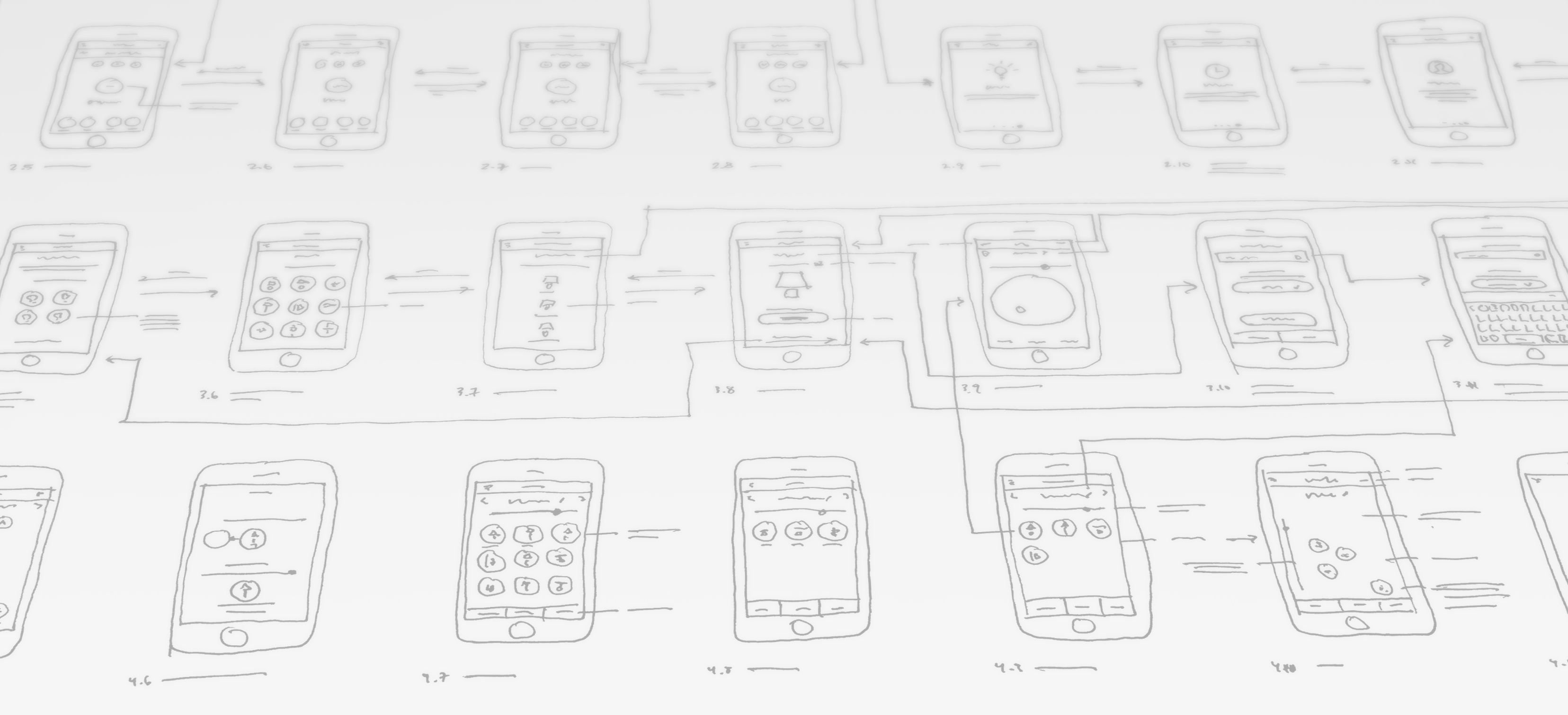
It was amazing to see how quickly our simple game came to life, but it was also amazing to see how incredibly basic and plain it felt. It completely lacked the motions, animations, small interactive elements and most of all, feeling that you get from polished apps. It was missing something that felt smooth, sleek and trustworthy. Luckily, this is something you can add fairly easily if you know what to add, but getting it right takes lots of tweaking. We adjusted animations, layouts, user flows, UX/UI design over and over and over. While it probably only took about 10 total hours to design and build the first version of our game, it probably took another 100 to make it feel right. Then there was probably another 100 hours after that of user experience redesigns to optimize how a user moves through the app. We had countless discussions about psychology, gaming and interaction, tweaking our app along the way.

All or Nothing
When building this app, I thought it would be a lot of fun to put something out on the app store. And it was. I also knew that it would be an incredible challenge to get it to take off. Making a great product is one thing, but getting it to be used or purchased or downloaded is another. We learned about app analytics, optimization strategies, marketing strategies, etc., but at the end of the day our app wasn’t getting the downloads we were hoping for. Sometimes things go viral, but usually they don’t. We just didn’t want to be the usual. It became clear after a month or two of almost no increase in downloads or in app purchases that our app wasn’t going to be the big life-changing product that sometimes happens to that .0001% of app creators. It wasn’t a huge disappointment - it was more similar to the feeling of when you check your lotto ticket to see that you didn’t win the jackpot. It’s something to keep in mind if you are thinking of creating your own app with the intention of making it go viral or make a lot of money. Approach with caution.
Worth It
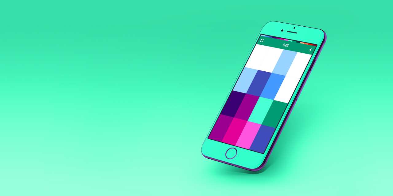
Our app has been on the app store now for about two years. Our downloads have actually skyrocketed in China just in the last week or two for whatever reason, which is kind of exciting, but we have no idea why. This adventure into the strange goldrush-esque world of apps was hugely successful for me personally from a learning experience. It definitely, at least to this point in time, has not been successful financially or in another way. It was an incredible learning experience from start to finish.
Make Something for Others
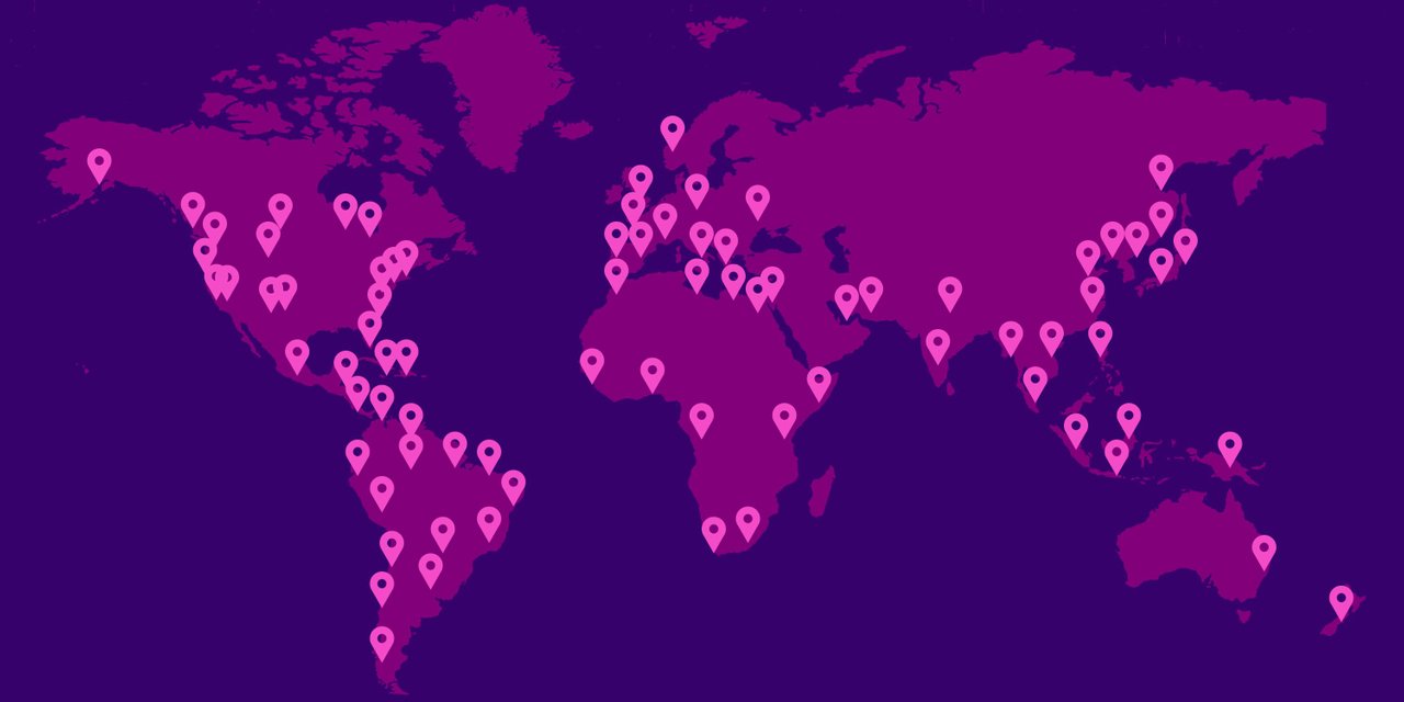
It’s exciting to create something and put it out in the world for people to use. I’d check our analytics from time to time and see that people were playing in South Africa, Poland, Tennessee, England, Japan, Saudi Arabia, Brazil and all types of other places at the same time. In a weird way we felt kind of connected to people through this little idea that became realized in digital form and accessible to anyone. It’s a fascinating concept to think about.

What to Know
If you’re going to build an app, I’d say it’s a great project to undertake, but go into it with an understanding of what you’re doing and manage your expectations. The likelihood of making more than a few dollars is incredibly low. Creating something that goes viral is nearly impossible and even creating something that can provide one person with a full time salary is incredibly difficult to do. I’d approach creating an app just like any kind of risky investment - only put in what you can afford to lose. But, if you can afford to lose, do it. It’s highly rewarding, exciting, educational and fun.
Feel free to give our game COLORS a shot and let me know what you think of it. Any feedback is encouraged! You can download the game here.
Ciao for now, Steemians.
- Weston (aka @design-guy)

