Hi there! This is my very first entry in Steemit after a friend of mine recommended it to me!
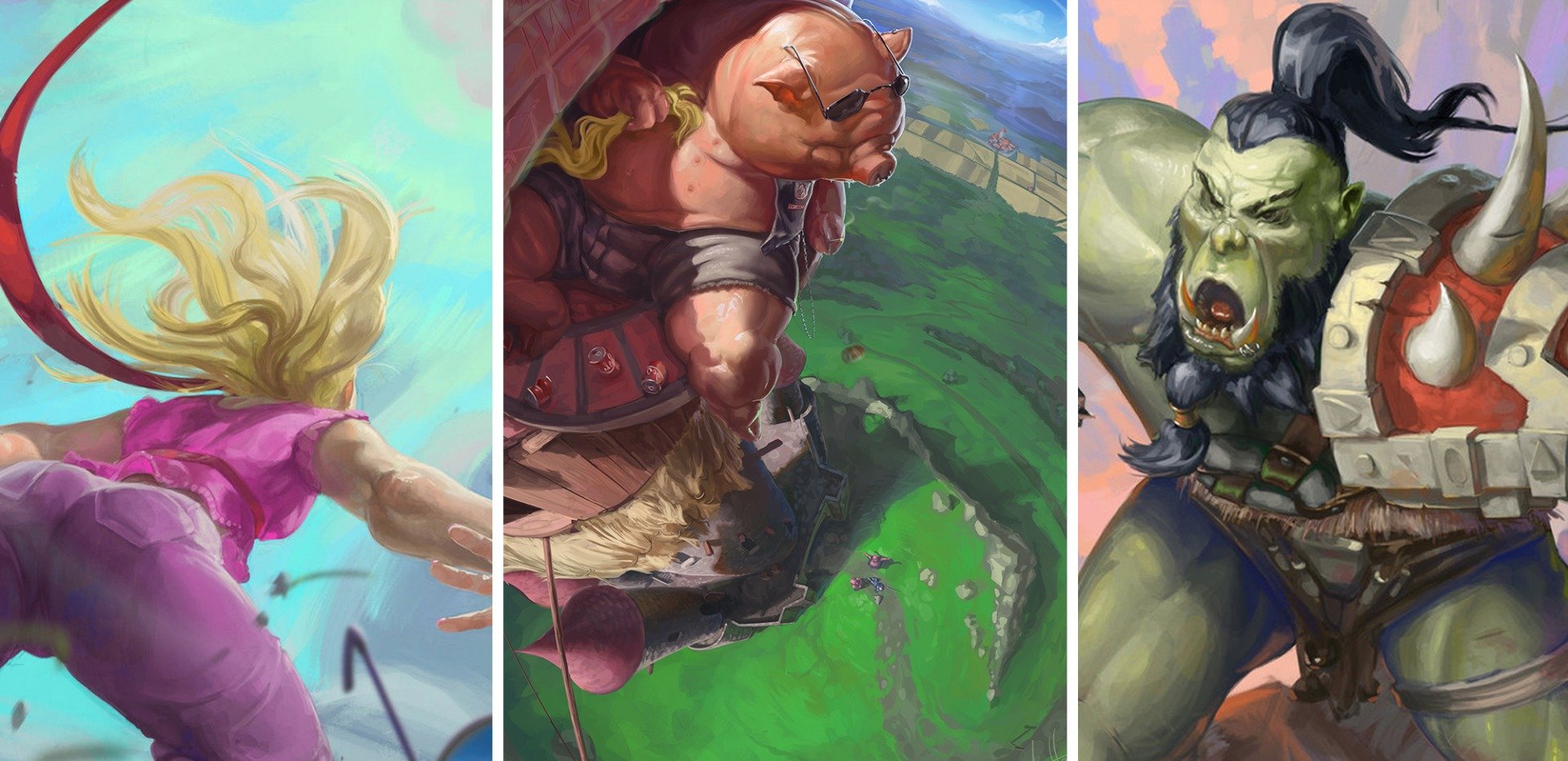
I'm a digital illustrator and concept artist fan of the extreme perspectives. Maybe because I like adrenaline, maybe because this is the element I find that gives more dynamism than anything else to the painting! I don't really know why, but for sure I enjoy it a lot.
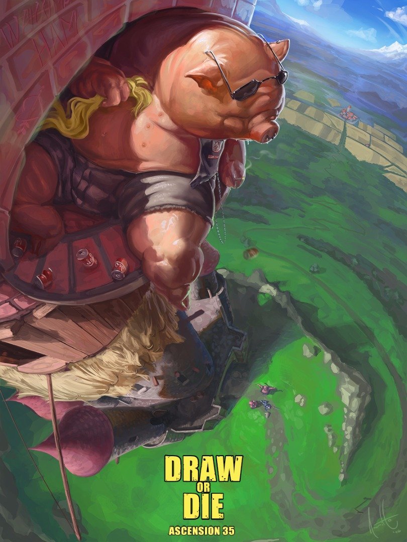
So as this is my very first entry I think the best thing I could do is to show you the process of a painting! I'm pretty sure I will show you many of them, but let's start with one of my lasts. A painting I did for a challenge called Ascension 35, for Facebook's group Draw or Die where you can basically enter there and ask for good advices and, if you are also an artist, just get there and be part of those challenge (feel welcomed to get in and if you want a critique from me, just tag me (Nic Morales).
Let's stop with this formalisms and let's get started!
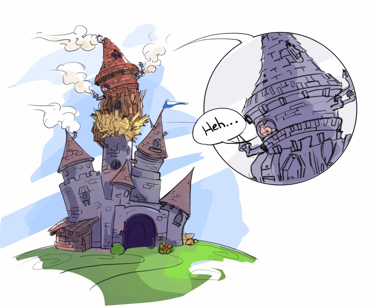
There was a whole story explaining the content for the challenge, developing the world and characters and situation itself. But basically, there was the three piggies and this time the wolf wasn't there. So they ran the town and usurped Rapunzel's castle (yep, pretty bizarre... isn't that cool?) and also builded their very own flats over there, with their very own style (straw, wood and bricks) -Idea that i actually loved... because it would be extraordinarily hard to build properly-. While the piggies itself were a bunch of disgusting, big and greasy porcine meat.
I don't want to go that deep into the story background but the painting itself. So here we go with the process!:
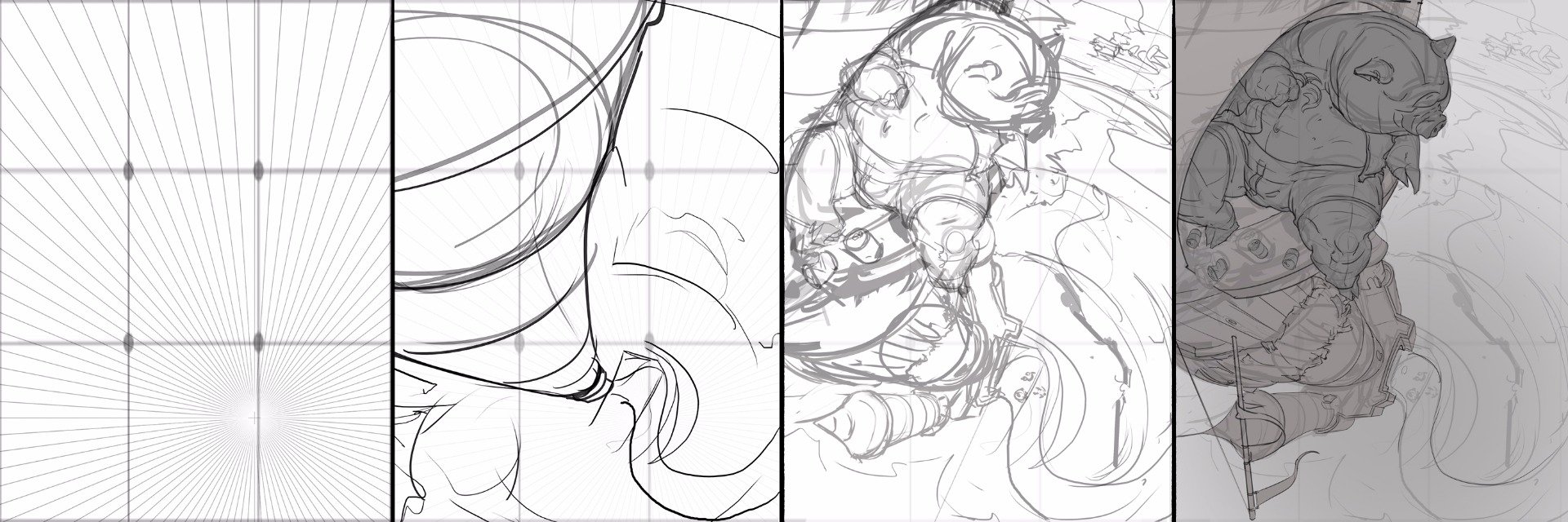
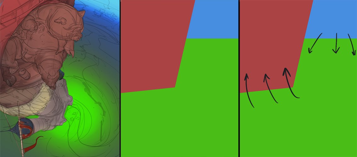
For this painting I had already in my mind that i wanted to use a composition based in the Rule of Thirds... so what is the Rule of Thirds? Easy peasy... You gotta divide the whole canvas (no matter the format you give to it. Say, vertical, horizontal or symmetric square) in three vertical units and three horizontal units. You can make them all equal or vary the center and make it both bigger or smaller. And whatever you put in the intersections or lines may be the center of attention. The closer they are placed to those dots, the most attention will the element catch. So in this case I placed the big pig in the superior-left side of the canvas with his head and sight at the right intersection. Vertiginously observing the action placed at the base of the castle with a pair of cokes (not diet ones) between his legs.
The composition started pretty solid. So next step was to add the colors and choose for a good source of light that would help the reading of the painting itself.
Now we are heading my favorite part! Ladies and gentlemen... Color and Light!!
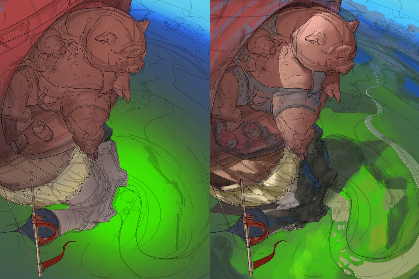
When it comes to the color and light you can kinda save a disaster, or make a completely mess over a solid base.
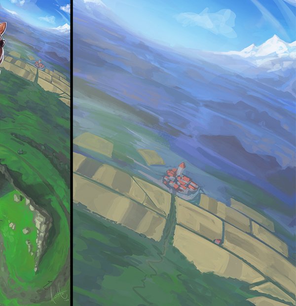
In my case, I knew since the beginning that i wanted a shining and saturated image. I wanted that the reading of the painting were super visible thanks to the contrast between colors. So my palette was very easy to figure out. Red in front of the blue... who may win? Red of course (Reddish things always call more the attention because of psychology of color: it means blood, it means fire, danger, rage. While blue means sea, sky, water, peace, cold and silence). So there you go! I could solve the back and front very easily. but what about the rest? (Because let s not forget that in a painting you gotta have a balance between elements and colors. Say 50% of one tone, 35% of a second one and 15% for the third... Which in this case it would be, in order; Green, Red and Blue) The rest will make a soft transition between the main character (closest for point of view) to the horizon (farthest PoV).
This also gives the possibility to add a of information (say... a village) in all that gradient of values and hue that will give a lot of life to the universe you are creating, strengthening and making it more plausible.
Then it comes the details. Such as texture, corrections of shape, content and storytelling.
You may think that this step is the most important because this is where the painting takes life... Well let me tell you something: I used to think that too.
When you have a solid base, the illustration, concept art or anything you do calls the attention, it has something that is great and powerful. So you can add more and more information, and it will still look amazing.
But When you try patching something that is badly done since the beginning... Well... In the end... It's more likely to be a failure than a success.
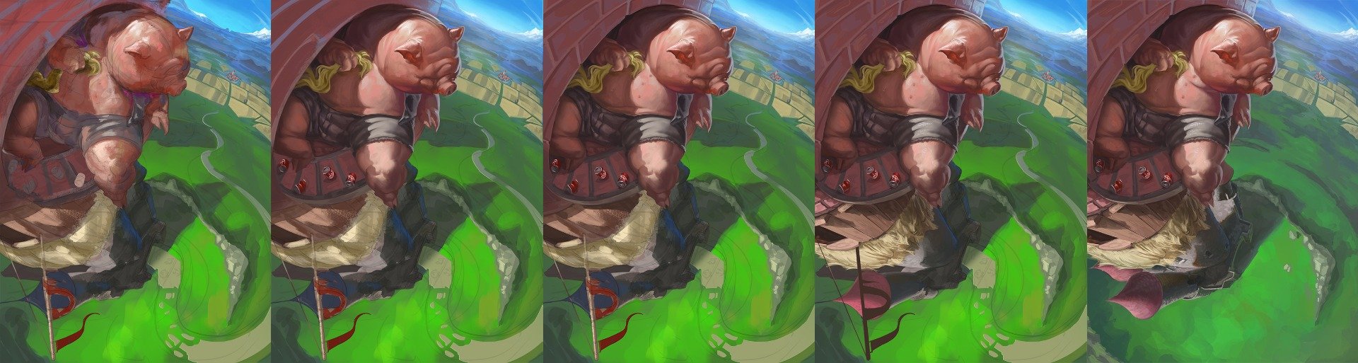
Said that, at this point I'm just making a mess for finding proper tones variations and nice textures that may help in further stages. Then I clean it up and work the piece as much as i can from as far distance as I can (trying to not hook up into the detail). When it s all clean and prolix. Then the final touches are here to pump the whole painting up !!
And what I mean by final touches? Well... Since I work with Photoshop, it means a lot of filters and masks! If they can be seen, then you did a bad job with them... The whole point of using filters is to make soft changes that will help, but not change the illustration itself.
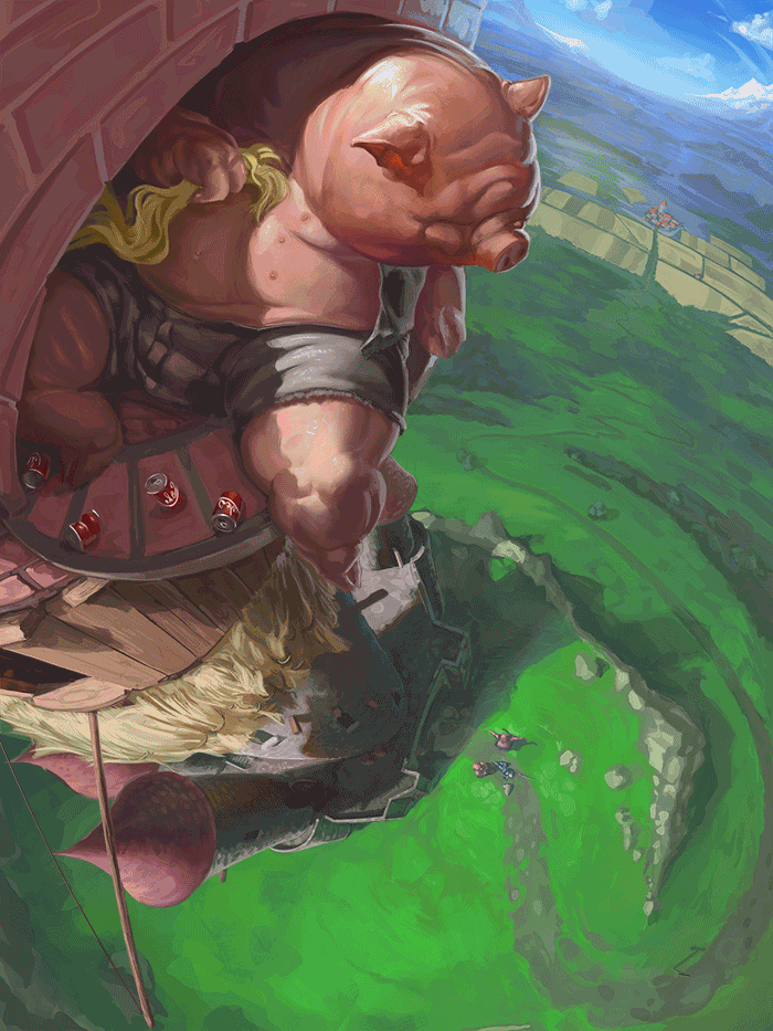
For example, here the eye was getting confused because of the pig in front of that wall of bricks, and then I fixed it with a color correct to separate the hue. Then the background was getting messy, so I made a mask of level correction to increase the value contrast also fixing the green in the right bottom corner.
After this point I made a preliminary presentation to my fellows in the Draw or Die Facebook's group. And I have a wonderful feedback. Mostly cheering me up because of this work and few of them giving me good advices to get the painting to another level.
Thanks to them I could add few more details to make even a better reading and to take off few things that were bothering to the whole composition. Calling the attention, or just feeling they were just useless.
Not much else to say, I finished the illustration by looking after all those corrections and applying them (even if i was really lazy after few days of working in this piece at late night after working the whole day in my full-time and freelance job).
And voilá!
Thanks for sharing!
Next time I will be making a step by step about this painting:
So feel welcomed to follow me and make me a good critique =)
You can follow my work in ArtStation https://www.artstation.com/artist/raphaelanritco
Cheers!