Hi Everybody !
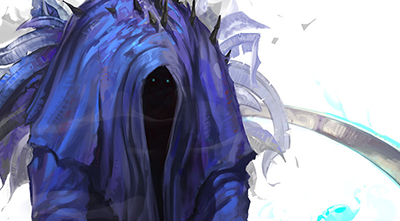
It's funny how suddenly everything in my life starts relating to the Angel of Death some how. Maybe the World is trying to say something to me... Hope not!
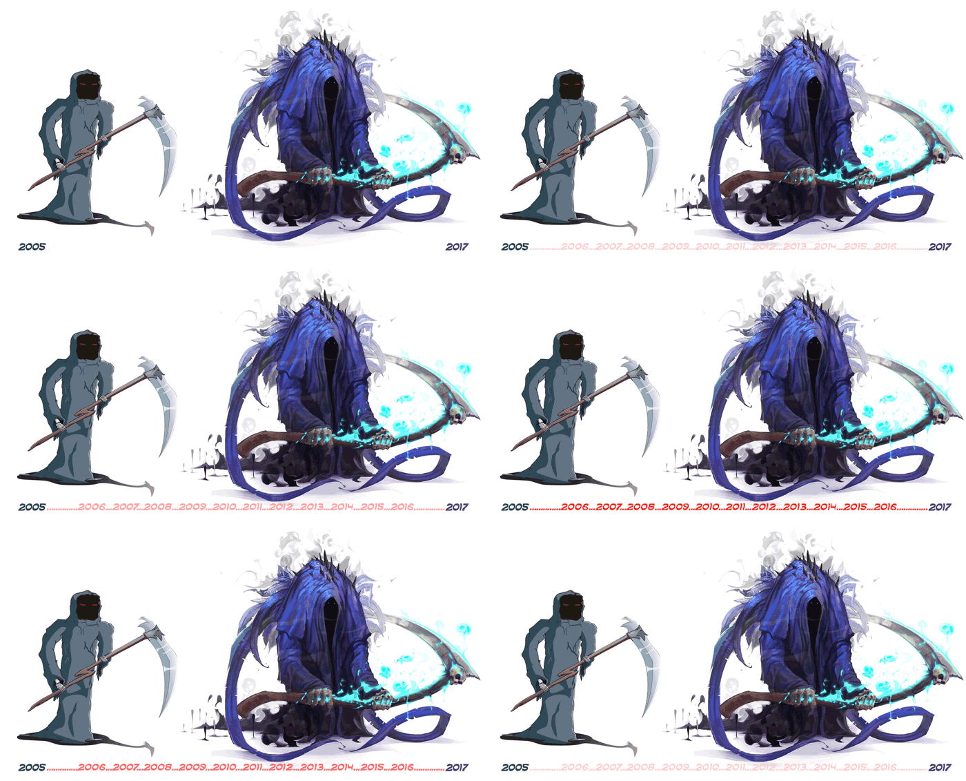
Twelve years ago I was really hyped about digital painting... I used to look to all those amazing paintings from people that never saw before in my life creating such amazing realities and worlds. I was completely fascinated !
So I decided to give a try to my artistic skills!
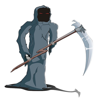
(Yes, it didn't work)
But I was a 13 years old boy who was impressed about it! I was showing it EVERYWHERE! I was so proud of my skills !! Until I asked to a professional artist, back then, friend of one of my brothers: "It looks made by someone that just got started".
But I decided to take it as a positive feedback: If I just got started, it means that I was already in my path to become an artist, right?
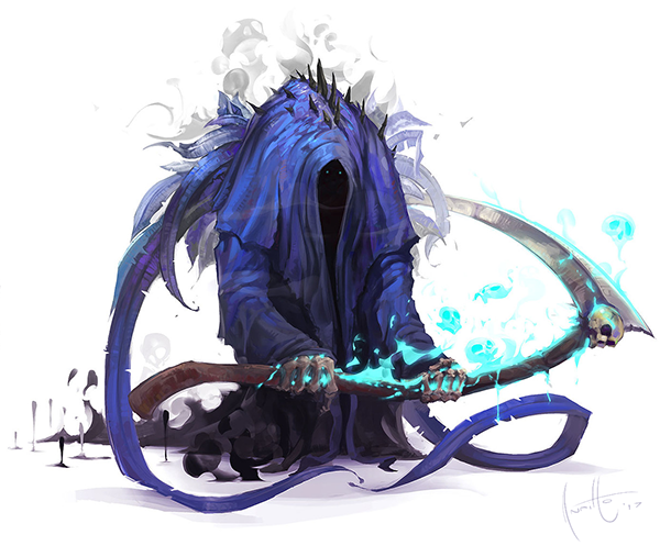
I think it was a beautiful decision to show to myself and to everyone that the path I started 12 years ago doing my very first digital artwork took a twist after some years and made me be the professional artist I am today. Just to be clear, at my 13's wasn't when I decided to become a professional artist, but was the moment when I realized that there was something more out there, waiting for me.
(Before we get started: All the images are my own creation and so I own the rights of them)
Nothing too complicated. I just grabbed the main old design and decomposed it into different shape-languages without any really detailed information. But I didn't need too many of those, I knew that the square shape would completely adjust to my vision of this solid, strong and stable character as I feel The Angel of Death should be.
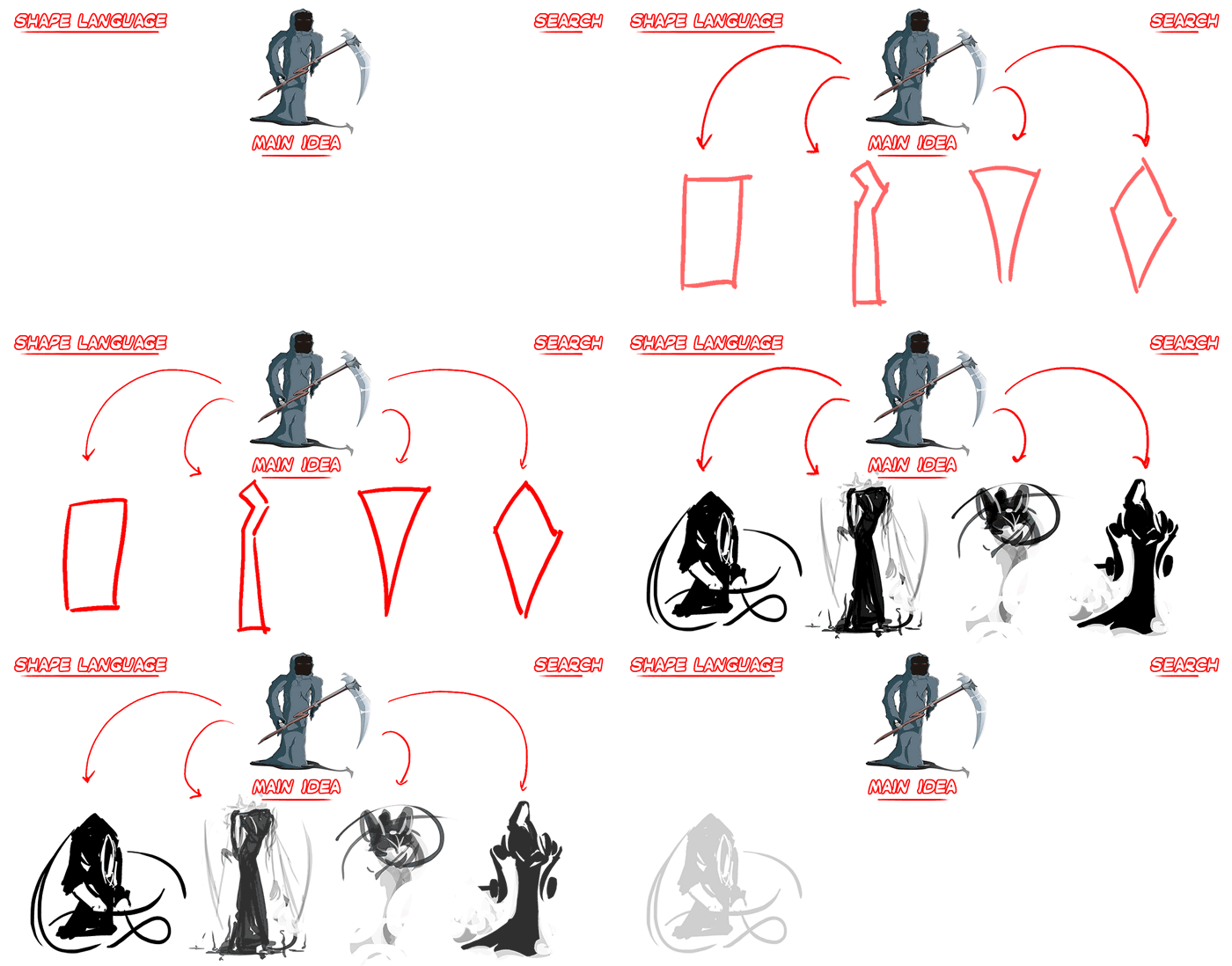
Te decision was made and now we had the explore the elements that would appear onto it: How we would dress it? What design elements should appear all along the character? How would the assets be and how to adapt them from the main old concept?

From the sketched shape to the sketched painting
All these elements and answer were appearing with a little bit of patience and a lot of my super good friend Mr.Improvisation. I always loved skulls and so they had to be all over the place. What would the death be without them?? I mean come on he harvests souls for dinner.
Here I used another technique that I am also familiar with:
1. Define the line-art (based on the main shape -> critical hit!).
2. Define the area of work (based on the line-art).
3. Define a gradient with the colors you want to use (based on the area of work -> alpha selection).
4. Define light and elements over it (based on the color gradient).
At the end of this tiny process we will find ourselves with something not so pretty, but actually very solid.

/
In conclusion
