Hi everyone!!
I have no words to thank you for the beautiful welcome you gave me on my very first two posts!! I felt so supported and so happy to be received with your arms wide opened!! It was so nice to me that I couldn't just leave it: now I feel I need to give something back to this beautiful community! So I hope you will enjoy this post!
This time I decided to pick up an illustration finished last month. Luckily enough I saved many stages of the process!
I completely did it as a personal work for pure joy! And what makes this painting so special is that I had a very important experience in the middle of the making of: my very first travel to Europe! (actually my very first time I ever left my country, alone -And without cellphone!!... because they robbed me it the week before #truestory-).
I discovered many, many new places, met new and beautiful people. And without even expecting it... I found myself.
I will come back to this tiny story of my little adventure but now let's get started with this painting!
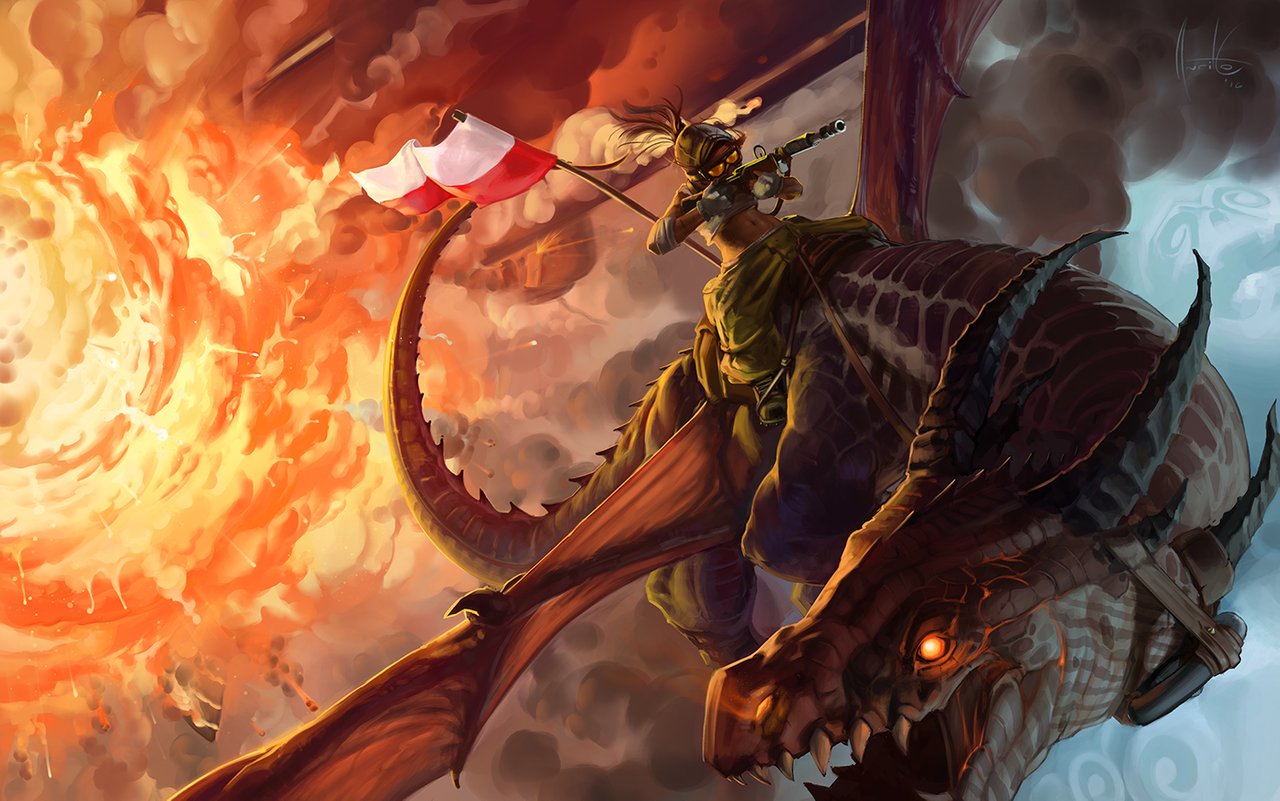
Heavy Air Forces
(Originally Polskie Siły Powietrzne)
Spoiler: For the lazy and curious ones I left a GIF img at the end with the whoooole process in a row. I think it looks cool!
Before I even started I had in my mind the idea of making a painting about a dragon with a whole sky from behind in a cool and extreme ...(wait for it)... perspective! Then the idea of doing riders/pilots taken from the 2WW came out from a friend between a pair of beers. My reaction was 'why not?'.
Then I started to think about a composition which could be great for showing two main elements, one in front of another... The answer was easy: 50-50!

50% against 50%
You see... when it comes to composition, you can follow the rules and laws (there are A LOT of them) or just free your mind.
I highly recommend to use balanced compositions for getting started in path of art (And we will see many of them all along my posts).
50-50 then! But, in which direction?
You have a lot of possibilities, but mostly three: Horizontal, Vertical and Diagonal. The first one is generally too calm and quiet(good for landscapes or scenes with meaning of peace!), while the vertical one is too aggressive and it generally takes the elements completely away from each other (Good for very looong distances of unrelated elements or massive conjunctions). And since I already knew that I wanted a dynamic composition for this, I chose the third (and my favorite) one.
Said this I couldn't hold my wants anymore. Took my Wacom pen and vomited the idea. But wait, why to use this nasty word?
Well...

...now you see why hehe.
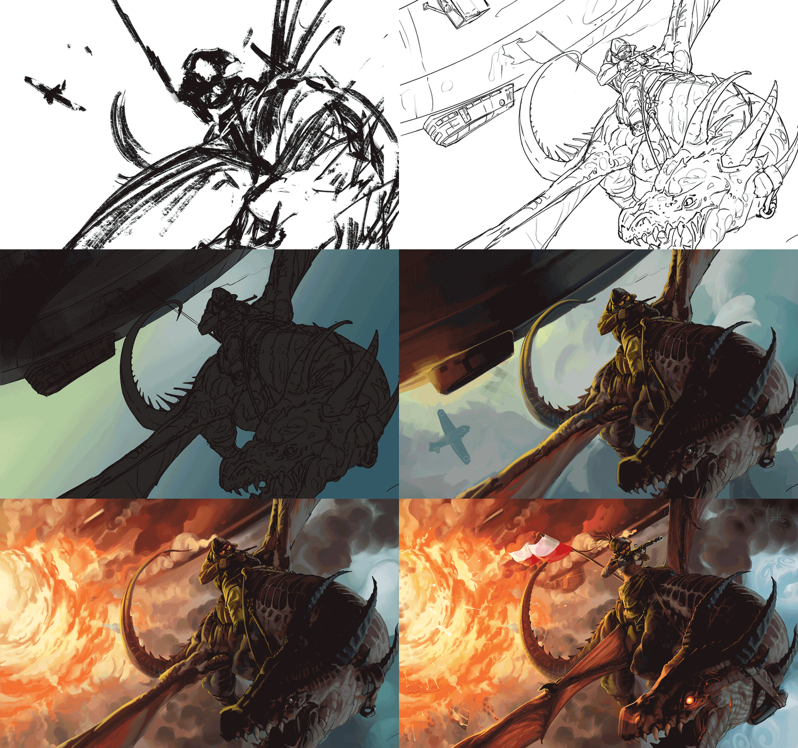
This is a early sketch from color and lineart. Generally artists do it to hold their ideas while they still fresh.
As soon as I did it, I could note how the composition were already working. I felt veery pleased with this so I decided to gather a bunch of references. To take the whole thing further and start with the second sketch lineart.
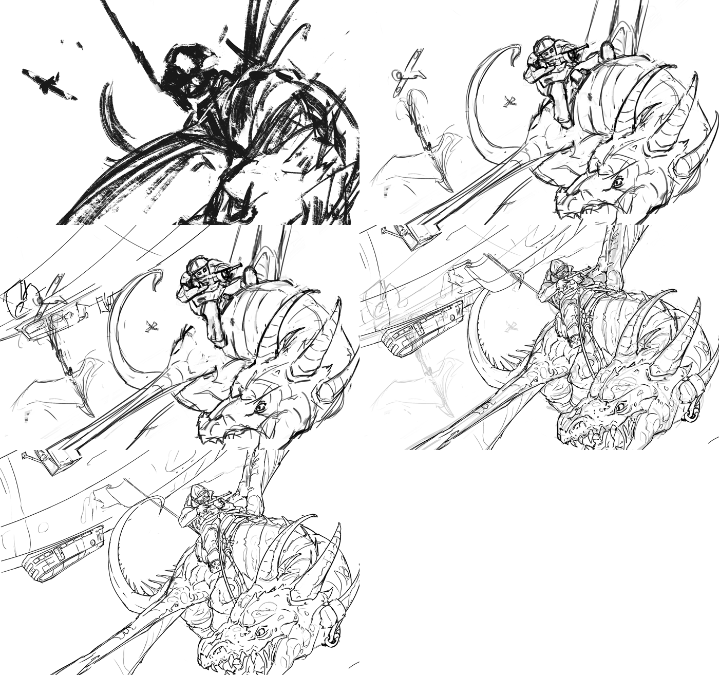
Stage that I also called cleaning the vomit (Ohh I'm so sorry for all this messy words).
Then the time for color came into the canvas!
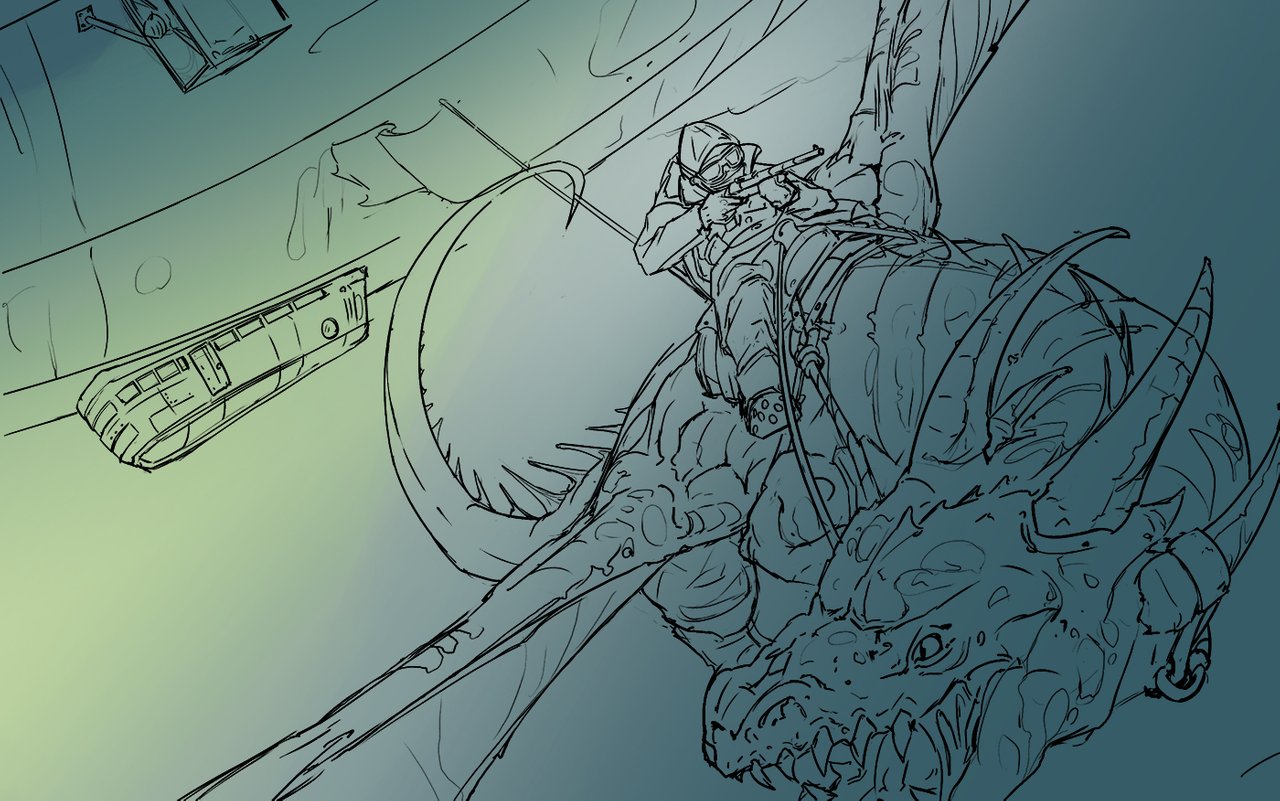
And I kinda knew which colors were needed here... When you use a sincere blue to paint a sky, with all the value of whites for the clouds and atmospheric degradation, it thends to look too realistic... But when you turn the color into a... say... a desaturated cyan, the whole painting takes a fantastic look. So there we solved the sky base already!
Then the character and the object against that background should have a proper contrast to pump up from stick out. And you have three different kinds of contrast available and all combinations between.
- Value contrast: most common (Shadow against light)
- Hue contrast: not so rare, you can see it very often! For example with a green sleeve against a red brick wall (with same value and probably same saturation).
- Saturation contrast: for sure the most rare, but once you nail it... ohh gosh you nailed it (And this, all mixed with hue contrast is my favorite one!!).
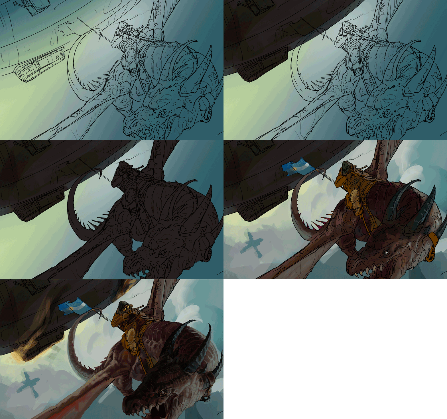
So the contrast was there in the basic shapes and it seemed to work properly... time for adding some information and different values!
At this stage I left the painting because my flight was ready to take me to Europe. And when I came back, after a month, I opened the PSD file with the painting and felt that something was wrong.
This colors weren't as cool as I remembered. The contrast wasn't enough. I felt I failed and I did a complete mess with the colors... But then a brilliant idea came to my mind.
Rim to the rescue!
I decided that the character should have a very strong rim light to give them both contrast and volume. So to make it plausible I should have a biiiig and badass light source back there. What could I do to make it? Which story telling element could I add for making it looking good??
An explosion...
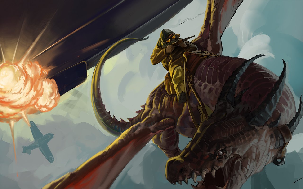
A BIG...
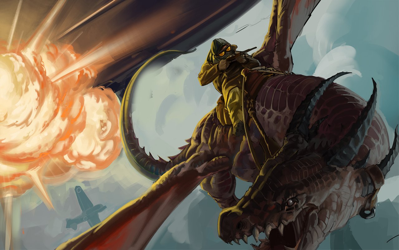
BIIIIIIIIIIIIG EXPLOSION!!!!
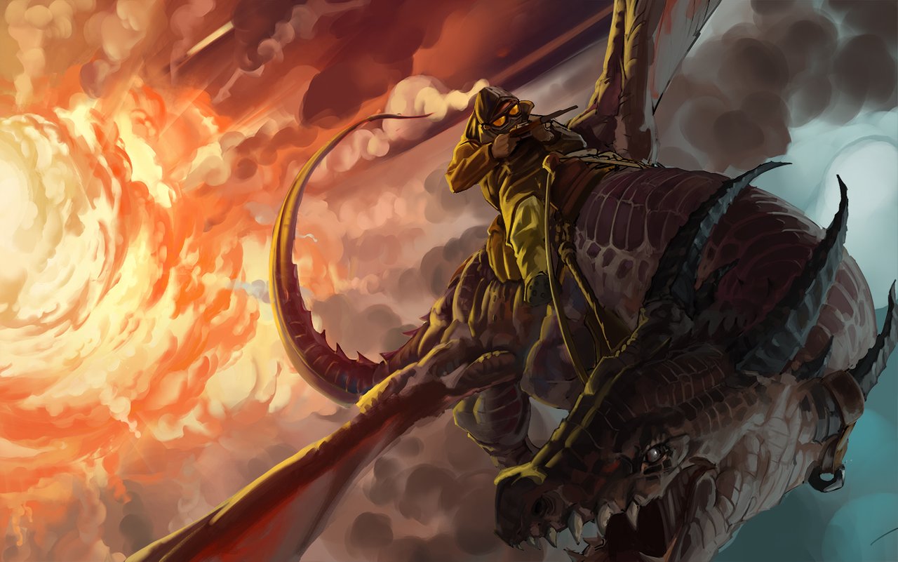
Power over 9000!!!
I remember how pleased I was when I saw the result of this decision.
So the painting was absolutely solved! The base worked and the rest were details to make the elements more readable.
But also a good idea came to me from my girlfriend: Make it a girl!
...I couldn't say no!

And after knowing Poland (place where I m moving in few week) needed to do some tribute to the country... so in my final painting... after some corrections, adjustments and details... The result was this:
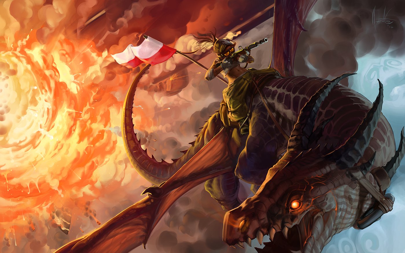
After I finished and published it into the social media I received a lot of support and good critiques about it... now you see that what starts as something that may not be as good as you thought can be saved with few techniques and little tips!
The last step was to sign it... well a little certification I use to put in my personal works (ohh I'm so old school...)
...And hell yeah it has my seal of approval! 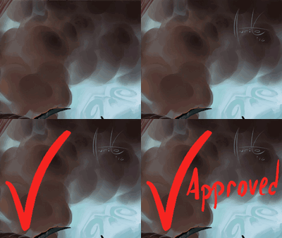
Thank you for reading and for all your support!!
And of course the promised GIF with the whole process!
If you want to see my upcoming work, I invite you to follow me and tell me what you think about this one and what kind of things would you like me to do in a future... I'm always looking for good ideas to paint or draw and also to post. So don't be shy!!
