Ten years ago I picked up acrylic paints for the first time. Edward Hopper inspired me to do it. I led nocturnal life then and felt some alienation from life and people. The painting "Nighthawks", which I saw in the art album, immediately captivated me with, on one hand, its melancholiness, but, on the other hand, a sense of self-sufficiency of its heroes. The people in the painting are like shattered pieces of a big city, and in each of them are fragments of the big lives.
I took up painting its replica and it took quite a long time. This was my first experience of mixing acrylic paints, matching the exact colors. I was still confused by the names of carmin and madder dye and I always lacked the right colors because at that time in my town we didn't have a good art shop. But that did not stop me.
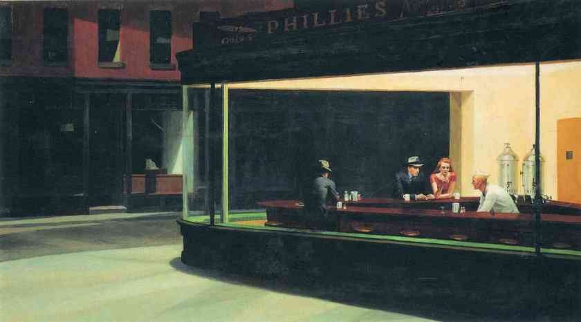 (Original work of "Nighthawks" by Edward Hopper)
Something else stopped me. Due to the tragic (or enlightening — depending on the point of view) events in my life I, myself, now became a fragment of the big city for a few years of my life. And abandoned painting. The painting was not finished. Unfinished were human figures, which were unable to come to life in this dark and cold city.
Only after six years, I have returned to this replica. At that time I had a completely changed condition and moods. And if you have seen my previous posts, you know that my new works are typically bright and I am inclined to fill them with some even childish naivete ... So I was not even sure that I will finish this work. But the small white spaces in the picture offended my eyes. And I completed this replica:
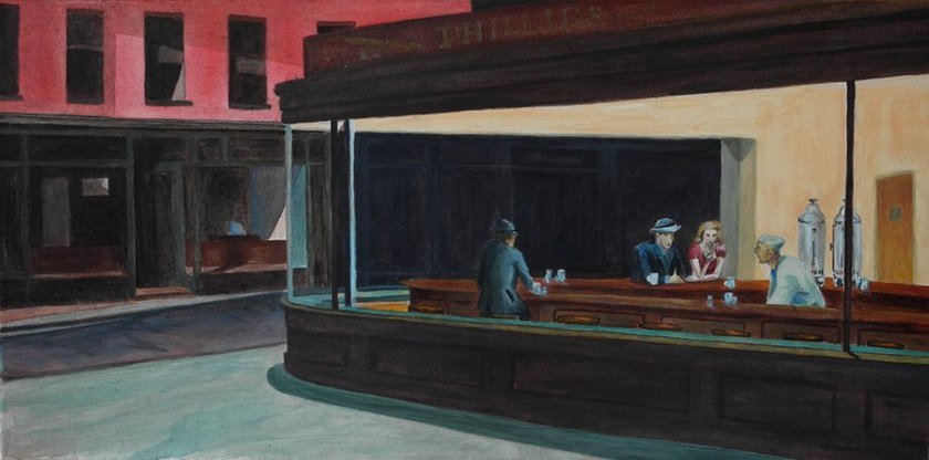
(My replica of "Nighthawks" by Edward Hopper, acrylic on canvas, 80 x 40 cm (app. 16' x 31'). You can purchase it for STEEM on Peerhub: https://www.peerhub.com/items/7455)
In fact I really like the concise but deep aesthetics of Hopper's paintings. He masterfully conveys the depth of feeling. He does not shout about it. But it fills the space evenly, firmly and without compromise. This is the feeling about which it is not customary to talk, but that can permeate entire existence like a fundamental principle, on which the society rests. He conveys it with mundane simplicity: with a view of cafe where you can not hide from loneliness, with a perspective of rails that will not get you anywhere, with a portrait of person who is cut off from their roots and thrown into a faceless city.
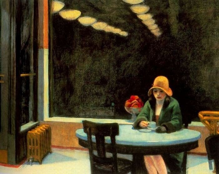
("Automat 1927" by Edward Hopper)
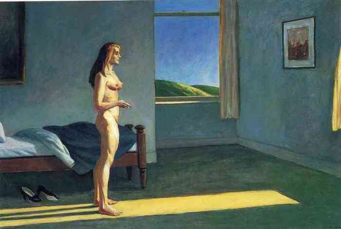
("Woman in the sun" by Edward Hopper)
With dense flat planes of color Hopper conveys the hidden threat of broken relationships in a society. His works are full of tension and somewhat theatrical drama.
What wins you over in his works is that all his subjects are ordinary: here's a girl in the cafe, that's a man on the filling station, here a sewer at the sewing machine... but they are unique in that they are seen through his eyes.
He himself once said: "Originality is neither a matter of inventiveness nor method — in particular a fashionable method. It is far deeper than that, and it is the essence of personality."¹ Looking at his paintings we look at the way he looked at all of us.
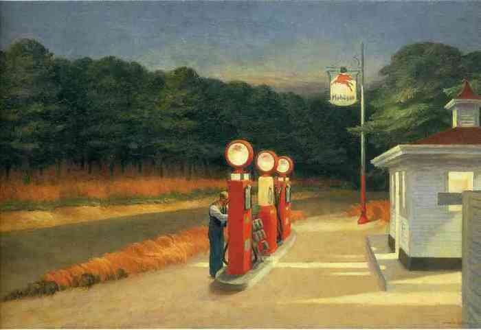
("Gas" by Edward Hopper)
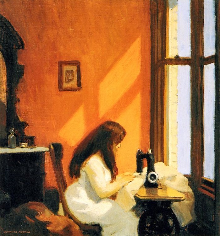
("Girl at the sewing machine" by Edward Hopper)
The composition of his works are often built in such way as if we face the accidental photo-frame, sometimes trimming characters, which are often frozen as if in a daze, in a busy waiting state, when one action is over and the next one has not yet begun. It is as if they were performing some kind of habitual movements and suddenly got distracted for a moment, contemplating, got deep into something invisible, and this exact moment was depicted by the artist, creating a drama of his paintings with small means like a minimalist theater, where there are practically no decorations: the main character, the plane of the stage and the spotlight.
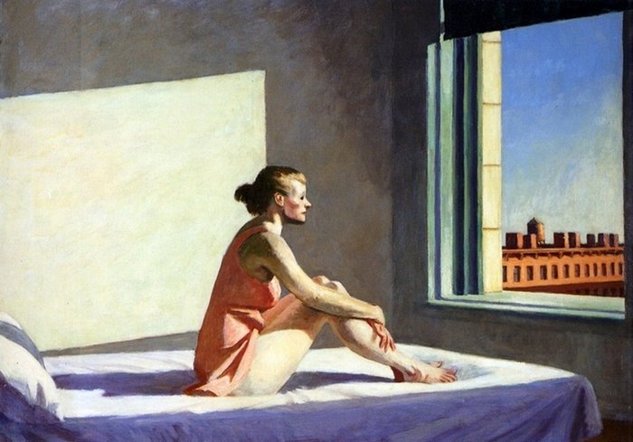
("Morning Sun" by Edward Hopper)
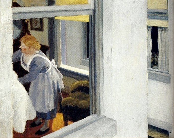
("Apartment house" by Edward Hopper)
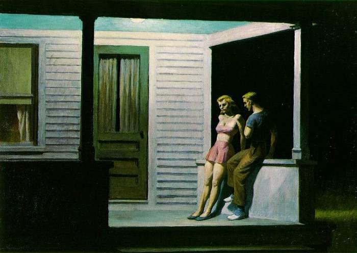
("Summer evening" by Edward Hopper)
Hopper often reduces even that arsenal, removing people from the frame and featuring landscapes that, in spite of the man-made elements, are imbued with a sense that people are out of place here. The feeling of existential solitude remains even if you remove the people from the frame entirely.
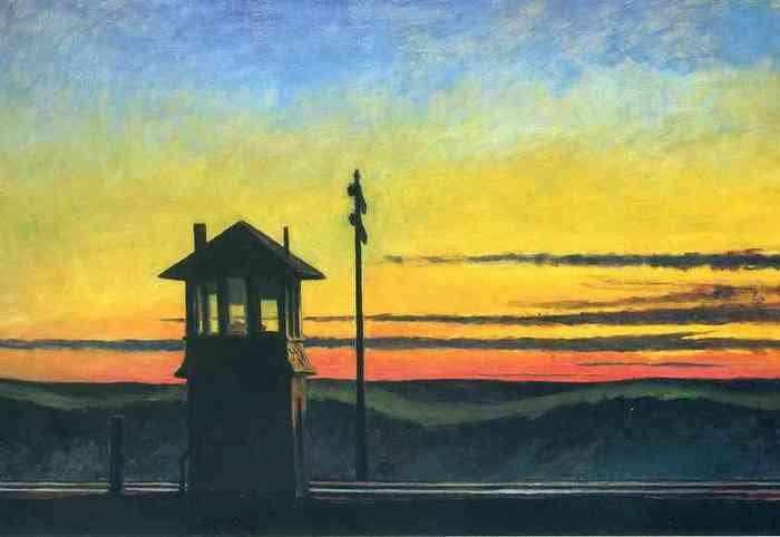
("Railroad sunset" by Edward Hopper)
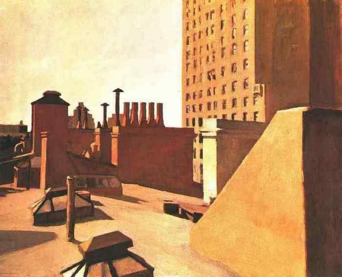
("City roofs" by Edward Hopper)
But what I like most about his style is how he works with color planes and the geometry in his paintings. Look at his canvases and you'll see a lot of accent rectangles (the walls of the buildings and large windows so often present in his works), diagonals (perspective lines and borders between shadows and light), and those geometric planes made in the laconic palette always create contrasts between them, making the paintings more graphical in a sense and adding to our perception of his paintings not only the perception of the subjects, but also graphical color patches.
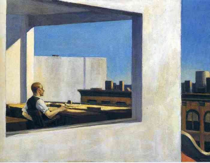
("Office in a small city" by Edward Hopper)
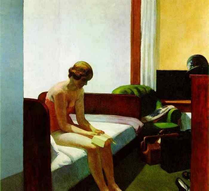
("Hotel-room" by Edward Hopper)
And although Hopper was a representative of the realist movement in opposition to the popular at the time avantgardism, in my opinion, his work with the shape and color is very progressive. He influenced the spectator with language of pure form and colors, and not only with objects of figurative painting. Culmination of color planes on the canvases we can see in Mark Rothko's works. But he, as we know, used in his work only rectangular perpendicular planes, "cells", ignoring the diagonals, which are often given spotlight in Hopper's work. Rothko once said: "I hate diagonals, but I like Hopper's diagonals. They're the only diagonals I like."²
As I remembered about my replica today, I have found an occasion to enjoy the marvelous diagonals of Edward Hopper as well.
¹ Gail Levin, "Edward Hopper: An Intimate Biography", University of California Press, 1998.
² O'Doherty, "American Masters: The Voice and The Myth" / "Edward Hopper’s voice", New York: Random House, 1973.
(Images of Edward Hopper's works are taken from https://www.wikiart.org/)
I took up painting its replica and it took quite a long time. This was my first experience of mixing acrylic paints, matching the exact colors. I was still confused by the names of carmin and madder dye and I always lacked the right colors because at that time in my town we didn't have a good art shop. But that did not stop me.
 (Original work of "Nighthawks" by Edward Hopper)
 Something else stopped me. Due to the tragic (or enlightening — depending on the point of view) events in my life I, myself, now became a fragment of the big city for a few years of my life. And abandoned painting. The painting was not finished. Unfinished were human figures, which were unable to come to life in this dark and cold city.
Only after six years, I have returned to this replica. At that time I had a completely changed condition and moods. And if you have seen my previous posts, you know that my new works are typically bright and I am inclined to fill them with some even childish naivete ... So I was not even sure that I will finish this work. But the small white spaces in the picture offended my eyes. And I completed this replica:

(My replica of "Nighthawks" by Edward Hopper, acrylic on canvas, 80 x 40 cm (app. 16' x 31'). You can purchase it for STEEM on Peerhub: https://www.peerhub.com/items/7455)
In fact I really like the concise but deep aesthetics of Hopper's paintings. He masterfully conveys the depth of feeling. He does not shout about it. But it fills the space evenly, firmly and without compromise. This is the feeling about which it is not customary to talk, but that can permeate entire existence like a fundamental principle, on which the society rests. He conveys it with mundane simplicity: with a view of cafe where you can not hide from loneliness, with a perspective of rails that will not get you anywhere, with a portrait of person who is cut off from their roots and thrown into a faceless city.

("Automat 1927" by Edward Hopper)

("Woman in the sun" by Edward Hopper)
With dense flat planes of color Hopper conveys the hidden threat of broken relationships in a society. His works are full of tension and somewhat theatrical drama.
What wins you over in his works is that all his subjects are ordinary: here's a girl in the cafe, that's a man on the filling station, here a sewer at the sewing machine... but they are unique in that they are seen through his eyes.
He himself once said: "Originality is neither a matter of inventiveness nor method — in particular a fashionable method. It is far deeper than that, and it is the essence of personality."¹ Looking at his paintings we look at the way he looked at all of us.

("Gas" by Edward Hopper)

("Girl at the sewing machine" by Edward Hopper)
The composition of his works are often built in such way as if we face the accidental photo-frame, sometimes trimming characters, which are often frozen as if in a daze, in a busy waiting state, when one action is over and the next one has not yet begun. It is as if they were performing some kind of habitual movements and suddenly got distracted for a moment, contemplating, got deep into something invisible, and this exact moment was depicted by the artist, creating a drama of his paintings with small means like a minimalist theater, where there are practically no decorations: the main character, the plane of the stage and the spotlight.

("Morning Sun" by Edward Hopper)

("Apartment house" by Edward Hopper)

("Summer evening" by Edward Hopper)
Hopper often reduces even that arsenal, removing people from the frame and featuring landscapes that, in spite of the man-made elements, are imbued with a sense that people are out of place here. The feeling of existential solitude remains even if you remove the people from the frame entirely.

("Railroad sunset" by Edward Hopper)

("City roofs" by Edward Hopper)
But what I like most about his style is how he works with color planes and the geometry in his paintings. Look at his canvases and you'll see a lot of accent rectangles (the walls of the buildings and large windows so often present in his works), diagonals (perspective lines and borders between shadows and light), and those geometric planes made in the laconic palette always create contrasts between them, making the paintings more graphical in a sense and adding to our perception of his paintings not only the perception of the subjects, but also graphical color patches.

("Office in a small city" by Edward Hopper)

("Hotel-room" by Edward Hopper)
And although Hopper was a representative of the realist movement in opposition to the popular at the time avantgardism, in my opinion, his work with the shape and color is very progressive. He influenced the spectator with language of pure form and colors, and not only with objects of figurative painting. Culmination of color planes on the canvases we can see in Mark Rothko's works. But he, as we know, used in his work only rectangular perpendicular planes, "cells", ignoring the diagonals, which are often given spotlight in Hopper's work. Rothko once said: "I hate diagonals, but I like Hopper's diagonals. They're the only diagonals I like."²
As I remembered about my replica today, I have found an occasion to enjoy the marvelous diagonals of Edward Hopper as well.
¹ Gail Levin, "Edward Hopper: An Intimate Biography", University of California Press, 1998.
² O'Doherty, "American Masters: The Voice and The Myth" / "Edward Hopper’s voice", New York: Random House, 1973.
(Images of Edward Hopper's works are taken from https://www.wikiart.org/)
