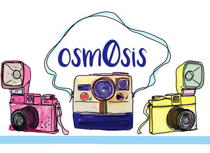
Here is my first divider I made for @osm0sis for photo posts on her blog.

That is just a thumbnail to show the main bit.
Here it is in its full horizontal glory:

It is really detailed, but I like to do that. It can certainly be shrunk down to fit smaller and centered in the page. Here it is at 500 pixels wide and using the < center > tag.

I saved it as a .png with transparent background but it would show up white here but can easily email it to her that way.
Here is how it would look on a black background with the osm0sis smaller in cetner

Here it is with osm0sis on the side.


Here it is with the same images shrunk down to a thinner divider and I moved some more of the photo snap shots to spread out the look with osm0sis in the lower right corner. Let me know which you like best, or just take em all. I'll have to email you the png file though if you want a transparent background which is easy enough to do.

I hope she is happy with it. She wanted osm0sis incorporated in there and since it is a bespoke piece for her blog I made it front and center. I thought this was a fun poppy bright one. I also have a version more subdued using antique looking camereas as well that I am working on. If she wanted to mix it up. I have saved it as a .png file but would need to send it direct as a .png with transparent when pulled into text editor here on Steemit just reverts in white for some reason.
I love making bespoke pieces like this for fellow Steemians
I hope she likes it, it was fun to do.
If you appreciate my work please feel free to upvote, resteem, and by all means comment.

