Playground Equipment as Public Art
Grown-ups need more playtime. With countless studies proving the mental and physical benefits of play for people of all ages, we need to find ways to fit playfulness and activity and laughter into our day-to-day routines. As children our experiences on the playground included a certain amount of problem-solving and risk-taking that is missing from many of the activities of our adult lives. Since grown-ups can't really start frequenting public playgrounds without seeming like creeps, I've been pondering how to make sculptural public art pieces that can double as playground equipment in public spaces. Imagine walking through a public park and coming upon a sculpture composed of colorful bars curved into fun and visually interesting configurations. Standing alone in a patch of green, the monkey bars can appear as both sculpture and playground equipment at the same time, inviting you to climb and swing while also adding beauty to the surrounding space. When separated from the restricted kids area of a usual public playground, suddenly it becomes okay for people of all ages to tap into the energy they used to find so easily as kids.
Monkey Bars - Baseline Form
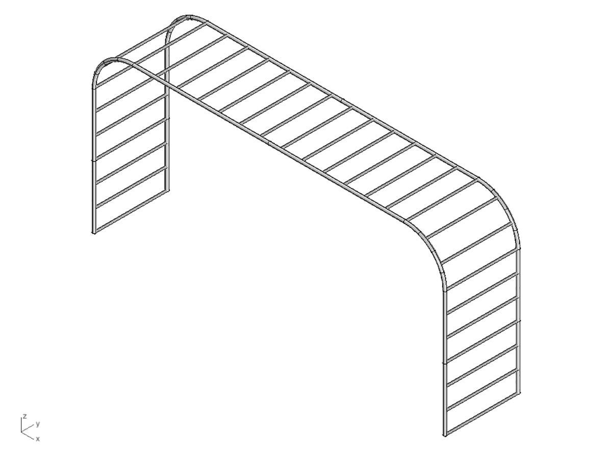
In order to create a transformation of a familiar structure, in this case monkey bars, I think it's important to first design the baseline form of the structure. By starting each monkey bars transformation from the same original form, I believe it helps unite all the designs as a cohesive series, and more importantly it helps the public recognize the wild new forms as a simple reshaping of the familiar monkey bars they've come to know in all playgrounds. It's that moment of recognition that helps the onlooker understand that this isn't just a normal public sculpture, it's meant to be climbed on and interacted with.
The Transformation
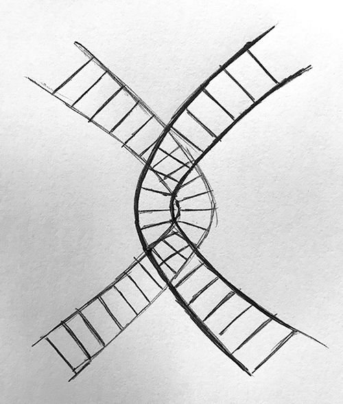
I started this design process the same way I start all design projects – with a series of very rough and very poorly drawn sketches in my sketchbook. I draw as quickly as possible, not allowing myself to get hung up on details in order to ensure the ideas flow out without the debilitating weight of overthinking or judgement. After many pages of sketches, I ended up with the sketch you see above. I liked the simplicity of this intertwining structure, and decided to take the idea to Rhino, a 3D modeling program that would help me construct the design more precisely.
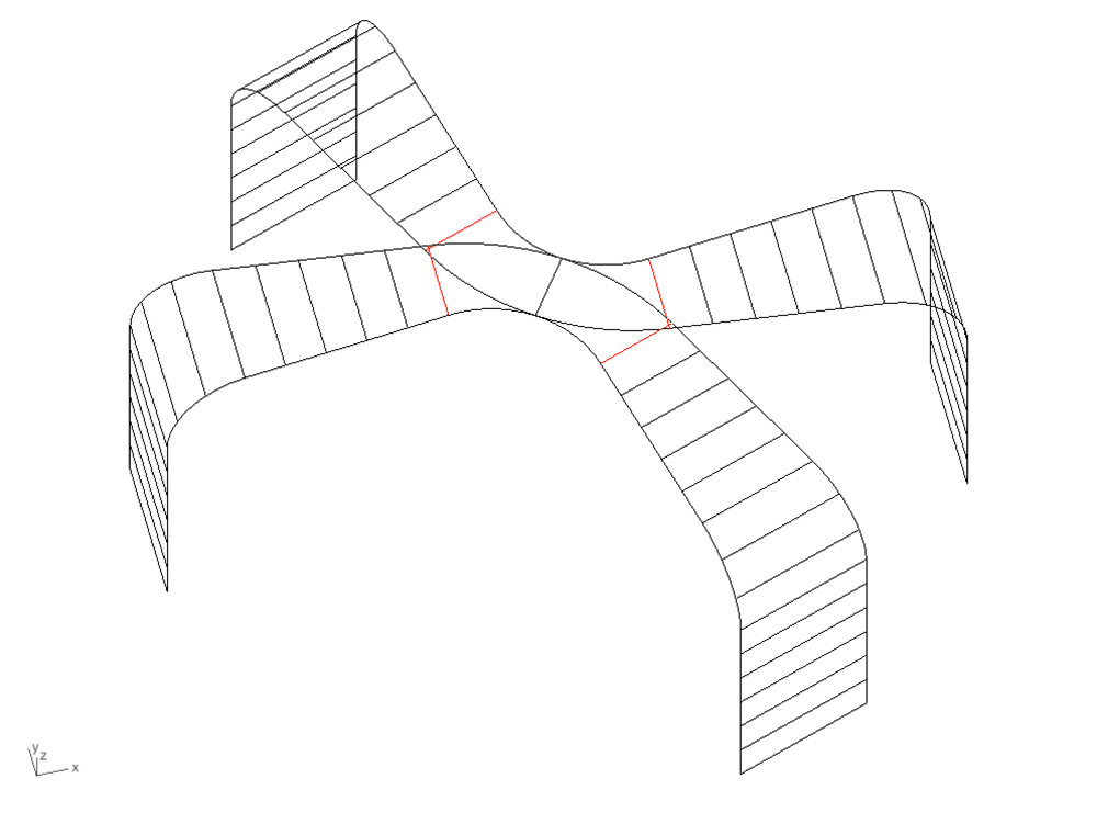
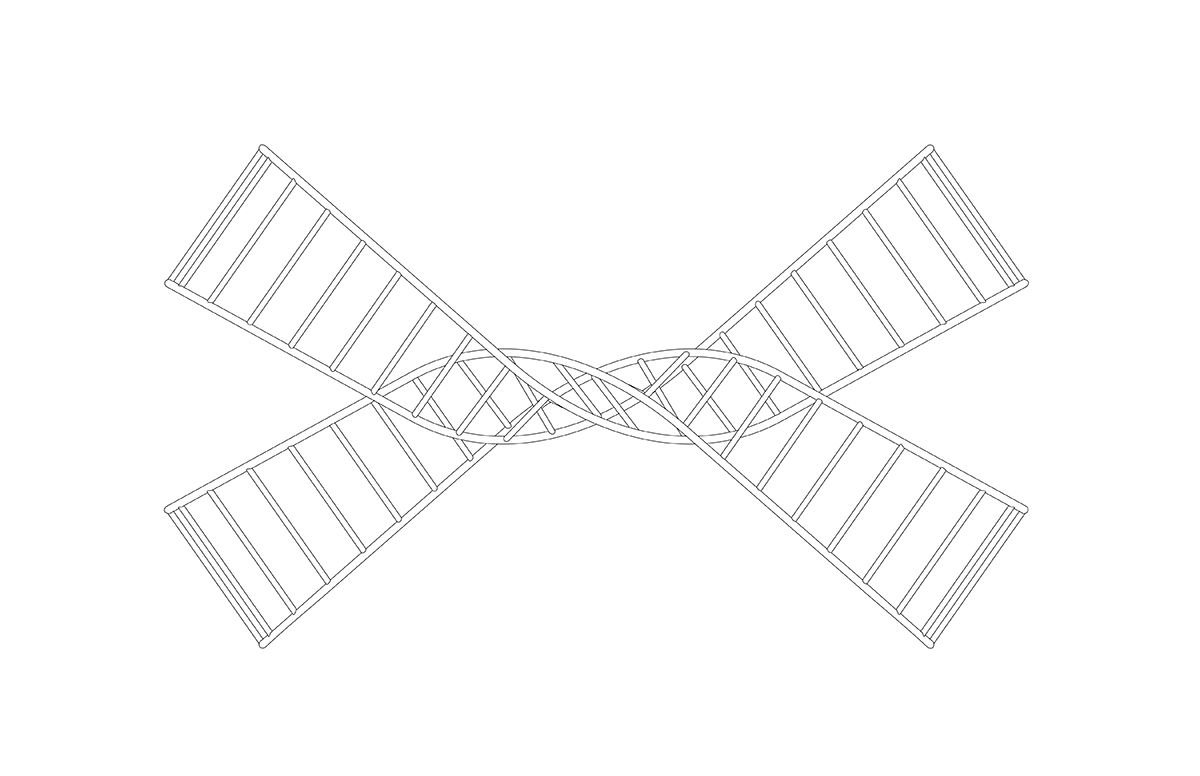
Before giving the bars a three-dimensionality, I drew the two intertwining paths as a series of lines, as shown above. The real difficult part of this design was figuring out how the two paths would meet at the center, with one going above and the other going below.
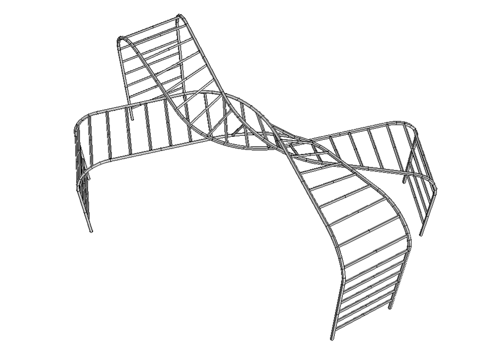
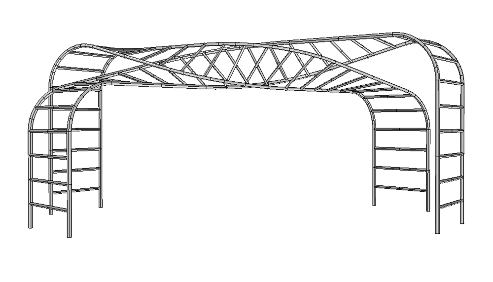
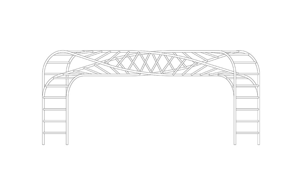
The above screenshots are taken directly from Rhino. You can see how, despite the speed of the original sketches, the final design ended up very similar to that initial idea. With bars spaced every twelve inches, the two paths appear to wrap around each other at the center point and then continue on to the opposing side in the flipped position.
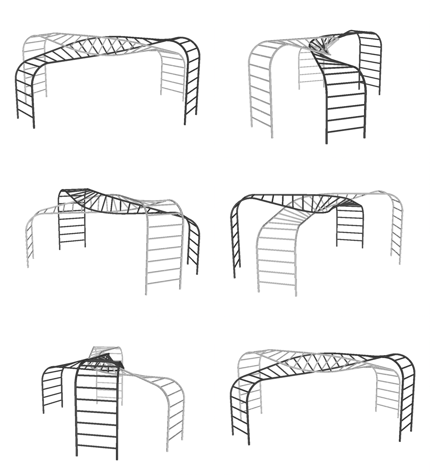
Renderings and Drawings
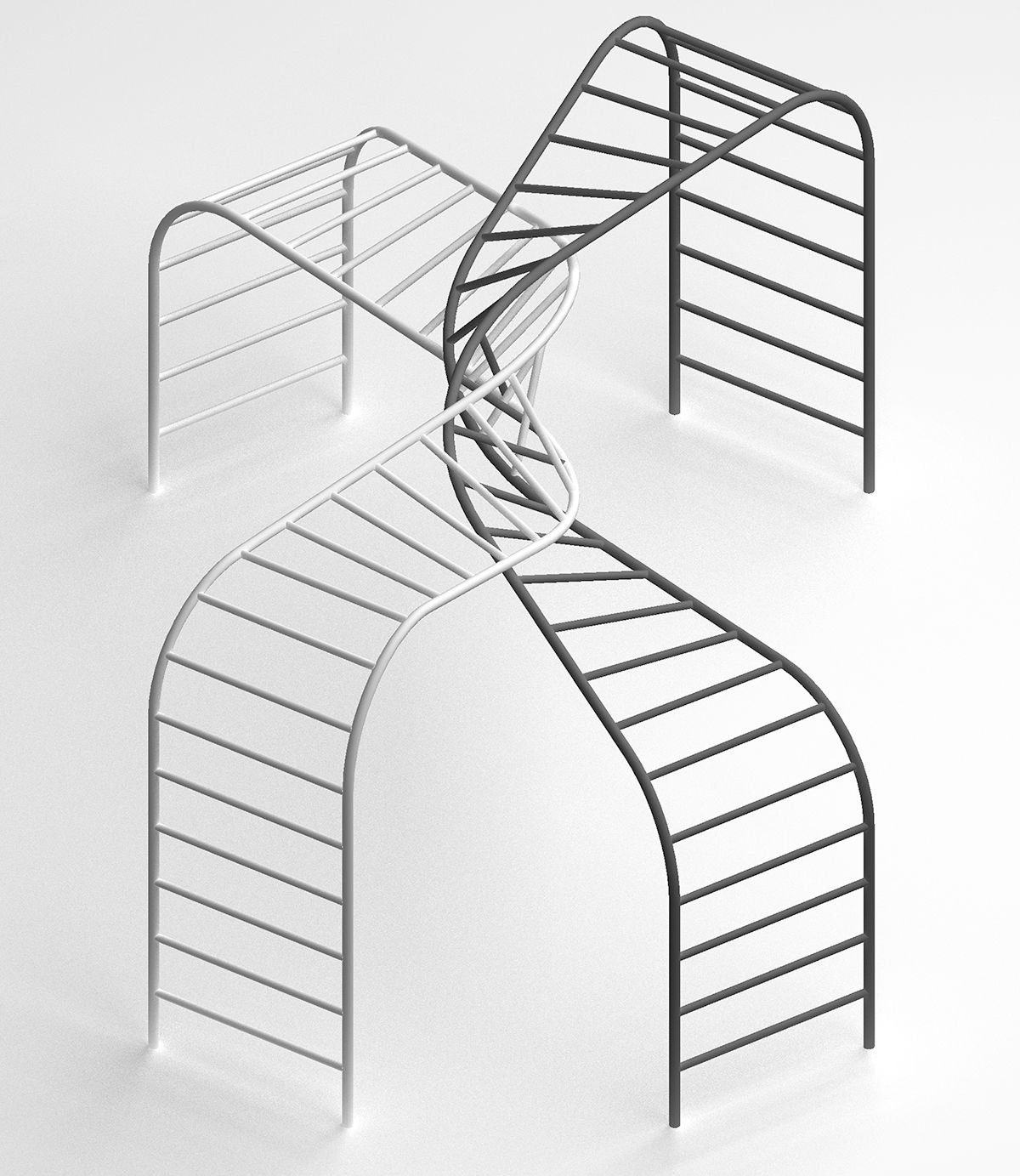
After finalizing the design, I rendered it using the built-in renderer within the Rhino program, and settled on black and white as the paint colors to make it clear where one path ends and the other begins. The two compliment each other like yin and yang.
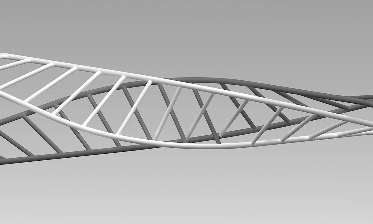
My favorite part of this design is the moment of intersection at the center. Since each path of monkey bars spans a distance of about 18 feet between the two sets of legs, it was important to allow the paths to not only visually compliment each other at the mid-point but also structurally compliment each other. If you look closely at the render above, you can see that a few of the bars actually jump between the black path and the white path at the moment of intersection. This way the black path is actually holding up the white path, and vice versa, making the construction much more structurally sound.
Visualizing the Final Installation
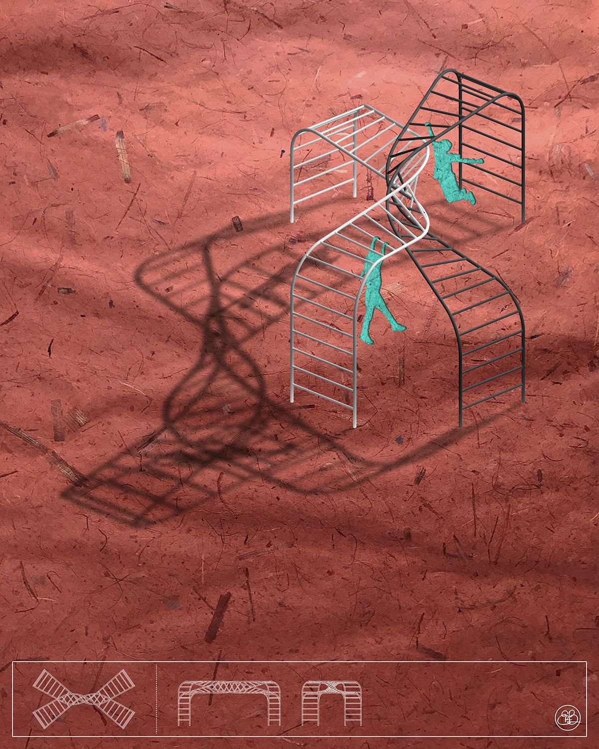
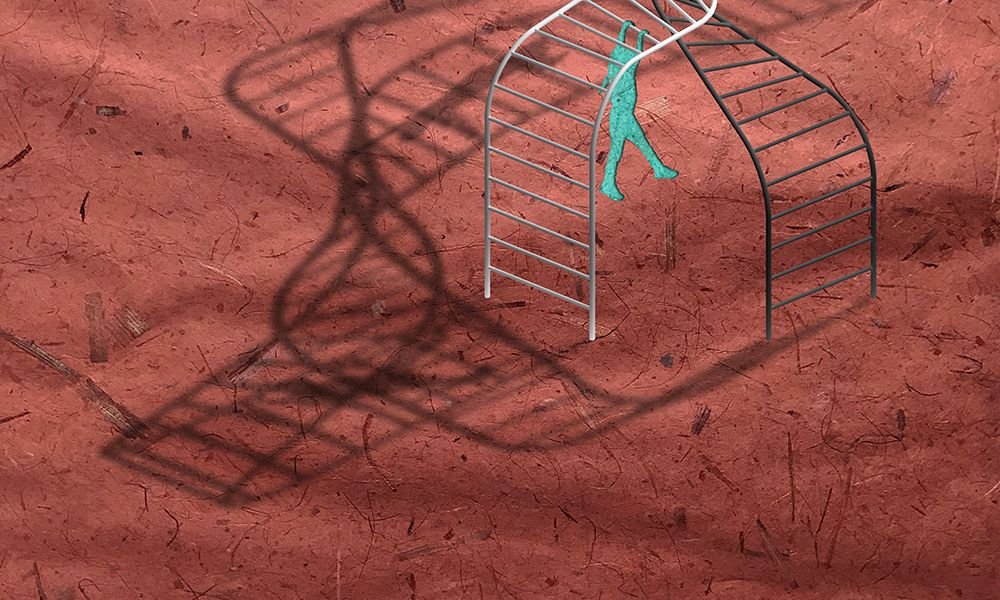
Since the design is supposed to inspire play and interaction, I think it's important that the visualization is as unpretentious as the object itself. The usual pristine perfectly-lit hyper-realistic renders coming out of most architecture firms these days would create an image of formality when in fact I'm trying to inspire the opposite. I decided to illustrate the monkey bars using more childlike materials, photoshopping the render onto layers of colored papers, more effectively displaying the playful spirit of the design.
This is the second of many sculptural transformations of familiar structures. Whatever I can do to bring more play into our daily lives. Check out my first monkey bars design in an old post here, and please follow along if you're interested in seeing more designs in the future. Thanks for reading!

