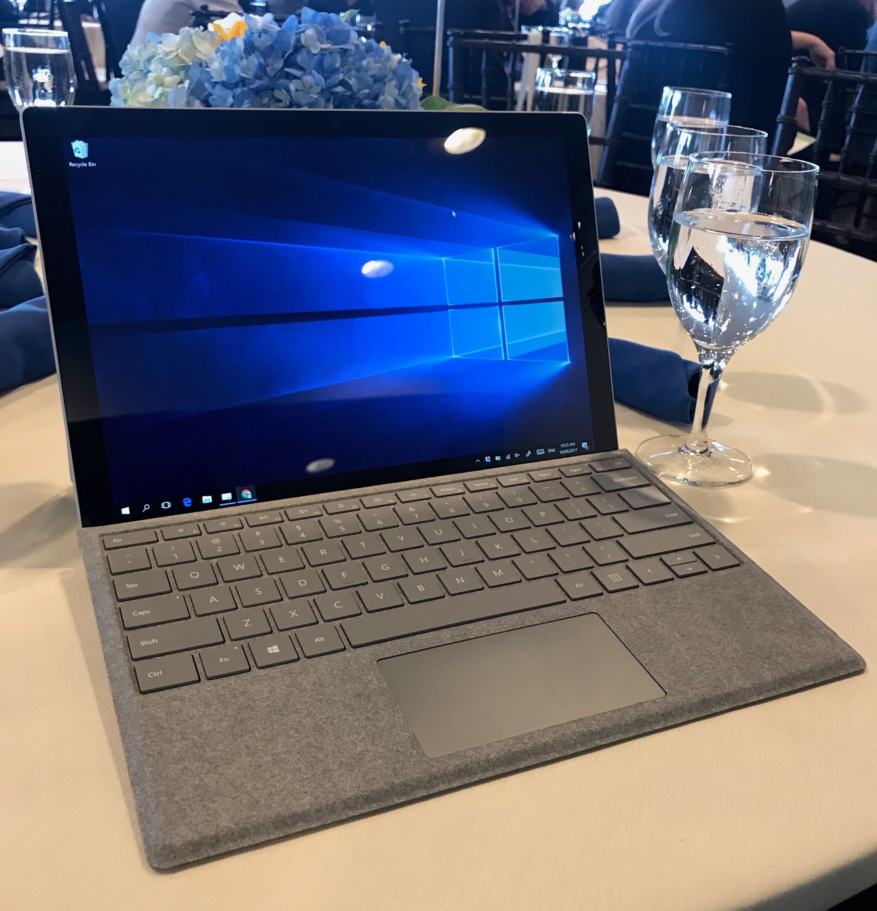
A couple of weeks ago, Microsoft released the fifth generation of its Surface Pro, to both positive critical reviews and much fanboy drooling. The highly anticipated upgrade to the 19-month old Surface Pro 4 promised new processors, improved pen responsiveness, and significantly lengthier battery life.
Let's just say I was really looking forward to it.
Inventory Issues at the Microsoft Store
And so it was that I found myself on 5th avenue in the heart of New York on June 15th, doodling on one of several demo units that they were showing off. I drew fast and rough, testing fidelity and latency, and admiring the improved kickstand.
This was all strictly a formality: I had already made up my mind about buying the damned thing after spending half an hour with another demo unit in San Francisco earlier in the week. But this being a premium product with a substantial price tag, it seemed wrong to just walk in and fork over my money.
And so I went through the motions of testing until one of the sales reps (can you imagine that Microsoft at one time referred to them as "muses?") came over and asked if I needed any help.
"Yeah, I need the i7, 256gb version please. And I'll take this gray Type Cover, and the new Pen too."
They came back with two boxes, but no Surface Pen, which was sold out.
Now, a Pen-less Surface Pro is a funny thing to be buying, especially since the whole point of getting one was to replace my current iPad Pro + Apple Pencil art package. So rather than leave the store empty-handed, I compromised with Wacom's Bamboo Ink stylus, which had been released just a few weeks earlier and offered similar specifications. (It also happened to be priced at $70 and included a set of 3 extra nibs, which in total was $40 cheaper than the combined offering from Microsoft.)
Almost a Laptop
If you ignore the pen input, the Surface Pro is essentially just a touchscreen laptop with weird ergonomics. It's neither the lightest, most powerful, or most cost-effective laptop on the market, and although it's quite pretty, it's no HP Spectre or Asus Zenbook 3 Deluxe. The 2017 model is nearly indistinguishable from its older siblings in the looks department, although the new processor is a 7th generation Intel Kaby Lake, and reported battery life is nearly 50% longer.
The kickstand that I loved so much for drawing gives the device a deeper footprint on your desk than a laptop would, and unfurling it on an airplane tray table is a challenge. On the other hand, the keyboard is truly excellent, probably the best detachable I've ever used. There's a nice amount of key travel, and the Alcantara fabric feels great against your palms. (Yes, it's significantly better than the odd butterfly keys on the Macbook.)
The whole package is slightly smaller than the 12.9" iPad Pro, but also twice as thick. With its Type Cover the Surface Pro is well over 2lbs in weight, a bit heavier than Apple's device with its smart keyboard attached. Of course, comparing weights is missing the point here: the Microsoft product packs a full-fledged operating system and the latest in Intel processors, while the iPad is (relatively) limited by iOS.
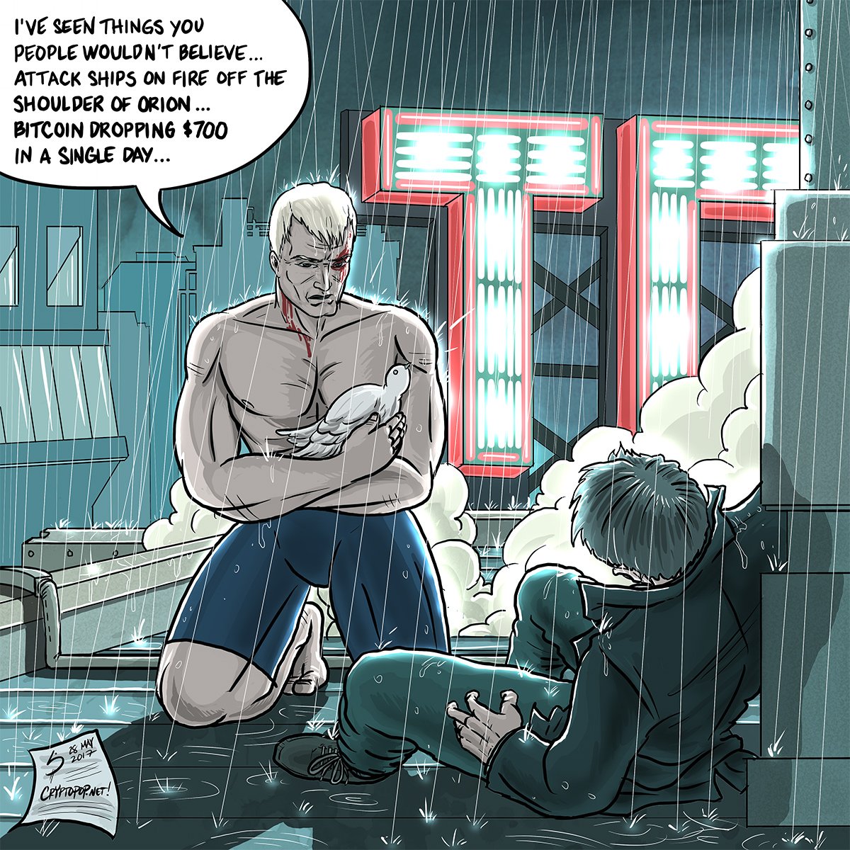
"Tears in Rain." 4000x4000, Sketchbook on the iPad Pro
On the iPad Pro, I use Autodesk Sketchbook for iOS ($5/month) for all of my work. It strikes a near-perfect balance between speed, simplicity, and robustness, for my money, it's the best drawing app you can currently get on the platform.
I do however have two issues with my iPad-only workflow, which is what motivated the Surface Pro purchase.
I have about 20 years of Photoshop experience that I can't leverage when I'm on iOS -- everything from adjustment layers to layer masks to noise filters to channel management. None of these tools are strictly necessary, but having access to them would allow me to work a lot more cleanly and efficiently.
My 350mb+ production files are simply too large for the app to handle reliably. I started hitting that filesize several weeks ago when I began working on illustrations measuring 6000 by 6000 or greater, and I noticed that the iPad Pro would start to glitch when loading or unloading such large files.
And so I was really looking forward to shifting my workflow on to the Surface Pro, and working with the full set of desktop tools out there.
TLDR; I did eventually get there, but not without a lot of experimentation.
Drawing with the Wacom Bamboo Ink
Like the 2017 Surface Pen, the Bamboo Ink promises 4,096 levels of pressure sensitivity along with a reduced activation force. It doesn't have the tilt functionality that is one of the Surface Pen's key new features though, which may be a dealbreaker for some folks.
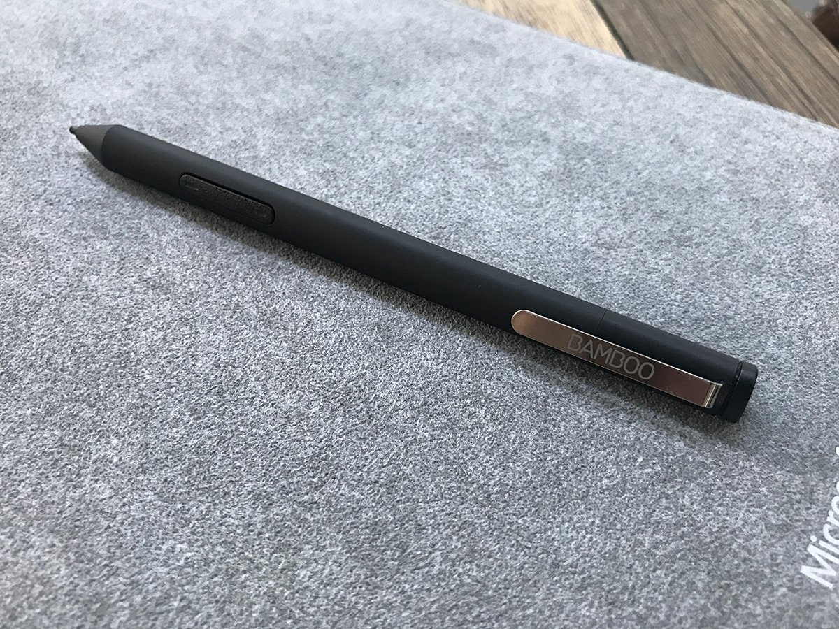
My immediate impression of the Bamboo Ink was that it was almost as good as the Apple Pencil, but I found that it was ultimately neither as accurate nor as consistent. It's likely due to the activation force necessary to get pixels painted on the screen: you can't just glide your stylus over the screen with the Surface system, you actually have to press down before it'll register any pixels.
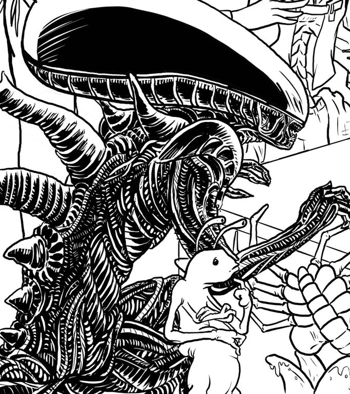
Detail from an unpublished piece. Autodesk Sketchbook on the iPad Pro enables some really complicated line work without skipping a beat.
Obviously, the hardware is only half of the equation, and the stylus is only as good as the art package that's receiving its input.
Weirdly enough, neither Autodesk's Sketchbook for Desktop or Sketchbook for Windows 10 (different apps, go figure) performed very well on the Surface Pro. The former was clearly intended for users with a more traditional Wacom tablet, mouse, and keyboard setup. While it sported a really comprehensive set of drawing tools, it was basically unusable in the Surface Pro's touch-only environment.
The latter (Sketchbook for Windows 10), meanwhile, had a bizarrely weak brush engine, unable to eliminate jitter without giving up line fidelity. I was particularly peeved by this because the iOS version had a great brush engine, with five selectable levels of line smoothing, whereas the Windows 10 version only had one.
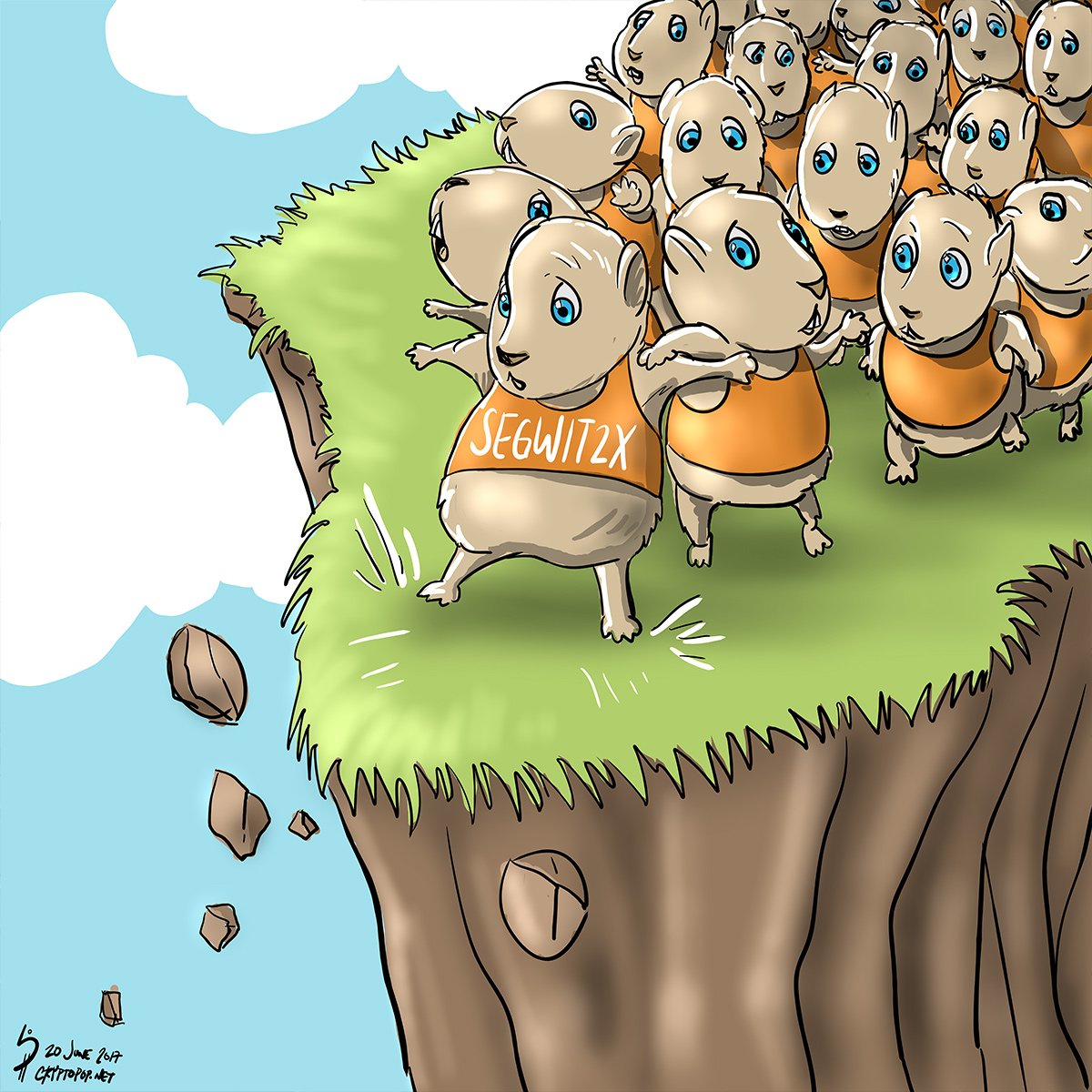
"Lemmings." 4000 x 4000, Autodesk Sketchbook on the Surface Pro. My first published piece that was rendered on the Surface is a good example of how weak the brush engine is on the Windows version of Sketchbook vs the iOS version. I spent most of the time on this piece just trying to get the ink tool to do what I wanted and eventually just gave up.
It turns out that the best analogue I could find for Sketchbook on the iPad Pro wasn't any of the available Sketchbook Windows apps, but a completely different drawing package called Leonardo ($39).
For what this young app lacks in tools, it makes up for by featuring the fastest drawing engine on the market. Leonardo was the only app I tried that wouldn't drop lines when I was cross-hatching fast, and on top of that had really sophisticated line smoothing and stabilization.
Unfortunately, Leonardo is still in beta, and thus is missing some pretty fundamental tools like a Lasso or a Paint Bucket. Both of those tools are must-haves for me, since my coloring strategy essentially relies on them.
My current plan is to use Leonardo for pencils and inks, and then do all my coloring and finishes in Photoshop CC. I did try doing all the line art on PS as well, but eventually decided it was simply the wrong tool for the job. PS doesn't give enough control over line smoothing and often can't keep up if you draw fast. It should theoretically be fine for coloring because speed is less of a factor ... not to mention that it gives you access to way more options than any other package out there.
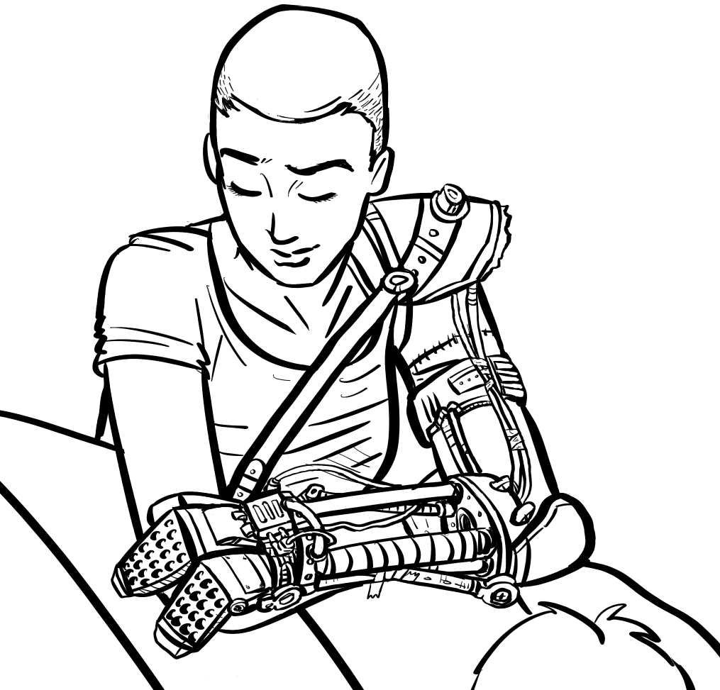
Detail from a WIP. Leonardo on the Surface Pro. Leonardo's calligraphy pen tool renders a very organic looking line and is a joy to use. It smartly displays onscreen modifier keys (Ctrl, Alt, Shift) that combine with the active tool to switch modes (Transparent, White, Ruled, respectively).
Tips and Tricks
Coming from the forced simplicity of an iPad Pro, I find that I have to keep reminding myself that there's more control possible with a full-fledged operating system like Windows 10, and that I don't have to just accept that certain things are the way they are.
Case in point: you can adjust the sensitivity of the pen in Control Panel if you want finer control, something that iOS probably has no intention of ever allowing its users to do.
Also, people sometimes forget that the iPad Pro automatically quadruples its sampling rate when it detects the Apple Pencil being used. Not so with the Surface Pro, and if you want it to devote more system resources to the task at hand (as you would when you're drawing), you have to remember to crank the Power Mode slider over to "Best Performance." Doing so shortens the battery life dramatically, and you'll barely get 4 hours in this mode, but the increased fidelity makes the drawing experience more consistent.
Lastly, if the software package that you're currently using (Photoshop or Sketchbook for Desktop, for example) doesn't have the touch tools that you want, try installing the third-party TabletPro ($10+). Amongst other useful functions, it adds a palette of onscreen buttons to allow you to draw in fullscreen mode without having to reach for the keyboard.
