My First Still Life of The Year. From its Development to Completion.

Greetings and salutations Everyone!
In this post I thought I’d share my latest finished and first still life painting of the year as well its progress until completion.
At first I began with an armature drawing of my still life setup. I made sure that the size of the paper was the same as my painting surface as to avoid any spatial relationship issues as well as securing a solid transfer onto the canvas in the next step.
After finishing the drawing, I then covered the back of the drawing with charcoal using vigorous strokes. Essentially, this technique is similar to using transfer paper, but instead the drawing itself functions as said paper.
I then taped the drawing back onto the painting surface and traced over my initial charcoal drawing with a standard ballpoint pen. Theoretically you could even use a skewer, but I like using the pen as it helps to show where you’ve been. You want to make sure you’re pressing hard throughout tracing the drawing. It’s all too easy to lose information in your block in drawing.
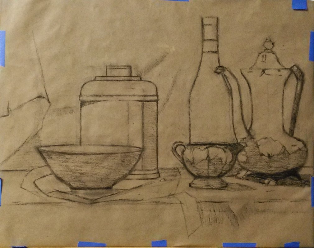
I then removed my initial drawing and sealed the charcoal transfer with an Indian Red Faber Castell Pitt Artist Pen. These are one of my favorites as for not only does it dry relatively fast and seals the drawing well, but it also does not have that tendency to show through oil paint. I’d say Micron pens are pretty good too. Just make sure that you do NOT use a ballpoint pen….or a sharpie!!
After I found the ink to be dry, I then started to mass in the drapery in the background.

...Then worked on the ground plane, wine bottle and bowl. While keeping in mind that I wanted to keep the darks in the wine bottle and under the bowl, I massed them in using mixtures of alizarin crimson and ultramarine blue.

With the intentions of methodically moving up and down and across to the left, I then started mixing value strings and began tiling/turning form on the metal teapot with an aim for a direct final finish. The value strings for the teapot primarily consisted of ivory black, yellow ochre, and titanium white. For the shadows I used cadmium red and ivory black to keep them warm. I treated the shadows on the small cream container the same way.

I then started on the large copper container. This part was very tricky yet enjoyable. It’s pretty easy to get lost in the reflections in metal.
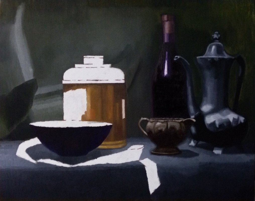
Once the copper container was finished, the next step was of course the ribbon and then I noticed that the foreground below the ground plane needed to be pushed a little further.

Now that the initial pass is complete, I then noticed that as suspected the colors were starting to appear sunken in and matte looking. I then to strategically oil out the sections I was going to work on each day. I decided that the drapery in the background needed to be pushed in value and chroma (more green).

..Then I began to break down some of the smaller forms on the base of the metal teapot. I also refined some edges where the wine bottle meets the background.
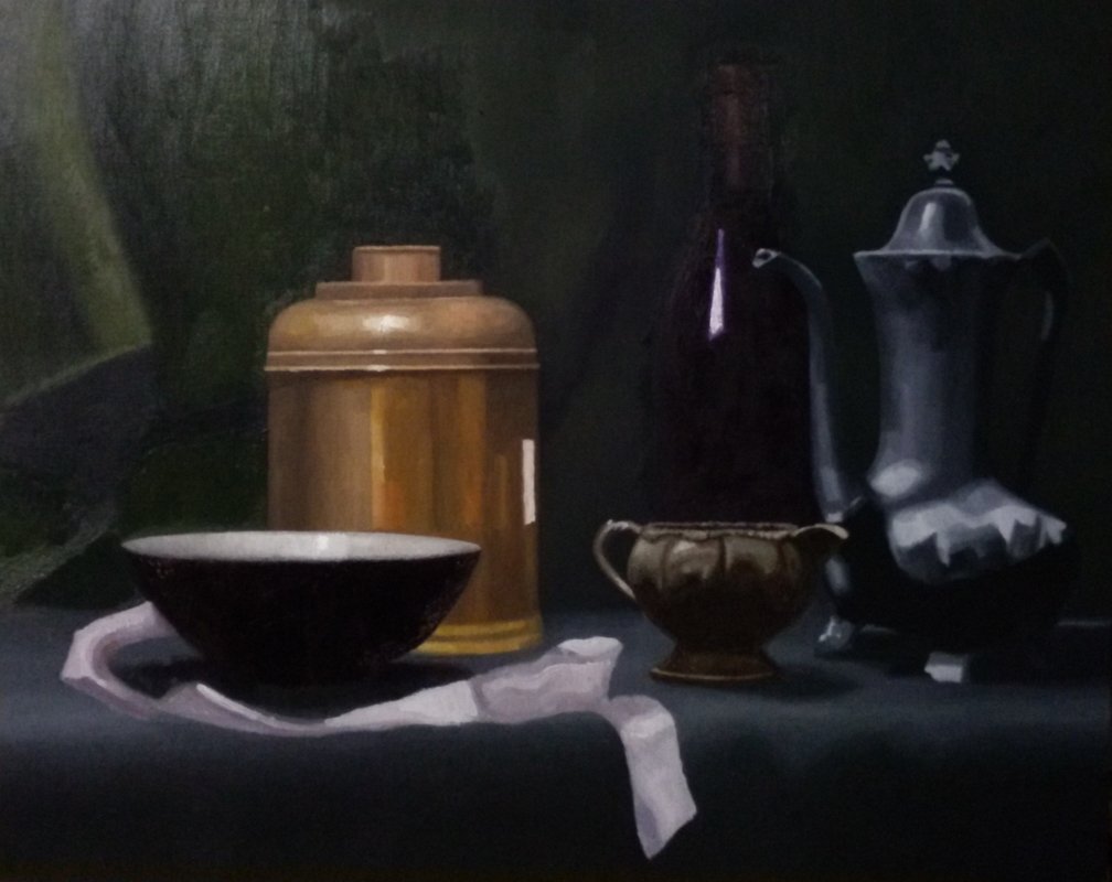
Now starting the second pass on the copper container and bowl, I made sure to remain very observant in the transitions and edges. I made sure to make those highlights as strong and tactile as I could!

I found reworking the ribbon to be particularly enjoyable in that it felt like there was an endless combination of soft and sharp edges as it lay around the bowl.
Finally I decided to work some subtle folds and transitions in the background, especially around the copper container to add interest.
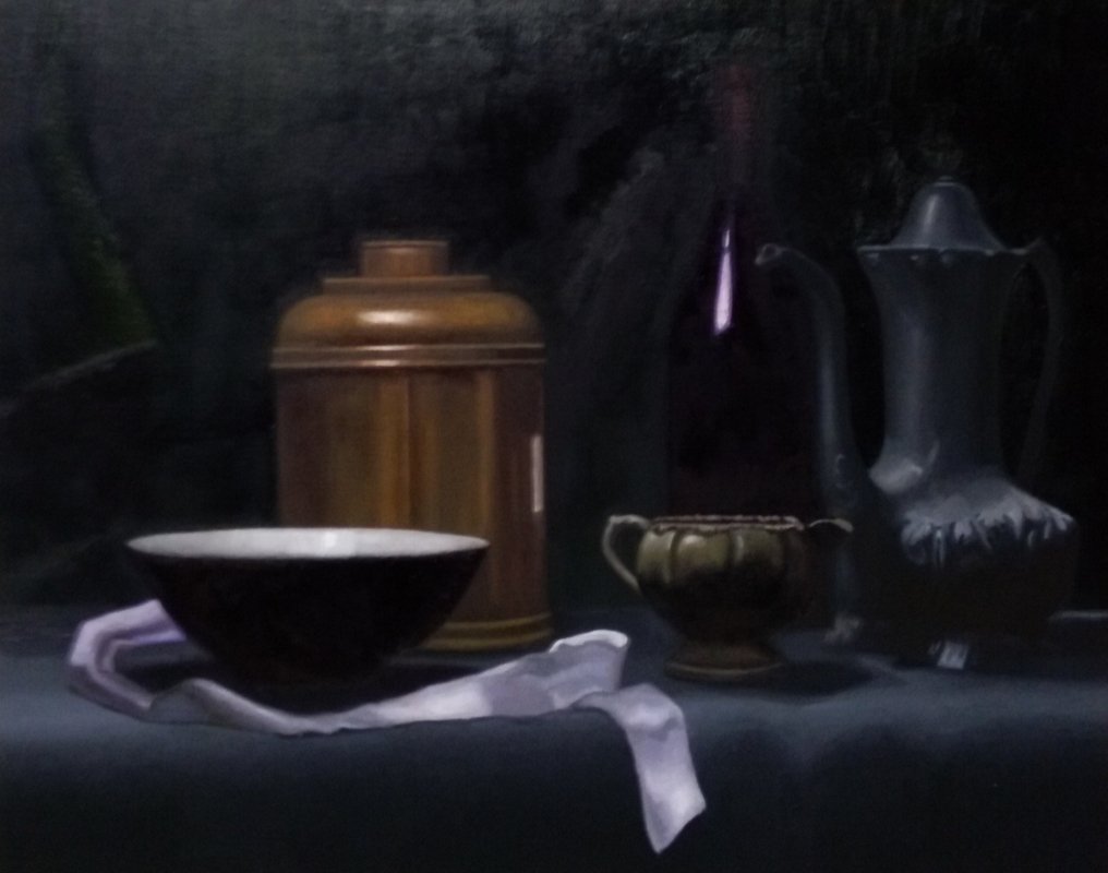
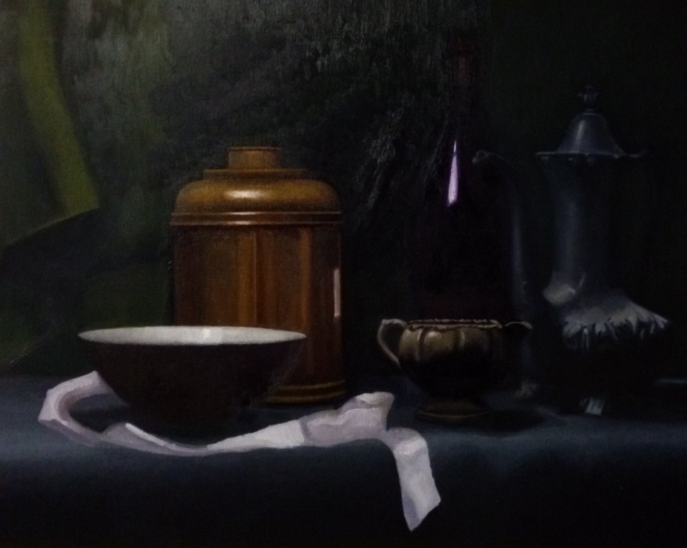
...And now it's done!!
The palette I used for this painting was titanium white, cadmium yellow light, yellow ochre, quinacradone red, cadmium red, alizarin crimson, ultramarine blue, and ivory black.
Teatime Still Life
16" x 20"
oil on canvas
2018
Please feel free to let me know what you think?
Thanks for reading Everyone!
-James Hansen