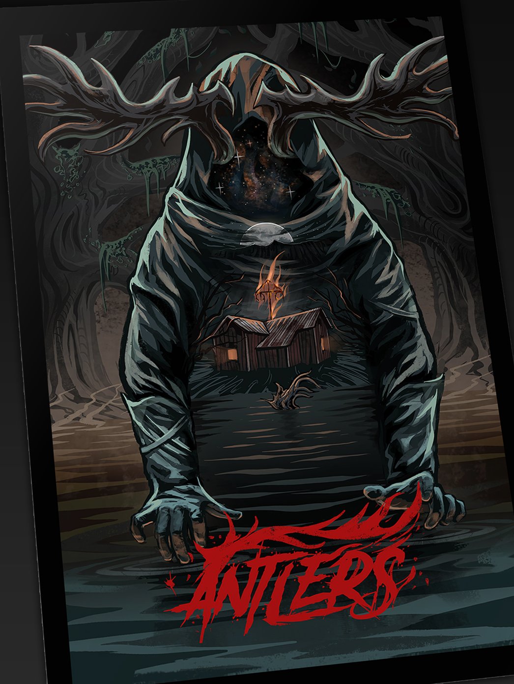
A quick process for how I designed the poster for the horror film "Antlers"
The film takes place in the deep pine forests of Sweden. It’s a modern take on classic 80’s horror films and games from the “golden era”. It also draws from the themes of H.P. Lovecraft.
The film is set in 1989 and the story revolves around a small group friends going on a camping trip to a remote lake deep in the Swedish woods. The film starts out with a lot of similarities to classic “cabin in the woods” style films.


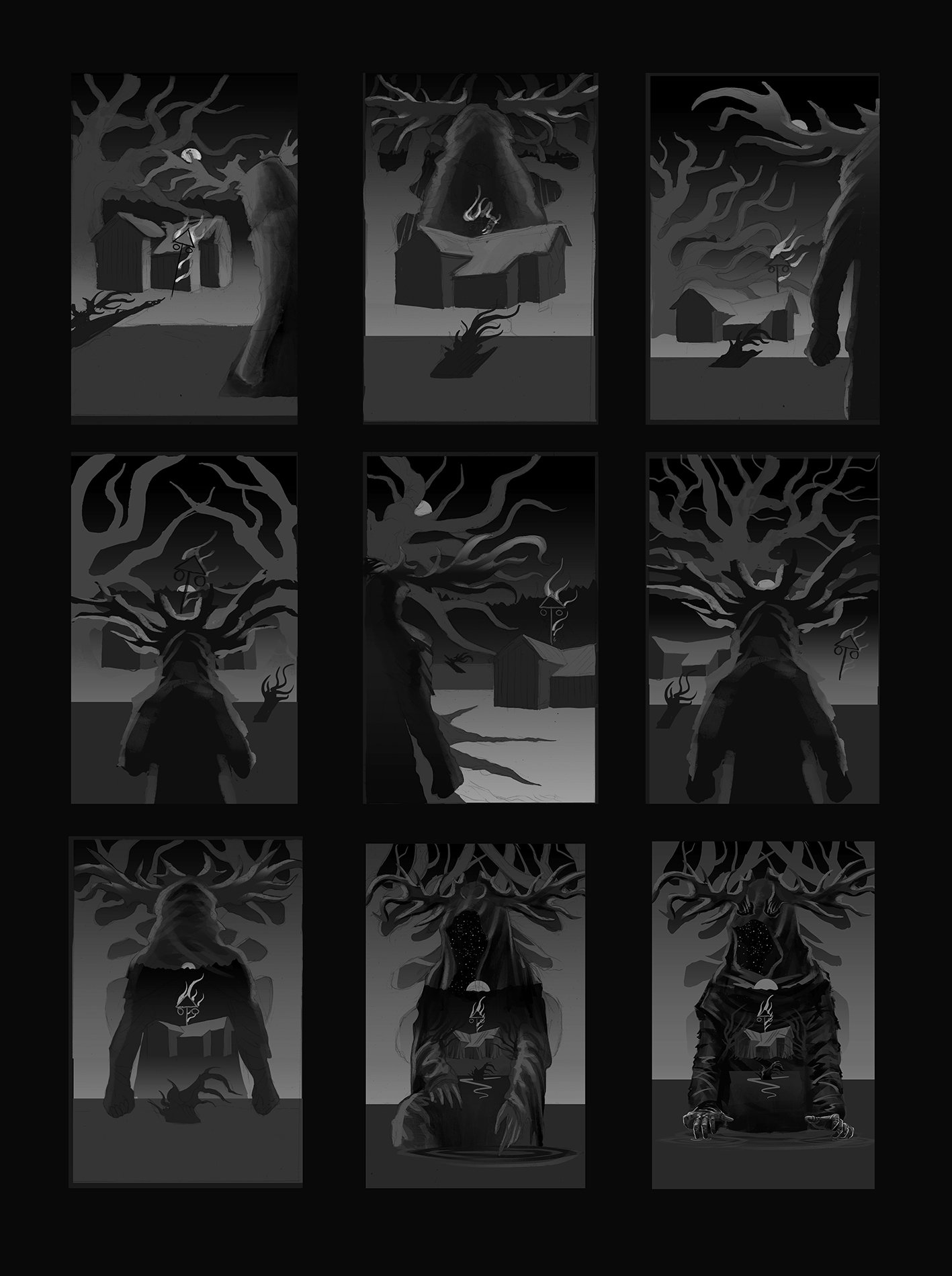
After the project briefing I put together a number of concept sketches to establish the over all composition and layout.
.
.
.

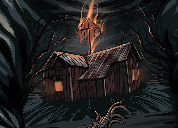
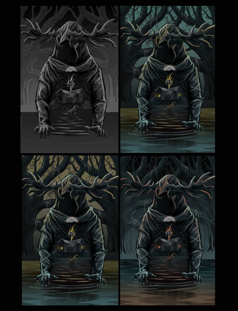
Once the concept had been decided upon I began moving forward with the illustration, establishing values and eventually the small details. We had cycled through countless colour variations but eventually settled with the dark orange and blue colour scheme.
.
.
.

‘Antlers’ was a recurring visual theme throughout the film. The main antagonist of the story wearing a mask with deformed antlers. The fictional place ‘Antler Lake’ got its name from a famous tall tree stump that has been floating around in the lake for decades.
Thanks for looking!
