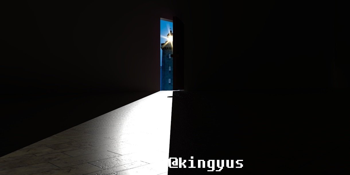
My entry for the Drawing challenge#9 - Light theme contest brought to you by @helene click here

I was inspired by this photo
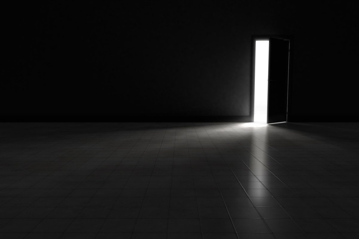
So I made my version
first I designed the environment in this case a simple box hence the title "box-light" and added a slightly opened door

I started rendering
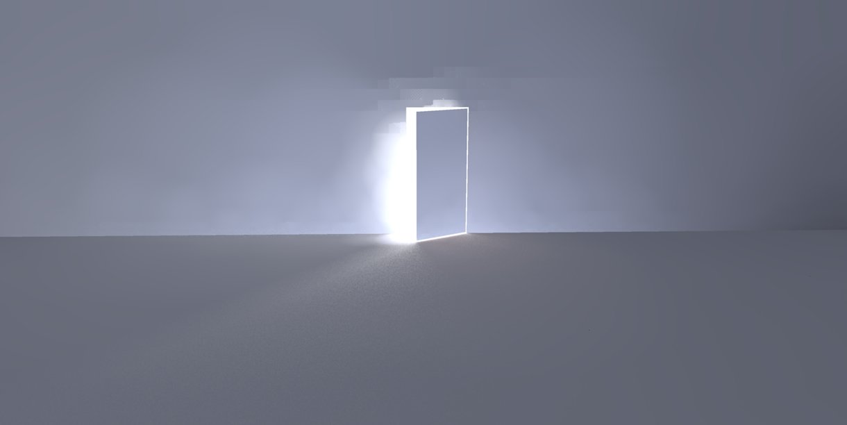
I needed to lessen the soft shadows to get a more clean shadow/light
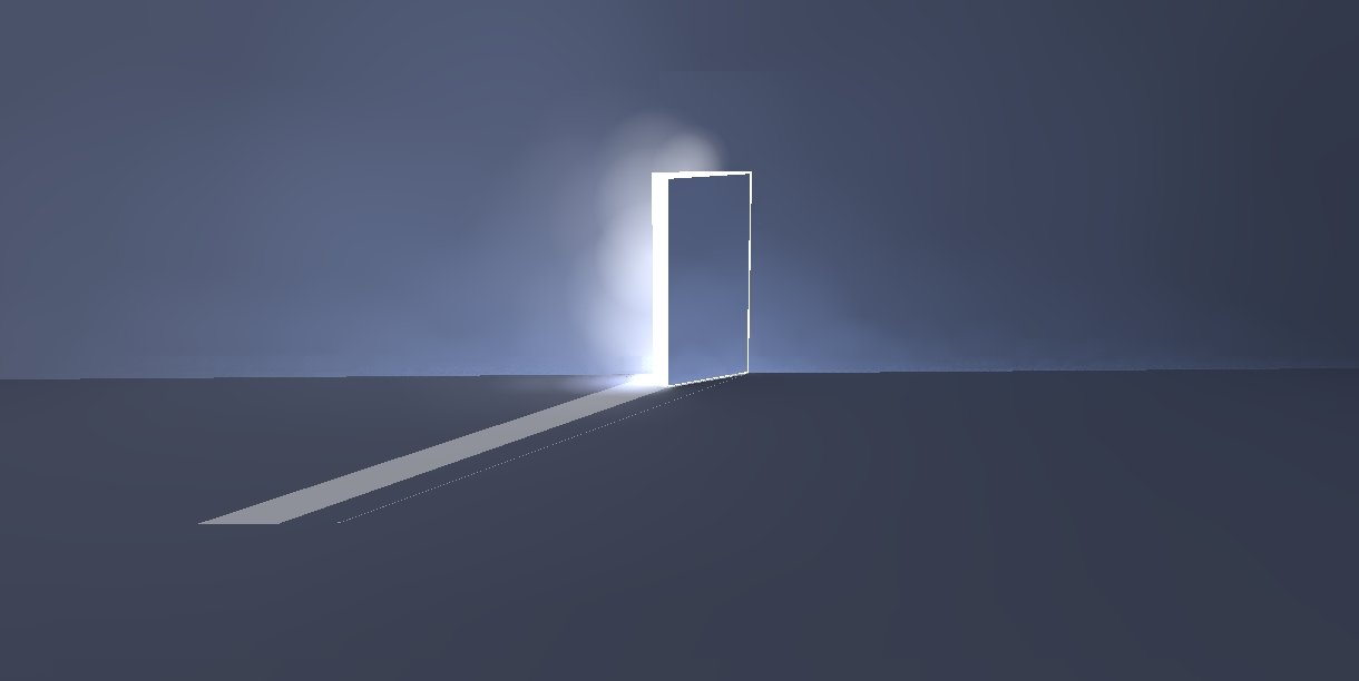
Those Global Photons are too many
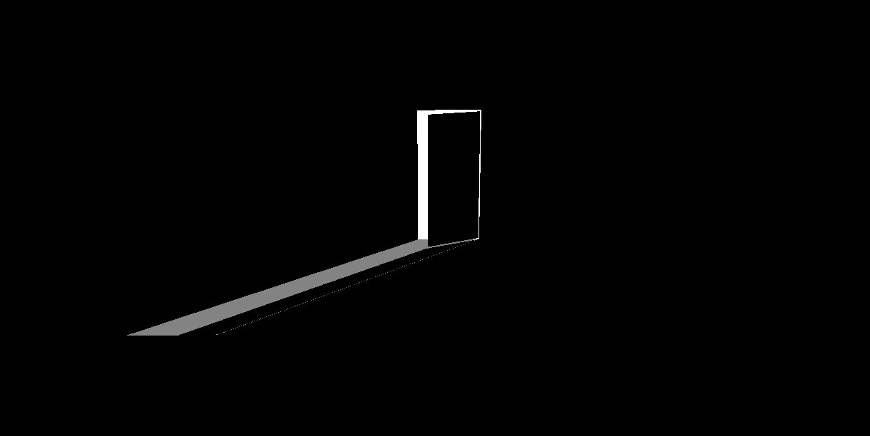
Now, that's more similar to the original
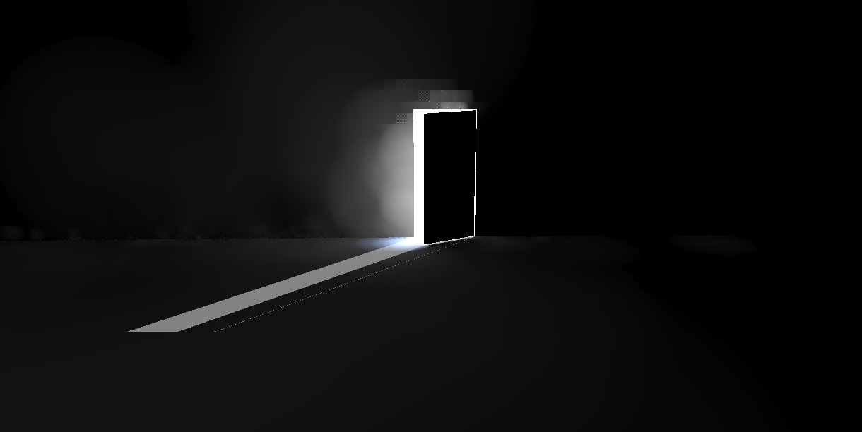
That "smoke" which is produced by the scattering sure gave it a richness though...let's stick to the image...
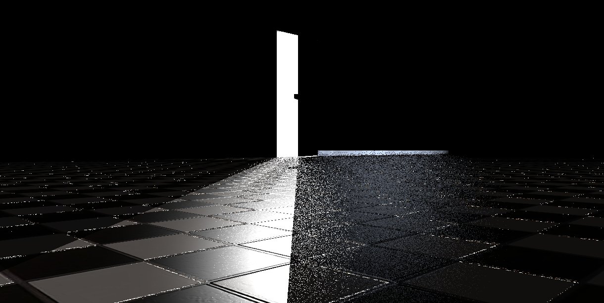
Gave the tiles a little Bump there..
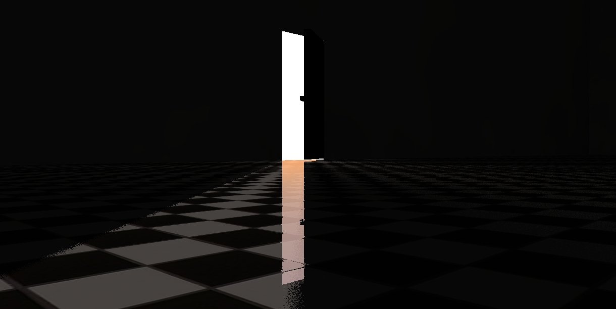
...some reflections...
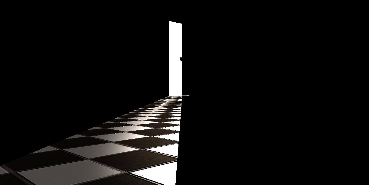
I could have stopped here but knowing me...not a chance
I needed more light reflected and an overall glaze to the tiles without compromising the darkness of the room which is key to contrast the light and make it stand out..
After trials and mistakes I decided that the tiles were not a very good pattern, I mean the material was not very accurate so I changed it to a "Navy" pattern...
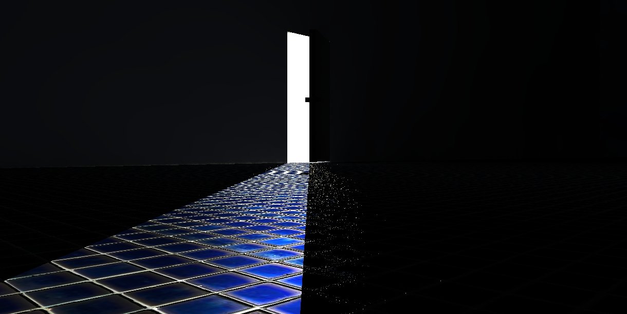
...added reflections and a tiny radius of soft shadows..
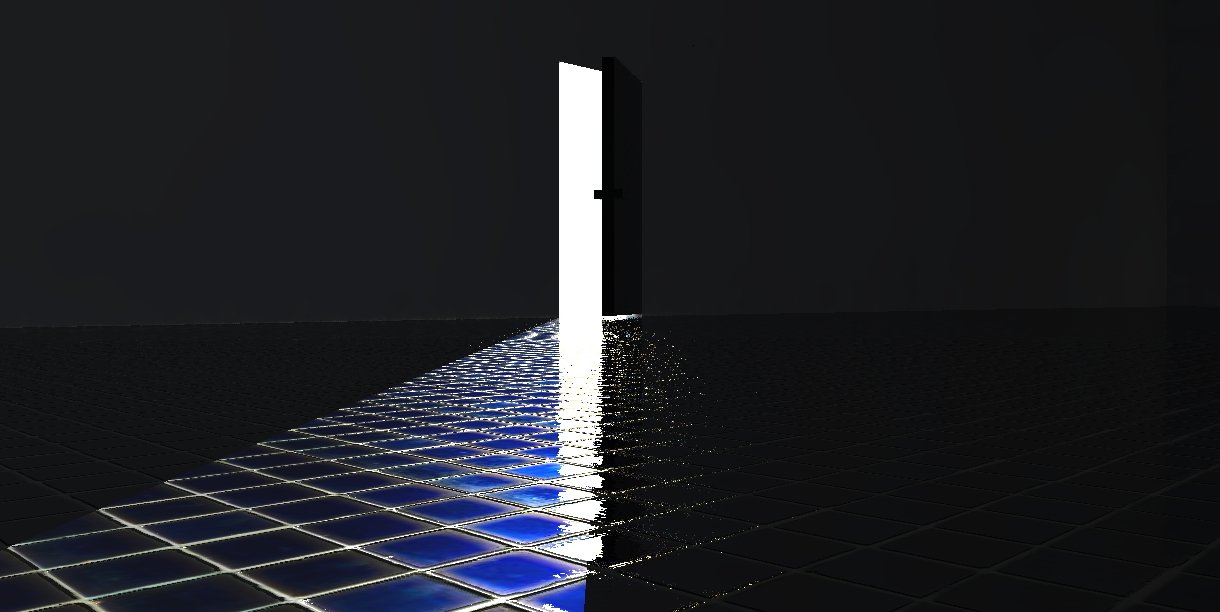
Again I could have stopped here but...
After trials and over 2 days of rendering and waiting out...once again I realized the material is not a good quality one...dangit!
All the while I had some preset materials waiting for me to pick..my God! ...like the Italian say "I got lost in a glass of water"
so here it is and at first rendering..
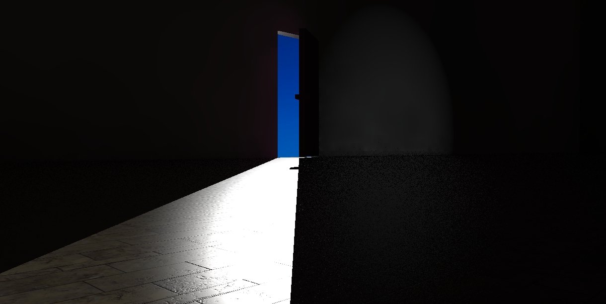
Wow..that is more like it and looks clean too, to my surprise..
now I can work with this...
I asked myself where does the Light comes from.. is it a lamp .. the moon, maybe?
While you don't know I have downloaded a pixabay photo and set it in the background
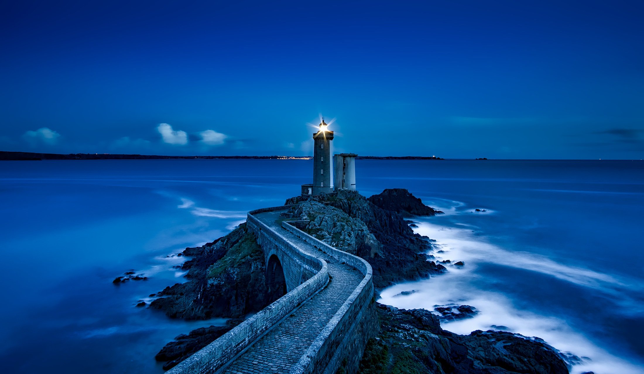
the result is not the super best but the combination was not premeditated and that is what makes it special ;) ...modestly. This was actually a last minute change...just before posting ;)
I think am satisfied with this result
