Realistic Human Portraiture in Graphite. I have a love-hate relationship with this style of artwork. Seriously! I easily get bored while making one, and I often have to fight and force myself to finish it. The only reason I do this type of drawing is because there is a connection between me and the subject. Yes, I only draw them for my dear relatives or friends, and for whoever I am dating, or desire to become romantically involved with.
First, a bit of history between me and this girl
Daryl and I met back in 2015. She lives just some three miles away from me, and we were introduced by mutual friends when I asked if they knew anyone who was into archery. We hit it off pretty well right from the start.
I had just recovered from a painful breakup from an abusive relationship, and her presence brought light, happiness, and color back into my life again.
But, what cemented our connection was the fact that both of us are serious artists! She, like me, loves to draw and paint, and is an accomplished computer graphic artist as well. But portraiture, and accurate, realistic drawing in general, were her weaknesses. Plus, she had always wanted someone to draw a portrait of her and shown the creation process too, and I knew right away that she was dropping hints about it on me. She was still too shy to ask me directly, because she knew I had a very busy work schedule to do anything about it.
I left traditional animation in 2003 and stopped drawing for a while, to give my drawing hand and arm a much-needed rest. In the years following my departure from traditional animation, and subsequent entry into 3D animation, I didn't draw much and had only done thumbnail sketches of poses of characters and creatures we were animating. Nothing really serious and stressful on the wrist.
Fast forward to 2017, Daryl made a request and asked me to draw her a portrait. It didn't matter what medium I'd use, as long as it was good enough for her likeness to be easily recognizable. I knew that sooner or later I would have to start drawing seriously again, as my job was beginning to demand it too. And so, I obliged. Now, see how it was done.
Note: If you are reading this on your desktop or laptop computer, you may view the images at full size by right clicking on them and selecting "View Image".
The Materials
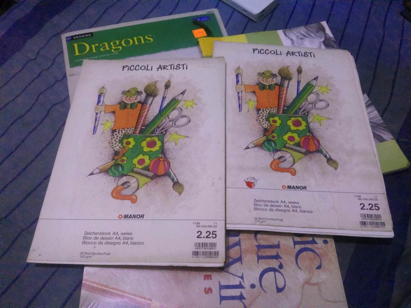
- Staedtler Lumograph pencils: H, B, 2B, 3B, 8B, and blue pencil
- Faber-Castell PVC-free eraser and Mitsubishi auto eraser
- 120 gsm sketchpad paper (an "antique" from a stack of pads brought home in 1999 for me by my aunt from Geneva, Switzerland, where she lived for 17 years)
- Tissues for blending and shading (these are unused napkins from fastfood takeouts, and I, being eco-minded, decided not to throw them but put them to good use instead)
- Paintbrush for brushing away eraser crumbs, and also for blending
The Process
We traditional animators always begin our drawings using what is known as the construction drawing method. It is based on the principle of understanding forms, and using geometric figures such as circles, ovals, boxes, and lines to draw a simple visual representation of the underlying three-dimensional volumetric structure that make up our head and other body parts. I won't get into a detailed explanation of how to do this as there are a plethora of tutorials about it on the Internet.
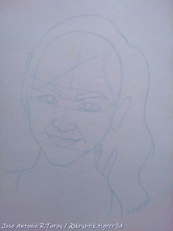
Blue pencils are often used for this since it does not show up when scanned. We draw rough and dirty, and often repeat or build up our lines until we get the desired shape, contour, or size. Then we finalize it by tracing over it with a B or 2B pencil. And since the scanner won't pick up the blue lines, only the graphite lines will be scanned.
Although traditional animation has largely gone out of fashion nowadays, we still draw like this out of habit, not to mention the fact that it looks cool too.
My construction drawing picture shows an advanced stage of the development process. I had already erased some construction lines and shapes at the time this picture was taken, not having foreseen that I would be blogging about this portrait's creation process someday. It was also enhanced in an illustration software, Krita, to make the lines more visible for you.
Drawing and shading the parts of the face
 |  |  |
|---|
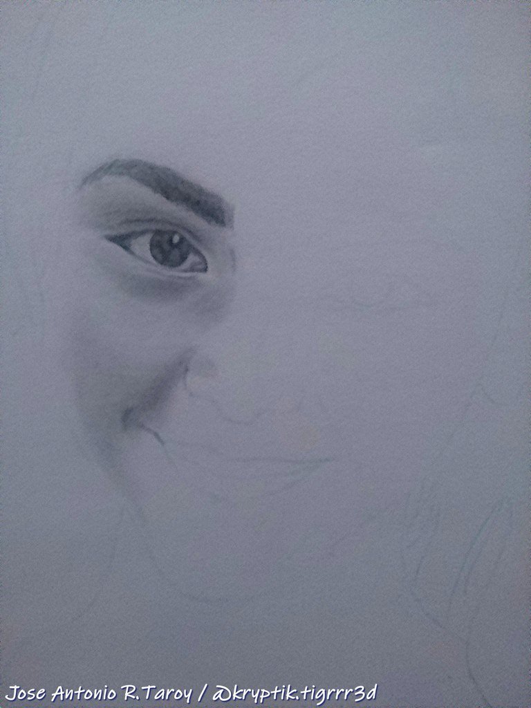
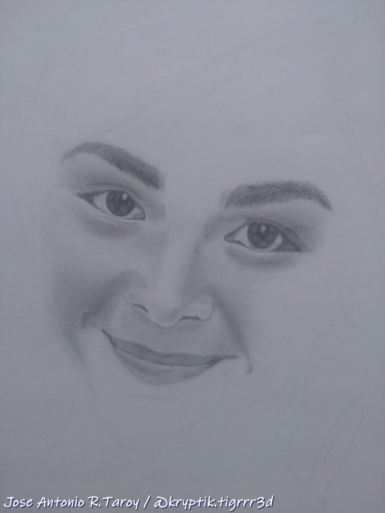
I always begin with the right eye and eyebrow, and then the cheek. For this part of the face, and the whole head in general, I used four pencils, H, B, 2B, and 3B. H was used for line drawing and to mark the borders between tones.
When done, I move to the other parts of the face in a clockwise direction. The forehead is usually the last part, before I start working on the hair.
B was used for shading the light areas that bordered the white (highlights). I laid a foundation of B pencil with light strokes, then spread the graphite with a tissue, blending the tone with a circular motion.
Then I shaded the areas that were a bit darker with a 2B, adding more graphite where needed, and blending to even it out. And finally, I used 3B for the darkest parts and the shadow areas, using the same procedure as in the other parts.
Finishing the face, and getting started on the hair


As in the other parts, I begin work on the hair by drawing the lines or patterns that represent light, dark, and shadow areas, as well as the demarcation lines between clumps of hairs. When those have been drawn, I begin shading using the same procedure employed with skin tone. She liked to dye her hair in streaks and the pattern is apparent in the dangling locks over her left shoulder. For the images above, I used B, 2B, and 3B.
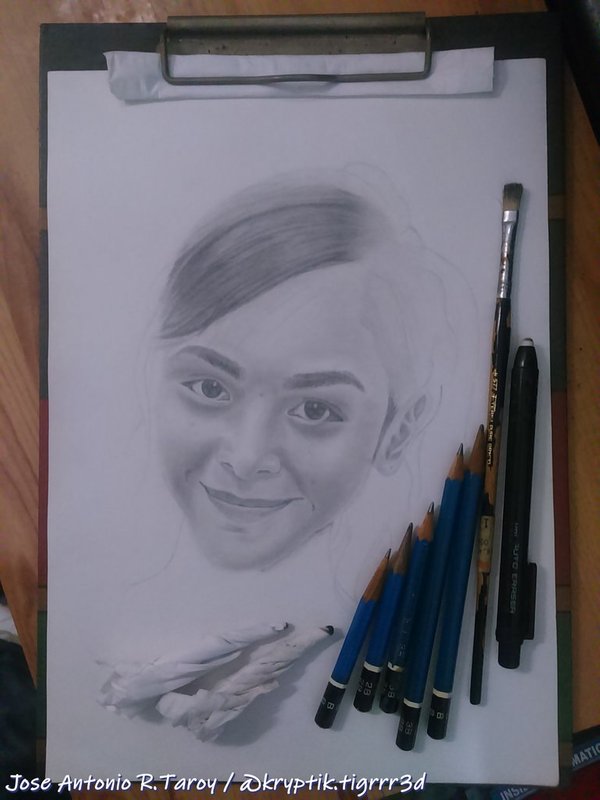
In this picture you can see the tissues I used for blending. For this portrait I used five, one for each pencil. The graphite buildup will eventually become thick enough that the tissues themselves can be used for shading.

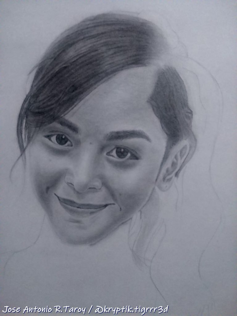
Continuing the shading, and this time darkening where needed, with an 8B. The ear was not given the same serious treatment as the face, as it would be partially obscured by a thin clump of hair. In art, you should know when to scrimp or cheat, especially in production!

Don't you just love how the face seems to pop out of the paper! And at this point she looks a lot like her youngest sister.
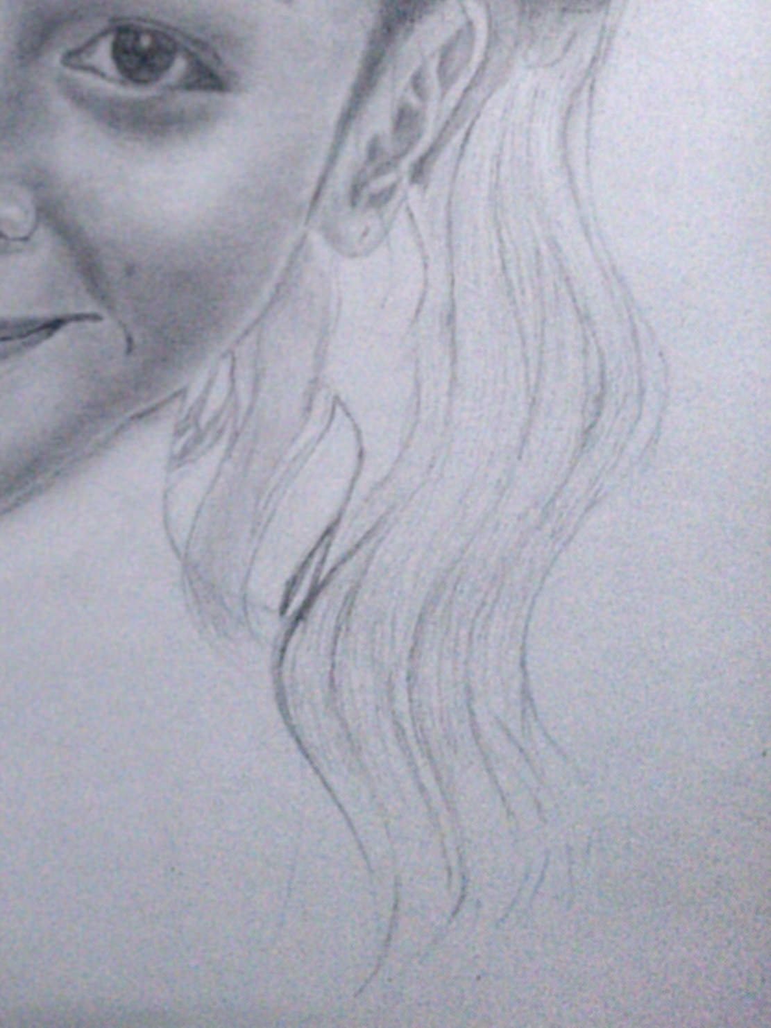
Finishing the hair

 |  |  |
|---|
Here I begin to separate the mass of dangling locks of hair into clumps before shading. Same three pencils, but with the addition of an 8B for the darkest parts.
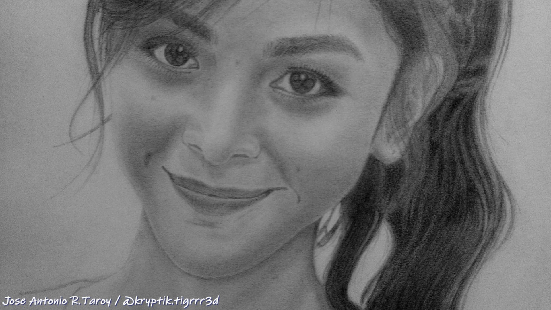
The finished drawing
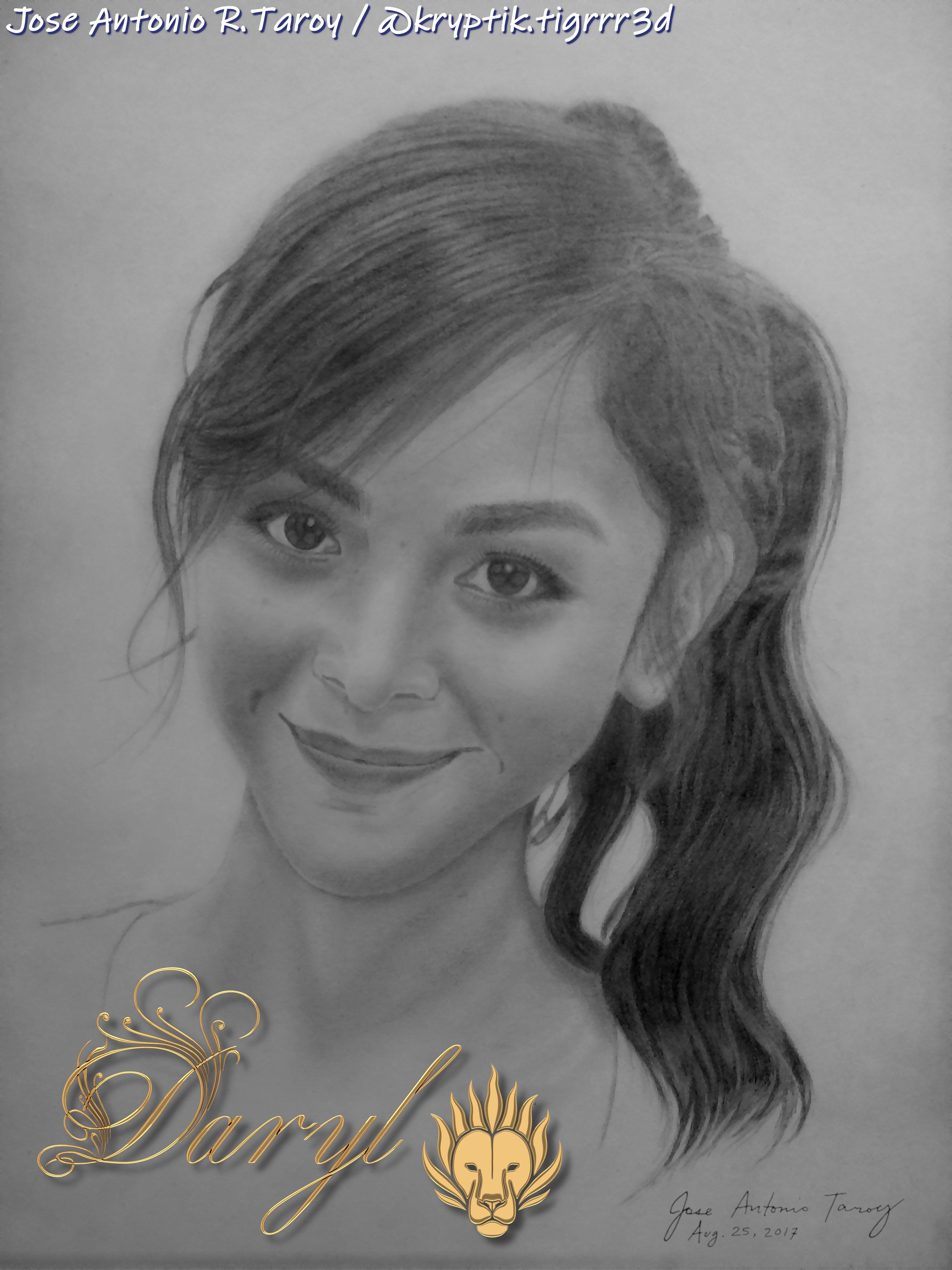
Finally, it is done! Not bad for someone who had just started to draw seriously again after a long hiatus, and who only dabbles in this type of artwork. And no matter how much I hate doing something, I always give it my best, especially if it's for someone special. I still owe her another portrait, but it will have to wait until I am done with other personal projects. The gold logo is a 3D model created in Blender, and another type of artwork I only give to special people in my life. And in case you're wondering, the font is Wiescher Design Royal Classic.
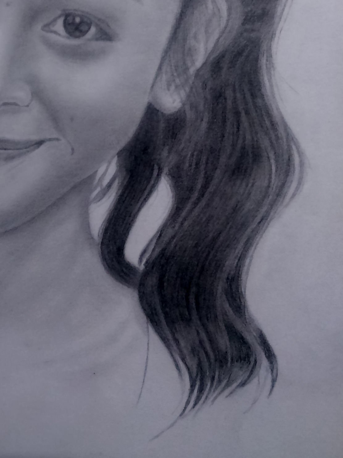
A sneak peek of another portrait I'm working on

Sophomore jitters, be gone! I can't wait to see how this one will turn out, and how it stacks up against Daryl's portrait. This will be a high-priority project that I wish to finish asap, before I get sucked back into big animation studio work and life again. I have a job offer that I might accept soon, if it's better than my current freelance gig.
Don't ask for my autograph, I'm not a rockstar.
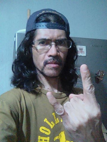
I rarely take selfies nowadays, but I just thought I'd let you see what I look like right now, before I get a haircut. Don't let my stern demeanor intimidate you, especially since you haven't met me yet in real life. There is a goofball underneath my strict, drill instructor-type persona. I'm a serial prankster, and you've been warned.