Fellow Steemians - Here's an art project that I've been working on inspired by the patterns and cityscape planning of Detroit. Below, I have a few progress images and some background on how the "Motor City" became what it is today...
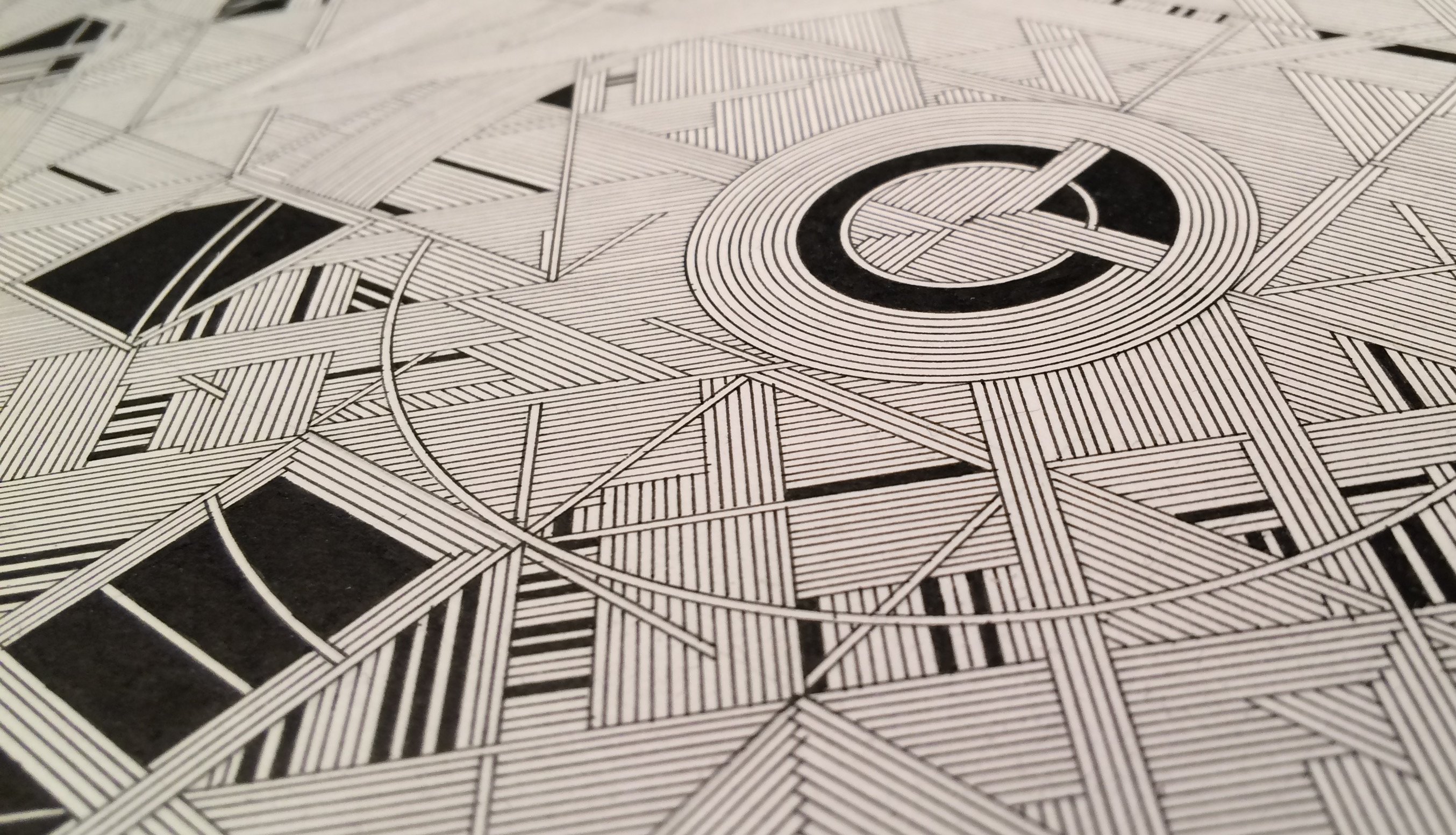
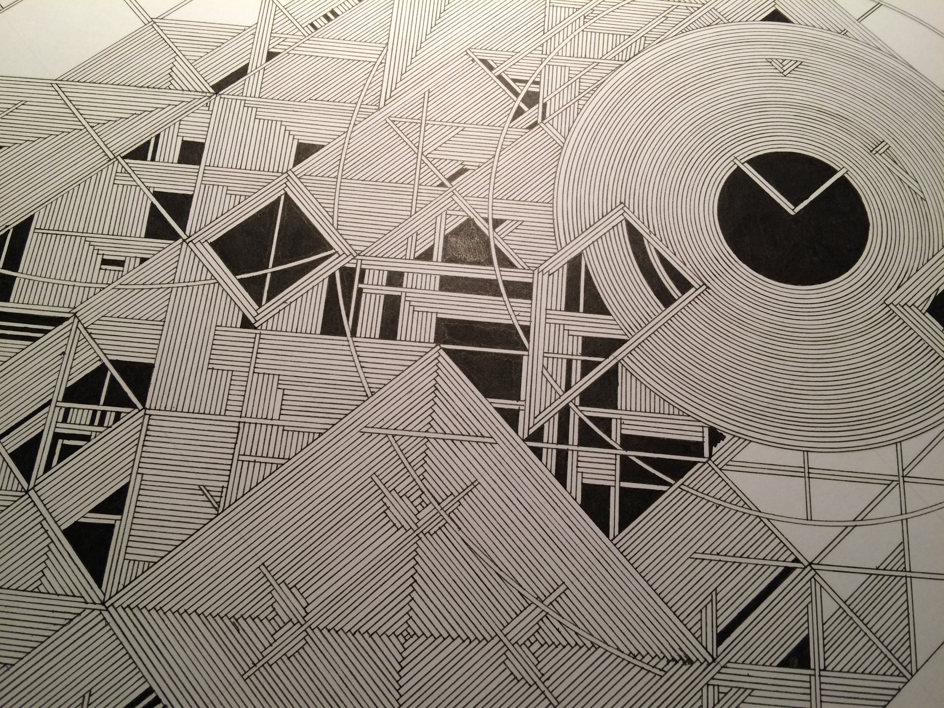
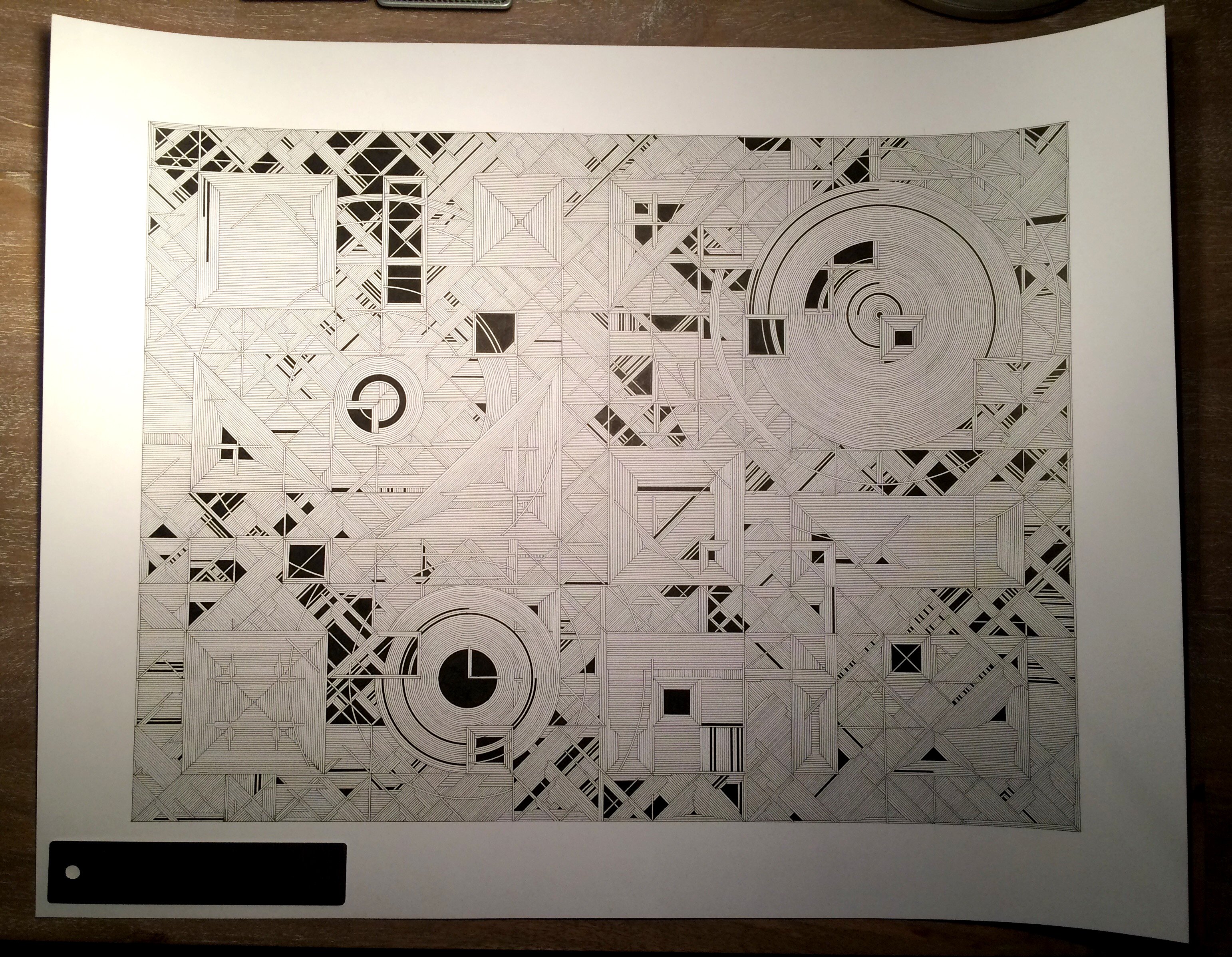
This hand-drafted drawing was inspired by a recent trip to the "Motor City" in Michigan.
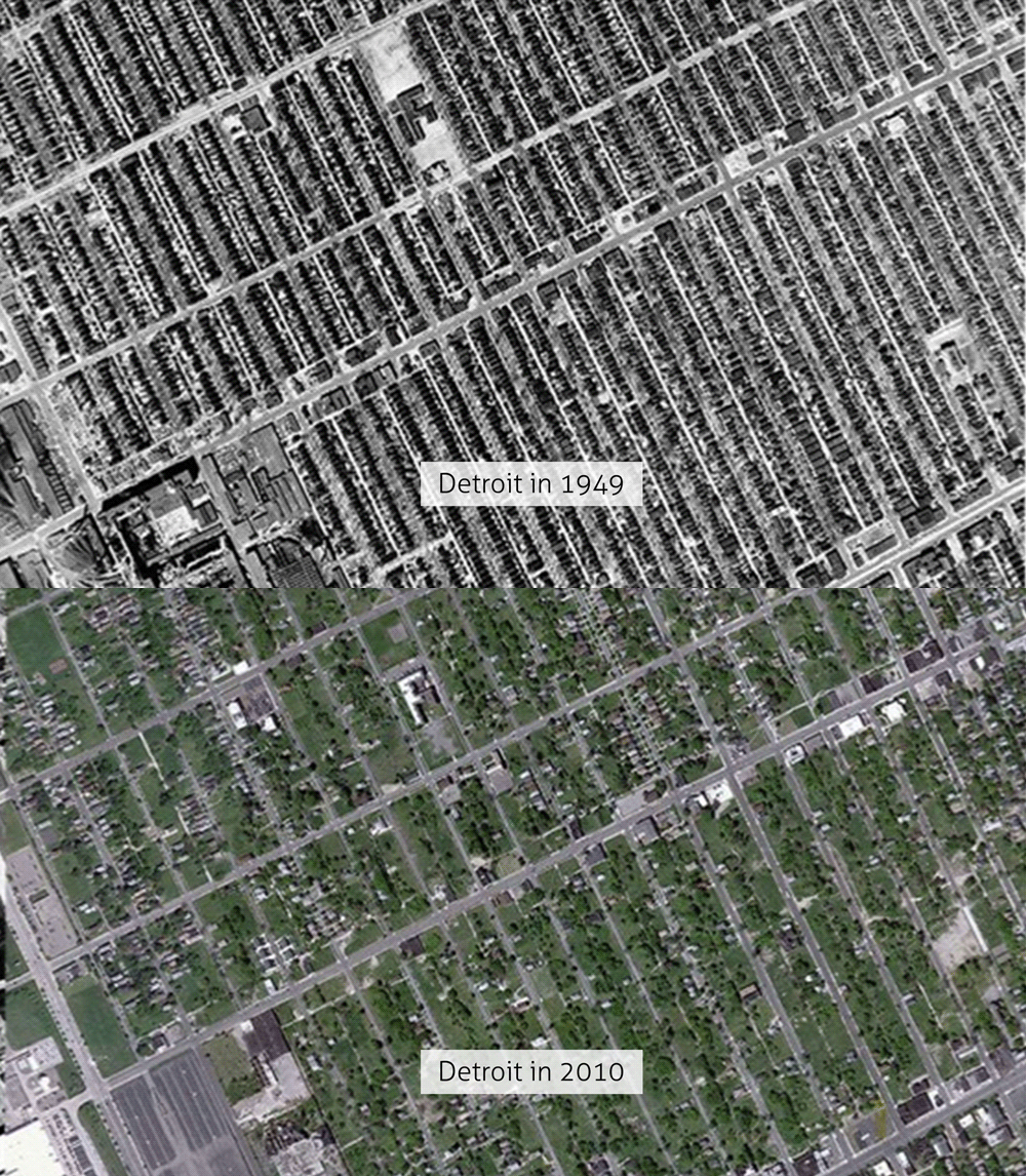
A metropolis of industry, music and culture; Detroit once held close to 2 million residents in 1950. Today, the city's population sits closer to 700,000. This sharp decline was a result of Detroit's dependency on a single-source-economy; the automotive industry. The "Motor City" was a mecca for all-things-auto back in the middle 20th century. However, after a series of advances in automotive assembly and machine-based manufacturing, car manufacturers no longer needed multi-story plants in urban areas. Fewer employees were needed to operate simplified machinery, and it became far cheaper to build single-story warehouses outside of major city centers. With this unprecedented shift... Detroit's economy was gutted.
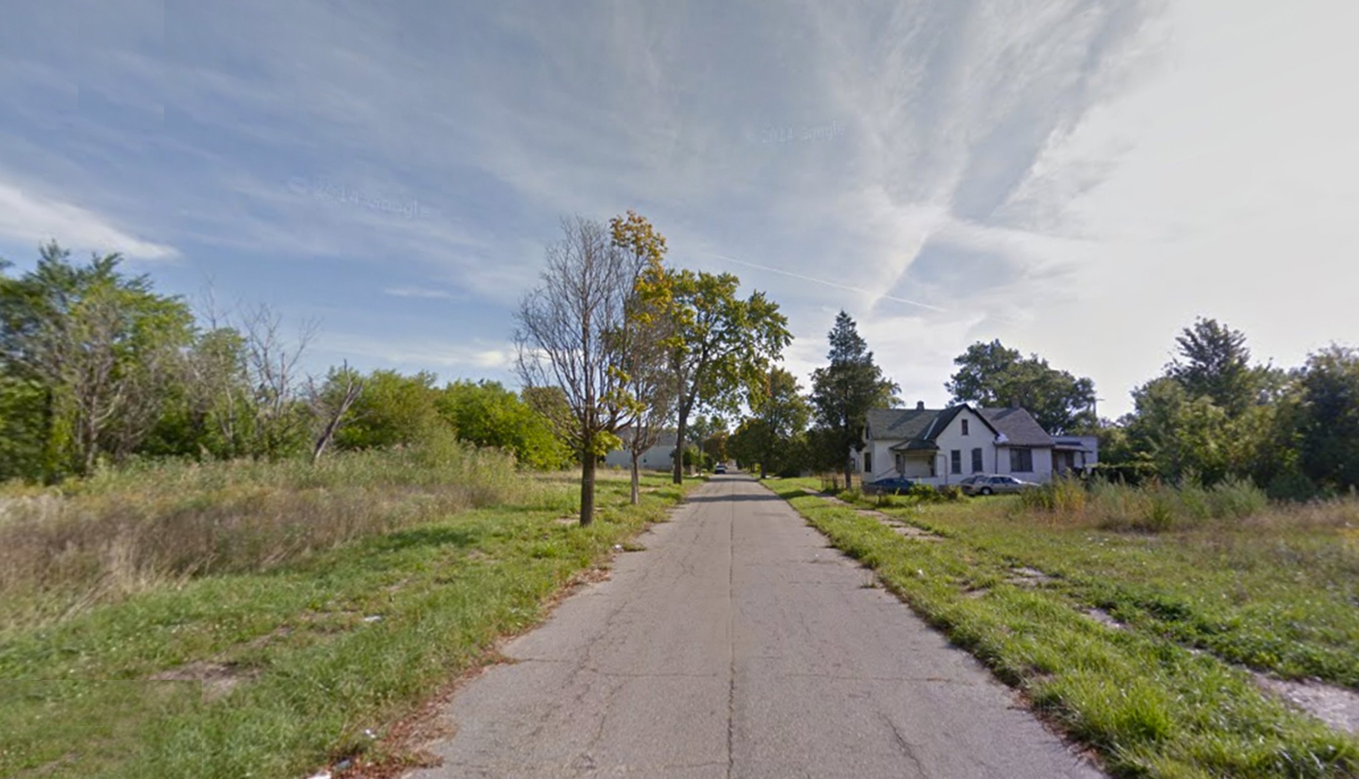
A city of 138.76 square miles, Detroit has the bones of a city planned to hold millions of people. Today, the city's infrastructure is being stretched thin. Electrical lines, water and waste pipes travel through ghost neighborhoods with only a few scattered residents. Pockets of communities stretch across a massive, and largely vacant street grid.
The imagery of Detroit from above is provocative... Here's a look at how the city became de-populated over time...
A street view below...
The dominant city grid was a major theme in my drawing. Where ghosted lines and shapes and fractured buildings made their way through...
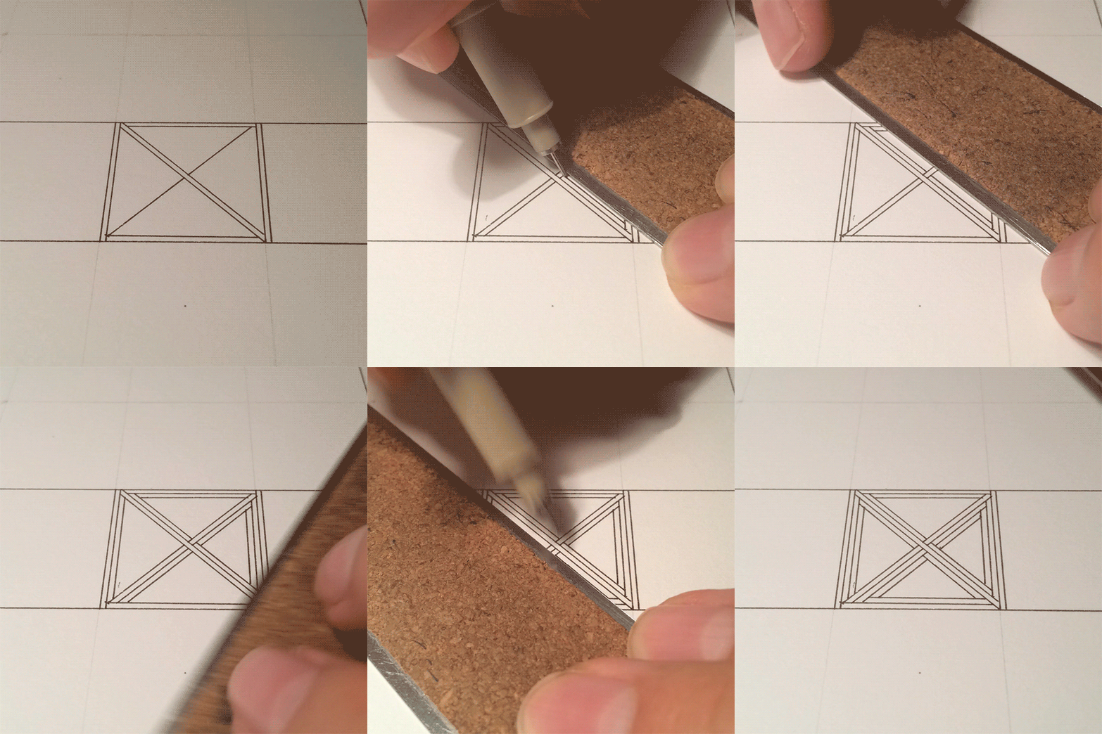
Behind the scenes - here's a GIF of how the linework goes from pen to paper :
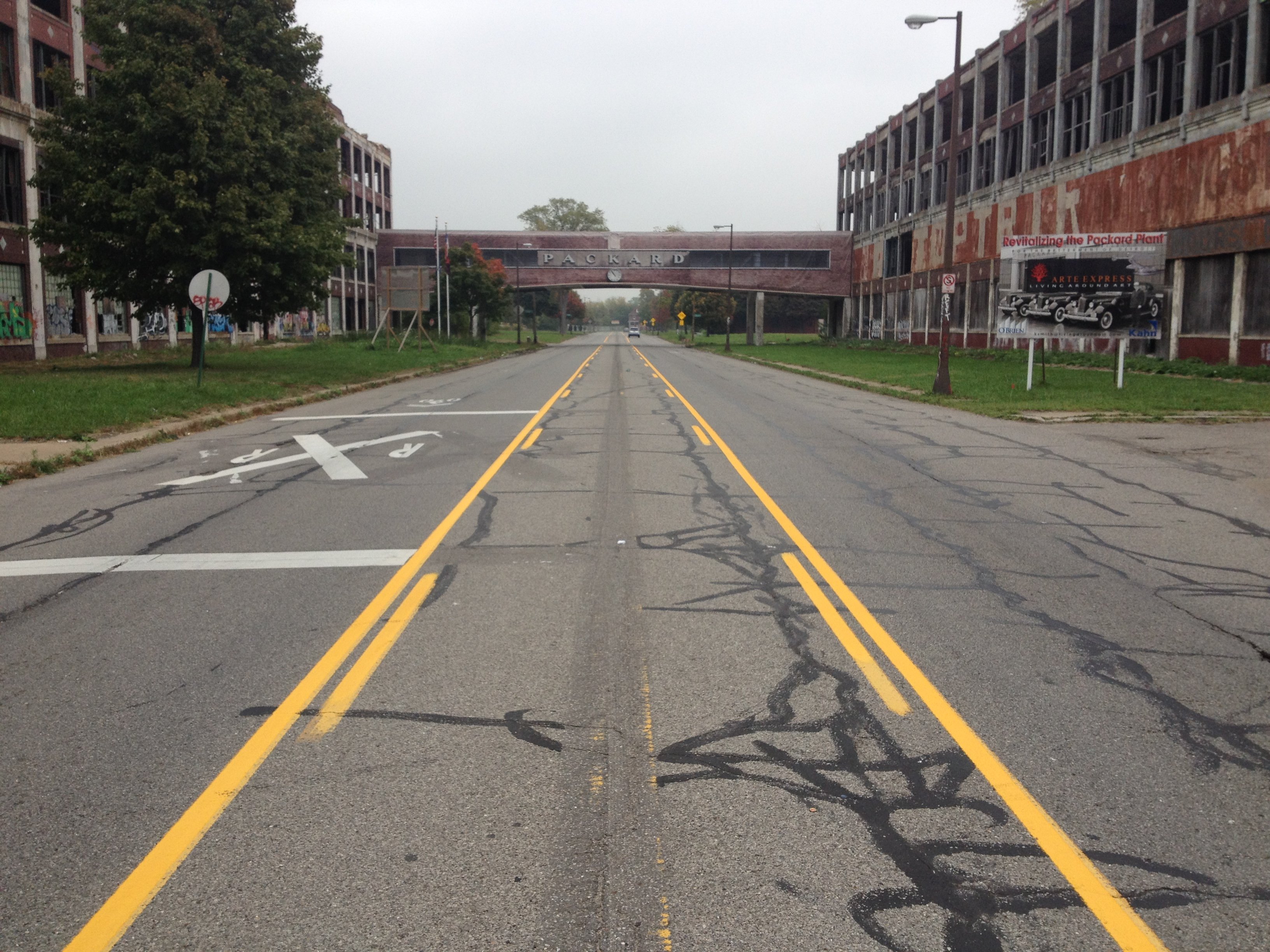
The Packard Plant, an abandoned automotive factory that closed in 1958...
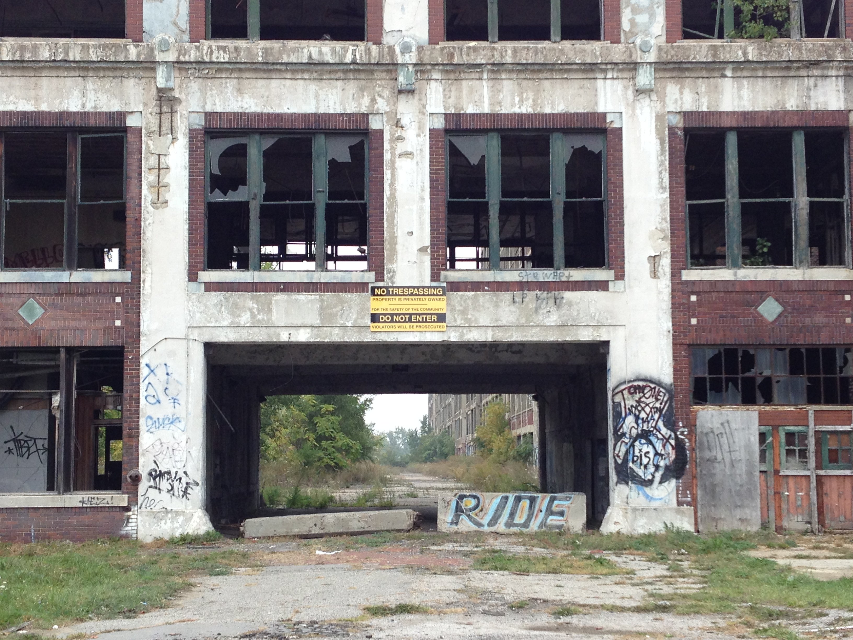
In progress...
Another view of the abandoned Packard Plant from the street...
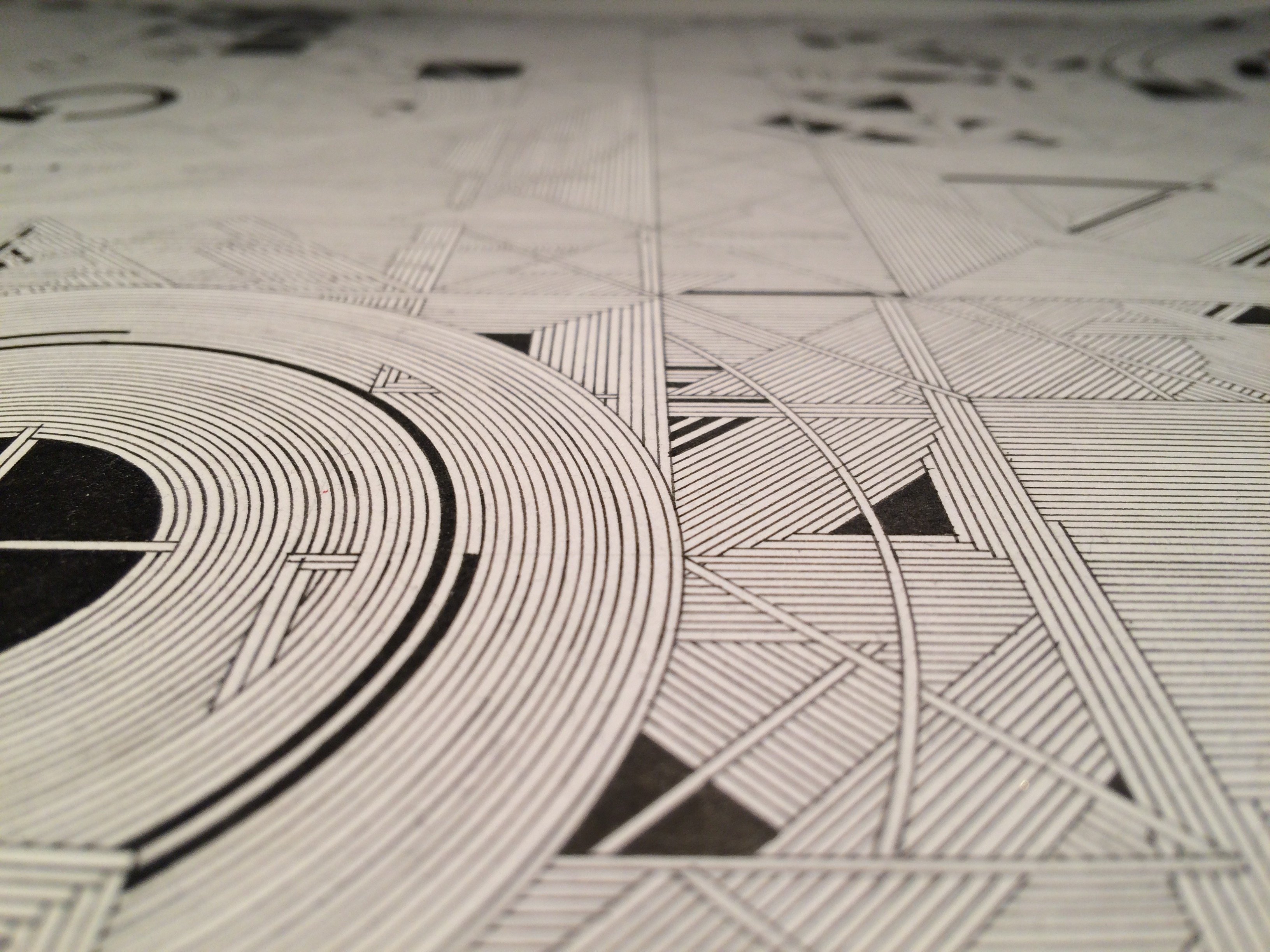
Finally, a detailed view... the grid becomes eroded over time and what started as a regimented linework becomes more organic and unpredictable...
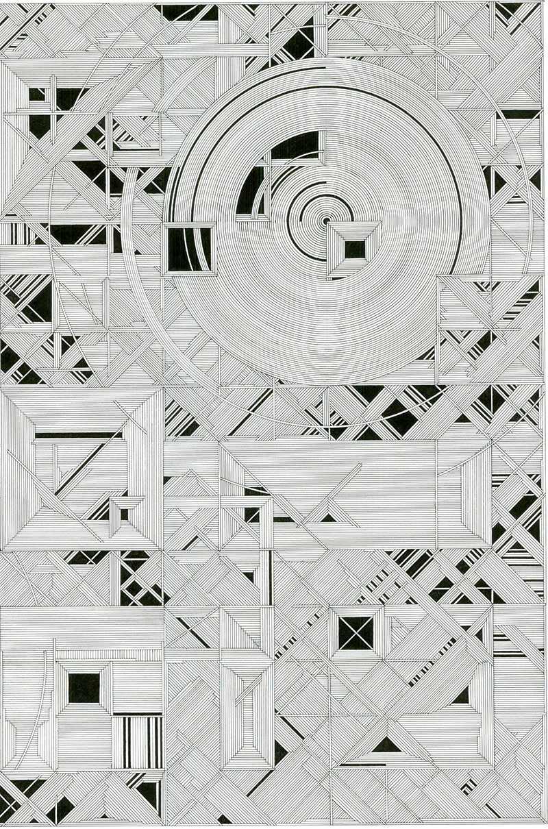
The final drawing! Pen and Ink on Paper (18" x 24")
Thank you for clicking and scrolling!
Follow + check out my page for more on art, architecture and photography.
By lgm-1

