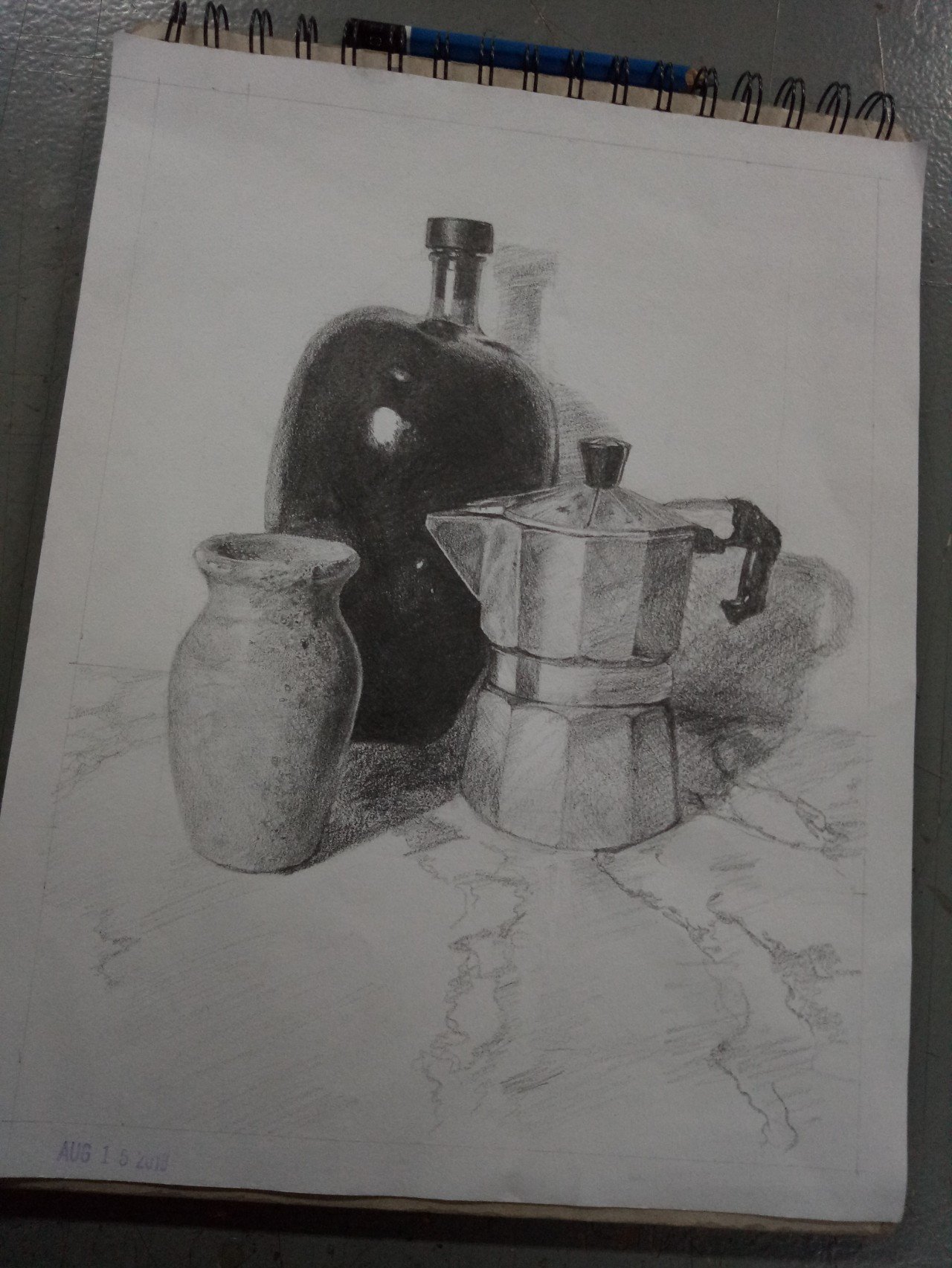
During our class in Visual communication 2, we had a lot of drawing exercises and one of those is the value studies in still life. We were given a reference and draw it in order to determine the exact tones, values, and the basic ways in rendering.
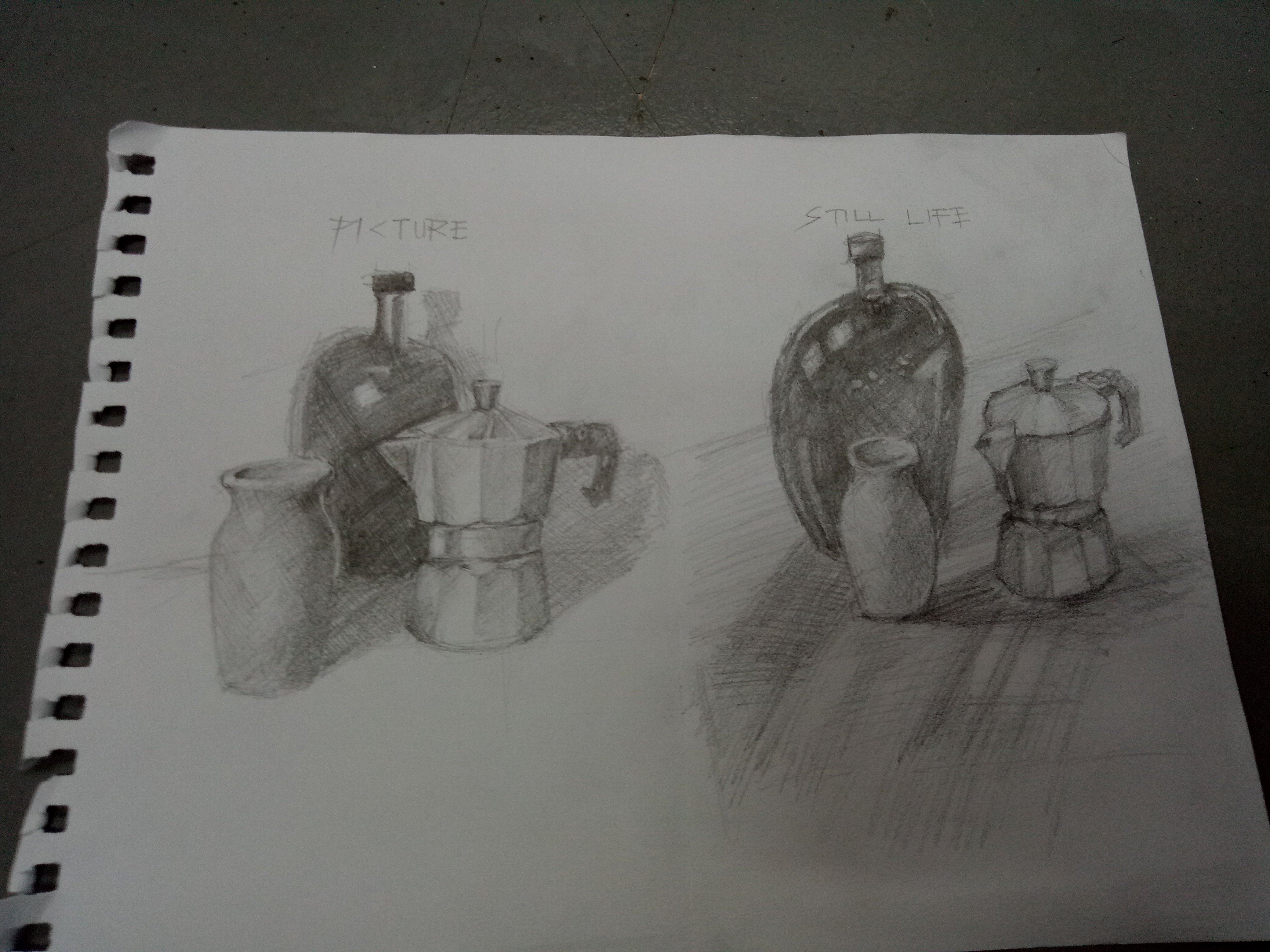
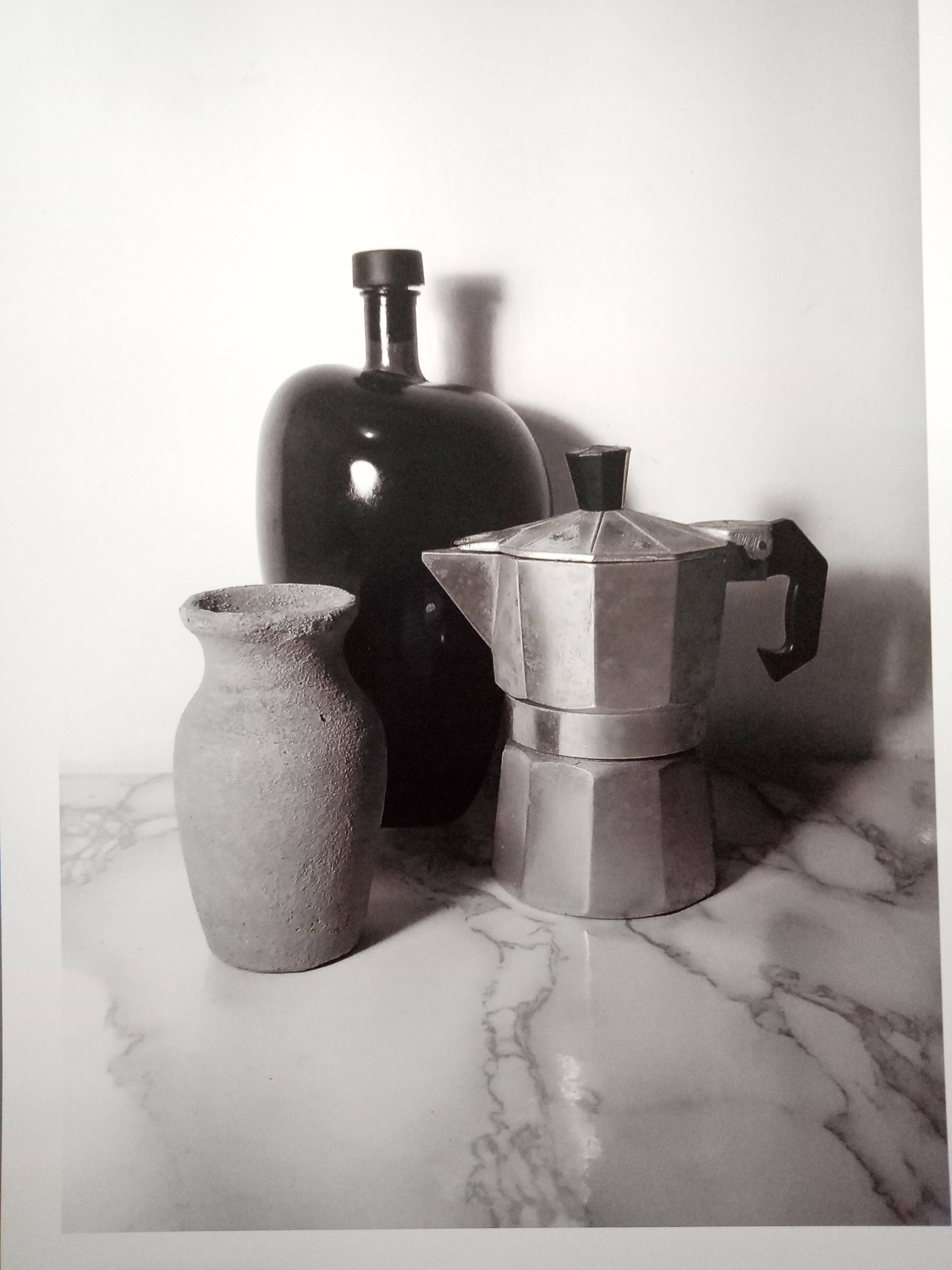
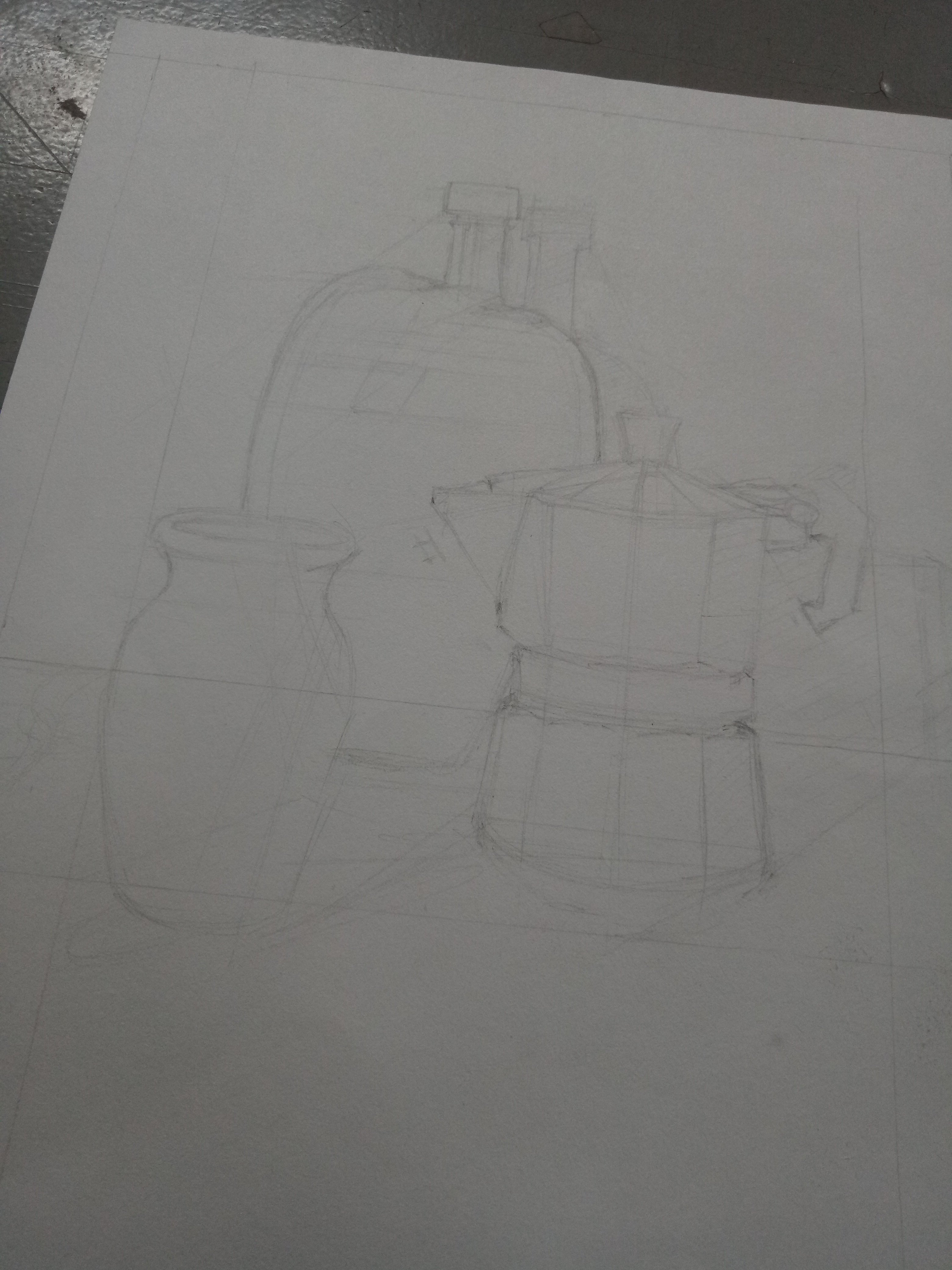
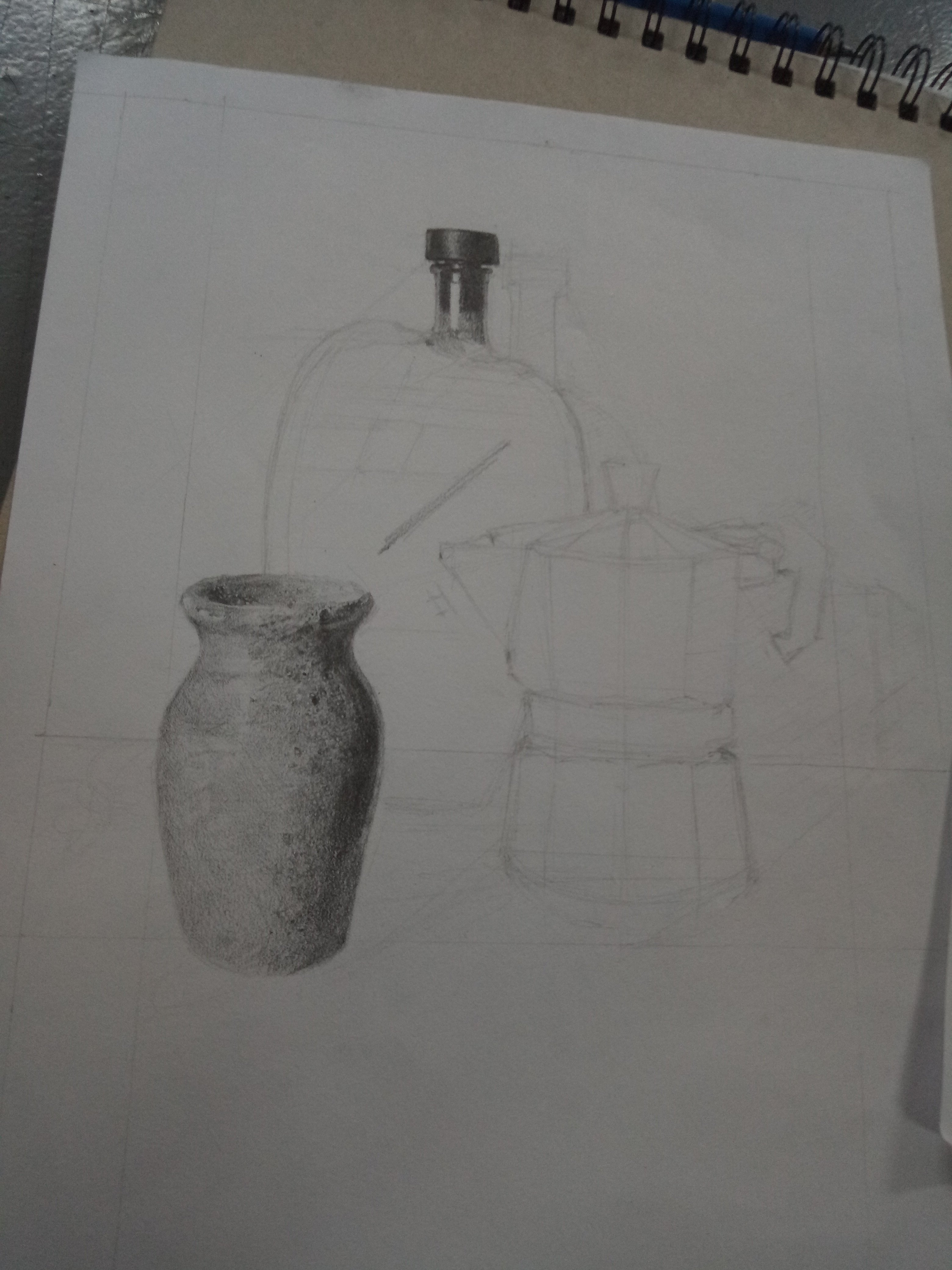
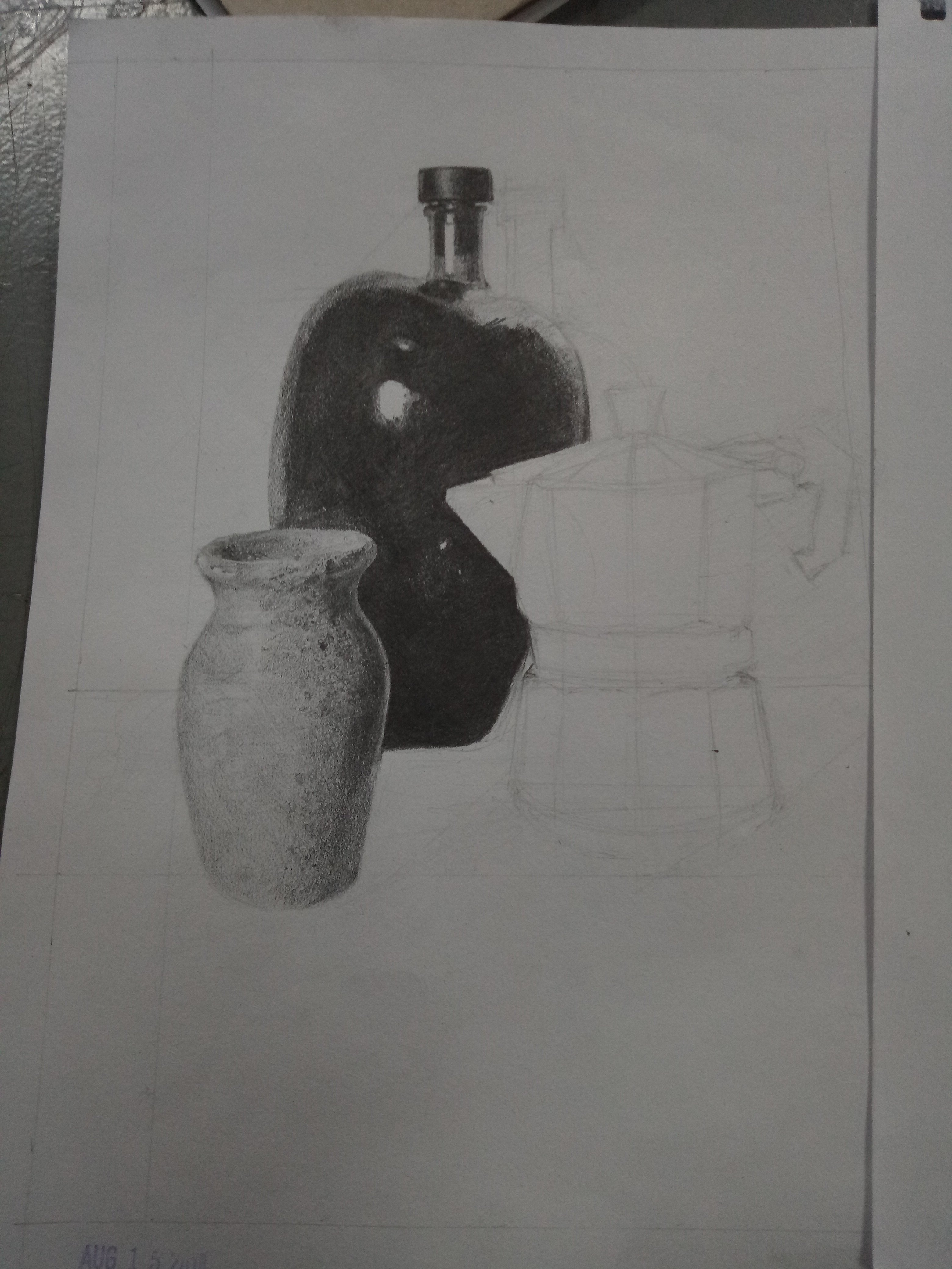
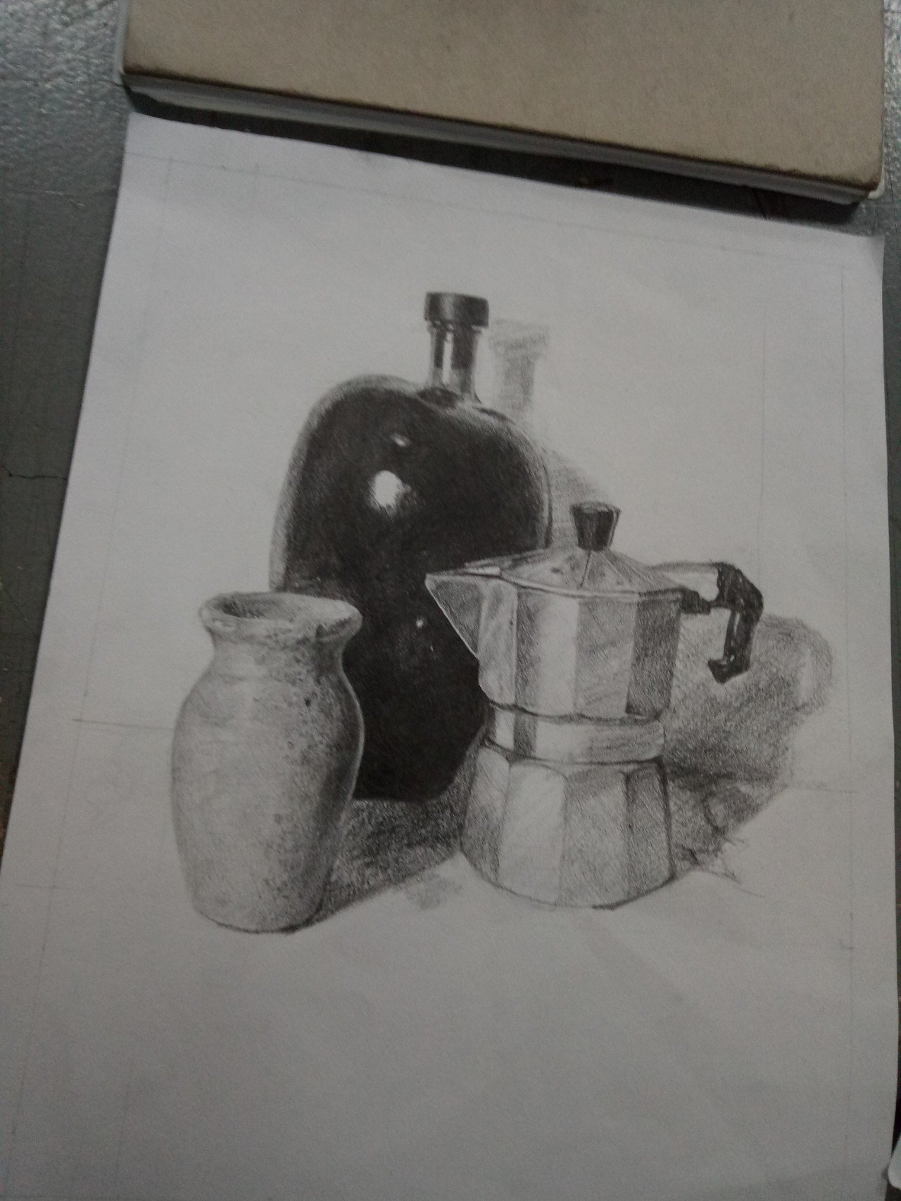
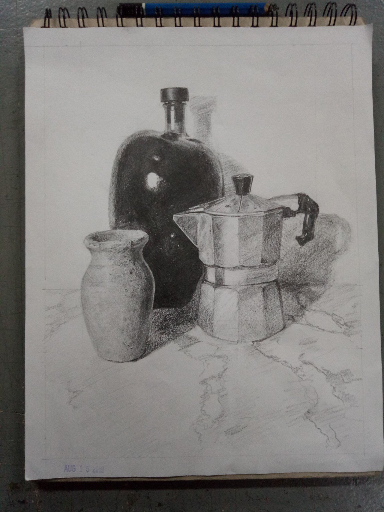
So I just want to show you guys my fina, the process and the things i learned from it. There were three things given to us as references: A flowervase, a bottle, and a steel pitcher/container. But before I was able to achieve this one, i had made 2 time-bounded practices and my output was kinda not good lol ... These are the two outputs I made before engaging to the final output. The one on the left side was drawn from a picture reference while the other one was a perspective drawing from an actual object placed in a corner. Using just an image as a reference is much easier than drawing an actual still life object ... Meanwhile, this is our reference (picture). Although it was just an image, but the details are still clear and visible so no worries yeah. And now the process of my final output... Firstly, I did some guidelines and outlining in order to determine the exact positioning of the objects. I used HB pencil, but 2b or 3b will still do though. Ps. The stroke must be just light to be easily corrected and be easily erased. And then after some brief observations, I finished drawing the flower vase. I used hatching technique since smudging wasn't allowed to be used. Its just really important to determine the light source and be familiar with gradients. What's challenging in drawing the vase was its rough-like texture. It has also some minute dots on its body. And then I started shading the glass bottle. I finished off the bottle then, the bottle is color black so it was quite hard to achieve the dark tone same as with the reference. All i did was series of series of hatching overylaying each lines until it covered up the figure. Of course, leaving up some space for the reflected light and for the highlights. Ps. I used 6b in making the bottle. Whats challenging there was how I was going to achieve the glossy look of the glass as what have shown on the ref. And the last object, the steel pitcher was done hastily since I only got just like 10 minutes left to do it. Well, it also has a glossy feature same with the glass bottle since it is made out of steel. It also have some reflected light on its body and highlights as well. I also added shadows on each object. Its very important because it adds up to the 3d effect of the drawing. Yeah lastly, the marble table. I didnt know what I really did lol but the table must have that glossy effect too since its marble. I just used non-stop hatching, like continuously drawing lines until it formed the same figure wt the ones on ref. After that, the output was done! I learned that you need to be patient enough to be able to determine the exact values and tones. Also, in outlining, the strokes must only be light and hatching strokes must start with the light ones first as well. I would agree that just a mere drawing is easy but learning its principles, standards, and everything is really hard, that it needs passion, and time, and you. But practice makes perfect, isn't it? So keep practicing and you'll get better.


.gif)
Value studies in still life.
2 Comments
