detail of proposed design
Recently I’ve been posting about the drawing phase of my pool house mosaic commission
@natureofbeing/inside-the-drawing-phase-of-a-mosaic-commission
@natureofbeing/2-inside-the-drawing-phase-of-a-mosaic-commission
but since I actually have a few projects in the drawing stage, I’d like to show another one that also uses the natural world as a subject.
Usually the phases of my projects are naturally spread out so that I’m creating a new design for one and cutting another and shipping something else alongside the office and pr/marketing and I’m not sure it’s ever happened until now that I’m working on 4 new project designs all at once!
What this means is that I’m engaged solidly all day long in drawing and design decisions and specifically with inception. The beginning of every mosaic begins with taking an abstract notion, concept and putting it into physical form which is both challenging and exciting. Even a year ago I don’t think I would have been able to manage this kind of creative intensity but somehow now I have the focus and it’s going well so far.

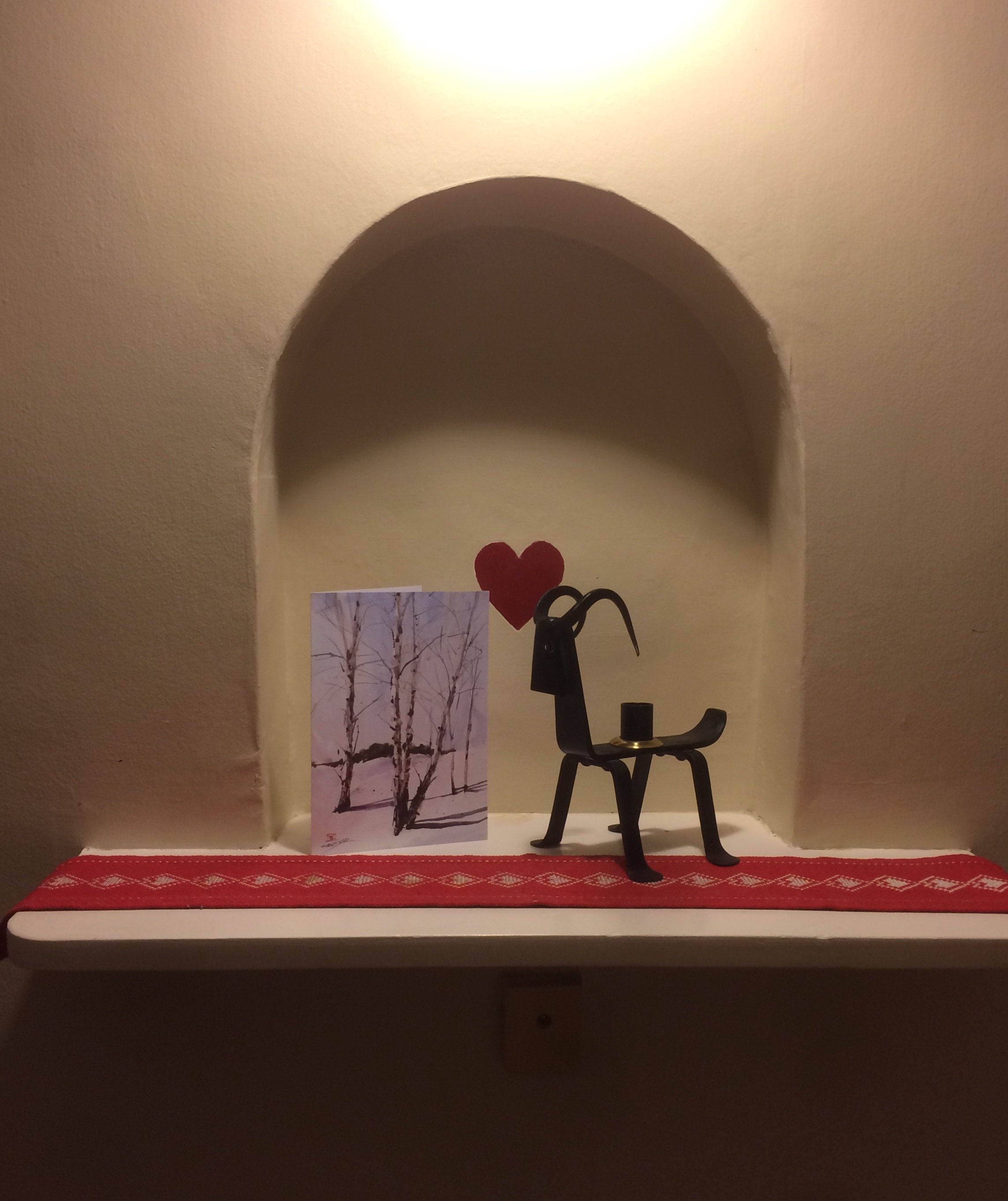
17" tall alcove space where the mosaic will be installed
This is a very small mosaic of a little more than 1 square foot but it’s a precious little piece. My clients have this little inset alcove in their 1930s Tudor home in Portland. It’s location is very central in the house so that even though it’s in a hallway, it’s seen constantly. In their words, “it’s the center of our home” and people wind up noticing this little alcove space a lot anyway so better to make it worth looking at.
They want an homage to love and to nature. Rather than to include actual hearts - which was a suggested possibility - I chose for the foreground the heart shaped leaves of Hostas which grow exceedingly well in Portland, Oregon’s Maritime climate.
The specific birds - American Goldfinch (yellow), the Red-Breasted Nuthatch (top), Black-capped Chickadee - the Dogwood tree and Tulips were chosen by the clients.They also liked roses and lupine flowers but neither worked well alongside the dogwood blossoms so I opted for the simple and elegant tulip and some grasses. I’ve had one eye on keeping this piece from becoming too “sweet”; I wanted the imagery to feel natural and not too frilly or fussy. I’m definitely straddling the line though and this piece is already much sweeter than I’m usually comfortable with.
At about 17” tall, it offered a small canvas to work with. Despite my best efforts, there are far more tiny pieces than I intended. These tiny pieces add lots of hours onto the making at every stage and if they aren’t done just right they wind up confusing the viewer’s eye.
Once I came up with the imagery and composition (placement of the visual elements), I needed to decide how to divide up the background. If I were to leave the pieces of clay around and between the images whole, they would never fit together after firing. Looking below at the space I've roughly outlined in blue you can see how at the lower right it hooks around a leaf. Once the clay body has undergone its 6% shrinkage that kind of space makes it impossible to fit the leaf into.
.jpg)
The solution is to cut up the background. In this case I kept the cuts minimal for stylistic reasons.
Here is an overlay showing these mostly horizontal cuts with a few others as necessary.
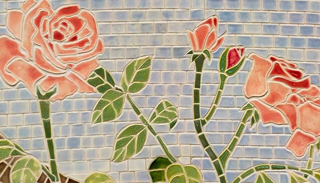
The background cuts are important in creating the style of this piece which calls for an airy contemporary kind of feel. Another option would have been to use the small grid background like I used in my Rose Garden mosaic from 2008. This creates a much more Ancient mosaic feel which isn't quite right for the alcove mosaic.

small detail from my Rose Garden Mosaic
Once this is approved by my clients the cutting in clay will begin! Stay tuned for more soon.
Thanks for supporting my process, my work, my blog! With the simple act of supporting creatives here, we are all creating a new paradigm.


Gif by @stellabelle
