Hello, Steemian
Today we will try to draw with imagination.
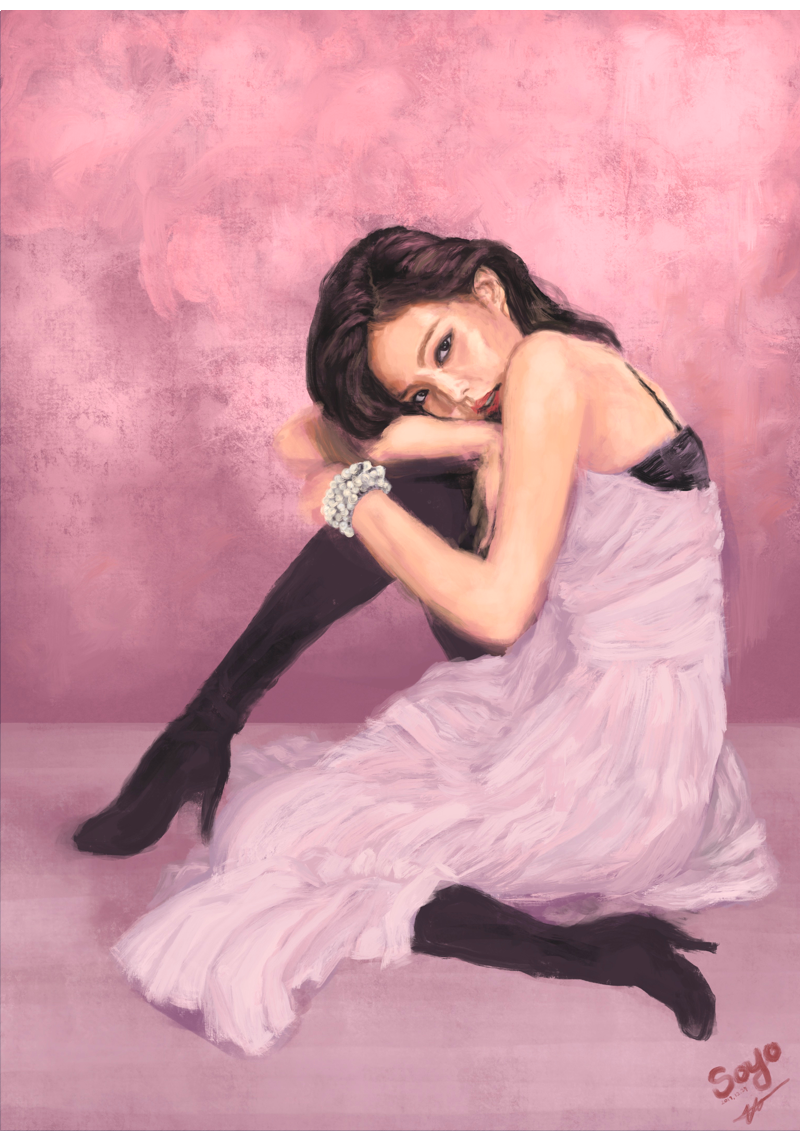
First! Please take a Look at this drawing.
오늘은 사진의 잘린 부분을 상상해서 그리기에 도전해봤습니다.
완성작을 먼저 봐주세요.
여기 하퍼스 바자의 화보 한장이 있습니다
.
Here is one Cover photograph from Harper’s Bazaar Magazine.

샤넬 메이크업 2018 s/s 런칭기념이라고 합니다. 화장품 광고샷이라서 그런지 얼굴만 크게 강조되있습니다.
저는 이런 사진을 보면 잘린 부분이 어떤 모습일지 너무 궁금합니다.
그래서 한번 그려봤습니다.
This is a promotional shot of the Chanel Makeup 2018 s / s line. Because it is a cosmetic advertisement shot, only the face is highlighted greatly.
I always wondered what the cut part looks like when I look at these pictures.
So I tried to draw.
Process
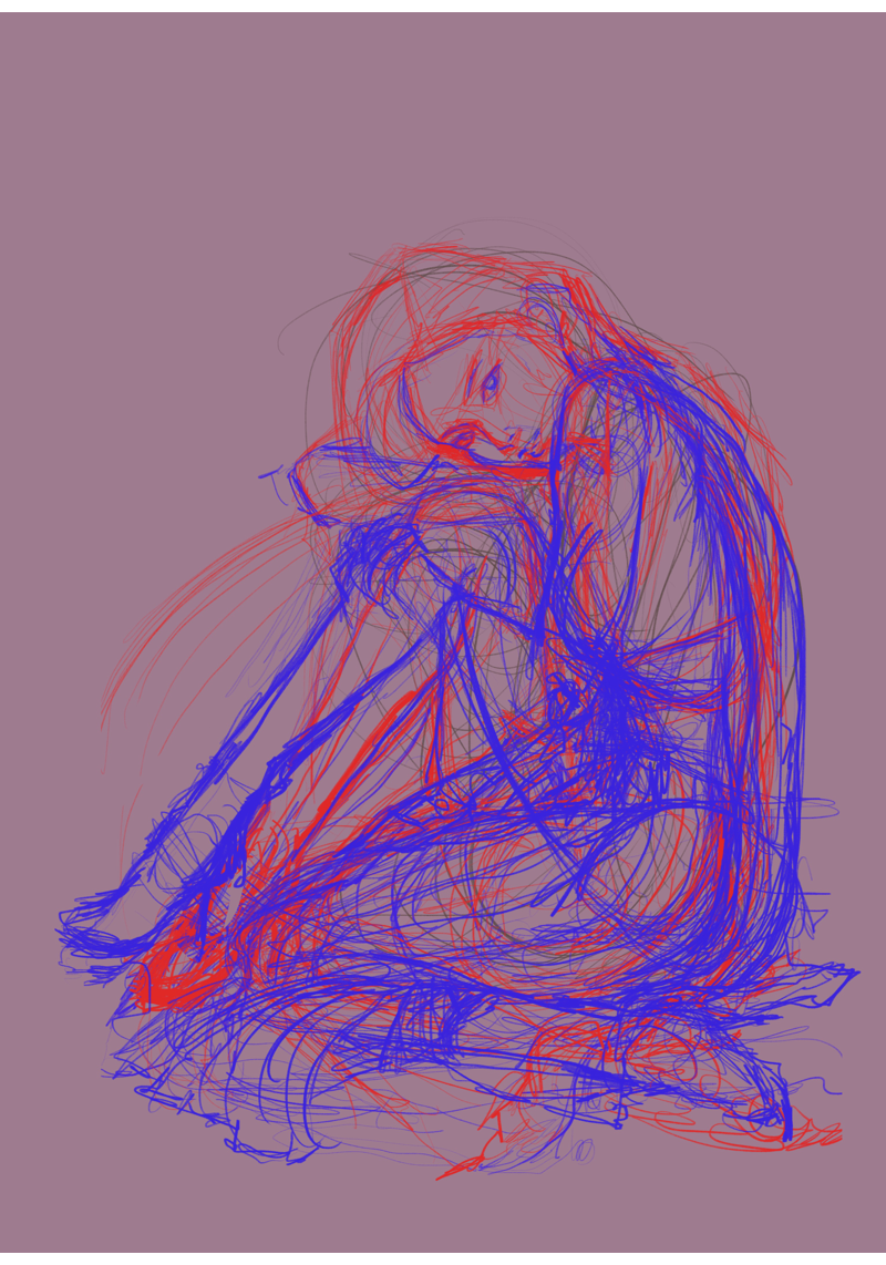
(1)sketch
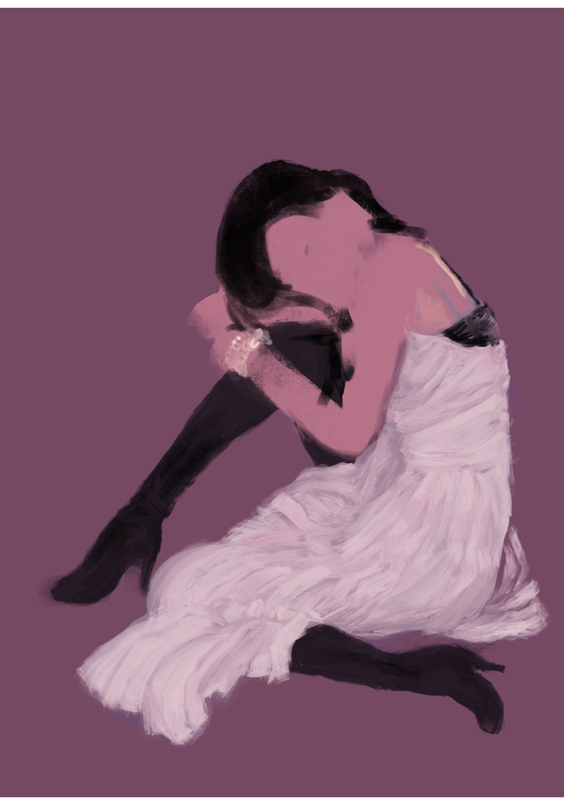
이번 경우에 스케치는 매우 중요합니다. 최대한 상상력을 동원해서 잘린 부분의 모습을 그려봅니다.
여러가지 버전을 겹쳐서 그려나갑니다. 스스로 이해가되는 자세가 만들어질 때까지 스케치를 반복합니다.
그 결과 전통적인 삼각구도를 유도해 냈습니다.
In this case, sketching is very important. I try to imagine the part that is cut off with the imagination as much as possible.
I draw various versions over and over. Repeat the sketch until a self-understanding posture is created.
The result is a traditional triangle composition.
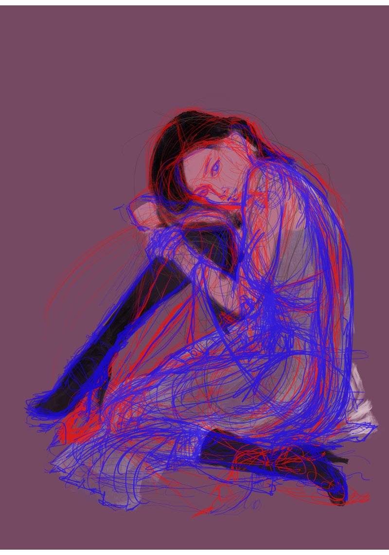
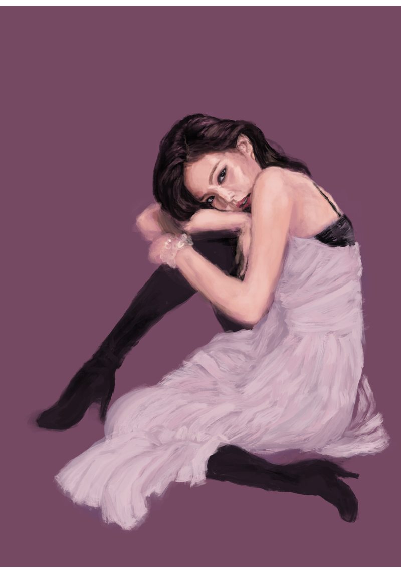
(2)base color
바탕색을 덮어줍니다.
이번 작업에서는 색을 간결하게 사용할 계획입니다.
모발, 피부, 원피스를 각각 검정, 흰색, 분홍색으로 끊어줍니다.
Cover the base color.
In this work, I plan to use colors simply.
Hair, skin, and dress are painted in black, white and pink, respectively.
(3)Detailed description of wrinkles, 옷주름 묘사
제가 좋아하는 인상파 화가들이 즐겨쓰던 기법을 흉내내봤습니다.
겁먹지 말고 색을 올려나갑시다.
우리에겐 ctrl+z가 있습니다.
I imitated the technique that my favorite impressionist painters used.
Do not be afraid to get the color up.
We have ctrl + z.
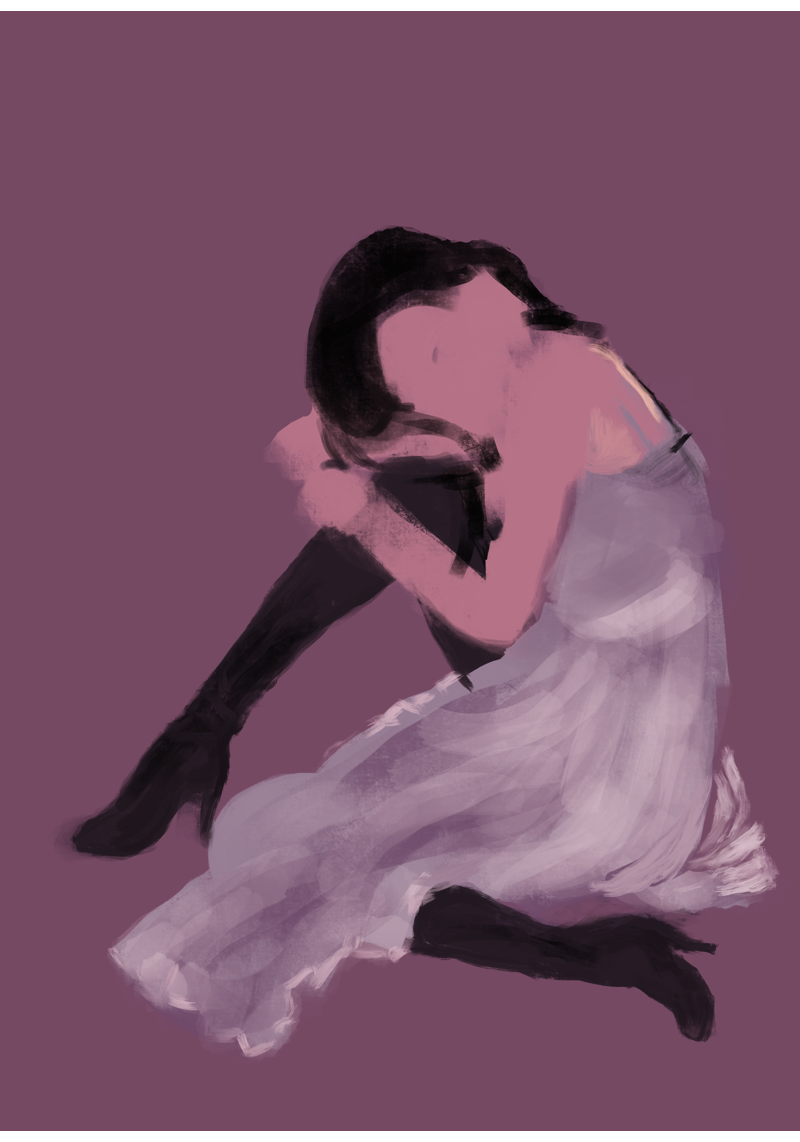
(4)Skin and Hair, 피부와 모발 묘사
간단하게 색을 분할한 후 둥글게 펜을 굴리면서 색을 펴나갑니다.
두개의 색 사이의 경계를 밀어내듯이 섞을 때는 포토샵을 쓰신다면 블렌드 모드, procreate를 쓰신 다면 브러시 옵션을 습식혼합으로 바꿔주세요.
Simply divide the color and move the brush round to soften the color border.
In the case of digital drawing, if you want to blend the border between two colors, use blend mode if you use Photoshop, and change the brush option to wet-blend if you use procreate.
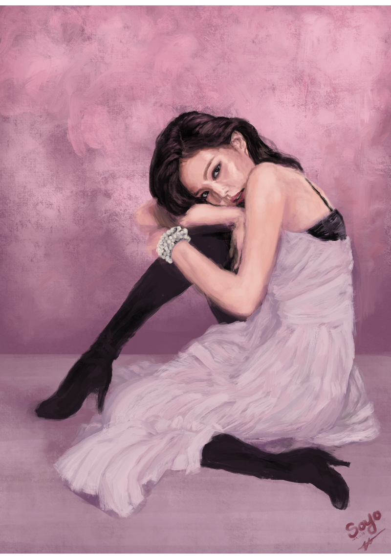
(5) Color adjustment and completion
니코 룰 브러시로 벽에 질감을 주고 밝은 색을 펴발라서 페인트가 칠해진 벽같은 느낌을 만듭니다.
웹사이즈로 저장 한 후 각 기계의 디스플레이간의 차이를 테스트합니다.
총 4개의 기계에서 테스트를 진행했습니다.(아이패드 프로, 아이폰, 엘지 G5, 엘지 울트라북 )
각 디스플레이의 색감에 맞춰서 두가지 버전을 더 만들었습니다. 이 중에 하나는 마음에 드시길 빕니다.
Draws a background. Give the wall a texture and spread the light color to make it look like a painted wall.
After saving in web size, test the difference between displays on each machine.
We tested on 4 machines in total (iPad Pro, iPhone, LG G5, LG Ultrabook)
We have created two more versions to match the color of each display. I hope you like one of these.
Fake oil painting
gear: IPad Pro 12” and ApplePencil
app: ProCreate
brush: terebene, wet acrylic, 6b pencil
위의 튜토리얼은 어디까지나 차근차근 그리는 경우입니다.
사실 저는 좋아하는 부분 먼저 그리고 나중에 거기에 다른 부분을 맞춰서 그리는 경우가 많습니다.
중간 중간 실수도 많이하고 이거 그리다 저거 그리다 산만한 편입니다.
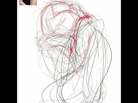
혹시라도 제가 좌충우돌하는 모습이 보고 싶으신 분들을 위해 비디오를 첨부합니다.
The above tutorial is a case study.
In fact, I often draw my favorite part first and then the other parts together.
For this reason, I make many mistakes during the drawing process.
But I like to paint freely because it is so fun.
Here is the video for those who want to see my mess and enjoyable workflow.
I hope you enjoy it

팔로워 분들에게 드리는 말씀!
연휴 동안에 보팅을 너무 남발해서 파워가 많이 떨어졌습니다.
어제만 140개를 했네요.
주말까지 보팅 쉬어야 할 것 같습니다.
양해 부탁드립니다.