Click Here To Enlarge Image
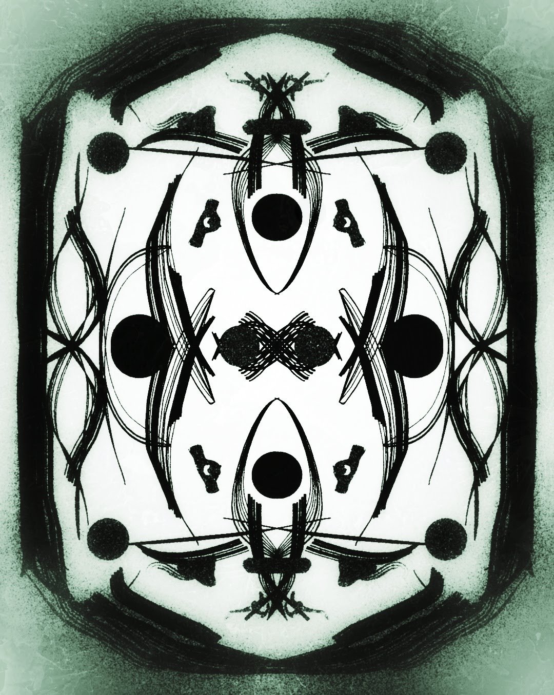
Hey guys, check out my today's abstract creation. One cannot go much wrong with black and white color. The edges I have intentionally kept shaded to give a more focus on the center of the abstract. I was thinking of using more colors but then later decided to just go with black and white. And, after completing the abstract I guess I made the right decision. I hope you like this abstract. I'm very new in this field so any kind of positive criticism is always welcome. Please share your thoughts in the comments section below.
You can also check out some of my previous posts by clicking the links below:
- Minimalist Abstract Art
- Geometric Abstract Art
- Antique Finish Abstract Art
- Textured Abstract Art
- Contemporary Abstract Art


