First Things First
REQUESTS ARE STILL OPEN
If you want your personalized banner
DM me on Discord : zord189#7776
I've changed the title to 'Steemit Profile Designs'. Cause I realized I would be showing you guys not only profile banners but logos as well. :) I got woken up by a discord beep in the morning. It was @mountainwashere requesting for a profile banner! It is definitely my privilege to design his banner. Mainly because it is interesting what this man does. Go check out his profile to find out more.
Once again, got to do a little logo design for the upcoming Steemit's Got Talent series!!! Thanks @steemitgottalent & @bambam808 for the opportunity. It's in Week 10 now!
Mountainwashere Profile Banner

Part 1 - The Idea
I've been reading some of @mountainwashere's posts and this guy is an avid geologists. He talks about ancient stuff, like really really old things. When I was a kid growing up, I always wanted to be an archaeologist. And this guy, is studying about them. So I wanted to take his passion for these things to add them on his banner to show people who he is. And he told me to add lots of mountains. Hahaha, @mountainwashere no doubt.
Part 2 - Layout

There you go! Mountains and layers of them too! The mist for some adventure dramatic effect. I figured silhouettes would help create the depth of the whole banner.
Part 3 - Key Details

I want the man himself to be shown as an achiever, to be a conquerer. Hence, The hiker conquering and reaching the top of the mountain. And also a few fossil details underground to show his passion for these artifacts.
Part 4 - Final

Adding some final touches of trees to create more depth of field to the whole banner.
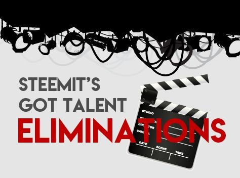
Steemit's Got Talent Elimination Logo
Part 1 - The Idea
This logo was actually pretty hard to do. It wasn't in my many first ideas. I wanted to try merge the word 'eliminations' to the original logo of Steemit's Got Talent but it wasn't working. Somehow it didn't blend. After cracking my brain the whole night. I finally decided to create a whole new logo itself. Heh, I'm only human, and I do have creativity block sometimes too!
I wanted it to have a stage and a judging symbol on it. Stage = performance/entertainment. Judging = the best one wins.
So I came out with the stagelights & the director's tape.
Part 2 - The layout
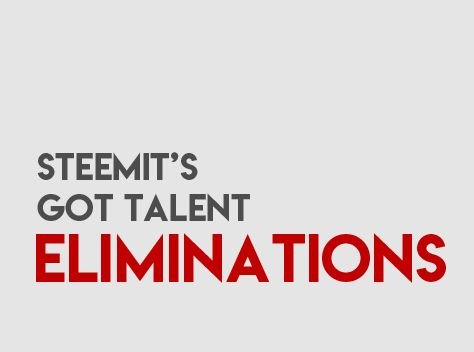
This time the layout, I came out with the texts first. Cause I didn't know what else to do. Wanted to add a stage behind, it looks weird.
Part 3 - Key Details
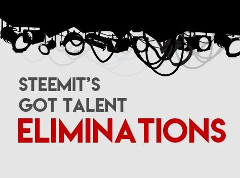
Finally decided to add some stage lights. Just like it is shining on the texts. The stage lights do have a layer behind to create depth as well.
Part 4 - Final

Finally, I thought something was missing. I filled that negative space up with the director's tape. I think it's a perfect tool to 'CUTTTTT', you're eliminated.
Bonus Nugget

@steemitgottalent has just started their week 10 entries!
If you have talents to showcase, I urge you to come send in your entry because there are BIG prizes to be won.
Thank You
If you like what I do, dont forget to check out my other posts on my artworks, photography & animations.
