#10 Animation - The 12 Principles of Animation. No.10 Is a SHOCKER! You will know why. Lol...

Just as important as humans needing air to breathe, animators live on another source of artistic food. Well, the technical side mostly. These are the essentials that every artist have to apply if their art exceeds the still image realm into the world of animation. These essentials will breathe life into the characters, making them more appealing and charismatic to the audience. How isit possible that people laugh, cry or feel all sorts of tangible emotions when watching an animation?? It is through these combined principles that it brings the animation to life.


The 12 Principles Of Animation

No. 1 Squash & Stretch

Haha, just look at that cute chick. :D This first principle is very vital to give a sense of weight and volume to the object/character. Without this, every bouncing ball would carry the same weight value and every movement would be monotonous without any sense of volume to it's action. From what you can see here, the chick is filled with air that is why it floats a little. Sometimes, details like these can even let u guess what air the chick breathe in. Simple principle but VERY important.

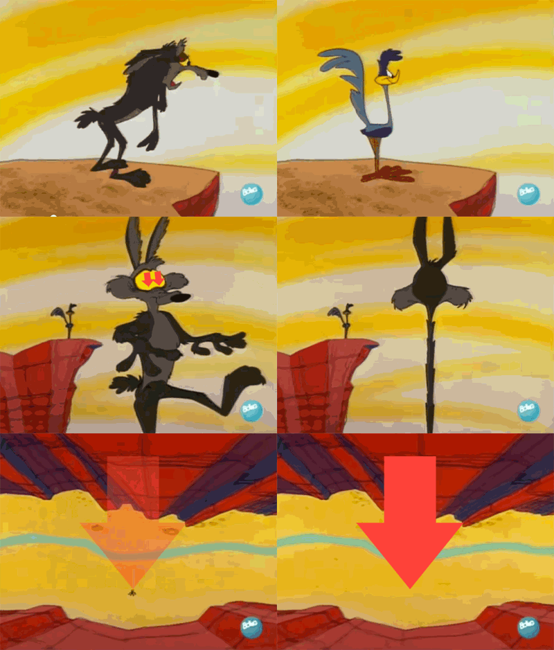
No. 2 Anticipation

Always leading to a key action. This principle is vital to give a sense of 'holding one's breath' before something happens. Some very subtle, some exaggerated like when the coyote falls off the cliff. Also slapstick animation often exaggerate this a lot.

No. 3 Staging

Staging done right will give you all the right feeling. Sometimes, when the director wants the audience to feel weak,helpless and small, the camera angle would probably be like the GIF Animation above. The feeling of the character overshadowing you.

No. 4 Straight Ahead and Pose to Pose
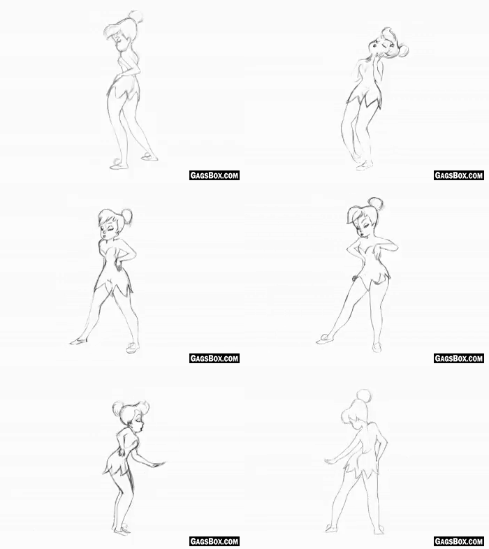
Every animator starts off creating 'key' poses. These 'key' poses have to translate to their entire scenario the character is in. A good pose is when you put a silhouette over the character, you can still understand it's emotions and actions. When the 'key' poses are nailed down, the in-between poses would then be added to add fluidity to the characters.

No. 5 Follow Through & Overlapping

One of the most obvious follow through and overlapping actions can be found in loose clothing and hair movements. When a character moves, the core will move first, following with rest of the parts. Some parts moves slower than the others.

No. 6 Slow-in & Slow Out

Also known as the ease-in and ease-out. Very important to add realism in the movements. All movement must start and come to a stop. By adding more frames in the beginning and the end will give the movement more time to settle without having it so abrupt. Unless if the animation style is snappy and quick.

No. 7 Arc

There must be a proper arc in every action and movement of the character. It is a very OCD-type of thing when suddenly you see the arc of a movement broken.

Just have a look at her hand movements. Really nice arc movements.

No. 8 Secondary Action

We should never ever overlook the little things that make the character comes to life. Secondary actions are there to reinforce and to add to the solidness of the movements. Also, helping to express the story/emotion better. The secondary actions of Mr.Angry here are his arms. This shows how much tension he collects to give one big blowout

No. 9 Timing & Spacing

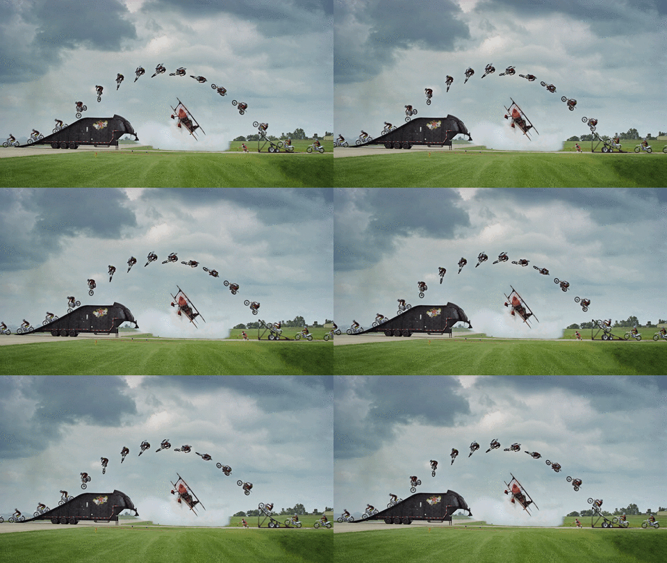
From a sprinting action transitioning into a punching action all needs to have the right timing and spacing to properly deliver the movement. From fast hits (lesser in between frames) to settle(longer frames and spacing).

No. 10 Exaggeration

Yea... I mentioned No. 10 is a shocker up in the title. I was just.....exaggerating!! hahahaha

Like seriously?? Who would do this alone at a waterfall?? Hahaha, but animation needs these exaggerated actions to show that she is enjoying herself. Exaggeration done right would still make the scene believable at the same time evoking a point across.

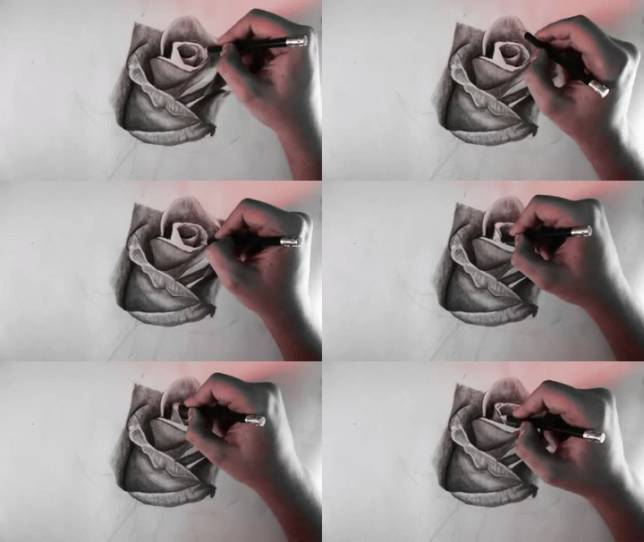
No. 11 Solid Drawings

This is very important because the character or the object has to look like it carries weight and volume. Eventhough the rose is 2D but it has a 3 dimension feel to it because of it's tonal value. Shadings play a very important part to give the drawings it's form.

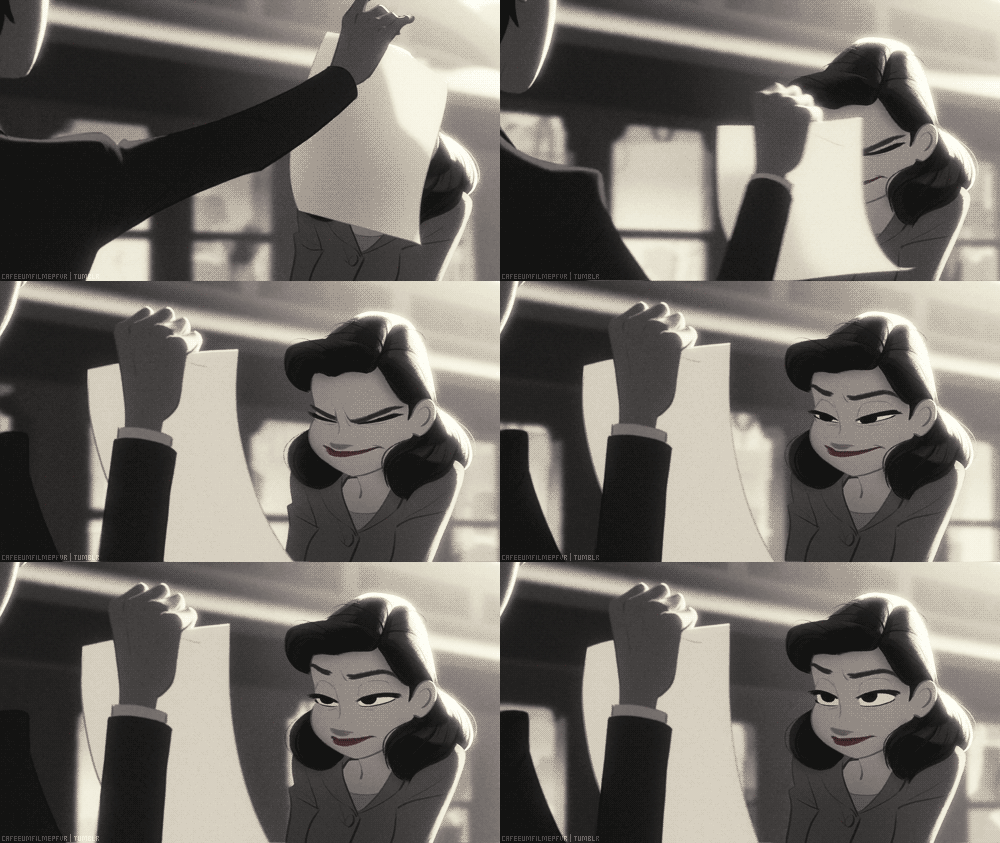
No. 12 Appeal

Though not all characters have to be appealing or likable. It has to somehow draw the audience in. Even a villain needs to be appealing in a bad way. Makes sense?? For me, I always use the short clip 'paperman' because as simple as it seem, the character stand out. Her big round eyes and her petite stature.


I hope that you've picked up something useful from this post whether ur an animator looking to improve your animation or just a fan of animation, wanting to know how all these brought together can give you that laugh, scream or sadness. :)


Thank You

If you like what I do, check out my other posts on my artworks, photography & animations.

I'm also open for

Personalized Steemit Profile Banner,logos & GIFs

DM me on discord : zord189#7776

Sketches_Footer.jpg

Credits to @pinstory & @coloringiship for this lovely photo of me.


APP.png

CLICK HERE TO JOIN THE STEEMIT BLOGGERS ON DISCORD

Animated Banner Created By @zord189

H2
H3
H4
3 columns
2 columns
1 column
31 Comments