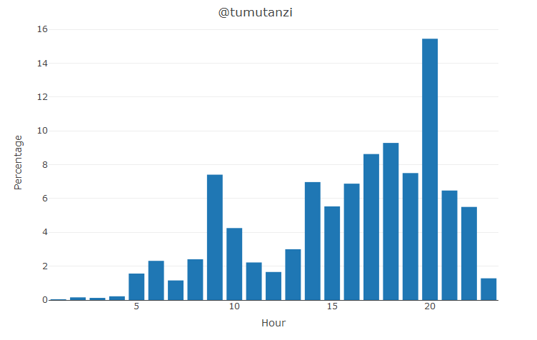
It is useful to know when a whale votes normally during a day so that you could publish your post right at a time when the whale has a higher voting power. With @arcange 's STEEMSQL and R, this becomes so much easy.
For example, I want to know when my best friend @tumutanzi upvotes with his amazing steem power delegated from @ned , we need this STEEMSQL:
select DATEPART(hour, timestamp) "hour", count(1) "count" from TxVotes where voter='tumutanzi' and datediff(day, timestamp, GetUTCDate()) between 0 and 30 group by DATEPART(hour, timestamp)
between 0 and 30 means we are extracting data for the last 30 days. And we group the results by DATEPART(hour, timestamp) which is the hour in UTC time zone.
Now, we wrap this in the R function, like what we did before:
votes_hour = function(id) {
  conn <- odbcDriverConnect("Driver=SQL Server Native Client 11.0;Server=sql.steemsql.com;Database=DBSteem;Uid=steemit;Pwd=steemit")
  x <- sqlQuery(conn, str_c("select DATEPART(hour, timestamp) hour, count(1) count from TxVotes where voter='", id, "' and datediff(day, timestamp, GetUTCDate()) between 0 and 30 group by DATEPART(hour, timestamp)"))
  close(conn)
  return(x)
}
Here is how we use this function by passing the Steem ID.
id = "tumutanzi"
vote <- votes_hour(id)
Let's examine the data:
   hour count
1     1     1
2     2     5
3     3     4
4     4     7
5     5    50
6     6    74
7     7    37
8     8    77
9     9   237
10   10   136
11   11    71
12   12    53
13   13    96
14   14   223
15   15   177
16   16   220
17   17   276
18   18   297
19   19   240
20   20   494
21   21   207
22   22   176
23   23    41
OK, if we want to compute the percentage, we just need to sum up the total count and then divide each count:
total = sum(vote$count)
vote$count = vote$count / total * 100
We also need to use the plot_ly from plotly library if we want to visualize the result:
plot_ly(x=vote$hour, y=vote$count, type="bar") %>%
  layout(autosize = F, xaxis=list(title="Hour"), yaxis=list(title="Percentage"), title=str_c("@", id))

Thanks @tumutanzi as he spends most of his afternoons and evenings upvoting good posts.

Image Credit: Pixabay.com
想知道你的贵人啥时候点的赞?我们可以通过 @arcange 's STEEMSQL 得到点赞的时间然后通过 R 语言很轻松的画出来。
比如,我的好基友 @tumutanzi 自从拿到 @ned 所代理的50万SP 后,是不是像他所说的,忙得连X生活都没有了呢?我们可以先用 STEEMSQL 取出数据来看看:
select DATEPART(hour, timestamp) "hour", count(1) "count" from TxVotes where voter='tumutanzi' and datediff(day, timestamp, GetUTCDate()) between 0 and 30 group by DATEPART(hour, timestamp)
between 0 and 30 是针对过去30天的数据,然后我们通过 DATEPART(hour, timestamp) 来分组(按UTC时区的小时)
接下来和我们以前做的一样,在R语言里封装一下。
votes_hour = function(id) {
  conn <- odbcDriverConnect("Driver=SQL Server Native Client 11.0;Server=sql.steemsql.com;Database=DBSteem;Uid=steemit;Pwd=steemit")
  x <- sqlQuery(conn, str_c("select DATEPART(hour, timestamp) hour, count(1) count from TxVotes where voter='", id, "' and datediff(day, timestamp, GetUTCDate()) between 0 and 30 group by DATEPART(hour, timestamp)"))
  close(conn)
  return(x)
}
我们需要传递 ID 给这个函数。
id = "tumutanzi"
vote <- votes_hour(id)
检查一下返回的数据:
   hour count
1     1     1
2     2     5
3     3     4
4     4     7
5     5    50
6     6    74
7     7    37
8     8    77
9     9   237
10   10   136
11   11    71
12   12    53
13   13    96
14   14   223
15   15   177
16   16   220
17   17   276
18   18   297
19   19   240
20   20   494
21   21   207
22   22   176
23   23    41
如果我们想计算百分比,我们需要把每一个次数除于所有。
total = sum(vote$count)
vote$count = vote$count / total * 100
然后在R里通过plot_ly 来画出柱状图:
plot_ly(x=vote$hour, y=vote$count, type="bar") %>%
  layout(autosize = F, xaxis=list(title="Hour"), yaxis=list(title="Percentage"), title=str_c("@", id))

看来, @tumutanzi 的确是连X生活都没有了呢,哈哈。
@justyy 是 https://justyy.com 的博主,在 @tumutanzi 大哥 的介绍下加入 STEEMIT,写些帖子挣些小钱养家糊口。
@justyy 也是CN 区的点赞机器人,对优质内容点赞,只要代理给 @justyy 每天收利息(年化率14.6%)并能获得一次至少2倍(VP 200%+)的点赞,大鱼 @htliao 都加入了这个计划(530 SP)表示支持。
R 教程之 STEEMIT 大鲸啥时候点赞的?
R Tutorial – Knowing when a Steem Whale vote?
Steemit 在线工具和API接口
SteemIt Tools and APIs
