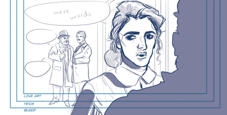
So in recent affairs, my computer is deciding to crap out on me; it keeps randomly restarting itself which makes working on art feel like I'm trying to diffuse a very temperamental bomb. One wrong move and I blow up (or lose precious artwork...same thing). Somehow I've managed to keep up with my work and it's mostly thanks to my trusty hard drive and habitually saving every minute.
But anyways, here is another look into my 19th century gothic comic:
Page 4
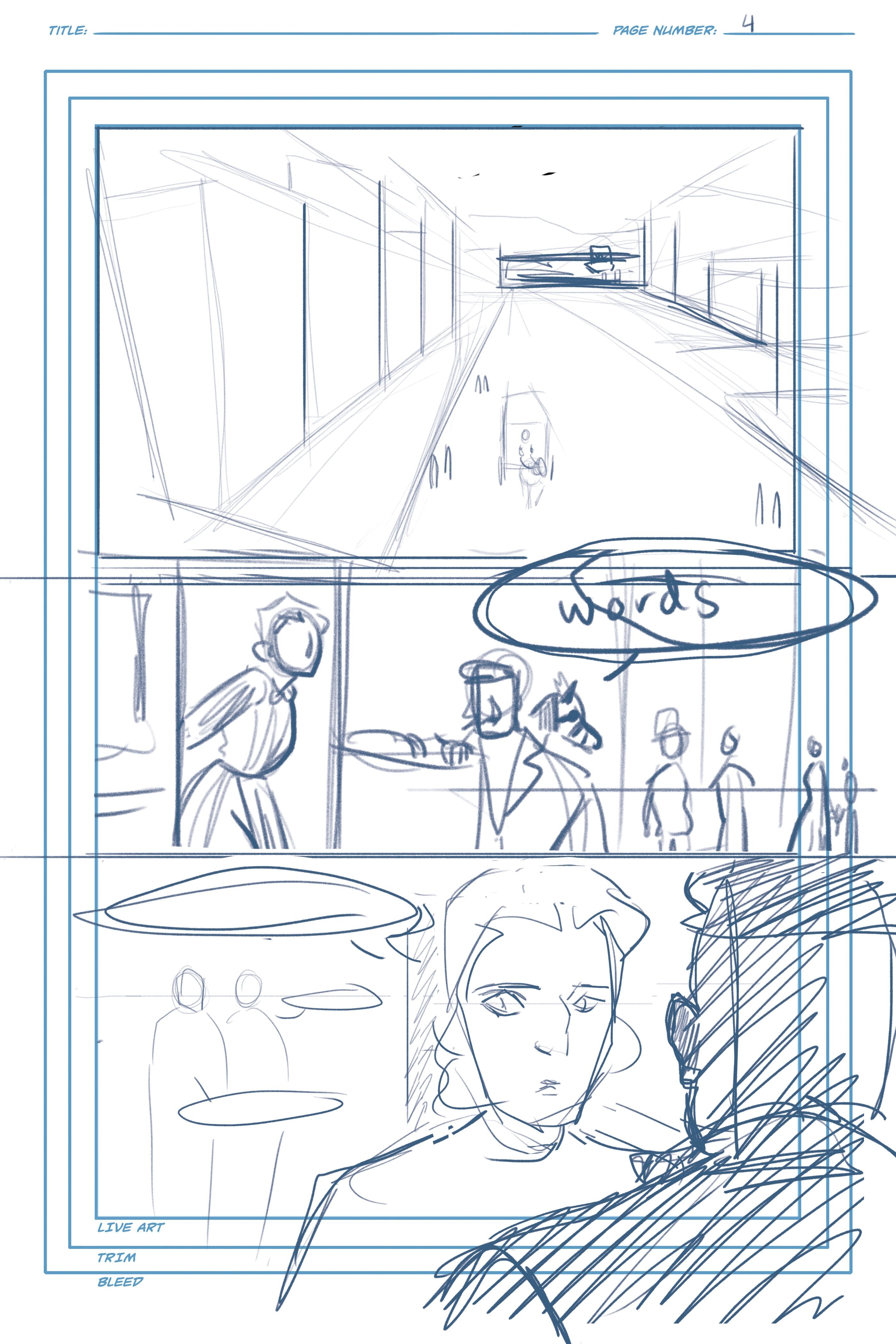
In panel 1 you can see some perspective lines; it's one-point perspective meaning there is only one vanishing point on the horizon line. As you can see all of the diagonal lines are emanating from one point in the center.
In panels 2 and 3, you'll see I'm not working with a perspective grid but instead just using the horizon line. Because there aren't any building or objects that need perspective in these two panels I'm using a "perspective hack"... if you will. If you're drawing people, the horizon line will cut through them at the same place no matter how far or close they are from the vanishing point. For example, in panel 2, the horizon line is hitting the shoulders of the carriage driver and the people in the background (not the girl, since she's at an elevated height). In panel 3 it's eye level. Now if the characters are a different height it won't intersect at the exact same point but it's easy enough to just draw a line then making a whole perspective grid if it's just people in the frame.
While I'm no expert in perspective, if any of you are interested in a little basic perspective 101 let me know.
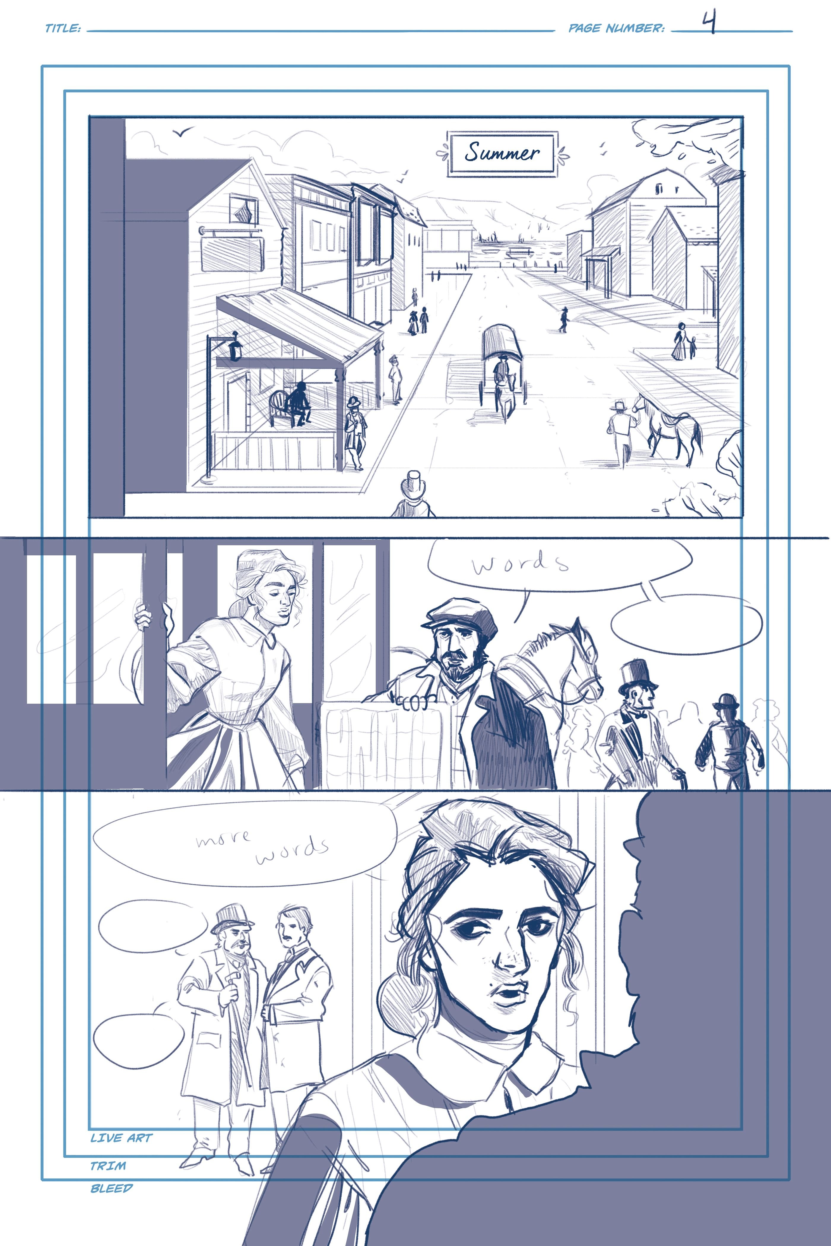
I'm making an effort to spot my blacks better ("spotting blacks" is a term used in cartooning for designating large areas to be filled with black). As mentioned in a previous post, I'm looking to Alex Toth, Becky Cloonan, and Mike Mignola to see how they execute their page compositions. All of them have an amazing ability to distinguish objects with large black areas as opposed to rendering every single detail. I've always been drawn to more graphic looking artwork and I think it will make things more moody, which is something every gothic tale should aspire to be.
Page 5
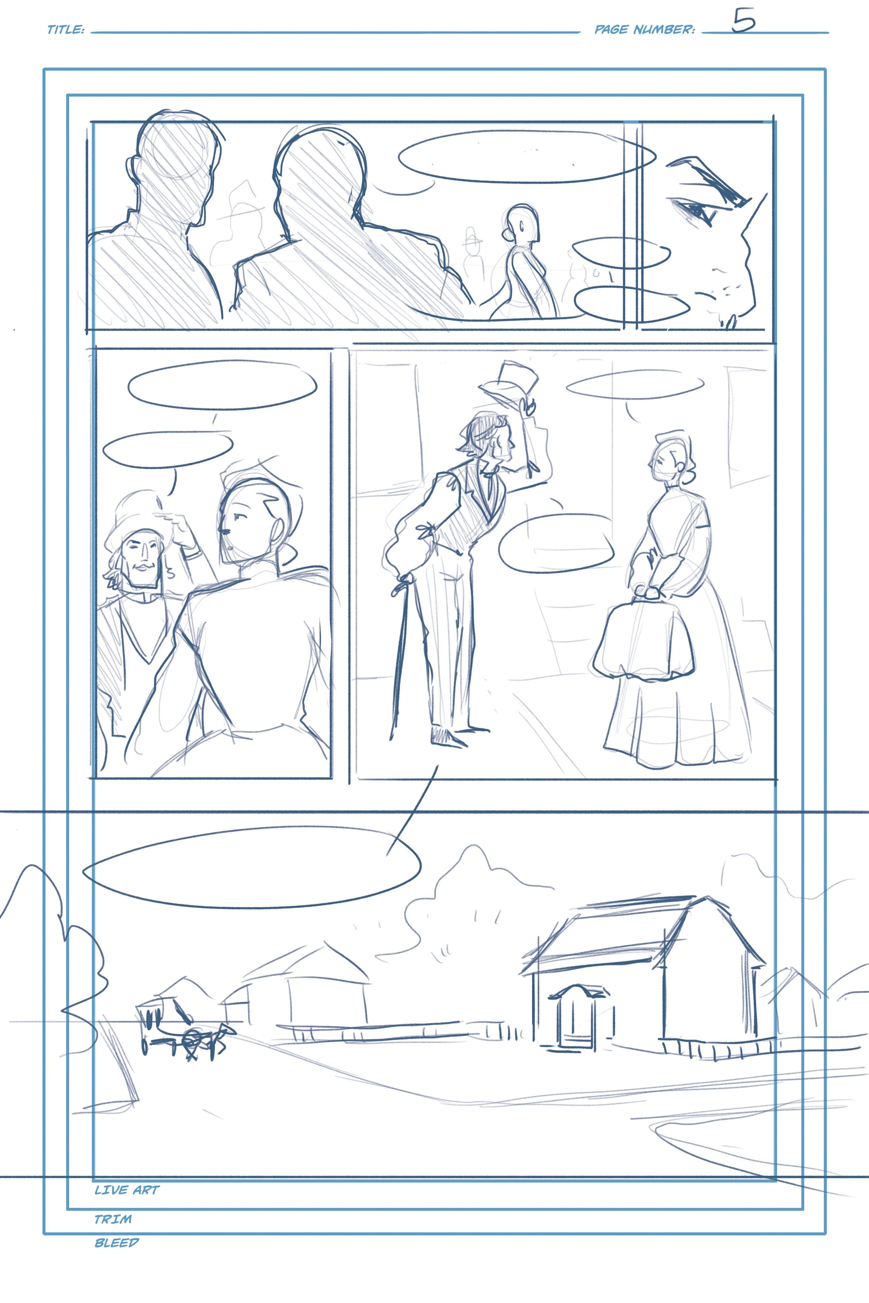
Large areas of black ink are also a good way to guide the eye and direct attention to certain areas. It's like an arrow pointing, "Look here!"
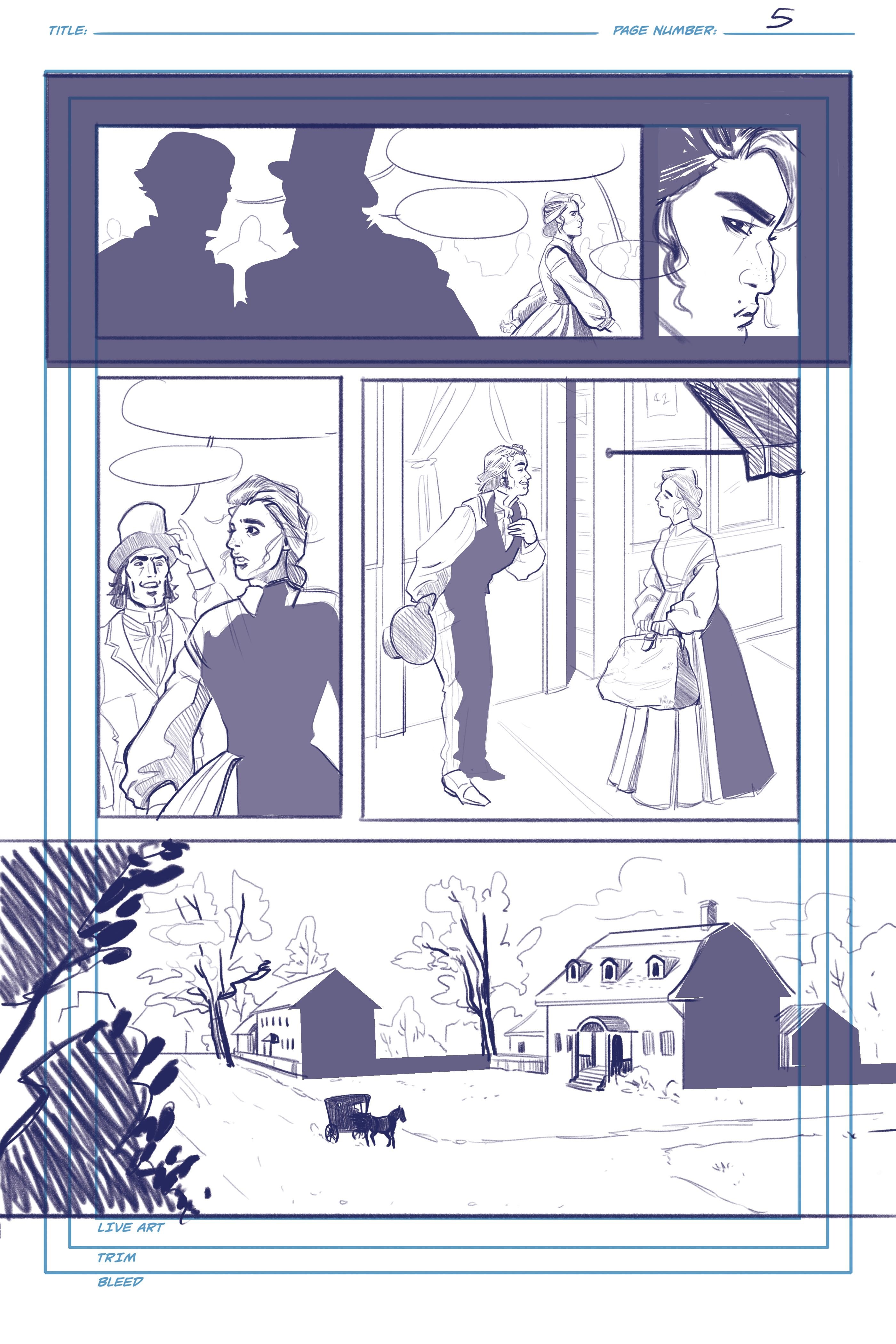
Spotting blacks also can help establish depth, distinguishing what elements are in the foreground and what are in the background.
An easy way to figure out what to be black is to establish your light source: what direction is the light coming from? Then, shade in the sides of the object that aren't in the light. Spotting blacks do not always have to correspond with lighting, however. You can bend the rules and just frame a person or object to draw more attention to the subject.
That's it for pages 4 & 5
Ending questions for you lovely folks of Steemit:
- What cartoonists/artists do you look to for inspiration?
- What is your favorite gothic novel?
Stick around for more page updates!
You can check out my previous comic updates here:
If you'd like to keep up with more of my work you can check me out at the following:
Instagram: @la.fumettista
Tumblr: http://la-fumettista.tumblr.com/tagged/art
Twitter: @TheresaChiechi
Website: https://www.theresachiechi.com/
