I was always very fond of knives - I always carry a pocket-knife and as I use a lot of time in the kitchen I daily use good kitchen-knives. A while ago two of my medium size kitchen knives disappeared... (yes, I know, and I haven't got any idea where they are), and I began thinking about having some new ones. And why not have them made, instead of buying boring standard knives?
So one evening I talked to @evilhippie, the best blacksmith on Steemit, and we agreed to try to make a knife together. After a lot of sketches we decided on a knife that was inspired by the Scandinavian Iron-age.

Go see Evil Hippies post about how he made the knife!

So after the knife was made in steel, @evilhippie asked me if I could make a logo for it and of course I agreed. We are calling it Madsted Kniven (the Madsted Knife) after the small village where it was conceived, so that was the letters I had to use.
As the design was inspired by the ancient Danes - I decided to draw the letters as rune, or something close. I adopted the upper and lower lines that can be seen on rune stones, and let the upper and lower horizontal lines of the E disappear in the general lines.
I wasn't too concerned with readability in this project. I like that the letters at first seem a bit unfamiliar, as if they were real runes and that it is first after a second the brain decodes the letters.
I have worked a lot with letters and no longer use premade fonts. I simply draw, and then I tweak it in a vector program ( I use the open source program Inkscape.) As you can see I haven't gone through all the detail yet. I plan to make the letters in the second line equally thick as they are in the upper line for example.

As the first letter, instead of the letter M I used the rune that @evilhippie uses as his trademark and stamps into all his blades. It is the rune Mannaz in @evilhippies own design.
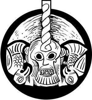
After the letters I added two ravens that I had already designed. They are there as an allusion to the Norse God Odin who was probably also worshipped in the late Iron-age.
I also made a design for the box as @evilhippie had orders for knives that was to be used as Christmas-presents.
)
Making logos, monograms and exlibris has been a fun and lucrative business for me, but normally I never publish them as they belongs to the customers. But this logo was for a project that I participated in so finally I can show some of my works in that field too.
And... remember to go see how the knives was made :)