Ever since the launch of @sndbox's competitions for reimagining various crypto logos, I've been meaning to take part in one but simply haven't had the time. Luckily, I'm back in India for some weeks and I've spent a lot of last week hanging out with @soulturtle. We often do art parties and decided to work on the Steem Edition of the Crypto Art and Design Challenge for one of them.
A Little Background
Both of us consider Escher our favourite artist and spent a considerable part of the week going through a collection of his works and then making our own tessellations. So, when it came to choosing an artist for this challenge both our minds went the same place. While @soulturtle's started off on a steem tessellation, I found myself facing the biggest art block ever.
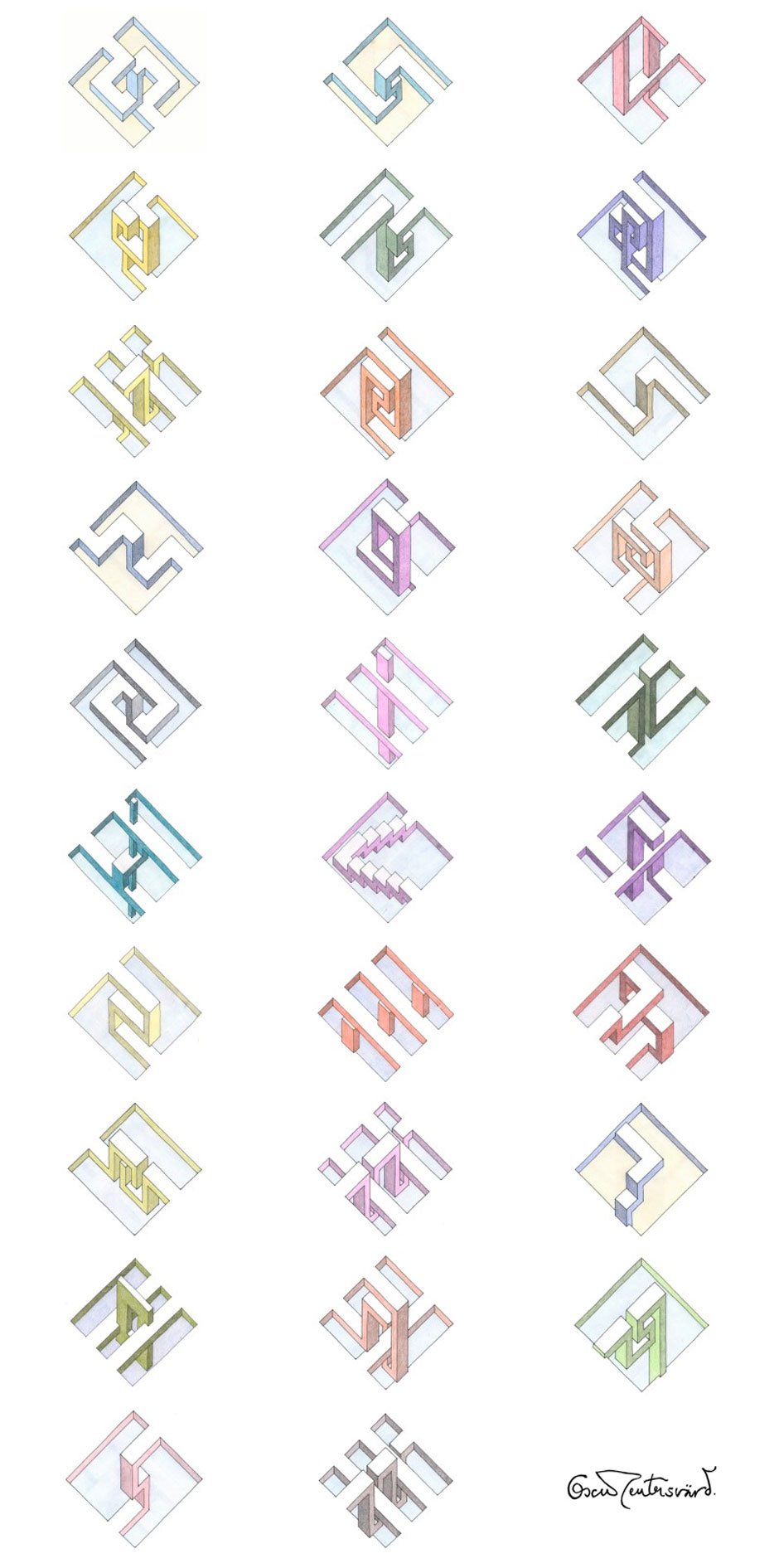
I wanted to use Escher's 3d objects as an inspiration but my mind would not bend to create a steem version of it. I was looking at images online and one click led to another and soon I stumbled upon another artist - Oscar Reutersvärd.
Oscar Reutersvärd
Oscar Reutersvärd is a Swedish artist who drew the first impossible triangle in 1934 and a quick glance at his work reveals that he is indeed the father of impossible figures. Both Escher and Roger Penrose were inspired by his drawings of impossible structures to create the now famous Penrose Triangle and Escherian Stairwell. Reutersvärd plays with illusion on planes and most of his drawings are represented in parallel projection. As soon as I saw his work, I knew that I would choose him as my artist for this competition.
The Entry
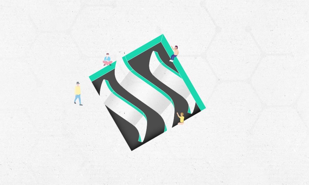
I'm not going to lie, this was difficult for me. Being enthusiastic about the artist's work is one thing. Interpreting it, especially a style that involves illusions, requires a lot of brain power. I spent an entire day in frustration, unable to make the s of the steem logo bend to go downwards. A lot of sketching on grids, trials on sketchup, drawing on illustrator, photoshopping on photoshop later, I got to somewhere that vaguely resembled what I wanted.
The reason why I wanted to play with Reutersvärd's style was because it explains my interaction with steemit. I liked how there was a plane that seemed to be the floor which flows in and out of a depression which is its own world. For me, steemit is like this punctuation on the floor. @soulturtle once said
'You're my only real friend from steemit but it doesn't make the rest of them less real'.
I feel like I live life in the real world and then I jump into the steem world which has bridges to the real world but also runs on its own rules.
Anyway, I tried pretty hard to get the steem logo to bend and curve to express that thought but this was the best I could do this time. I used the green from the steemit logo on the website and changed the absolute black to more of a grey. There's still a bunch of things I would change about it but if anything, I'm glad to have found a new artist through the competition.
Here's to you, Oscar Reutersvärd.
I would love to know what you think of this and if you have any suggestions, do drop them in the comments! Especially if you know how to bend this s in steem.