Hello friends!
Next day, next contest :)
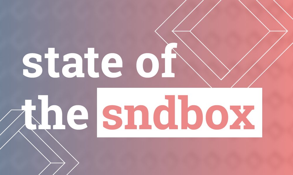
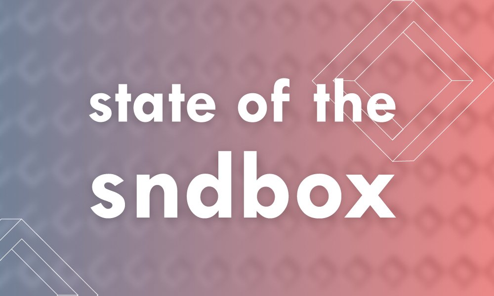
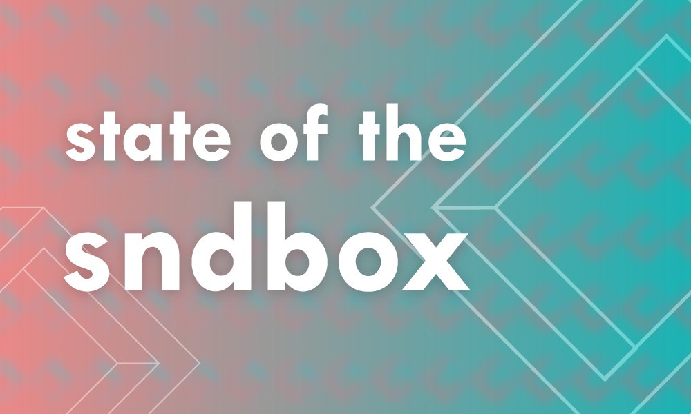
These are my entries for thumbnail design for #sndbox. I was working with their colors and trying to create an interessting composition using the geometry of the logo. My main goal was legibility in small size and eye-grabbing visual style.
version 1
version 2
version 3
version 4
Which one do you like?
I will upvote your comment tomorrow if you like the same one as I do.

Andrej Cibík @andrejcibik
Web design | Web development | Logo design
