A little bird told me that Steemit Private Messages will soon be a real feature! This is great news for the lot of us waiting patiently for this to be available. Since that day has yet to come... I decided to do little design concept on the potential look and feel of the private message feature. I tried to keep within the current design of steemit.com, using elements found thought-out the site and maintaining a continuous flow between messages and the rest of the site. The following is what I came up with for the Desktop side of things, I am still working on the mobile UI and will post that when I have it finished.
Messages Page/Tab
example my messages page
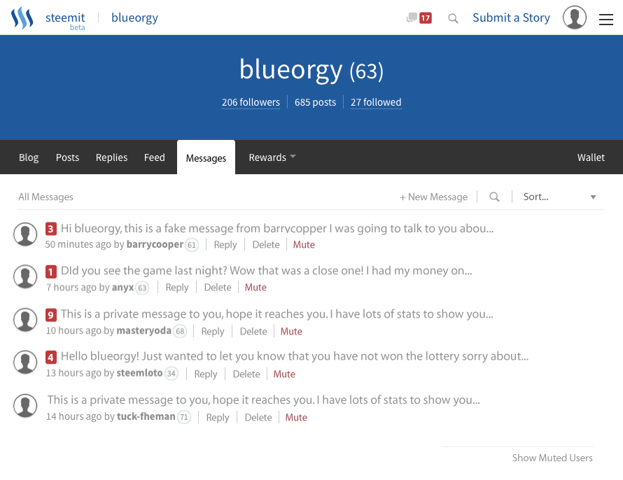
- Current Messages icon on top right of navigation bar
this will give the user a quick glance at his/her current messages
when new messages are un-read they appear in red to notify the user - All Messages
messages aree listed out in chronological order by default
messages counts for new un-read are highlight in red
quick access to reply, delete, and of course Mute
Mute will hide the current and all new messages from the selected user - Show Muted Users
will reveal all muted users and the ability to un-mute them - Search
on hover: will reveal small search box for one word or username searching
on click: will open new page inside with a larger search box - Sort...
will let the user sort the current messages by: username, date, message count, reputation... - New Message
will lead you to a new page (seen below)
Create New Message Page
example my new messages page
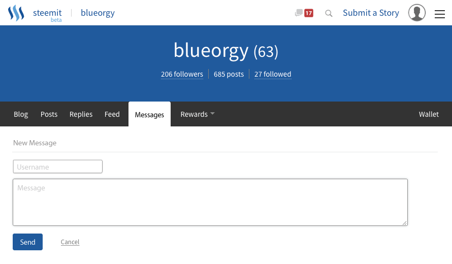
- Username Field
which user will the message be sent to - Message Field
message that will be sent to selected user
will allow markdown and all featured that any reply would have
Private Message with User View
example chat with @steemloto
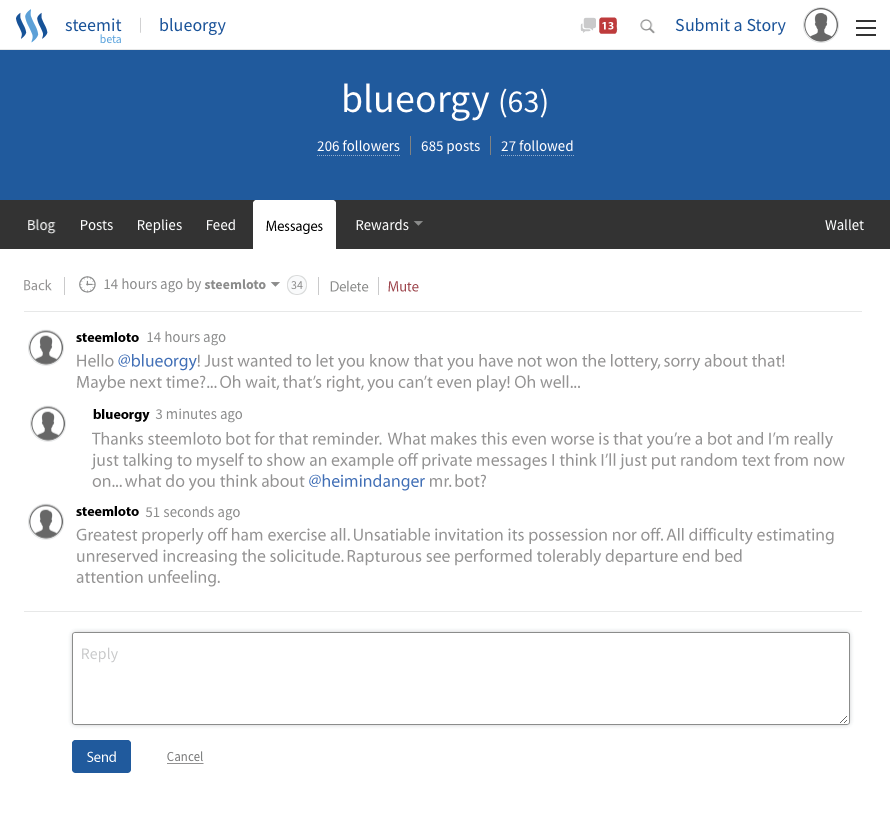
- Delete
will delete the current conversation - Mute
will mute user and go back to All Messages page - You will be indented slightly for visual chat representation (This is the most simplistic way I could see to do it, most more complex ways seemed unnecessary)
- Quick Reply Box
easily reply to last message as you would any comment
markdown and all features of regular reply box available
New Profile Header for other users
example new header for @dantheman
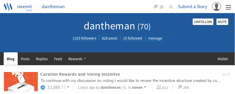
- Message Button
simplistic new button underneath username that leads to the Create New Message Page with the username pre-loaded in the username field - Current Messages Icon
displays current messages in your mailbox
link to All Messages page
That completes my Private Messages UI Design Concept let me know what you think on my design and any thoughts you may on what the real PM UI design will look like. Will I be close? As i said at the beginning of the post I will be completing my Mobile design soon and will post that up when I have it. If I here anything about when the private message system will be released I will let everyone know!
Looking forward to your responses!
Blue
