It’s time to take a look at some more puzzling design decisions. In this addition I’ve broken down the botched plans into three categories:
1.) The Emperor’s New Clothes. People are supposed to believe that it looks good because an architect or designer created it and therefore it must be good!
2.) You Mean That You Didn’t Try it First? Any amount of testing would have shown that the design didn’t work or wasn’t practical!
3.) What do You mean That You Didn’t Think of That? A designer should be able to foresee certain end use problems!
Let’s Take a Look At Today’s Examples of Shame!
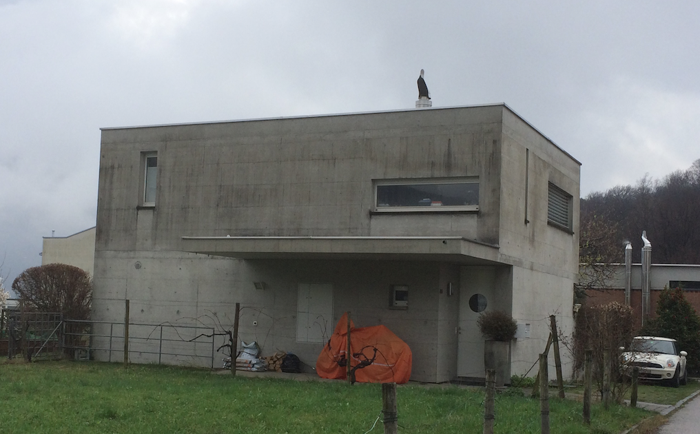
1.) The Emperor’s New Clothes: The Shoebox House Design.
What are the elements that make for good design? Shape, color, pattern and texture can all be used. Right now, where I live, in the past 15 years or so the fashion in houses is what I call the shoebox design. Take a box, cut openings for windows and doors and voila.
Flat, uninteresting, colourless and boring!
These houses are typically constructed of re-inforced concrete with no finish or color added. There is practically no use made of 3 dimensions, and therefore the designs are flat and boring. The eye is not made to move but is paralyzed by the static nature of the boxy design!
There is also no overhang on the roof, which cause water to cascade down the walls. This fascilitates the formation of mold and stains the windows with lime scale!
This begs the question, why was a designer or architect even necessary?
2.) You Mean You Didn’t Try it First?
Here we have a simple garbage bin that is used in the washroom of a physiotherapist to hold the paper towels used in drying ones hands. After pushing down on the foot pedal to open the lid you can see that the inner basket has a nested metal handle with which to lift out the can.
Notice the imbedded metal handle which is supposed to assist in lifting out the inner canister!
When emptying the towels the metal handle flops down and obstructs their exit!
The problem with this metal handle is that when emptying the basket into a garbage bag for disposal the handle forms a barrier to and stops the paper from dumping out! Bad design period!
3.) What do You mean That You Didn’t Think of That?
Here is another example of installing a window that doesn’t open in a place that is ridiculously hard to get at for cleaning purposes. This window is at a high-end auto dealership and we wash the windows for them every month.
Dangerous, time consuming and expensive to clean!
We can’t even get near the window with a cherry picker and so we’ve got to climb up onto the sill with a ladder and then latch on a safety harness to the frame! This, of course, makes it very costly to clean. Installing a sliding door and putting a railing across the opening would have made things cheaper and easier!
Here's a view from the inside. A lack of foresight makes this job an expensive nightmare!
- Can you see the problems with these designs?
- Do design blunders plague you?
- Do you have any examples of design blunders?
I hope that you enjoyed this look at "The Designers Hall of Shame Part Two!"
Until next time,

@kus-knee (The Old Dog)
Remember, I reward the best comment(s) on each of my posts with my "The Old Dog is Throwing You a Bone" program! So please re-steem and follow so that we can spread the wealth!

