Hi Steemit, it has been a while!
Today I am going to walk you through the signage project that I’ve been working on for the Herbert Von King Park in Brooklyn New York. As I announced in my earlier post, I got SBD donation from @hitheryon and @sndbox to continue projects at the STEEM Park site. These posts will help round out the in-depth considerations that go into a simple piece of signage, all while fundraising for more STEEM-POWERED amenities for the park!
Do people really look at the sign?
When people are touring historical sites, national parks, or wetland restorations, they spend a good amount of time reading signage for facts and other interesting tidbits. How about urban parks? Information signage at urban parks don't seem to get a same level of attentions from the crowd. People visit urban parks primarily to rest, and enjoy a chunk of nature. Especially in New York where parks are mostly a moment of respite...
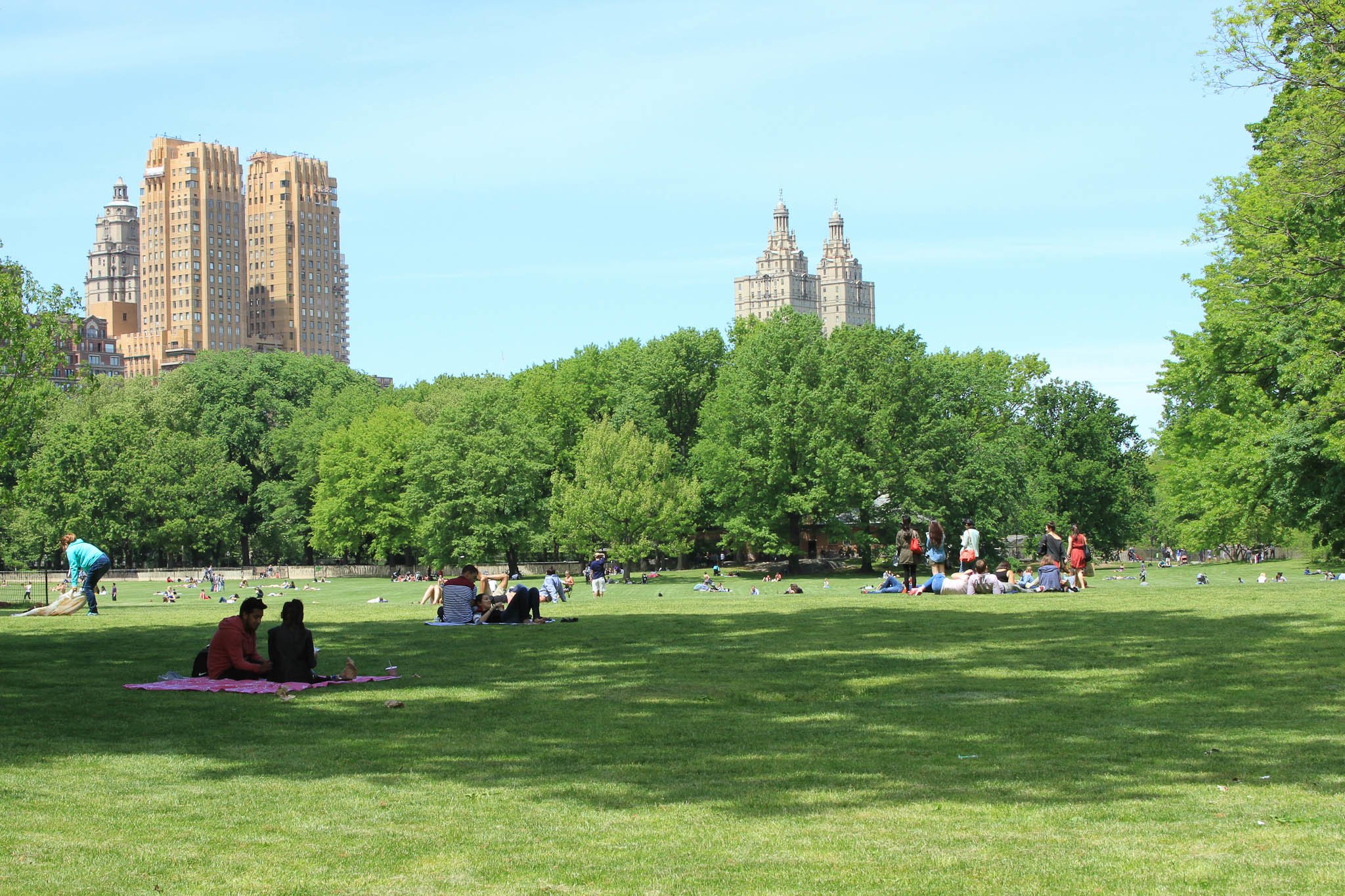
Central Park | Source: Timeout NYC
Then why is the urban park signage important? Park amenities, like signage, show that parks are being taken care of and are visual cues that the park is a welcoming place for the public.
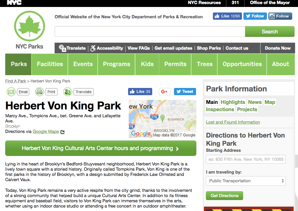
Herbert Von King Park has been attracting a spectrum of demographics. Adults, kids and the students. The neighborhood has been gentrifying rapidly. There are new incomers at the park who recently settled in the neighborhood. However, there is nowhere to get information regarding the park besides NYC Parks, the government website that is outdated and doesn't contain immediate information like community leaders, organizations, current events, etc...
We wanted to find a way to communicate between these groups and tie the diverse community together. This project will hopefully be a solution for all of these developmental gaps. Though relatively small, the map will give the park a face and cohesive energy that it hasn't had before.
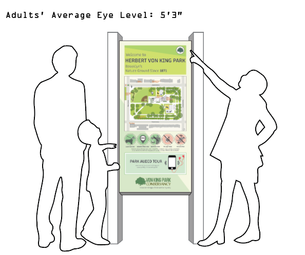
The Eye Level
Important thing to note is the eye level of the signage. The US Standard is 5’0"-5’3” is a typical eye level (of adults) for an outdoor public signage. So the information that you want people to see first should be listed there. Just like shopping at a market or department store, placing key info at this level and expanding in other directions is the main tactic.
The Site Map
Site map is not only for people to use to navigate within the space but to also consolidate information for park visitors to know what to do and where. The names of certain sites within the park like amphitheater, cultural art center, etc. strengthen that sense of place and lead to situations where people generate a feeling of ownership – i.e. “I'll meet you at the pit! (amphitheater). Specifying certain activities within specific location means that certain activities are not allowed or encouraged. Portraying that nuances of this is something that I am still trying to learn.
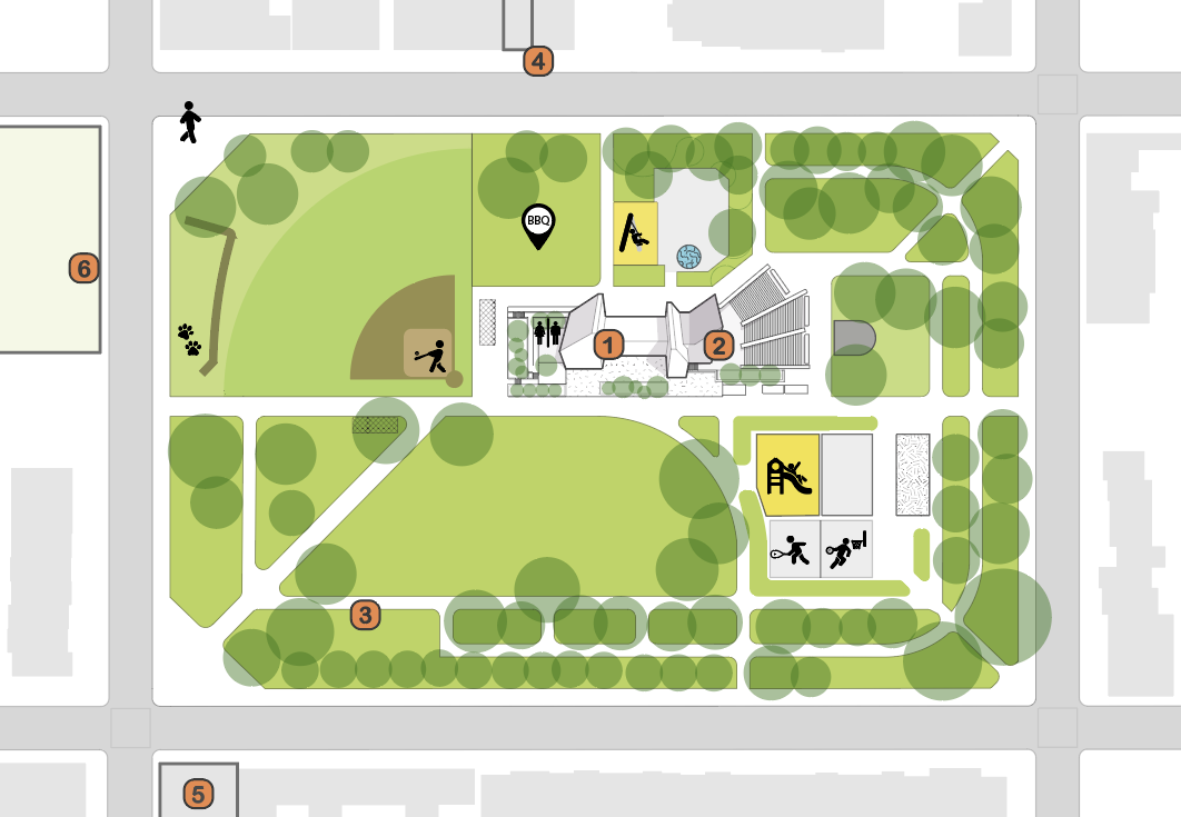
Finally, a raw file of this map will be useful when we are trying to develop a certain area to use and need exact measurement for art installation, measure the plant quantity, etc. It will serve a more casual way-finding purpose in this sign but will be useful as a technical resource as well.
Thanks for following me through these main elements of the project! In my next post, I will explain the details of the social elements including the audio tour and historical sections.
