This easy and hands-on guide will show you how to use Fonts in your cover design for Steemit, Dtube and other platforms. In the last two episodes we leaned about How to select a picture and The Power of Color.
photo source unsplash.com
As always i want to thank some people before I get started. This time i want to turn your attention towards @gmuxx, @anikekirsten, @princessmewmew, @ocd and the wonderful @thewritersblock group, where i found so many friends. Ok, and now let's get started:
Fonts tell a Story
If you learn only one thing from this episode, it is that Fonts are about emotions. They are like the Title Music of a Movie. They set a scene, tell a story, give you a feeling.
To understand this better, it helps to look at some Fonts used in Movies
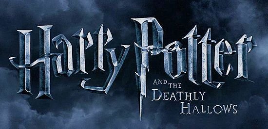
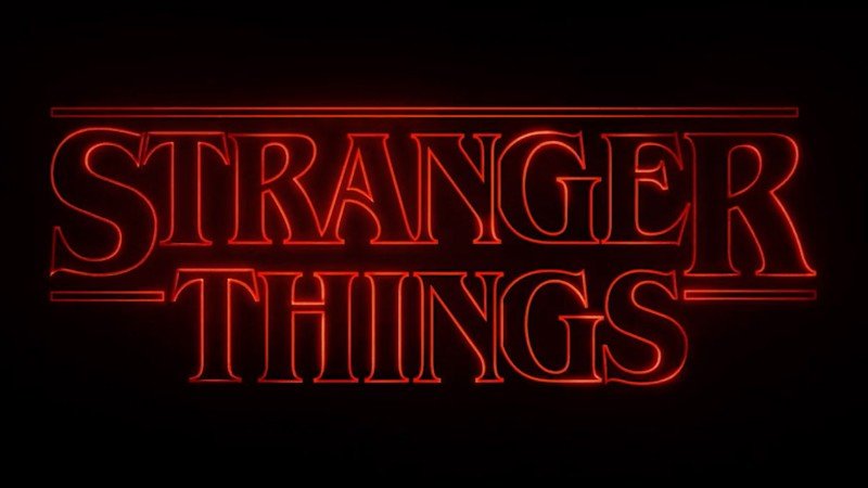
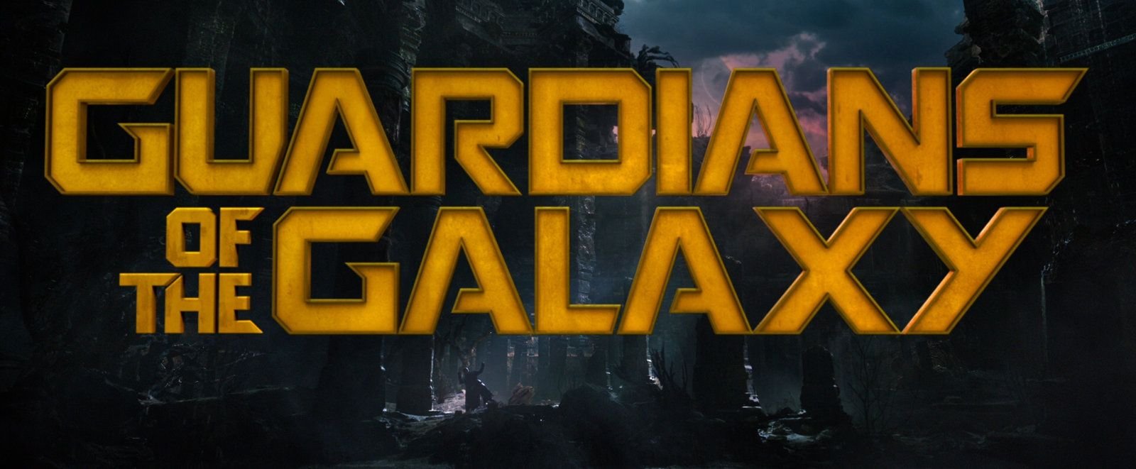
As you can see, the fonts that are used are not by chance. They tell a story and give you a feeling about how the creators of the movies want you to feel. Often it is enough to look at the Font used to make you interested in watching the movie.
You might argue that you are not going to make a movie or have that kind of budget. Luckily we can get a lot of FREE fonts and they can be used for any purpose - video, music, post, you name it.
Where to get fonts?
There are several sources i can recommend:
- https://www.dafont.com/ - a lot of free fonts, also free for private use and paid fonts too.
- https://www.fontsquirrel.com/ - fonts that are free for commercial use
- https://creativemarket.com/fonts - paid fonts, but very creative and high quality & at low prices. Look for Bundles
It's a good idea to think about getting a Font that speak for your brand - buy a quality font that you use for all or most of your covers. This will give your content a feeling of professionalism, focus and brand recognition.
Think about it: you would recognize the STAR WARS font anywhere.
How to select Fonts
Rule 1
Don't use too many fonts. 1 or 2 Fonts are good. More than 3 makes you look undecided and a bit crazy. Of course, if you list band names or brand names, they all come with their own font, but that is called a text-logo and not seen as a design choice by you. So these don't count towards the number of fonts used
Rule 2
You always have a Main Font - the one that is the biggest font in your design. It should represent what you want to express - the Story we talked about before. So, what do you want it to look like? Modern, classic, playful, serious, strict, open-minded or some other way? There are a lot of qualities. And you should concentrate on 1 or 2 qualities that are reflected by your font.
Rule 3
Readability is important, but the expression of your emotions is important too. So you have to find a balance between how much you want others to be able to read you text, compared to how much you want them to see a cool font. More often than not - and when we are talking about a first impression - you might want people to be able to read your text with one glance.
Rule 4
No matter the text, keep your main title or message short. Often your title image will only be seen online, the size of a paper stamp. You want people to take an interest and click on it. So you only have a very small space and should use it by filling it with a huge font that can be read at the smallest size of the image. You can put the rest of the text into the second font, but still keeps it as short as possible. Think SLOGAN. Like Nike's "Just do it", instead of "Sport is good for your health and that is why you should just do it". Keep in mind you are not a billion dollar brand, so focus on the main claim, like BURN FAT or STAY FIT or ADVENTURE or NATURE SPORTS
Here are some Font examples:
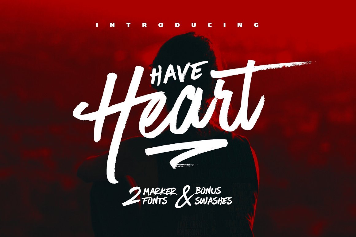
font source creativemarket
You can instantly see that this is a very powerful font. Action, party, adventure - so many things are projected by this font. Of course, the picture and the color helps. But the font is a very important part in conveying all that.
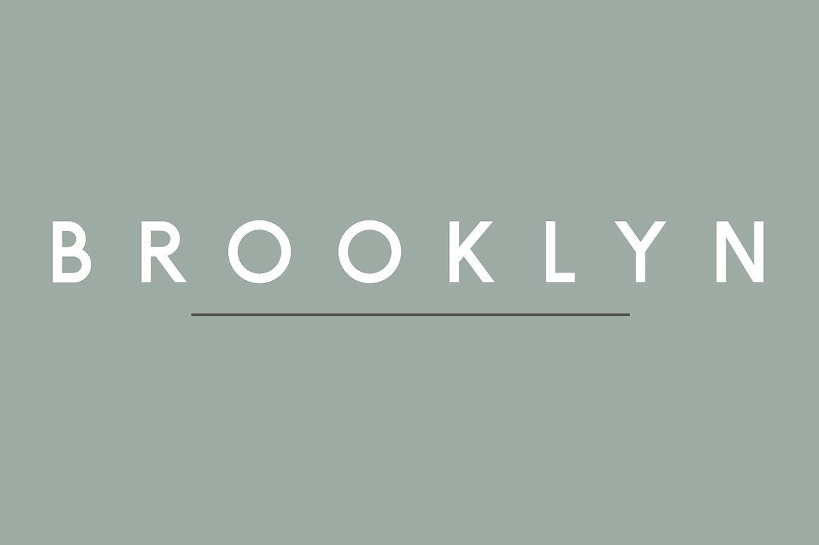
font source creativemarket
This font is rather strict and serious. You can imagine a School or Lawyers using this font. It's clean and stable, but also friendly and supportive. You feel like you can trust a font like that.
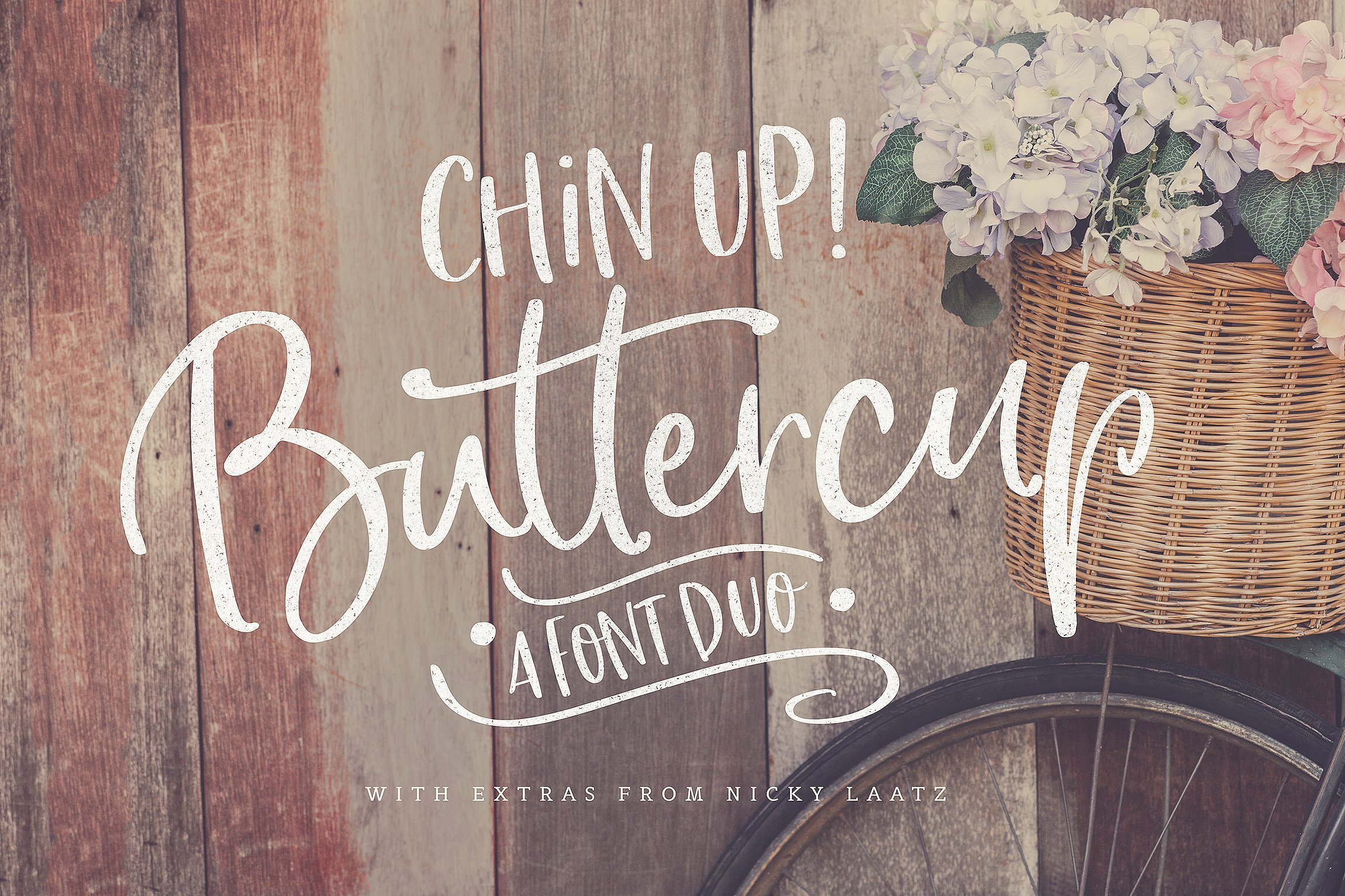
font source creativemarket
This last font feels like a summer love. Like living in the countryside, in a cosy town with good friends. Everything about this font is playful, warm and inviting. It gives a feeling of something handmade with love. Something organic and natural. If you have a Blog about organic cooking or homemade clothing, this might be a good choice.
How to combine Fonts
Here are some simple Rules that will help you a lot when you try to combine Fonts.
Rule 1
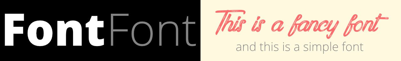
If you use a fancy font, always combine it with a simple font.
Rule 2
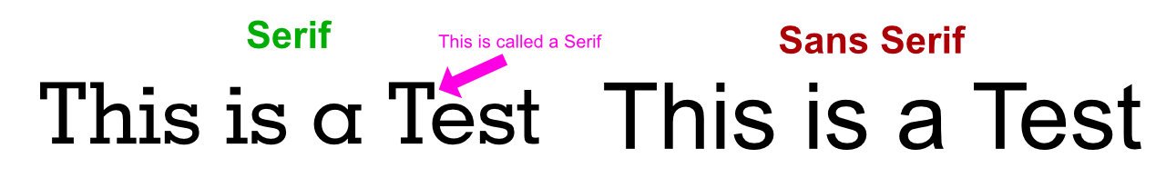
Combine Serif Fonts with Sans-Serif Fonts
Rule 3
If in doubt, use fonts of the same font family. This also makes things a lot easier.
Rule 4
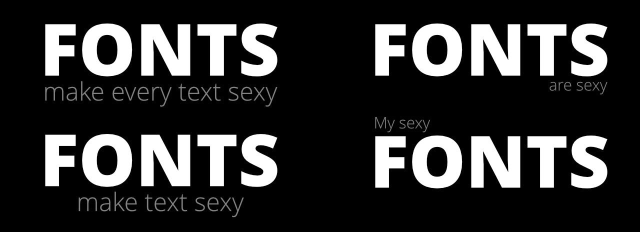
Create contrast, but not too much contrast. It is good to combine fonts that are different, but they still need to complement each other. This can be created by choosing different Fonts, but also by size, color and brightness.
Rule 5
Position of fonts. There are a lot of ways to position fonts towards each other. Some simple ways to do it is to either center them, make them the same width or lining them up on one side. This also depends on the length of the Text
Rule 6
Practice your font skills. There are many pages online where you can combine fonts, find font combination and you can always download fonts and try it yourself in your favorite image editor. Good places to try font combinations are:
http://fontjoy.com/
http://canva.com/
https://www.typotheque.com/fonts/combinator/latin
Rule 7
How good a font looks depends a lot on what else is part of the design. You can make the most boring font look amazing and the most amazing font boring.
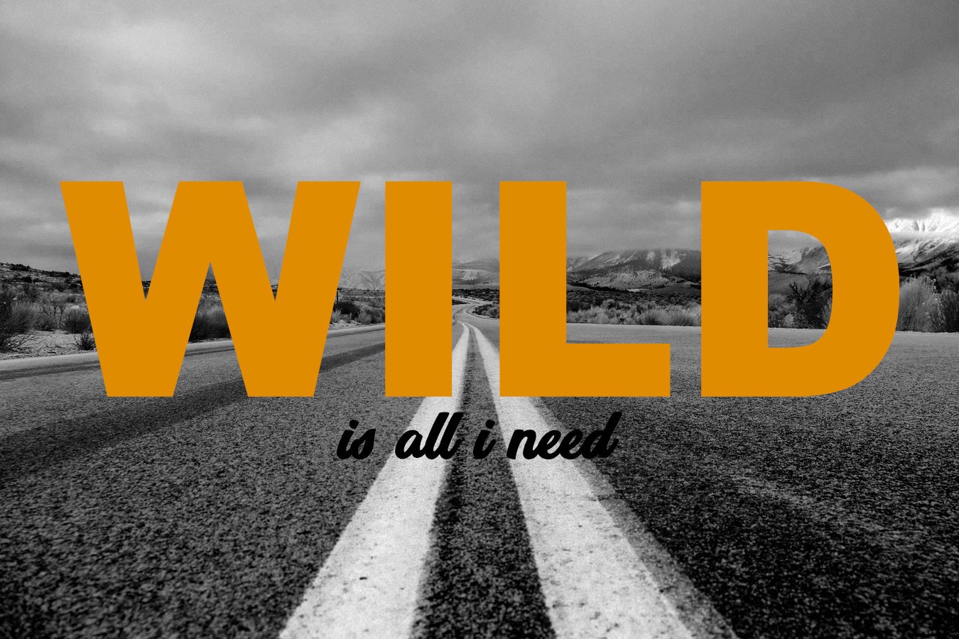
photo source unsplash.com
###########
Thank you for reading. Feel free to ask me anything or suggest further topics.
Read the next Episode now:
Design Basics #04 - using Canva
More Episodes of this Series:
Design Basics #01 - How to select a picture
Design Basics #02 - The Power of Color.
This post was rates "TOP of the POP" Newbies:
The Alternative STEEM TOPs, 13.01.2018 GMT- Top Of The Pop - Newbies