Once upon a time long ago, my mother, a middle school teacher, received twenty new laptops for her class. (They were brand new and ran Windows Vista, to give you an example of how long ago it was.) Unfortunately, kids are not that good at typing in URLs, let alone possess enough impulse control to allow them to run off into the Series of Tubes during school hours.
I, meanwhile, had discovered the novelty of running one's own intranet HTTP daemon. Together, we came up with running a small website over her school laptop. We started with almost no knowledge of HTML, CSS, or Javascript, a one-page template, and the idea of using as a springboard to the links the kids were supposed to go to. Then it grew, and grew, and grew, and grew... At some point we started making online review games for the kids. Now we have true webhost, and countless games with hundreds of review lists to pick from.
Though my mom's retired now, she still runs her now-gargantuan website, and we still work together on making new games for kids. She does the HTML and CSS, and I write the Javascript and Python backend. Aside from the graphics, which are usually clip-art, we make every game from scratch. I'll be linking to a handful, which will only be a tiny sample.
This is the first article in lessons we've learned, starting with the frontend design of the games themselves.
Children will happily do the exact same activity on the computer that they hate to do on paper
Our games are, to be frank, review tools. As much as I like the idea of making an Oregon Trail or a Cellcraft, it's not really possible to create a deep simulative experience about the perfect versus the past perfect tense. It's like the old edutainment games you might have played on Windows 95, except without even the non-educational intermissions. You, the would-be educational game maker, may have the same disappointment.
But fear not! The fact that it's digital, moves, and has shiny colors is sufficient! Your game may have no practical difference from homework, but it is still more exciting. My mom found that even our simple games were eagerly preferred to the very same activity done with ink and paper.
And, arguably, it's more effective. One drop of immediate feedback is more exciting than getting a good grade some time later, particularly for a hyperactive child. Each of our games may be played as many times as necessary until mastery--and no need for the teacher to grade a thing.
Even a "game" that is more test than game is still more exciting. QuizComposer spits out a simple HTML quiz, where the answers are selected by drop-downs or typing in. Just an HTML form! No graphics or animations--but again, the kids prefer it. It also immediately gives them a score, so they can try again as many times as needed.
For another specific example, BakerBattle, the all-time favorite, is basically a multiple choice test--the same you'd see on the SAT--except two teams of bakers toss cupcakes at each other every time you answer a question.

Please do not completely fill the circle with icing
Which bring me to...
Reward the children with violence
(or at least something that explodes)
Our first game was called VanishBot. My Mom and I found a simple Javascript hangman game, except without graphics. Through MS Word (shudder), Notepad, little care for our own lack of knowledge, and sheer gumption, we hacked it into a functioning hangman game. Rather than an actual hangman, which is slightly disturbing, we decided to use a clipart robot instead. This robot, like a reverse hangman, lost limbs for every incorrect guess, until it was brutally torn in two while it screamed in JPEG-artifacted horror, then finally vanished.
The kids loved it.
But what they loved even more than winning (where the robot, now whole, would praise its correctly-spelling rescuer) was losing. In fact, some of them would deliberately lose until the robot was only a head, and then try to win. Arguably this took more skill, but it was hardly the intended goal.
Now that we make our games from the ground up, we know better. A sequel called DisappearingDino illustrates this--you start with a dinosaur that fades away, and guessing correctly gives you the full, colored dinosaur! Our games contain food fights, giant robot battles, pirates, saucers launching to defend their mothership, or David braining Goliath with stones--anything to stimulate their developing crocodile brains.
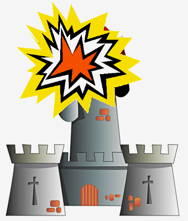
You must have the fun, cool, exciting thing happen when they win. You may spend all sorts of effort in a game where you construct a castle as you answer correctly. But if, losing, the kids see the castle exploding, that's what they'll actually want to do. So rather than fight human nature, embrace it! Throw bombs at that castle every right answer, and wrong ones are duds.

That's more like it.
The corollary: losing must be boring. Failing enough questions in SpaceWalker results in a popup informing you that you've run out of oxygen and are now a corpse drifting in space. But, mind you, only a popup.
I'll note that this principle is in place in "real" games. Your reward for fighting through the level is to fight the boss, who when defeated is probably going to explode and then the level explodes, too. More subtle rewards--like seeing congratulatory text--are probably secondary to the player's brain, all things considered. The amyglada demands its share of the fun.
You, as the educator, may wish to promote peace, generosity, and inclusive problem solving methods. That's great! But the kid does not want to see bunnies playing in fields if the alternative is seeing the bunny grabbed and swallowed whole by a passing heron. Failing to appreciate this principle will lead to boredom at best, and the kid playing "wrong" at worst. Use colors, fireworks, pies to the face--anything. Be realistic--the kids' desire is a primeval longing for COOL THINGS. Please the crocodile.
Variety
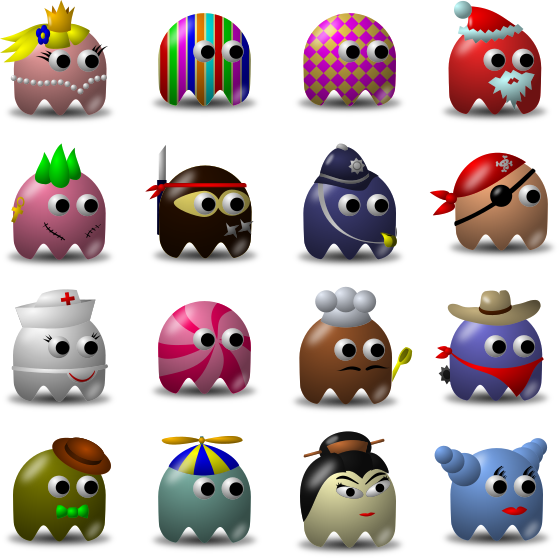
Take a look at these guys.

(Not depicted: Pacman making a break for it.)
There's a zillion of them on OpenClipArt. We decided to make a game based on them, which we called SaucerSortie--the idea being you matched aliens to saucers via word/definition pairs, thus allowing them to scramble to defend the mothership. (Remember, violence.) When we made it, it was one of the kids' favorites, and still is. Each game feels slightly different, as it randomly picks groups of seven aliens to run to the ships. In fact, even though there's only twenty nine or so the game can choose from, there's no practical chance you'll ever see the same aliens in the same order.
Ever since, we've tried to make as much variation as we can. Even outside of a single game, we try to produce skins. (SaucerSortie, ColorCatcher, and CircusTrain are basically identical.) BakerBattle (again, the all-time favorite) randomly arranges one team of girls and one team of boys, and the targets and cupcake splatters are semi-randomized. Even as an adult, it still seems slightly fresh every time--probably the same reason a forest in Minecraft seems unique even if it's the same few kinds of blocks in a slightly different form.
Another method is giving the player a choice. Both BakerBattle and BotBattle (a distant descendant of VanishBot) give the player a choice of sides--boy chefs or girl chefs, blue robot or pink robot. While it's difficult to get as much variety, it adds a personal flavor to one's game.
The variety can even be made by the kids themselves! Once, as a computer project, my mom had the kids make aliens for a SaucerSortie skin. It was garish, chaotic, and the kids loved it. We've considered giving the kids the opportunity to construct a unique avatar, but unfortunately our art skills and HTML5 are both limits.
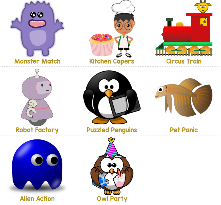
Our latest batch of games, teaching phonics and Kindergarden-level math, come with seven skins. All the same game, but you can choose whether you're playing with penguins, pets, owls, two different kinds of aliens... Each of those groups contains many images, and sometimes we've got even more variety. For a remedial learner (which is part of our audience) being able to choose a different skin when you're playing it yet again is important. We also try to make skins for both boys and girls--there's both cuddly and cool available.

We can reuse clipart, too.
Bonus: Have a big win screen
All these games are, as I mentioned, basically review tools. Another teacher in Mom's school had the kids play to completion as a form of review. Mom took up the same practice, with great success.
But one key to this is a large graphic that is displayed on victory.
A big, shiny win screen has three benefits:
- It provides immediate feedback--much more than an A+ on a future paper.
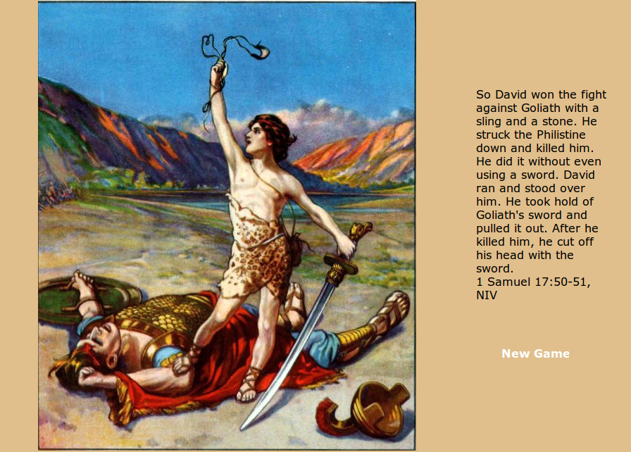
- The bigness and shiny-itude are rewards themselves. Remember, please that crocodile. GiantSlayer's win screen is a public-domain image of David standing over Goliath with a sword, and a Bible verse recounting how David chopped Goliath's head off.

This part was not in VeggieTales.
- Most importantly, you can see it from across the classroom as proof the student actually won it. We don't store any scores for a number of reasons, so this is also the only way to see them.
For almost all of our games, we have an additional shiny trophy if they win a perfect game. This, too, is large enough to be seen across the classroom.

Glory is fleeting, yes, BUT IT'S SO SHINY.
Next time!
I'll have some lessons on backend development, and I've gained quite a few. See you!
