Hi Steemit Friends!
Fashion can be one of the greatest forms of personal expression. I would argue that designing an outfit or look can actually be a form of art. By intentionally choosing pieces that work well together, one can bring a sense of creativity and beauty into their day.
Now don't get me wrong, I have plenty of days that are all about leggings and a t-shirt, but I also love those days when I am feeling creatively inspired around my look. Style can not only be a way to express your personality, but build confidence as well. I love walking into a meeting, party, or event knowing that I look great.
I've spent a lot of time analyzing the science behind a good outfit, and so i'm excited to bring this new segment to my blog.
Most fashion blogs post photos from an outfit shoot, with very little text to support the images. I always wished that they would share what was going through their brain when they designed the look. If only they would also share their fashion advice, perhaps I could more easily replicate the look or at least better understand why the outfit was so compelling. That's where i'm hoping to bring value in this blog series.
I used to look at fashion magazines and wonder why their outfits always seemed to have the perfect balance of looking coordinated yet still fun and unexpected. Their looks were beautiful and interesting, while still feeling care-free. That's when I got interested in understanding the mechanics behind a good outfit. Are there certain visual lines that look better together? Which colors look "ok" together and which color combinations really pop?
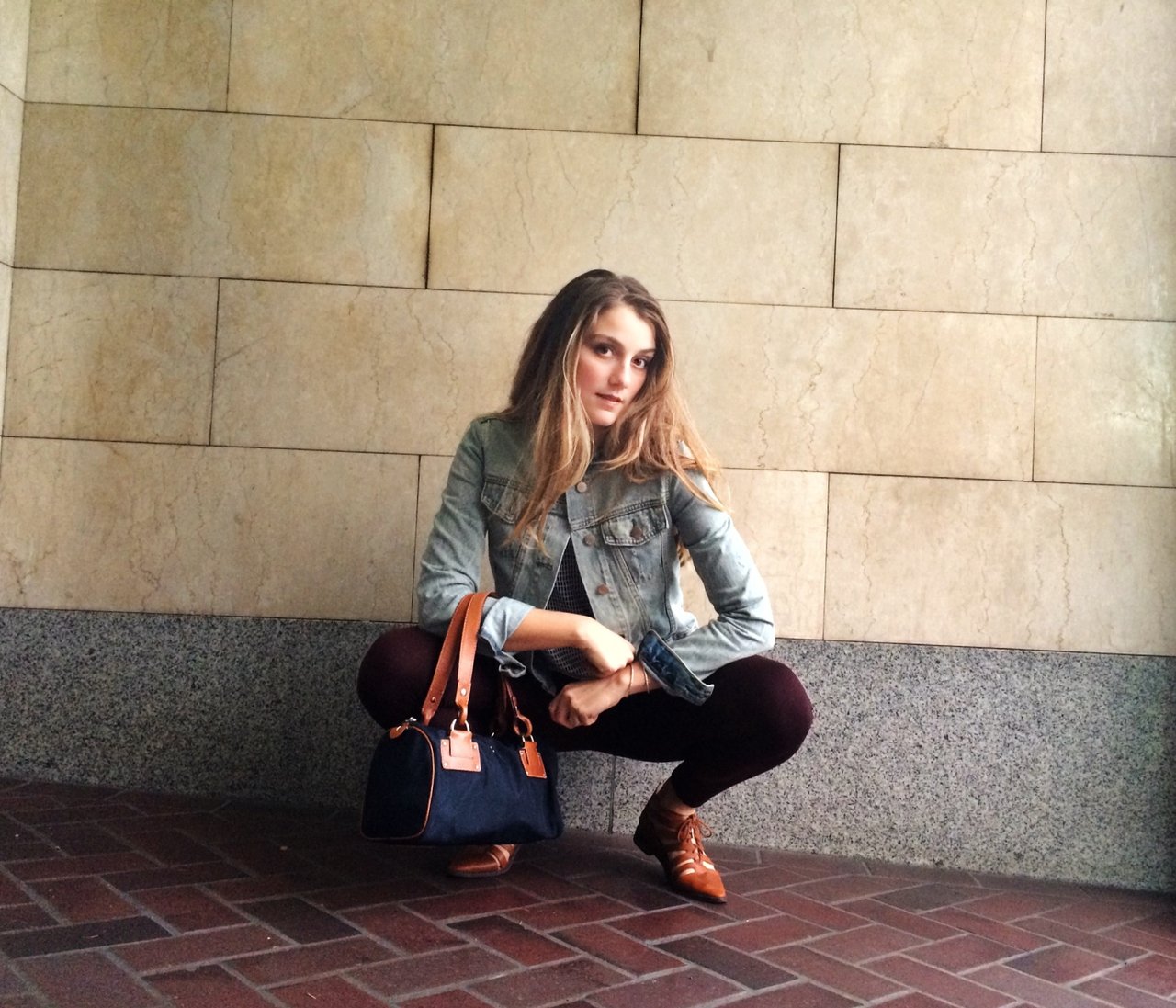
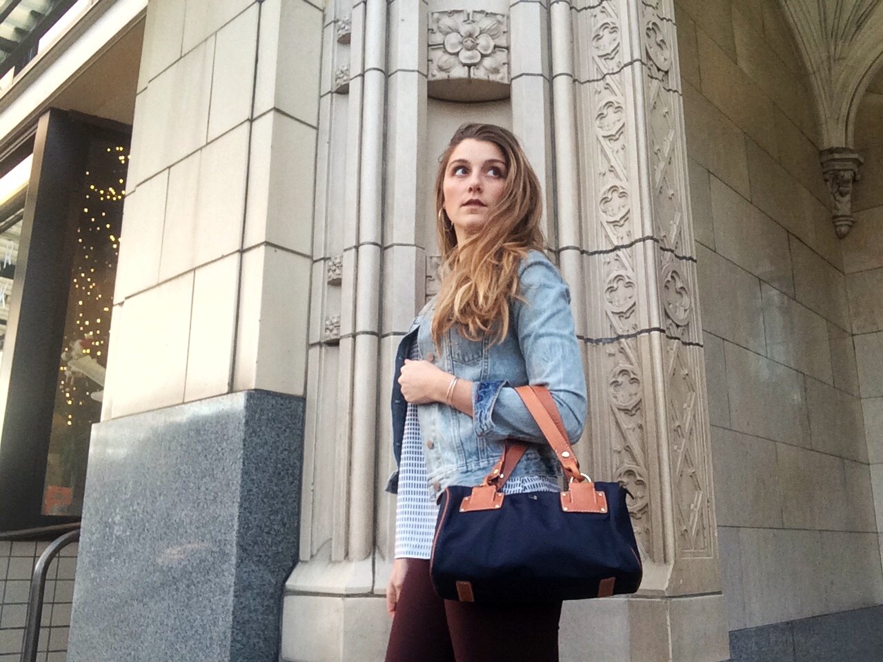
In these fashion posts, I'll go out and do a full outfit photo shoot, and then break-down the outfit in detail through the post. My hope is that perhaps you'll find a little inspiration or good tips that you can apply to your own style.
My style advice will be mainly geared towards women, but I hope that you can still enjoy the photography from the shoot - even if the tips are not applicable to you.
The Color Pallet
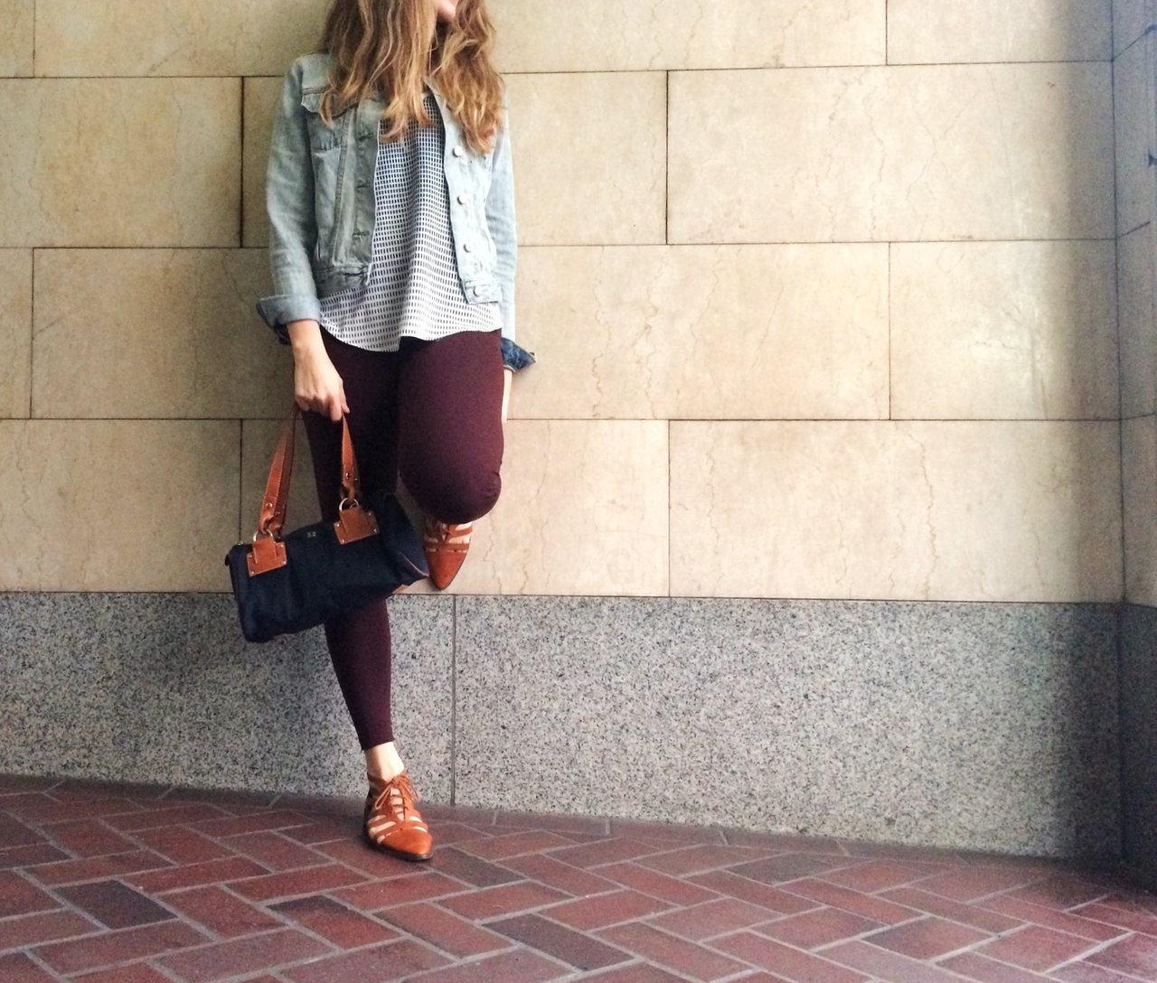
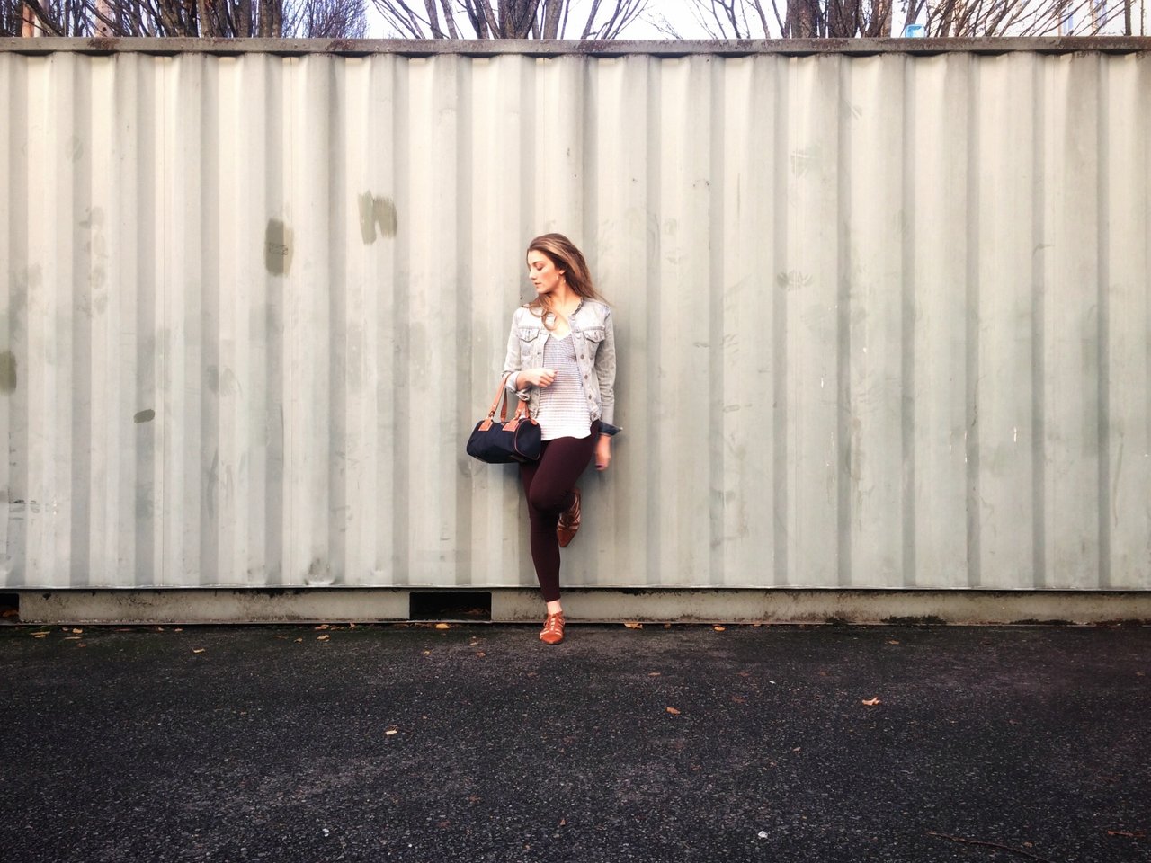
Wine colored pops are a big trend for the fall and winter season. Maroon is a warm color and pairs well with other warm neutrals like tan and navy. Black would have been a little harsh with the maroon, where navy compliments it's warm undertones much better.
I used these wine colored leggings as the inspiration for the entire outfit.
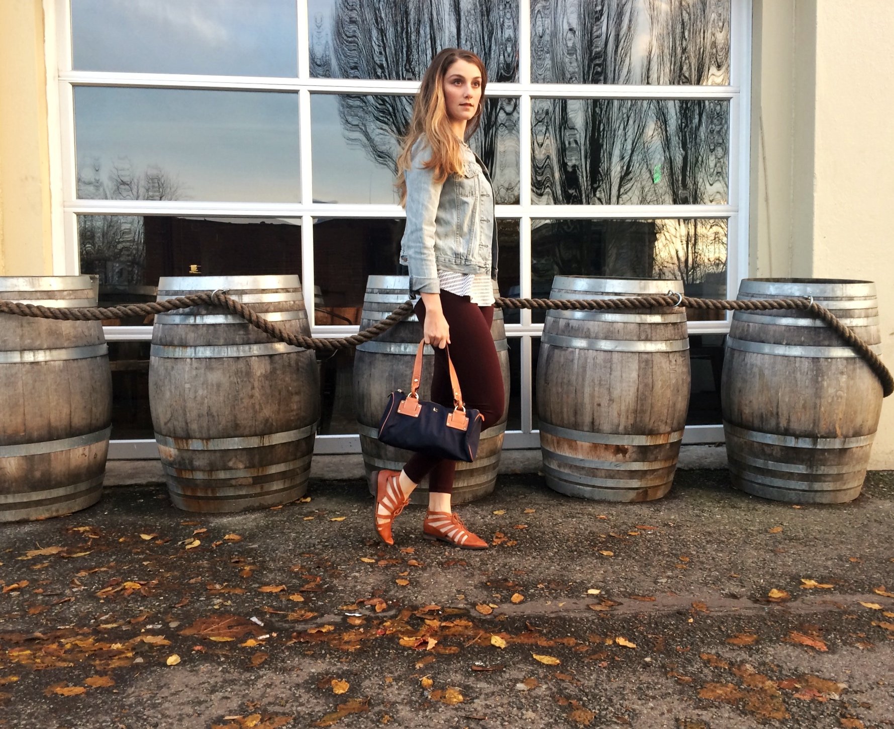
By adding a darker element such as navy to the color scheme, it helps to really ground the look and clearly makes it a fall color pallet.
I did end up incorporating an unexpected element with the jacket. It is a washed out denim jacket with a frayed hem and a light wash. I've found that this jacket transfers well from summer to fall looks and is actually one of the most versatile pieces in my closet. The bleached out look actually helps to lighten the collar pallet a bit.
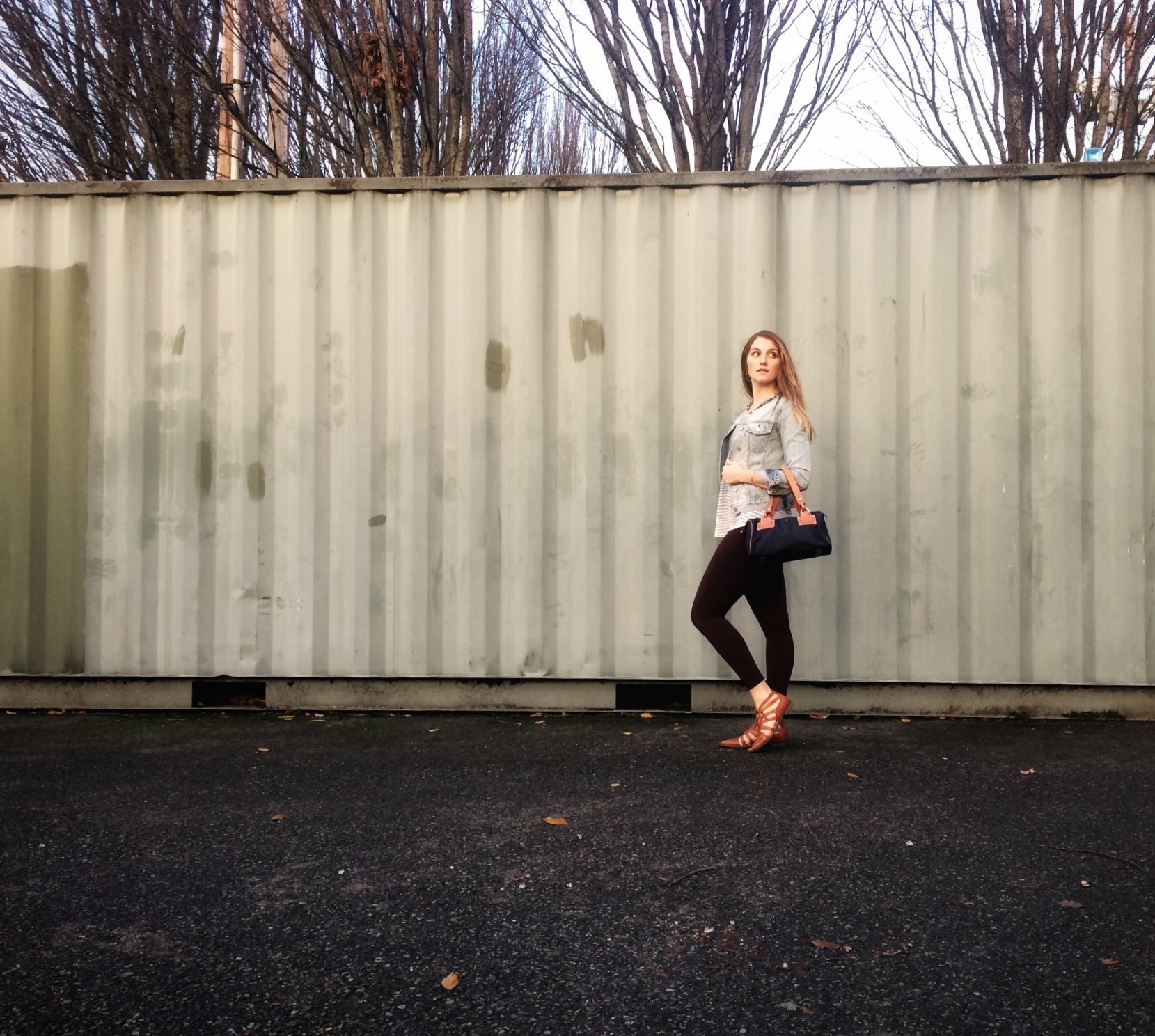
This helps to brighten the overall look and provide some contrast. Even though maroon, navy and tan are the main colors featured in this outfit, the brighter pops with the top and the jean jacket are essential to giving the overall look a bit of life without looking too predictable.
The bag really ties into the overall look. It closely matches the same shade of tan in the shoes and ties in the navy featured in the top.
I also want to call out the size of the bag. It was just big enough to be a statement within the outfit, but the colors tied up some loose ends to where it feels like a seamless accessory.
The Materials and Textures
This outfit is rich in both material and texture. Let's start at the top and work our way down. The look prominently features a frayed denim jacket. Jeans with a frayed hem are pretty big right now, but have you seen a jean jacket with a frayed, "cut out" collar? The jacket really helps to add dimension to the look not only from a color perspective, but from a texture aesthetic as well.
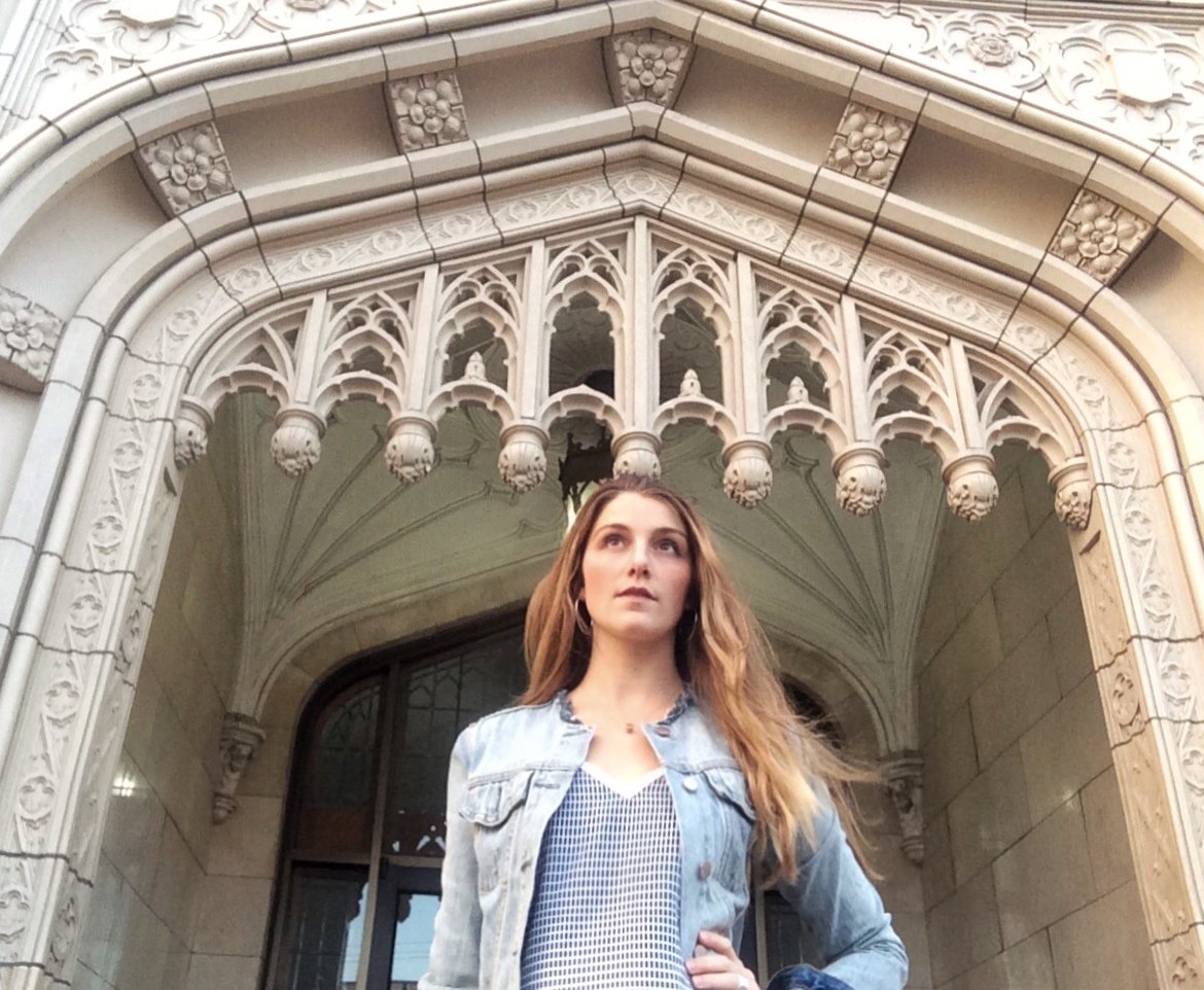
Underneath the jacket is a silky top that lays loose against the body. This top has as gradient visual appeal as the pattern has a darker concentration of navy at the top, and loosens to a greater white space at the bottom.
The leggings are a smooth, wine colored material. The entire texture appeal is topped off with a good dose of leather.
I have some fun "fake leather" shoes (purchased from a consignment store) paired with a canvas and (real) leather Kate Spade bag.
This bag was really the perfect accompaniment to the entire look because it coordinated on both a color and texture perspective. It ties the tan color to the outfit in a few ways. Not only is it nearly the same shade of tan as the shoes, but they both had a leather texture to the look.
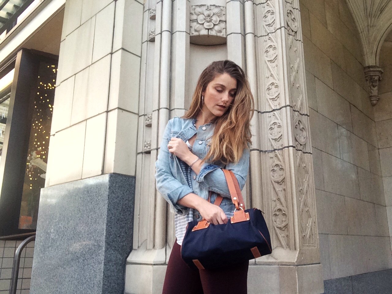
There is not an exact science to the amount of textures or materials needed to make an outfit interesting. As a general rule, I think you usually need at least three. If you get above five, that can get a bit visually confusing.
Here we have jean, canvas, leather (both real and fake), silky polyester, soft cotton and sterling silver in the jewelry. I'll dig into the jewelry a bit more in the next section, but i'm a big fan of supporting local artists and wearing hand crafted, high quality jewelry whenever possible.
The Little Details
I'm a big fan of using accessories to provide small, but fun, visual statements.
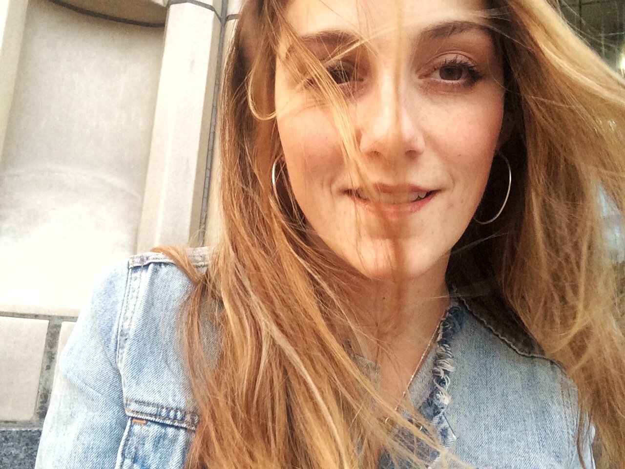
Jewelry and shoes can be fun ways to introduce new colors, fabrics or textures into the outfit without overwhelming the look.
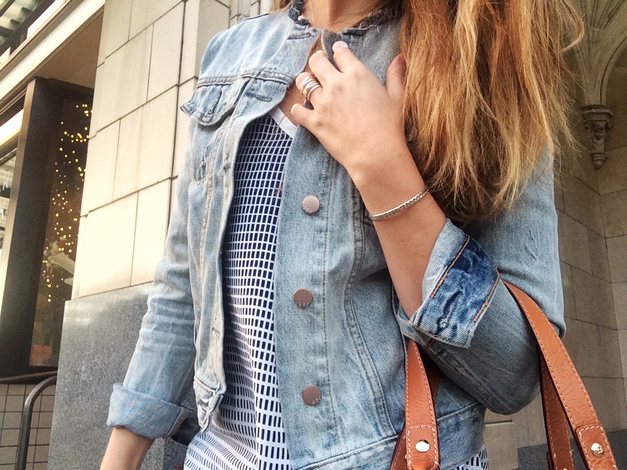
Here i'm wearing a beautiful set of sterling silver bracelets that have been hand forged and textured by Martini Metalcraft. I am a huge fan of her work and own quite a few pieces.
Most of these pieces have been acquired through a trade as i'm the main face of her brand and do most of the modeling for her website and social media campaigns.
She is a talented metal crater and all-around inspirational woman, and so I've had a great time working with her!
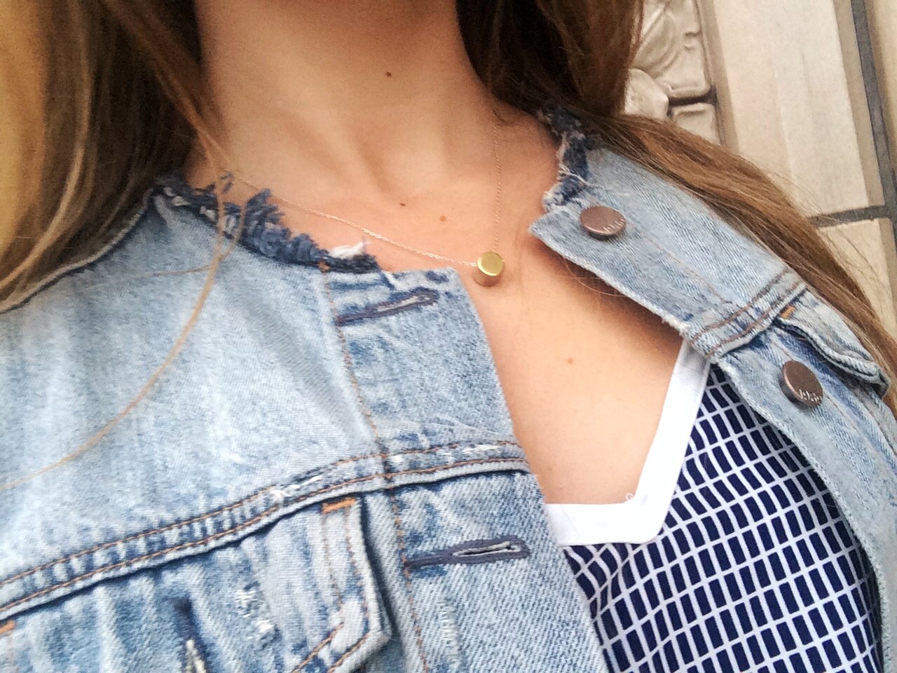
A simple metal necklace that fell right below my collar bone fit the bill perfectly.
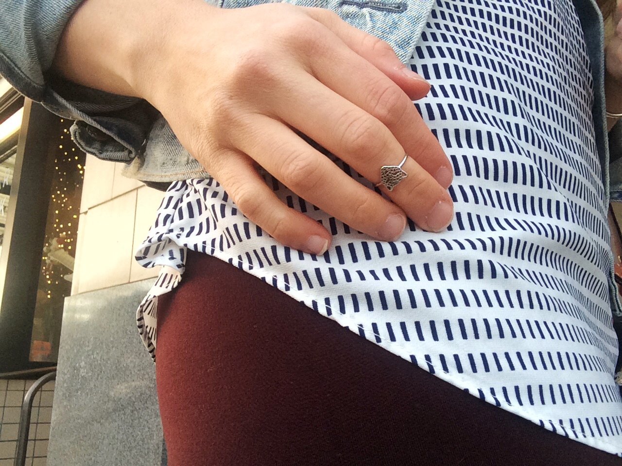
There is something both playful and powerful about displaying a strong animal on your hand. I think it adds an unexpected element to the otherwise conservative jewelry look without being visually overwhelming.
Sneaking in fun pops of personality with dainty jewelry is one of my signature looks and one that you will see repeated throughout my various style blogs.
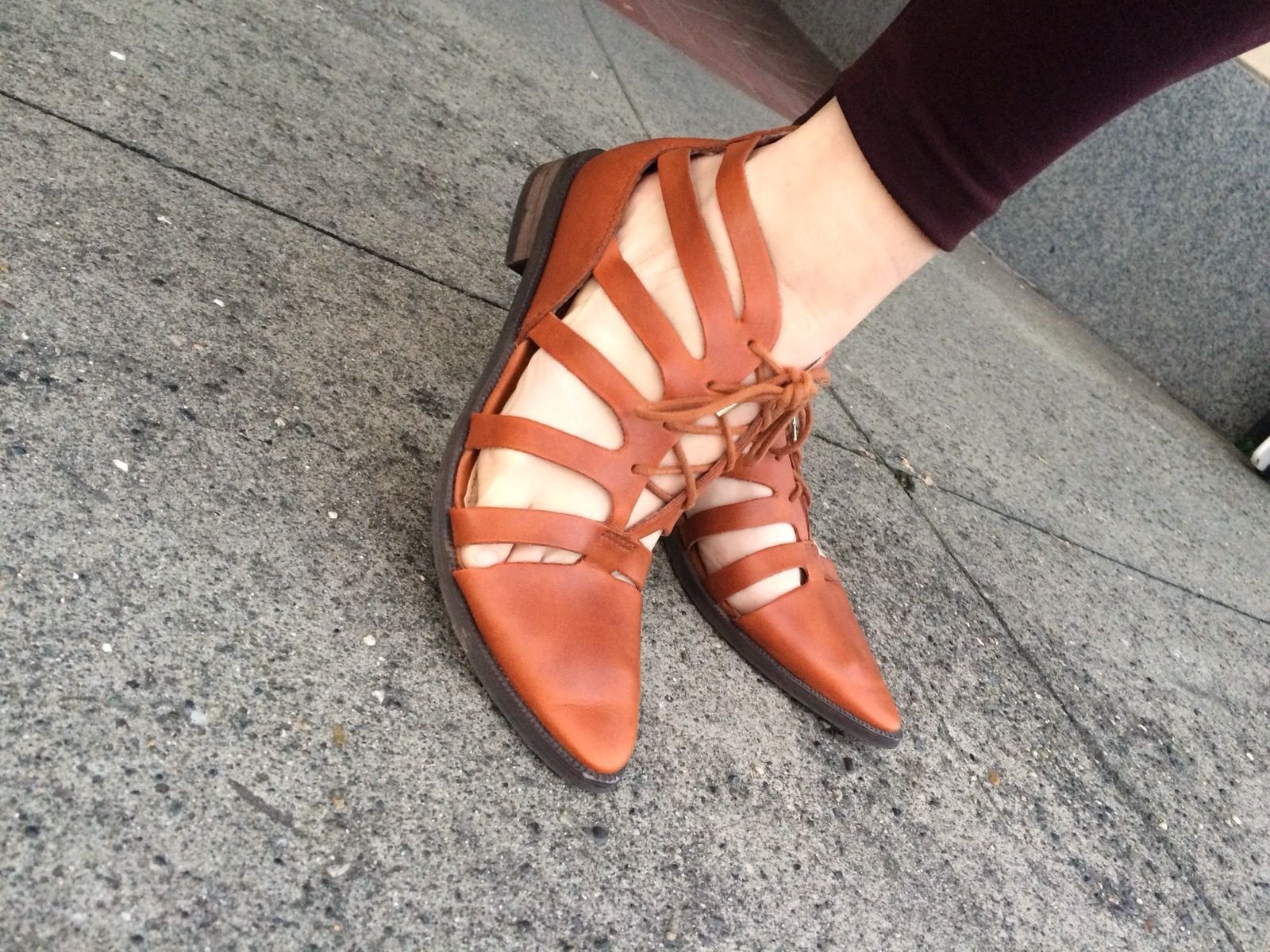
Imagine if I had only had black or brown shoes for this outfit. I would have chosen brown to stay within a warmer color pallet, but it would have been competing with the tan in the bag. I was lucky to have a fun pair of shoes that matched well with the colors in the bag.
The shoes have a life of their own and they certainly add a different dimension to the overall look of the outfit. The cutout design on the sides give it a lighter, more stylish vibe - while keeping the shoe comfortable for all day wear. The pointed toe makes it easy to either dress up or dress down and adds a bit of class to the overall look.
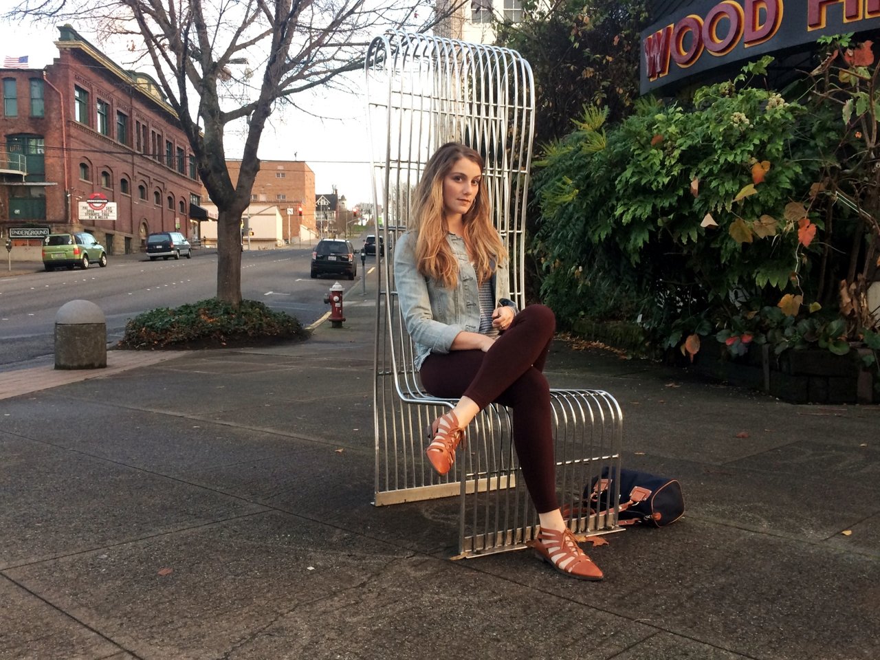
The Visual Lines
Symettry and balence are two things I focus on quite a bit when designing an outfit. For example, I will be cautious about pairing a loose top with a loose bottom, just as I would be careful to combine a slim fitting top with a tight pair of leggings. By allowing flow in one area, I generally want to create a silhouetted shape in another area.
This ensures that I don't either lose my body shape in one look, or overly show it in another.
I mean, a girls gotta be able to eat tacos and still feel good in her outfit.
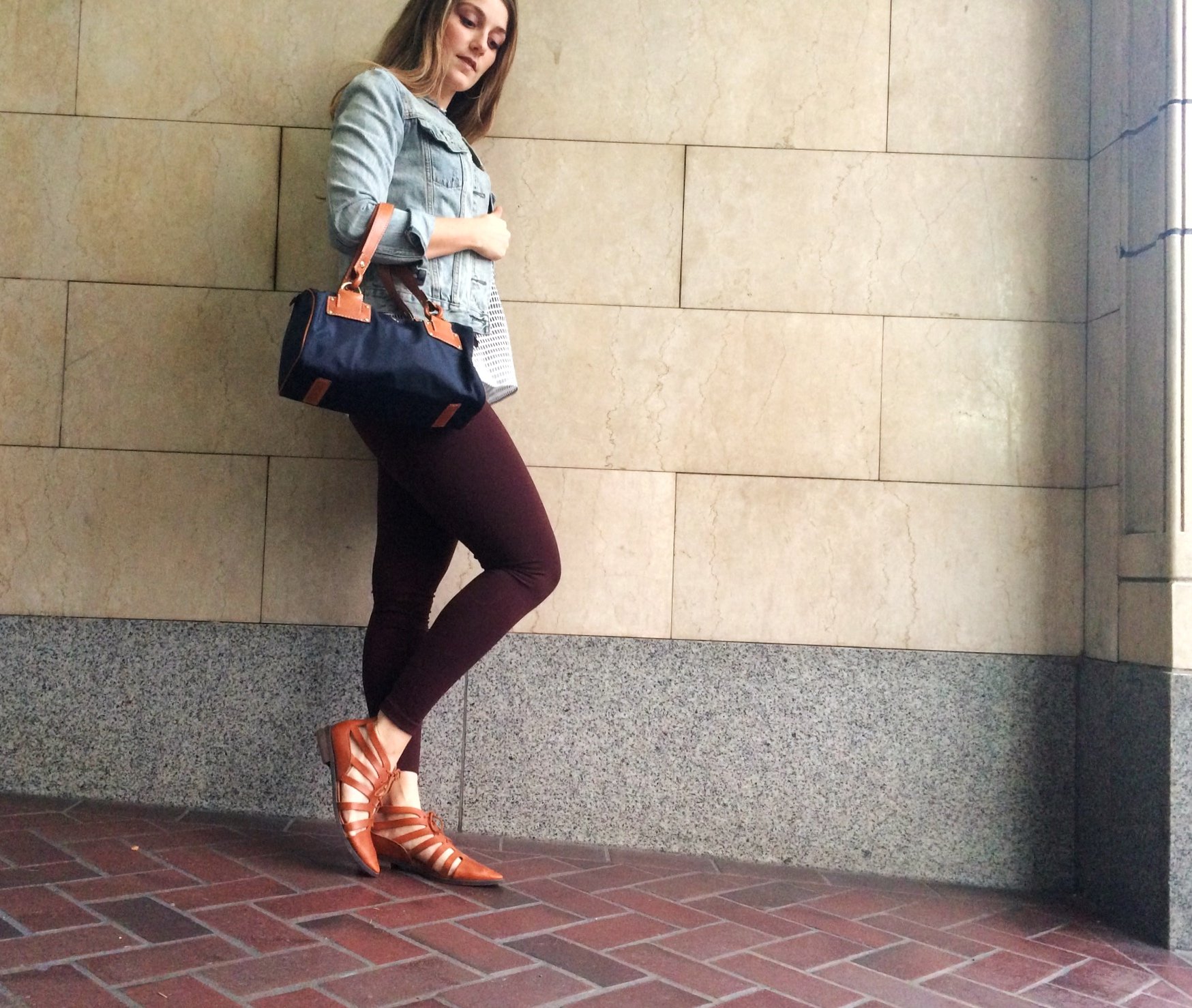
In this look, I had to be careful with the necklines I presented. The jean jacket presented a strong rounded line around my collar bone, and so I either needed to lay casually beneath it, or go over top it with a collar.
If I tried to go with a straight neckline, it would have cut in the middle of the jean jacket hemline and created visual confusion. By choosing a top with a deeper V neckline, I was able to allow both to stand out independently.
The length of the top in relation to the jacket is important as well. Because the jacket hit at the top of my hip bones, it was most visually appealing to choose a top that hit below my hip bones.
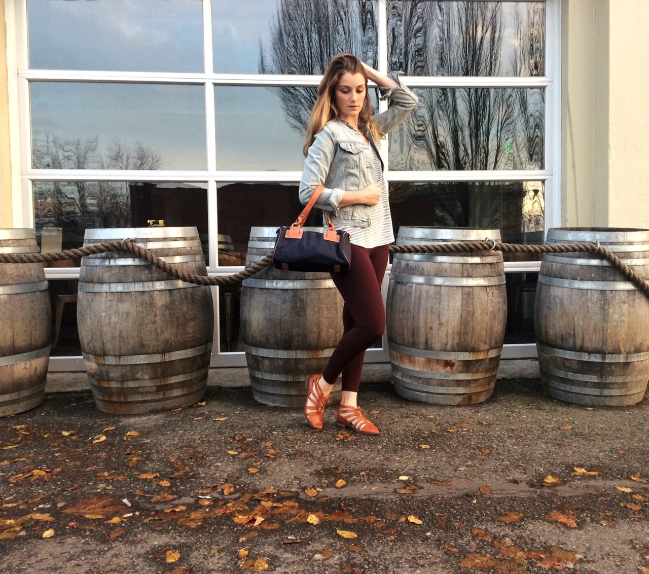
If my top had gone too far below my hip bones, it would have created an awkward distance from the end of the jacket to the visual end of my top. By allowing a few inches of space, it creates visual clarity for both the jacket and the top, without rivaling each other for the same area or creating too much length.
I am usually quite intentional when it comes to the hem length of my pants - which is part of why I have a regular tailor that I know and love.
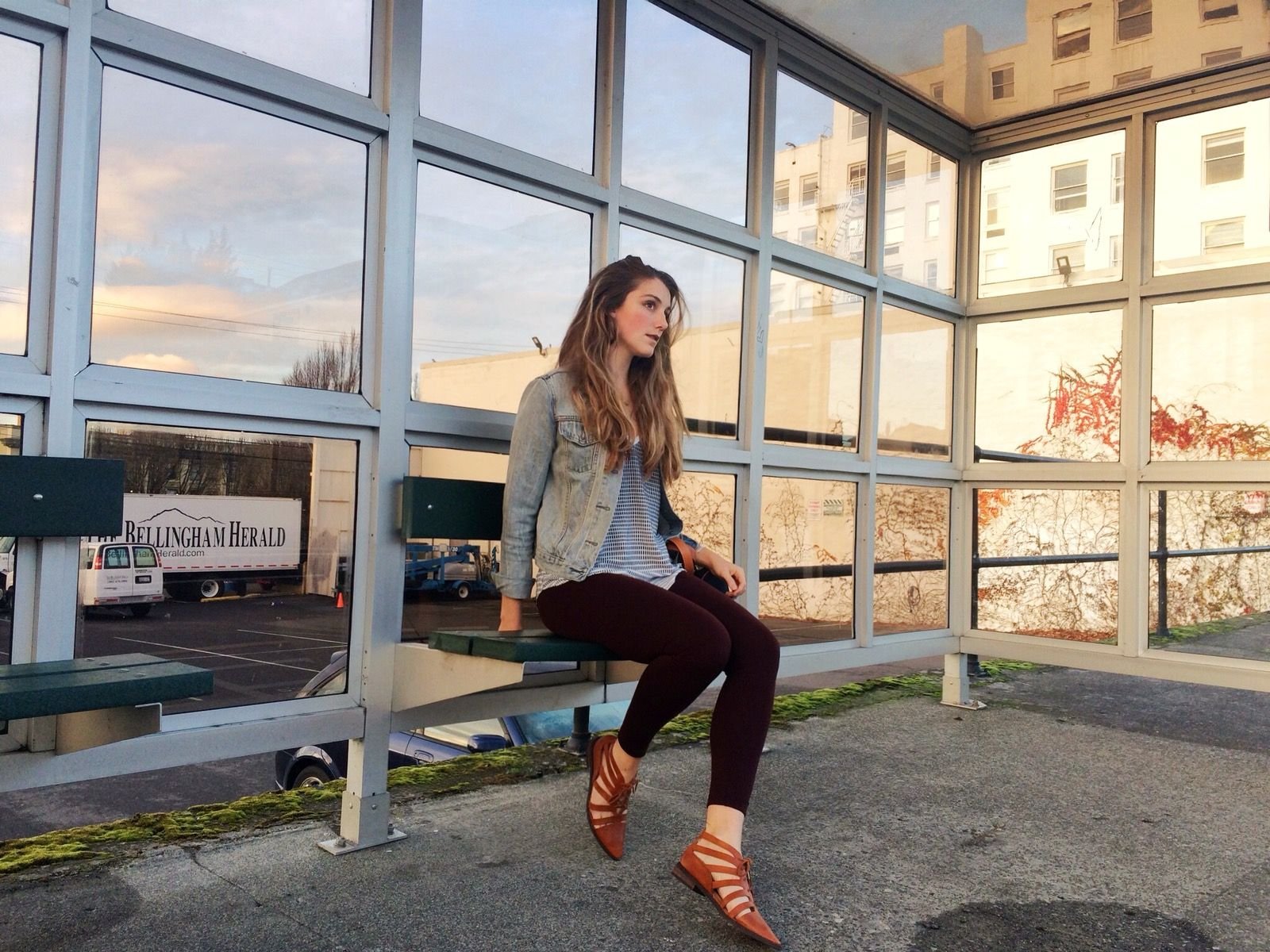
Naturally, these leggings went down a little too far, and it created a strange visual from the end of the pant to the top of the shoe. To create the illusion of a longer looking leg, I actually folded the length a bit so you could clearly see my ankle.
This not only helped to create a cleaner visual, but made a clear delineation between my pants and my footwear.
I hope you enjoyed my first fashion post! I sincerely appreciate you taking the time to read/look through it. Love and peace. <3
A Few of My Recent Posts
Always Hitting You With The Good Stuff!
