
Hi Steemians :)
I think I should start by explain what graphic design is, so you do not get confused with web design, that´s another championship in which I don´t play...
In a nutshell, graphic design is basically the process of communicating visually. This communication can be through images, texts and drawings, where the designer uses drawing skills, aesthetics, visual arts and, mainly, creativity. This work is embedded in our daily lives through brands, symbols, logos, packaging, books, advertisements and everything else you can imagine. That is, much of what is seen, heard or touched.

And what does a graphic designer do?
This is another story and involves more than drawing.
It solves communication problems by creating arts and designs. But as much as it is spoken in arts and designs, the main tool of this professional is, nowadays, the computer, equipped with programs like Photoshop, Illustrator, Lightroom, Indesign, 3D Studio Max etc.
Of course, it's not enough just to know a little bit about how to use these programs to be a professional graphic designer, after all, in addition to technique, you also need talent and study.
For each project, the designer studies and knows issues related to what will be developed, such as colors, typography, graphic production, ergonomics, support and everything that is needed to find the best solution, in an organized, aesthetic, viable, and above all, bring results.
Once the access to these programs is increasingly facilitated, many untrained people call themselves "graphic designers", which is a misleading statement. The true professional designer studies for this, and in his projects, he respects a structure from beginning to end, he develops his works with the objective of making them attractive and easy to read, making it understandable even for the illiterate public.
In my case, I consider myself an apprentice graphic designer, self-taught, in a process of continuous learning, discovering something new every day, a technique, an example, an inspiration.

Speaking of inspiration, i want to share the work of a graphic designer who has inspired me in a particular way.
Victoria Siemer aka Witchoria is a young graphic designer from Brooklyn. She tells little about itself, only reveals that is an artist.
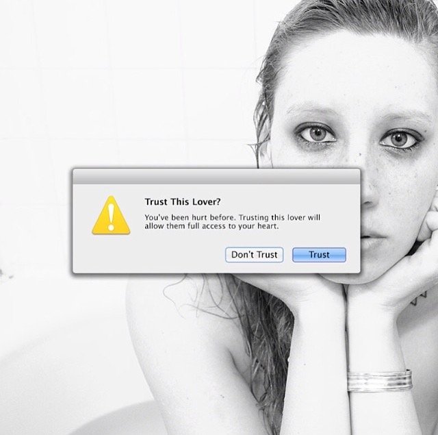
And you must have the strength and the courage to present yourself to the world with such a single word.
She´s very good to photograph, excellent in Photoshop, viscerally emotive and has a beautiful imagination. A talent!
I like her for several reasons, some more visual, some more personal.
Since I saw the monolith in the masterpiece "2001: A Space Odyssey " from one of my favorites film-maker "Stanley Kubrick" i have a weakness for those who try to build them. Victoria creates mirrored monoliths that show other landscapes - and sometimes not. Monoliths are rectangular - and sometimes not lol each mirror seems to reflect an emotional state.
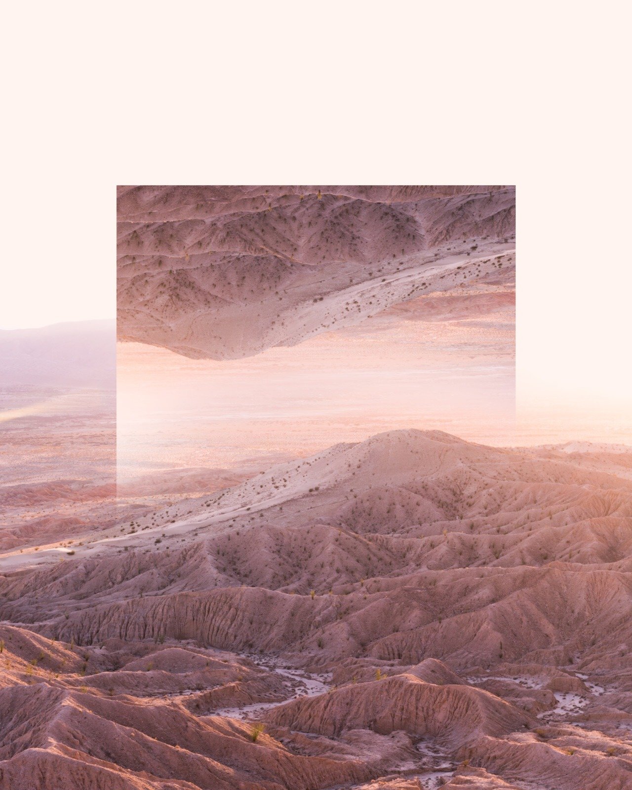

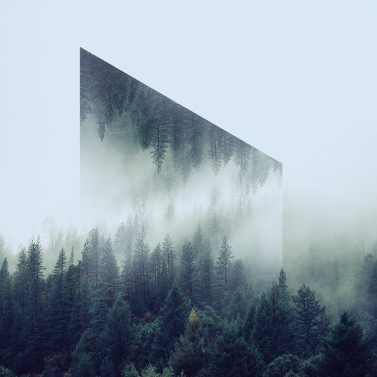


She likes Pink Floyd, and this is me who says, not her ...
Sorry, but that´s the only explanation i found for her choice to the name "Wish You Were Here" for a series through which, with grace and imagination, makes use of Google Maps to express moments of solitude ... or desires of revenge.
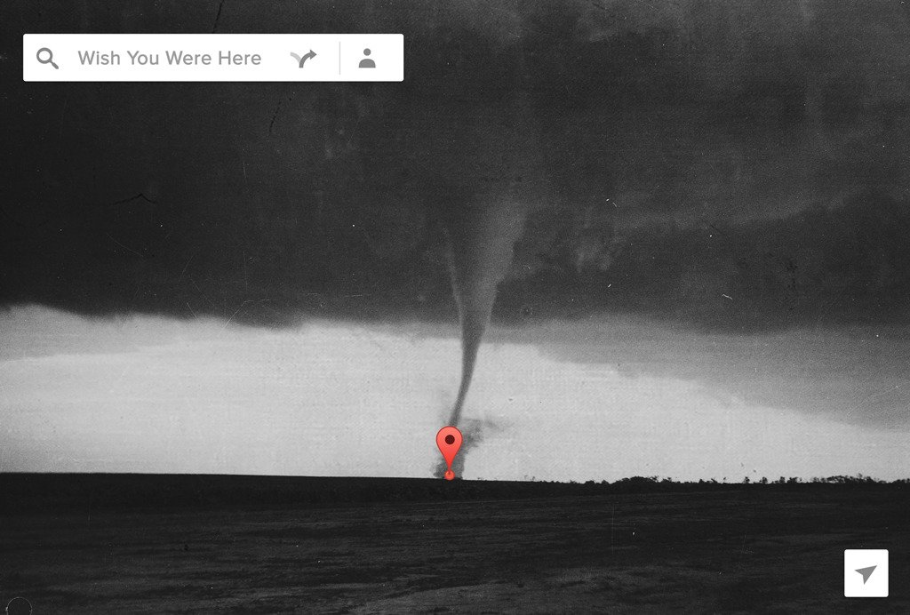

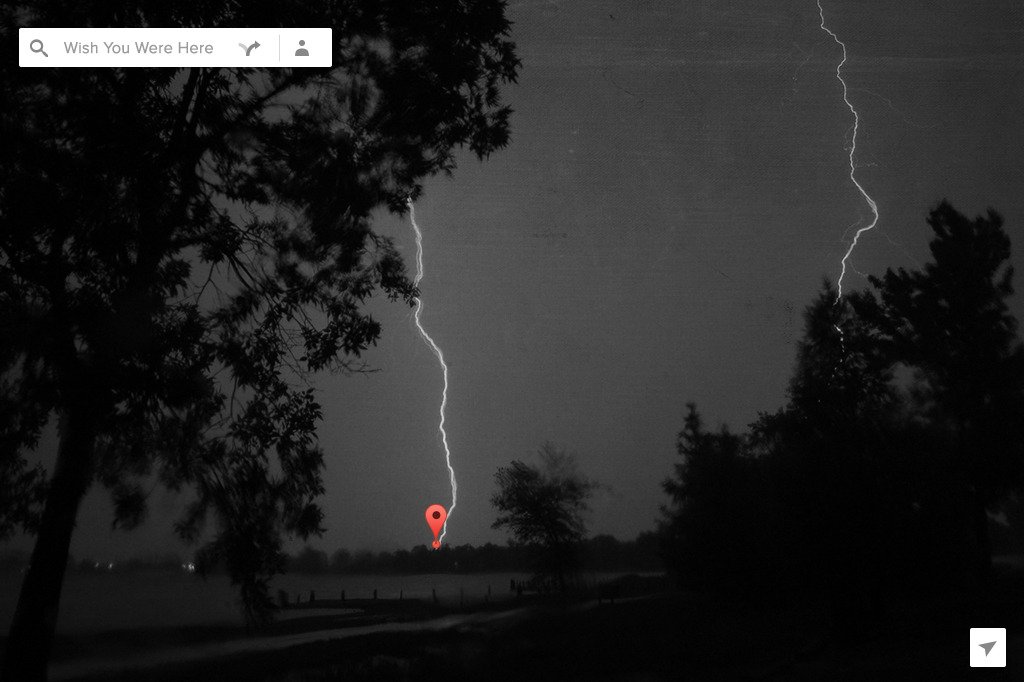

The messages she transmits visually are aesthetically beautiful, reflect genuine emotional states:
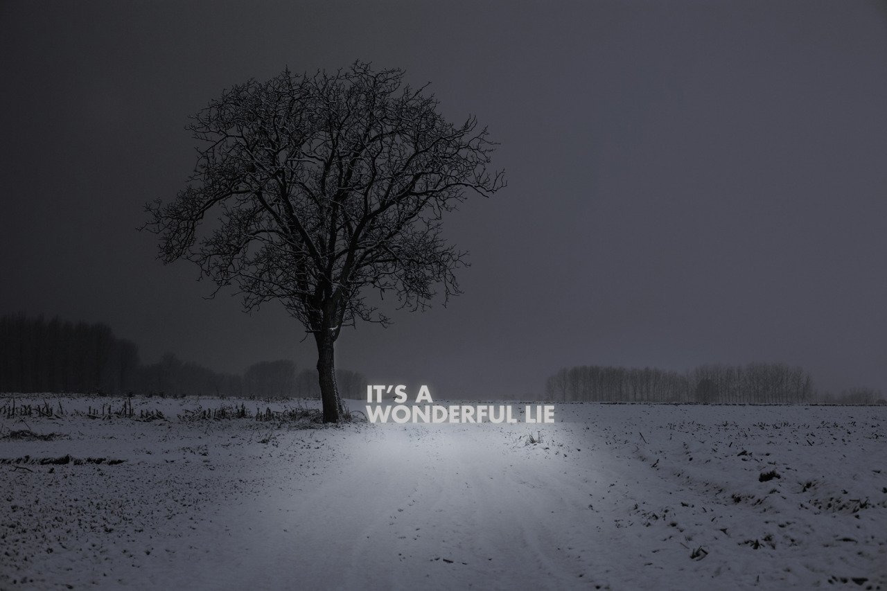


And because to err is human, she created a series called "Human Errors" where she put the Photoshop skills in work to give Mac graphical interface functions that even the visionary Steve Jobs could not imagine. And given the graphically immaculate environment of Apple's operating systems, it's always fun to use it to remind us that sometimes we do shit.
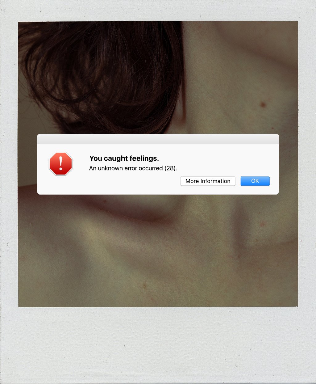
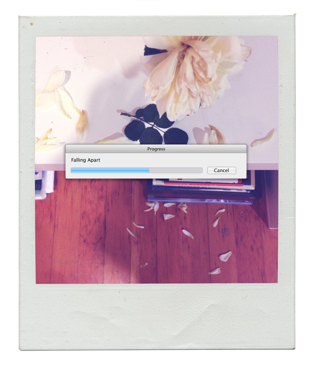
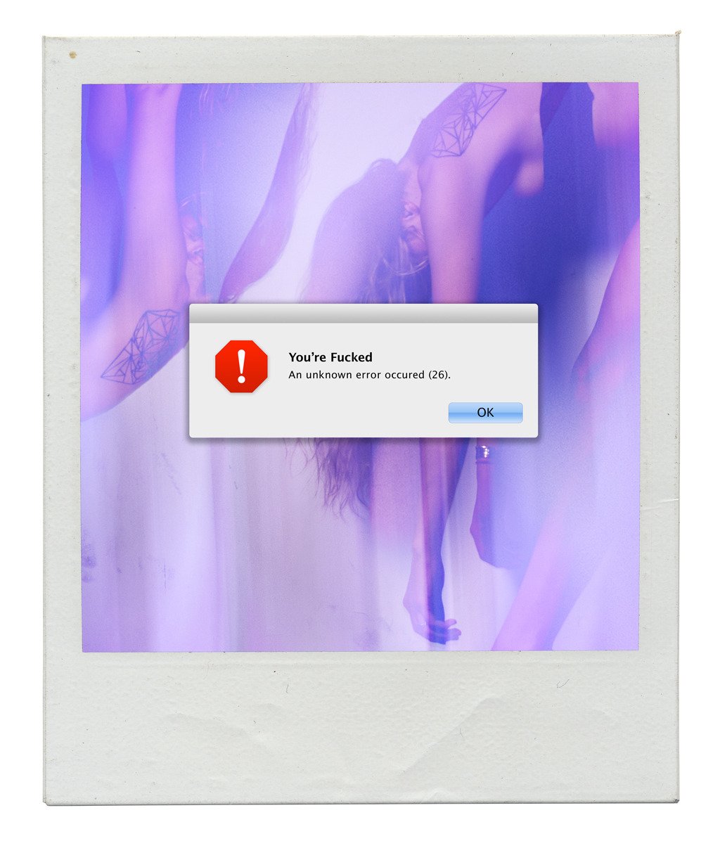

These are just some of the reasons why I like Witchoria and use her portfolio as a source of inspiration.
All the images used in this post and much more can be found > HERE
Now would be the right time to share some designs of my own, taking advantage of the theme, but I'll leave it for a next opportunity :D
But I'm not leaving without share with you a digital cuddle 😉
In addition to the dividers used in this post, I've created more this one that you can use freely if you wish and like it.

Thanks for reading ;)

