Hey design lovers,
Last time I took a hit at the sndbox thumbnail competition I got I believe it was the 4th place. This time around I've already seen some great entries and I think I'm nowhere near getting in top 3, but surely had to make another one because I support what sndbox does, partly because their content is awesome, and partly because I'm also on a mission to bring creative content to the platform.

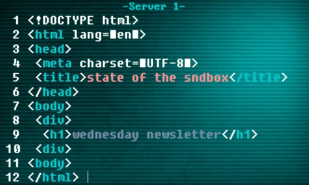
This design was one of those where you spend a lot of time coming up with the concept. I began my creative process by looking at some of the different definitions of the word sandbox. And I came across the term in computing sandbox mode which stands for "a virtual space in which new or untested software or coding can be run securely."
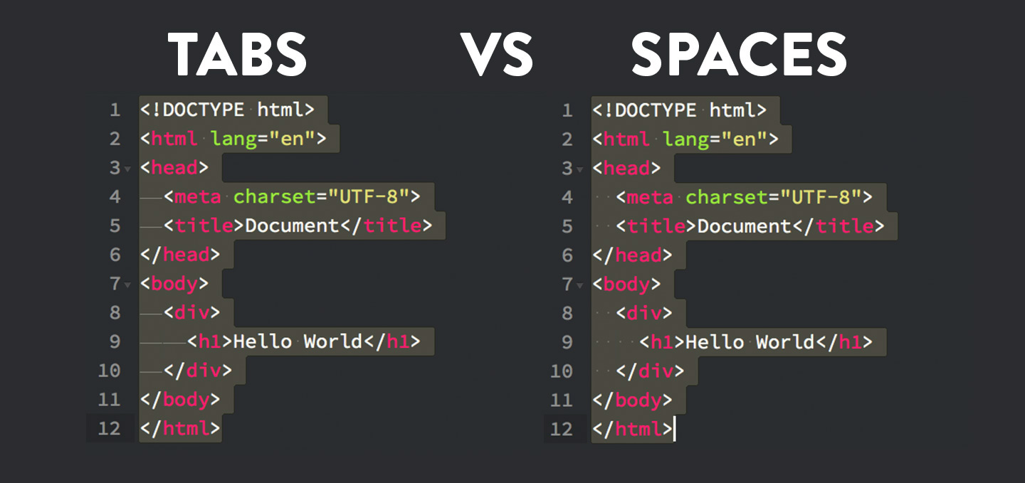
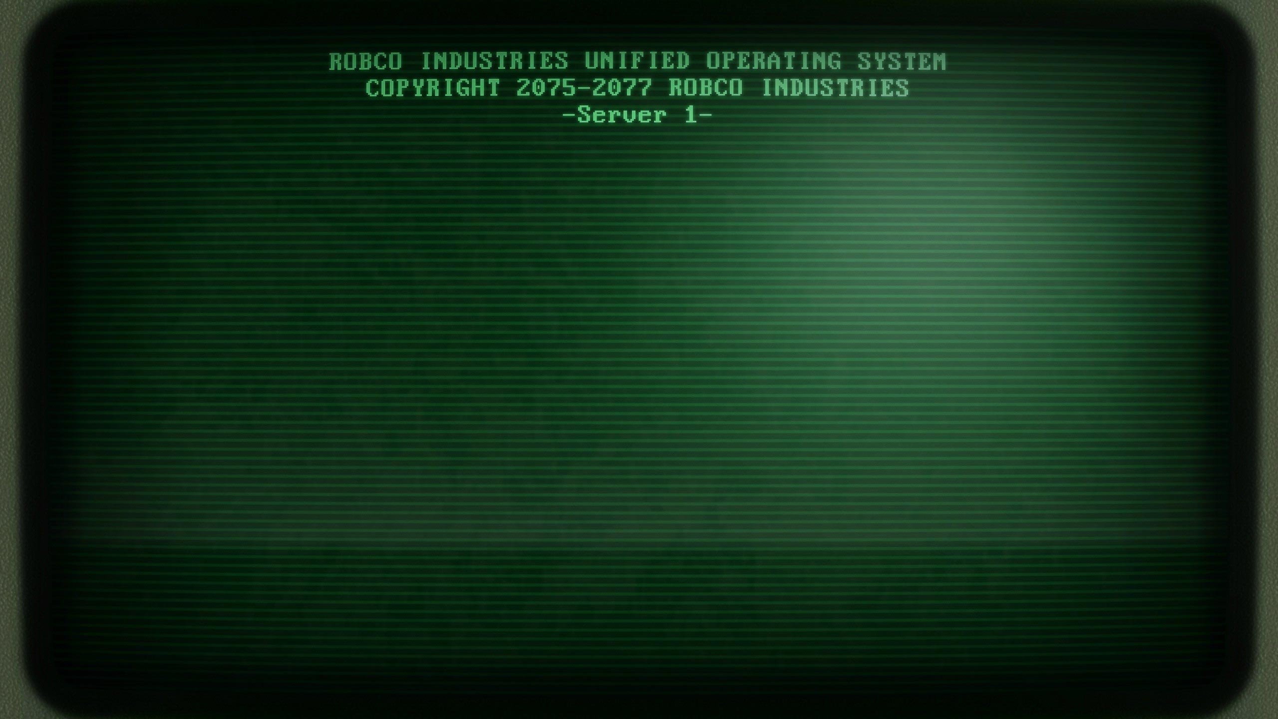
And so I began working around some designs with coding and came upon some of the following designs that I eventually integrated together.

+

I am no coder but I found immense attraction to the idea that I could plant a brand name and a message into a coding language, while being syntactically correct in it (html) at the same time.
I think the image overall is not effective to instantly make the viewer understand what the image is trying to say, but at a closer scrutiny I think the idea is really cool and hope that the sndbox team will love it.
The State of the Sndbox Competition #6 is here: @sndbox/the-state-of-the-sndbox-monthly-thumbnail-competition-6-usd450-upvote-prize-pool
Thanks for dropping by my post. I'd love to hear what you guys think of the design, so feel free to comment below : )
