
Background
A public Blockchain is an immutable incorruptible, verifiable & auditable public ledger, and utilizing the Blockchain data one can leverage into the on-chain metrics to make it relatable with the price development of an underlying asset.
The price action may be an explicit thing, maybe the king in trading, but the underlying microstructure of price action always takes cues from the on-chain metrics.
The fundamental perspective of an asset, backed with on-chain metrics is more about the utility of a coin, the real business and economic activities that are happening around it. And sampling such data to ascertain a trend to make it relatable with the price development makes the thing more justified for the trader, and investors in particular(long term investors mostly rely on fundamental aspects of an asset).
On-chain Metrics
There are so many useful on-chain metrics, but today we will keep it central to the following ones:-
- Nos of Active Addresses & Nos of Transactions
- HODL Wave & Age of a coin
- Exchange inflow and Outflow
- NVT Ratio
Nos of Active Addresses & Nos of Transactions
In a crypto ecosystem or a Blockchain network, the exact userbase is always unknown. However, it can be approximated to the number of unique addresses. That is why the nos of unique addresses is an important variable in analyzing the price development of a crypto asset. The different variants taken into the analysis are Daily Unique Addresses, Weekly Unique Addresses, Monthly Unique Addresses, etc.
So if we approximate the number of unique addresses to the userbase, then it should signify that a greater number of unique addresses means a better adoption rate for a particular network and/or asset. Further, more the no of transactions means better utility value of a Network.
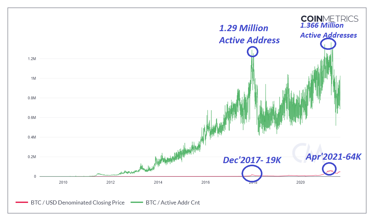
Growth in the number of Active Addresses historically has always translated into Bullish price action-- Source: Coinmetrics
So both "Nos of Active addresses" and "Nos of transactions" are fundamental to the bullish price development of a particular crypto asset(a direct correlation). However, it depends on the type of network. In a smart contract-based platform, particularly in an ICO campaign, it might show the highest volume of transactions but that may not necessarily translate into a Bullish price action for the asset. But for a UTXO structure like BTC and LTC, it will correlate perfectly to the bullish potential.
HODL Wave & Age of a coin
Please note that the age of the coin does not mean when it was mined rather since when it has not moved to another Address. Further, it holds good for an accounting structure like UTXO-- Example, BTC, LTC, etc.
So HODL wave analysis is done on the basis of the Age of a coin(on the premise of UTXO).
Take the example of BTC,
The journey of Bitcoin started from 50 BTC supply to more than 18.8 Million supply(with a max total supply of 21 Million only). So since its inception, we can identify the pattern of the HODL wave.
Since Bitcoin has already spent more than 10 years, let's create age groups like 1 yr, 2 yr, 3 yr,.......,10 yr, etc. Now if we correlate the age of Bitcoin(UTXO) with the bull cycle then evidently we will find a HODL wave. There are enormous transactions every day, but in the HODL wave, there are two distinct patterns. The local spikes at the bottom end of the graph suggest daily, weekly or monthly transactions(age), but towards the upper end of the graph, you can find the age of the coin as more than a year, 2 yr,...., 10 yr, etc.
.png)
A HODL wave will occur when a large number of Bitcoin will tend to age into the subsequent Band and progressively gets flat, and noise-free, with less or no spikes at all.
The total volume of transactions on a daily basis is slowly creating the base for the HODL wave, as a few transactions are aging into the subsequent age group like 1 yr, 2 yr, 3 yr, ....., 10 yr, etc and ultimately producing a HODL wave when the larger audience is in favor to HODL for more than a 1 yr at least.
In a HODL wave, more nos of people will hold their coin, which means the circulating supply will be lower, so that is favorable for supply/demand dynamics with a bullish potential, as for a given demand, the supply is reducing, so the price should go up.
Exchange inflow and Outflow
Exchanges are the gateway to the crypto sphere and they derive the liquidity in the crypto ecosystem. Most of the liquidity is still concentrated in Centralized exchanges.
Generally, a user who wants to sell his asset moves the asset into the exchange platform. In contrast, those who want to take a position in the crypto assets for long-term investment objectives generally withdraw from the Exchanges to a decentralized wallet.
So the attractiveness/unbecomingness of crypto can be determined by the Exchange transactions(inflow/Outflow).
Huge units of an asset, if moves into Exchanges, then it is a sell signal.
Huge units of an asset, if moves out of Exchanges into Decentralized wallet, then it is a buy signal.
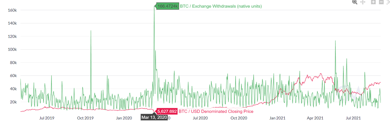
166.472k BTC were withdrawn from the Exchanges in March, interestingly in March it bottomed out and rallied since then to reach an ATH of 64k in Apr'2021. So Exchange outflow is translating to Bullish price development in this case. Source: Coinmetrics
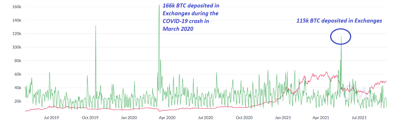
166k BTC were deposited into the Exchanges just before the COVID-19 crash, interestingly BTC turned bearish to crash into a low of 4000. Interestingly in April 2021, 115K BTC were deposited into Exchanges and BTC corrected from 64k to 29k. Source: Coinmetrics
.png)
70.88 M Exchange outflow(HEX) followed by one-way bullish price action from $0.12 to $0.35 is another testimony to the fact that huge units of Exchange outflows have translated into bullish price development. Source: Santiment
Exchange Flow Balance= Exchange Inflow- Exchange Outflow
If the Exchange Flow Balance is a positive value then the more BTC is flowing into Exchanges, then it is a sell signal. Similarly, if the Exchange Flow Balance is negative, then more BTC is flowing out of Exchanges, hence a Buy signal.
![Bitcoin (BTC) [22.44.34, 05 Sep, 2021].png](https://steemitimages.com/0x0/https://cdn.steemitimages.com/DQmQXjnRXzk5dXq1bfzQPBNXpzgJSCprXNdg7QntyxVXSoR/Bitcoin%20(BTC)%20[22.44.34,%2005%20Sep,%202021].png)
Supply on Exchanges as a percentage of Total Supply
If the supply of BTC in Exchanges (as a percentage of total supply) reduces then it is a Bullish signal and vice versa.
.png)
In March 2020, the total BTC supply on Exchanges(as a percentage of the total) was 16.05% and the BTC value was 5200 USD per BTC. Since then it started declining and visited a low of 13.26%, with the BTC price at 32000 levels, so that's a clear bullish sign. Similarly, the recent price action of BTC after hitting the low of 29K, the total supply on Exchanges was 13.73%, but with reduction of supply to 13.15% prompted a rally to 50K.
NVT Ratio
NVT= Network Value to Transaction Ratio= Daily Market Cap(Daily)/Daily Transaction Volume of the asset, recorded on-chain.
NVT ratio signifies the utility value of an asset. In other words, transaction interaction giving rise to the network value.
The exact userbase in a network is always unknown. However, we approximate it to the number of unique addresses. The unique addresses interaction (e.g. Sending/receiving BTC) creates a network effect and a network value which further determines the economic activity of a network and its worth.
So if the NVT ratio is higher then it signals an overvalued reading for the asset, in contrast, a lower NVT ratio signals an undervalued asset. (This signal should be used for long-term purposes only, the short-term use will produce distorted results).
Different reliable sites for Onchain Data
The raw approach to obtain on-chain data is to run a node and extract and sample the data to identify a trend/pattern.
But since the birth of Bitcoin, we have already spent a decade in cryptos. So there are different sites/services available as of date to provide you the readymade on-chain data along with novel approaches to analyze it with a proven history.
List of reliable sites for onchain data
Creating a Fundamental Analysis Model using a combination of On-chain metrics to ascertain the trend in BTC(using Santiment)
- Go to https://app.santiment.net/ and create an account( You can choose for 14 days Pro Trial, free of cost)
- Click on Chart, then create a New Layout. Name the Layout, then hit the Create Button.
- Now click on Metrics and in the search field, just type the on-chain metrics that you want to use for this chart.
.png)
.png)
.png)
We will add a combination of on-chain metrics one by one and then analyze the price action in relation to that on-chain metric: Nos of Active Addresses(Daily), Transactions Volume, Exchange Flow Balance, Supply of BTC as a percentage of Total, NVT Ratio, etc.
(1) Daily Active Addresses
Search "Active Addresses", then choose the metric-- "Daily Active Addresses', then click to apply the selected metrics on the chart.
.png)
We will be analyzing this metric in the Bitcoin chart for the last 6 months or so. So adjust the time frame using the slider at the bottom of the chart. Further, I will be also be using the D1 chart for this.
.png)
.png)
Observations:-
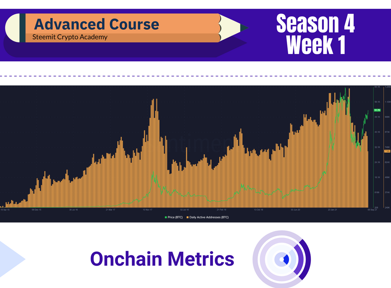
There was a steady rise in the Network activity in the context of Daily Active Addresses sending & receiving BTC. This range in the run from 20k to 63k was from 1.03 Million to 1.36 Million, with the average being 1.17 Million Active Address es Daily.
This figure slides to 710K when BTC corrects from 63k to 29k. From then, again the network activity improves to 1 Million Addresses and that helps BTC to recover the ground and now BTC trading above 50k with 1 Million Daily Active Addresses(upper range). The recent spike from 48k to 51.5k is well supported with 1 Million Active Daily Addresses.
So healthy network activity has always translated into bullish price development of the underlying asset.
(2) Transaction Volume
Search "Transaction Volume", then choose the metric-- "Transaction Volume", then click to apply the selected metrics on the chart.
.png)
![Bitcoin (BTC) [04.58.11, 06 Sep, 2021].png](https://steemitimages.com/0x0/https://cdn.steemitimages.com/DQmefKsCWXcYrDJ1oxPRKuTDRqtm7qULF7Bi5gttsU7HfPL/Bitcoin%20(BTC)%20[04.58.11,%2006%20Sep,%202021].png)
Observation:-
From 4th Aug to 23rd Aug 2021, the range of Transaction volume in BTC was 74K(lower range) to 248k(upper range) and during this period BTC rises from 39k to 48k.
Further, the recent spike in Transaction volume is as high as 790k and during that period BTC trades flat in a tight range, from 47 to 49k, so the recent spike in Transaction volume may be a shift in the overall network activity.
Transaction Volume in USD(BTC)
Now let's select Transaction Volume in USD(BTC) and apply this metric to the BTC chart and choose a larger span(e.g. let's analyze it from 2017 to 2021).
![Bitcoin (BTC) [08.57.25, 06 Sep, 2021].png](https://steemitimages.com/0x0/https://cdn.steemitimages.com/DQmcbU7WZX8rCJs3ukTvZpRkgTVh2mp13PYJagvZxweH6nL/Bitcoin%20(BTC)%20[08.57.25,%2006%20Sep,%202021].png)
Observation:-
In Dec 2017, the total volume of transactions in USD(BTC) was 270 Billion and the price of BTC at that time was 17415 USD per BTC.
In July 2019, the total volume of transactions in USD(BTC) was 106 Billion and the price of BTC at that time was 11800 USD per BTC.
In April 2021, the total volume of transactions in USD(BTC) was 345 Billion and the price of BTC at that time was 54000 USD per BTC.
On 29th Aug 2021, the total volume of transactions in USD(BTC) was 625 Billion and the price of BTC at that time was 48800 USD per BTC.
The very last one is very interesting and different from the other three previous correlations. Maybe this is a hint that BTC is setting the stage to refresh the ATH in 2021 yet again, as it has exceeded the Transaction volume of the last ATH.
(3) NVT
Search "NVT", then choose the metric-- "NVT", then click to apply the selected metrics on the chart.
.png)
![Bitcoin (BTC) [05.39.51, 06 Sep, 2021].png](https://steemitimages.com/0x0/https://cdn.steemitimages.com/DQmQEdQMQQqeb65hdq8i6Hcx42AchdupHySctKSJkfFjFkF/Bitcoin%20(BTC)%20[05.39.51,%2006%20Sep,%202021].png)
A higher NVT always signifies an oversold conditions whereas a lower NVT signifies an undervalued assets. But NVT should not be used alone as it is a lagging indicator and it can not help you predict the market. But if a peak has already occurred then you use the NVT ratio to ascertain a consolidation phase or crash.
(4) Exchange Flow Balance
Search "Exchange Flow Balance", then choose the metric-- "Exchange Flow Balance", then click to apply the selected metrics on the chart.
.png)
![Bitcoin (BTC) [05.51.43, 06 Sep, 2021].png](https://steemitimages.com/0x0/https://cdn.steemitimages.com/DQmUrkA4Pf1Crh2z1M4ebXTJdJHL2PK8TVcbTeBVRD5gPwn/Bitcoin%20(BTC)%20[05.51.43,%2006%20Sep,%202021].png)
Observation:-
The exchange flow was -19k on 24th Aug 2021, but it was +24k on 25th Aug. If we look at the data over the last 6 months the broader range is -63k(Bullish sign) to +30k(Bearish sign). Interestingly, BTC has had a bullish run from 20k to 63k during this period and after peaking at 2021 ATH(63k) it has traded with a range of 29k to 55k, and during this period, there is no such huge spike in the Exchange Flow Balance which indicates a range trading within 29k and 63k.
(5) Supply on Exchanges as a percentage of Total Supply
Search "Exchange Flow Balance", then choose the metric-- "Exchange Flow Balance", then click to apply the selected metrics on the chart.
.png)
![Bitcoin (BTC) [06.01.52, 06 Sep, 2021].png](https://steemitimages.com/0x0/https://cdn.steemitimages.com/DQmaFzrEGyKg5CAV8HoXAFVkgmdH71JquXDEGVDLJcBHkxc/Bitcoin%20(BTC)%20[06.01.52,%2006%20Sep,%202021].png)
Observation:-
On 26th July, the supply on Exchanges(as % of total) was 13.73% and the price of BTC was 37k, on 5th Sept 2021, this figure stands at 13.27% with BTC price trading at 51k. There has been a clear deviation between the two in the chart, so it is clearly evident that as the supply of Exchanges(as a percentage of the total) decreases, it results in an uptick in the price action of the underlying asset.
Final Thoughts
Except for BTC none of the coins have spent a decade time. So what is holding true for BTC may not translate to other coins with the same efficacy. Further, coins like BTC and LTC are UTXO accounting structures, whereas ETH follows an account model. Therefore all on-chain metrics may not have a universal approach for all the coins. It depends on the type of Blockchain too.
Furthermore, by and large, on-chain metrics help long-term investors, they help to predict the cycles(Bull/Bear), it may not be that accurate/helpful for medium-term and short-term traders. However, TA can be suitably integrated with on-chain metrics particularly at the inflection point of major resistance and support levels.
TA- Technical Analysis
Homework Task (Season 4/ Week-1)
(1) What is a HODL wave, how do you calculate the age of a coin(BTC, LTC) in a UTXO accounting structure? How do you interpret a HODL wave in Bull cycles?
(2) Consider the on-chain metrics-- Daily Active Addresses, Transaction Volume, NVT, Exchange Flow Balance & Supply on Exchanges as a percentage of Total Supply, etc, from any reliable source(Santiment, Coinmetrics, etc), and create a fundamental analysis model for any crypto[create a model for both short-term(up to 3 months) & long-term(more than a year) & compare] and determine the price trend (or correlate the data with the price trend)w.r.t. the on-chain metrics? Examples/Analysis/Screenshot?
(3) Are the on-chain metrics that you have chosen helpful for short-term or medium-term or long term(or all)? Are they explicit w.r.t price action? What are its limitations? Examples/Screenshot?
Guidelines
- Your article should be at least 600 words.
- It is always better to gain sufficient user experience before submitting your article.
- Refrain from spam/plagiarism. This task requires screenshot(s) of your own experience. Use images from copyright-free sources and showcase the source, if any.
- This homework task will run until 11th Sept'2021, Time- 11:59 PM UTC.
- Users having a reputation of 65 or above, and having a minimum SP of 600(excluding any delegated-in SP, delegating to vote-buying services is viewed negatively) are eligible to partake in this Task. (Must not be powering it down).
- Add tag #sapwood-s4week1 #cryptoacademy in your post and should be among the first five tags. You can also use other relevant tags like #blockchain #onchainmetrics #fa or any other relevant tag. And also make sure you post in the Steemit Crypto Academy community.
- Do not reproduce the information that I have provided in my course article. Expand your knowledge by extensive research & analysis with proper reasoning to chainlink your understanding.
(Please feel free to join the comment section if you have any doubt on Homework-Task)
Thank you.
Disclaimer
This article & analyses are for education purposes only and should not be viewed as investment advice. This does not guarantee or promise in regards to any result that may be obtained from using the above content. The information provided here is for educational purposes in Steemit Crypto Academy. No person should make any kind of financial decision without first consulting their own financial adviser and/or conducting their own research and due diligence.
Cc:-
@steemitblog
@steemcurator01
@steemcurator02