
Hello 👋
The images give an extra value to our publications, so today I come to bring you some tips to make your posts even more beautiful and have a better quality, in order to increase the chances of receiving support. Surely these tips no one had given them to you, but they always prove to be crucial when it comes to attract people's attention so that they visit our publications.

As you know Steemit is a social network where each user owns a wallet and a blog, for this reason we consider very important that all publications have many similar characteristics to a professional blog, since many publications are monetized every day, only the best and most reliable will get the support of the great curators, creating a kind of competition where if we want to get rewards per author we must give our best possible effort. Without forgetting the interaction with the rest of the authors who make lives in Steemit, every vote, every comment is valuable.
Having a blog is not just anything, many of us create it only as a hobby and do not expect anything in return, although we know that most of them have created their blog with the intention of generating rewards either to invest or to support their economic situation, rather than seeing it as a hobby. But we must know that a very popular or successful blog requires many things like time, dedication and many strategies that allow us to always be in the trends. So I invite you to keep reading and knowing all those "keys" that a publication and our blog must have to increase the chances of success and connect with other users.

Preview our publications.
At this point we will talk about this important part that can lead someone to decide whether or not to open your publication in Steemit, because a good title, a good thumbnail image, and a good opening text are key pieces for someone to decide to enter to finish reading our publications.
%2012.26.15.png)
Of course these 3 parts (title, thumbnail, and first words) of the preview should have things in common like the reference image of the great author @serap.
Look at her post, she talks about painted stones obviously her title speaks correctly without any extra embellishment just the club100 to identify her status, and her thumbnail very correct where you can clearly see a lot of painted stones, also her first words start with something coherent from a post.
It would be illogical and incorrect that if the subject of the post was painted stones she would show a miniature of the sun and sky. Many authors do this nowadays and then wonder why they have no support.
Let us now look at these points separately to see clearly what we should and should not do.
Title of our publication
The title are those keywords that identify the topic that our publication is about.
Ideally, a title should be simple and only deal with the topic of the publication, without the need for capital letters, accents (in Spanish), or strange symbols, so that your post can come out perfectly in the google searches of some curious person. do research on the subject.
Steemit users usually put their title in CAPITAL LETTERS just to try to attract attention, but they don't realize that it doesn't look very neat and is usually annoying to the eye.
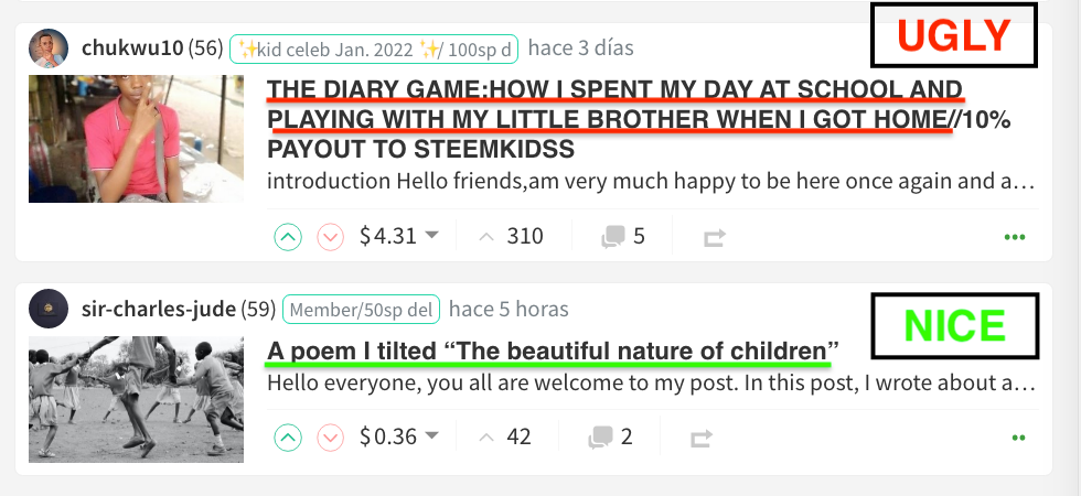%2013.08.18.png)
Many users are adding in the title the **% percentage of beneficiaries to the community account "This really is not necessary" and it is usually annoying, if this is also going to be checked by the moderators.
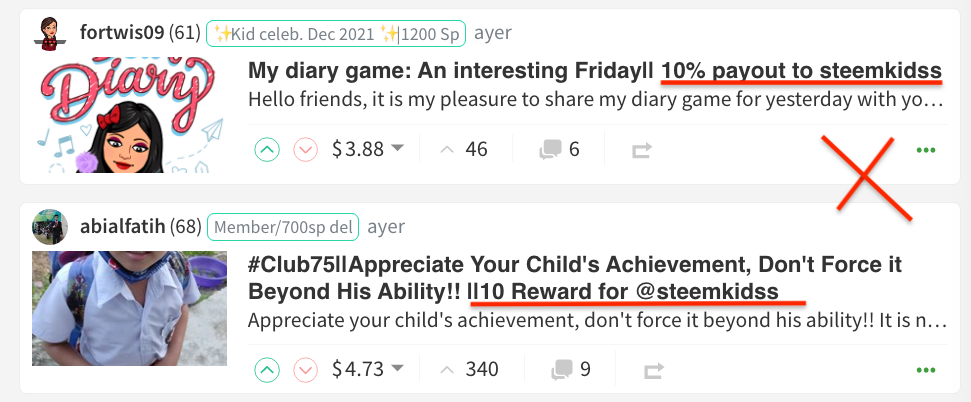%2013.03.29.png)
Most are indicating or identifying the Club Status (#club100, club5050, etc) in the title. This isn't or shouldn't be needed, but it seems to be helping the marshals, so try to place it as neatly as possible.
If your publication is about a trip to the beach, the logical thing would be to mention the keywords "travel and beach" in your title. Obviously the thumbnail photo should clearly show the beach.
First words of our post
In general, most people start by greeting their readers, some giving a small interesting introduction about their article, these two cases are fine and valid.
But, there are some who unconsciously start off on the wrong foot, leaving as their first words, credits for images or resources, mentioning the % of delegation, even with the same title, and it shouldn't be like that. They should start with some nice words like I mentioned before.
%2013.28.53.png)

Thumbnail of our post
Personally, I consider this to be an important part of the preview of our post, perhaps the most important, and it should always be consistent with our title.
Normally I try to use the 16:9 format or aspect ratio for images and photographs, specifically I use the resolution 1080 pixels: 1920 x 1080 for my images, as you can see they cover and expand perfectly in the thumbnail, that is to say that the main image it will look completely without cropping or anything, in our thumbnail.
Other resolutions of this 16:9 format
- 2160 pixels: 3840 x 2160
- 1440 pixels: 2560 x 1440
- 1080 pixels: 1920 x 1080
- 720 pixels: 1280 x 720
- 480 pixels: 854 x 480
- 360 pixels: 640 x 360
When we upload an image to Steemit with this 16:9 format, it automatically takes the minimum size 640 x 360, I suppose that in order not to overload the platform, because they will realize that when uploading it, the quality of the photography decreases once uploaded to the web.
Visit this link to see the actual size of the main photo by @genesisaguilera
%2013.57.21.png)
Normally, cell phone photos come predetermined with the 4:3 format, which in the horizontal direction also works for the thumbnail, but it will not be seen completely, on the other hand, vertical photos are not suitable for the main photo and thumbnail.
Now, let's see how an image with this 4:3 aspect ratio looks vertically and why we shouldn't use them.
Visit this link to see the actual size of the main photo by @mini80
%2014.02.50.png)
As you can see, this user tells us in the title (A selfie with the Steemit logo), but in the thumbnail you can only see her mouth, part of her neck, and the Steemit logo is nowhere to be seen. Now do you see it? that's what I mean.
Horizontal images in the 4:3 format tend to look better on websites, although they do suffer from a little cropping in the thumbnail display, "They work and look good."
On the other hand, those that are vertical type NO
Let's see other examples, I also leave you the address of the post so you can see the real size of the photograph and see what I'm talking about.
Visit this link to see the actual size of the main photo by @anderannahysa
%2014.11.28.png)
Visit this link to see the actual size of the main photo by @ibtisamwaqas
%2014.08.43.png)
Visit this link to see the actual size of the main photo by @patience90
%2014.27.38.png)
Personally I recommend that all users share photos or images in horizontal direction, as it is like the preset for websites for a long time. And if you want your main image to fit perfectly in the thumbnail use the 16:9 format.
Even all images should be the same size in our publication to make everything look neater.
By the way, for people who use a smartphone to browse in Steemit, you will see that everything looks perfect, but surely most people, and curators use the computer where you can clearly see these details in the thumbnail.

In this second part of how to have a successful blog I have dedicated myself to talk about this topic because I consider it is very important for people to be excited to open your publications, the first impression always counts.
Remember that in the first part I showed you part of the process of what a good publication should have, and I also mentioned what things we should do so that our publications have more audiences. But always keep in mind before writing a publication that you should study what kind of audience you want to reach, and do not forget that the interaction and votes of support to other users is of great help in STEEMIT to build a network of supporters and frequent readers.
I hope that all this material is very useful for you and that you put it into practice, I believe that the things that were discussed today will be useful for your Steemit blog and any blog in general, and they are necessary things that every blogger should know and know. Also, this is the second part of this guide for Steem Kids so that all users from all countries can learn a little more and improve the quality of their publications.
Thank you very much for coming to enjoy my blog, I hope you liked it and come back soon. Until next time ❤️
✯✯✯✯✯✯✯ ✯✯✯✯✯ ✯✯✯ ✯
Read the following posts to find valuable information for you:
Regards 👋👋
@saracampero
Country Representative Venezuela
WhatsApp - Telegram 📲
saracampero#0510


