Hello friends and famz. It's always my pleasure to connect with you each and every time am opportuned to. I trust you're good and keeping well. Do well to enjoy your stay here.
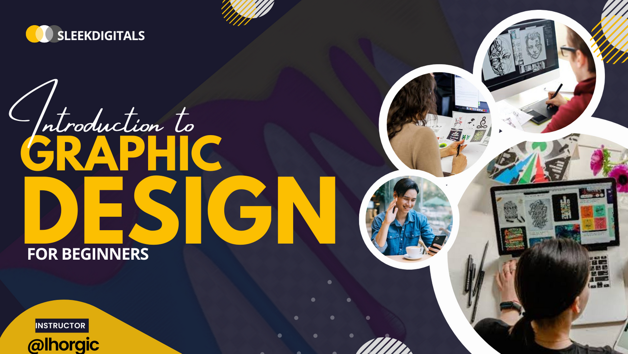
Yea! Am sure you're wondering what am up to with this post, you must have carefully gone through the flier design I used as my cover image for this post...smiles.
Well I will be giving you the full gist in detail.
You know I have been on the steemit platform for quite sometime now and I have noticed that there are certain factors that makes ones post or article presentable and very attractive. One of those factor is what I want to give attention to as a user on this platform.
What am I talking about? Am talking about visuals, Graphic Design to be precise.
A quality post is usually made up of several elements which includes the design you use for your post.
This is what people get to see first before they get to read the value you have put into a post.
Do you know you can leverage on your design to gain audience? According to research, many people have read publication they would not have read ordinarily because of the visuals (design) used in presenting the write up.
In the same vein, so many value packed publication has been skipped and bypassed simply because the cover design or visuals was not attractive and appealing enough. This is what I hope to help users with on the platform.
I want to officially introduce to you all my Graphic Design lesson which I believe would add to the quality of your publication. It doesn't take much to create a simple and cool design.
You might not be interesting in taking up Graphic design as a profession, it understandable but then it still not wrong to have a profound fundamental knowledge of graphic design as a content writer because there is a strong connection between writing and visuals. It's time to step up your game.
Graphic design 101 just as the name implies will be a weekly publication that will help you kick start from the scratch even as a beginner, hence the attachment "101" which is more like and introductory course code
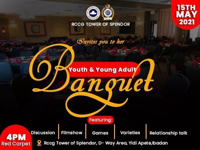
I have some handful of designs I will like to showcase, some of these designs were captured in classes I've held on the platform as a graphics teacher while the others are just some random designs I did for clients. The designs should convince you and give you an idea of what am about to teach weekly. Check them out below, they are all for your perusal.


 |  |
|---|
.jpeg)

At this point I believe you're fully convince of what you would be learning, trust me, I've been in this for quite sometime and my goal is to help you come up with simple but top notch design without complications. Once you learn the fundamentals as a beginner, you're good to go with any graphic design app/software.
The problem with many designs is not really about the graphic tool or software they use but lack of fundamental principles guiding design. Once you get this, you can manipulate any app/software to your advantage.This is what I hope to achieve with this lesson.
Introduction to Graphic Design
General tips for graphic designer
Typography
Alignment
Hierarchy
Elements; Shapes, lines, white space etc.
Colours
Use of Assets in design
And lots more....
The above mentioned outline will be followed for the lessons, I can alternate them as the need arise. This is just the beginners phase as I wouldn't want to come up with something complex hence the very simple lesson outline.
Am sure you would enjoy it as I unravel the lessons, so keep watching this space.Thank you so much for coming this far with me, your valuable time is much appreciated.
Your coach:
@lhorgic♥️
Cc: @ubongudofot
