Thank you to everybody for their feedback on the idea of introducing a main navigation - in general, the idea of a primary navigation, as well as the ability to more easily switch between the Feeds and Profile was well liked.
At the end of this post, I'll ask you for your opinion on a few of the layouts that I'll share with you. Whilst I've gone to some effort to make the concepts that I'll share look pretty, they'll need some polish before they're production ready.
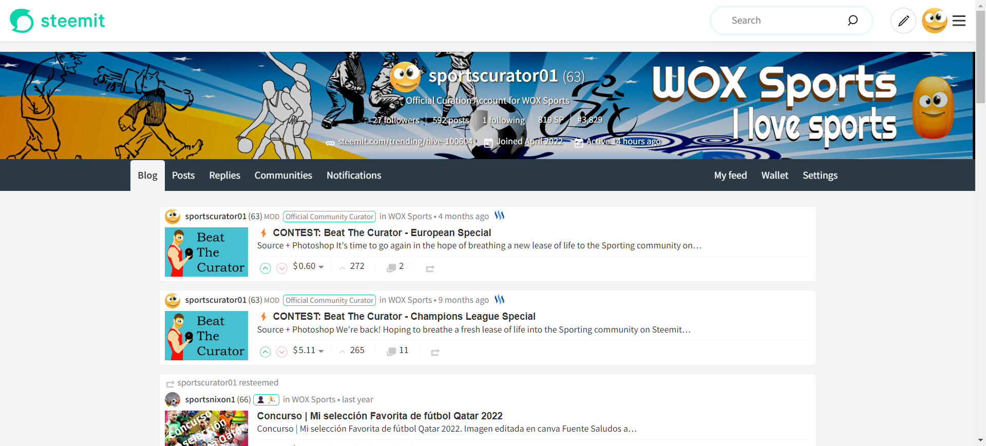
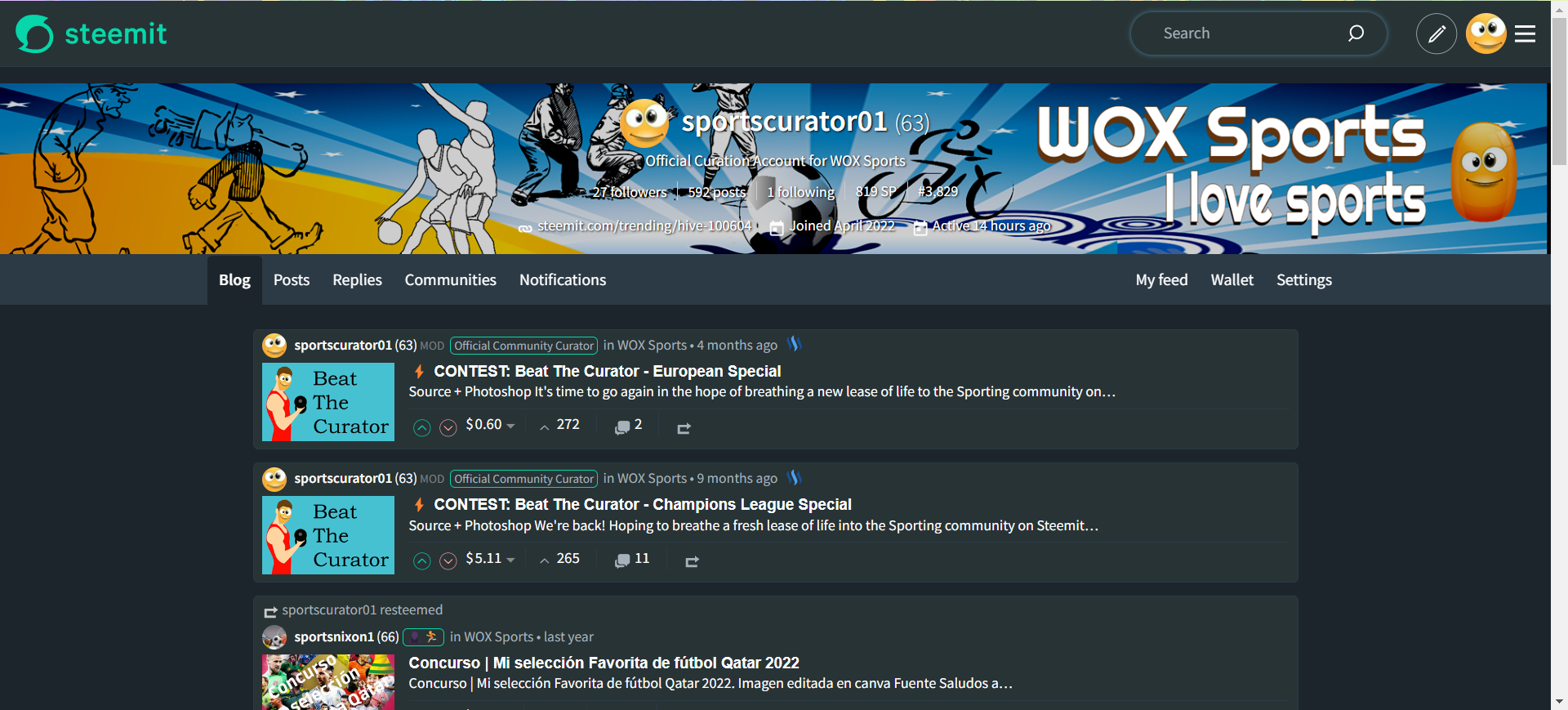
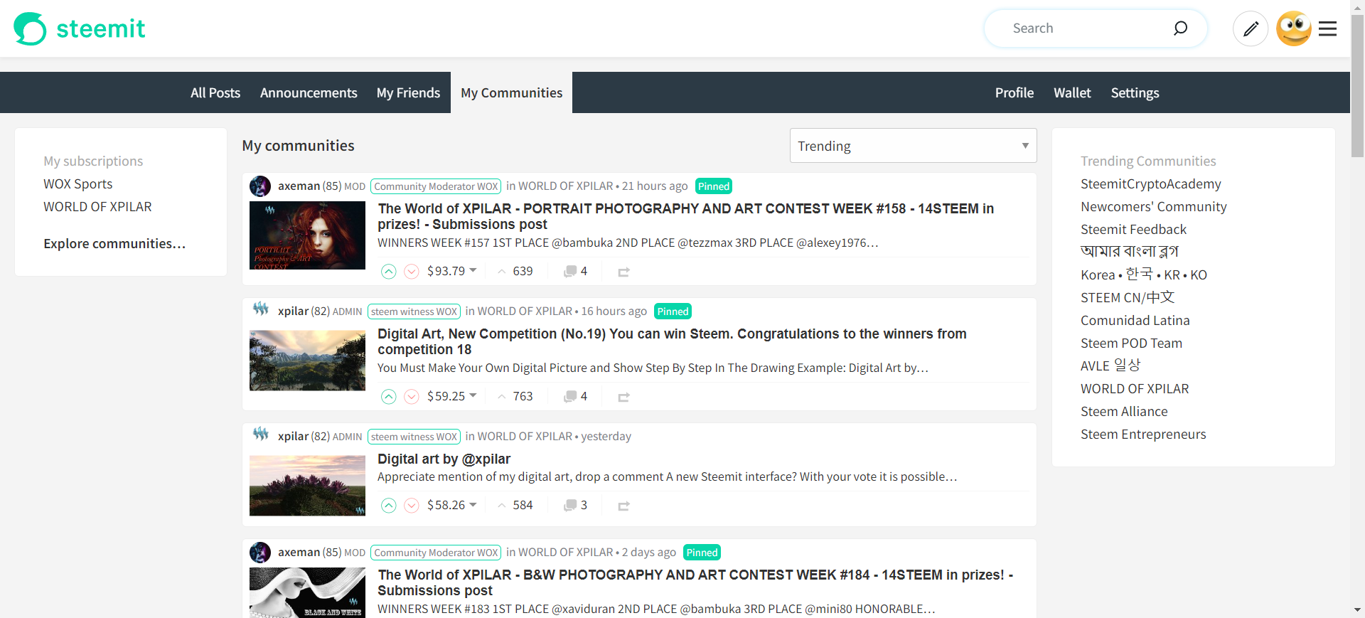
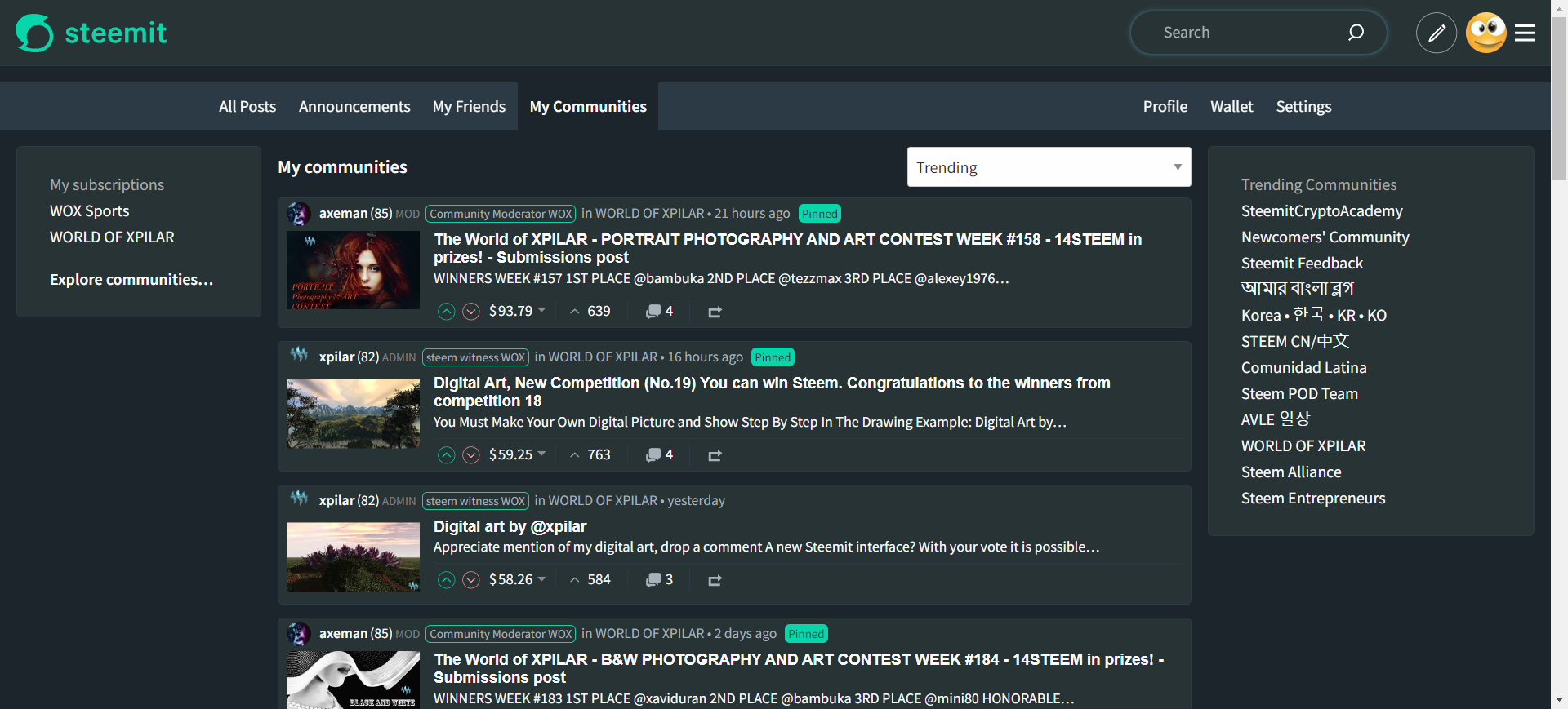
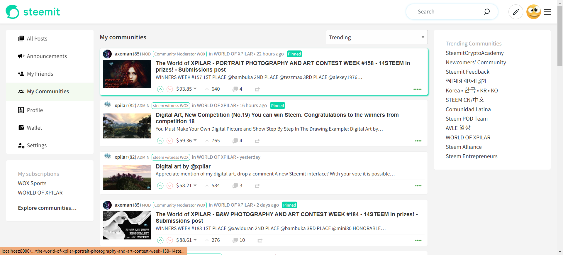
On the back of my previous post, I started to implement a top navigation that is consistent with the primary navigation in the Profile page. I also implemented the My feed idea which as I mentioned in the previous post, is a helpful and very playable feature when switching between different users' profile.
As always, all images are clickable to view in full size and this time, I'll share both light and night mode versions.
Below is the "basic version" - the addition of the My feed link, alongside the Wallet and Settings.
As I mentioned above, the initial idea was to make the design consistent with the Profile page which once implemented, looked like this:
Whilst this design was consistent, it's difficult to disagree with @boylikegirl.wit's comment that:
This seems to be a retro design
The consistency made it look dated but boylikegirl.wit did get me thinking and wondering why I've constrained myself to the consistency with the existing site.
boylikegirl.wit also suggested that the navigation could be in the left sidebar (like Twitter (I don't think I'll ever call it 'X')) and whilst there is nothing forcing the primary navigation to be in a specific part of the page, convention dictates that it's either at the top (e.g. Facebook or BBC) or on the left (e.g. Twitter). A variety of navigation designs can be seen on dribble.com for some additional inspiration.
One thing that has become increasingly common, is the use of iconography - particularly useful when a menu bar is collapsible and in the case of Facebook, even when it's not. (Perhaps) interestingly, my MSc dissertation investigated the use of icons in computer systems and the conclusion from the research was that icons assist with the understanding of a system (provided that there's some familiarity with the icons being used).
So, this is a long way of saying that the next thing I introduced, was some icons as well as a subtly curved tab implementation of the "active" state.
![]()
![]()
![]()
![]()
For consistency, this also required the addition of icons in the Profile screen (where icons have been used in the Avatar menu, I have reused them for the tabs):
![]()
![]()
![]()
![]()
The concept of icons also allows for a "mobile app" style implementation (for mobile devices) with tabs across the bottom of the screen.

The final iteration (which has only received limited effort so far (steemit.com's APIs being unavailable makes development... difficult)) is again following on from boylikegirl.wit's comment:
The left and right forms are more in line with the usage habits of x users
The introduction of icons increases the appeal of moving the primary navigation to the left sidebar. As things stand, I've not implemented this in the Profile screen and if this is the preferred option, the profile area would benefit from this implementation as it would improve consistency and the prominence of the body content (hard to articulate what I'm thinking but it feels like the profile page needs something more than "lists of information").
Anyway, left sidebar...
The sidebar also lends itself well to becoming a collapsible area with only the icons displayed when minimised.

Whilst comments are a bit of a mess on Steemit at the moment, I can generally read them even if they don't always appear on steemit.com's interface. Similarly, I hope you've been able to read my replies even if I can't see them myself.
I'd also appreciate it if after reading this post, you see what others have said in the comments and discuss some of these ideas amongst yourselves. The feedback I've received so far ranges from "removing the sidebar is a great idea" to "removing the sidebar is a terrible idea" as well as "the new design looks great" to "the page looks ugly".
Please, when providing feedback whether positive or not, make it constructive.
On the back of the above, I'd like you to start your reply with a simple prioritisation of your preference:
a) Basic version - consistent with existing Profile navigation
b) Introduction of Navigation with icons across the top
c) Introduction of Sidebar
d) Other
Whilst I've implemented quite a lot in code (via the creation of a FeedsNavigationMenu component), I haven't hooked up the Announcements yet (its appearance in the primary navigation doesn't feel right and its presence in the body content feels more appropriate), so there's still some work to be done. The amount of work to complete this task will also be dependent upon feedback to this post.
Once I know which direction is preferred, I'll get it implemented and share it to a test server that I've configured.