It has been a little whilst since my last update during which, a lot of time has been spent testing the integration of the navigation as well as the beginning of the next stage of development. Testing has generally gone well with 3 bugs being identified and fixed:
- Empty secondary navigation in the "Explore" tab for logged out users on mobile devices.
- The "Load more..." link on the "Notifications" screen being inaccessible behind the navigation on mobile devices.
- Trending communities displaying under "My Subscriptions" after refreshing when logged out and then logging in.
In addition to this, the indentation and spacing has been subtly tweaked on both mobile and desktop views.
These updates have been deployed to https://steemitdev.com and are working as expected.
Communities
Whilst fixing these bugs, I also fixed a couple of other bugs that had been submitted to GitHub (more on that later) and whilst looking at these, I found this "issue" raised which was an idea of how to redesign communities.
There were some consistencies in this design with what I was already considering with the following objectives in mind:
- Make it prettier.
- Reduce the need to scroll past 100 pinned posts.
Make It Prettier
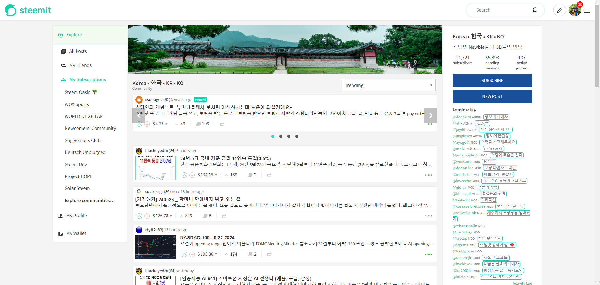
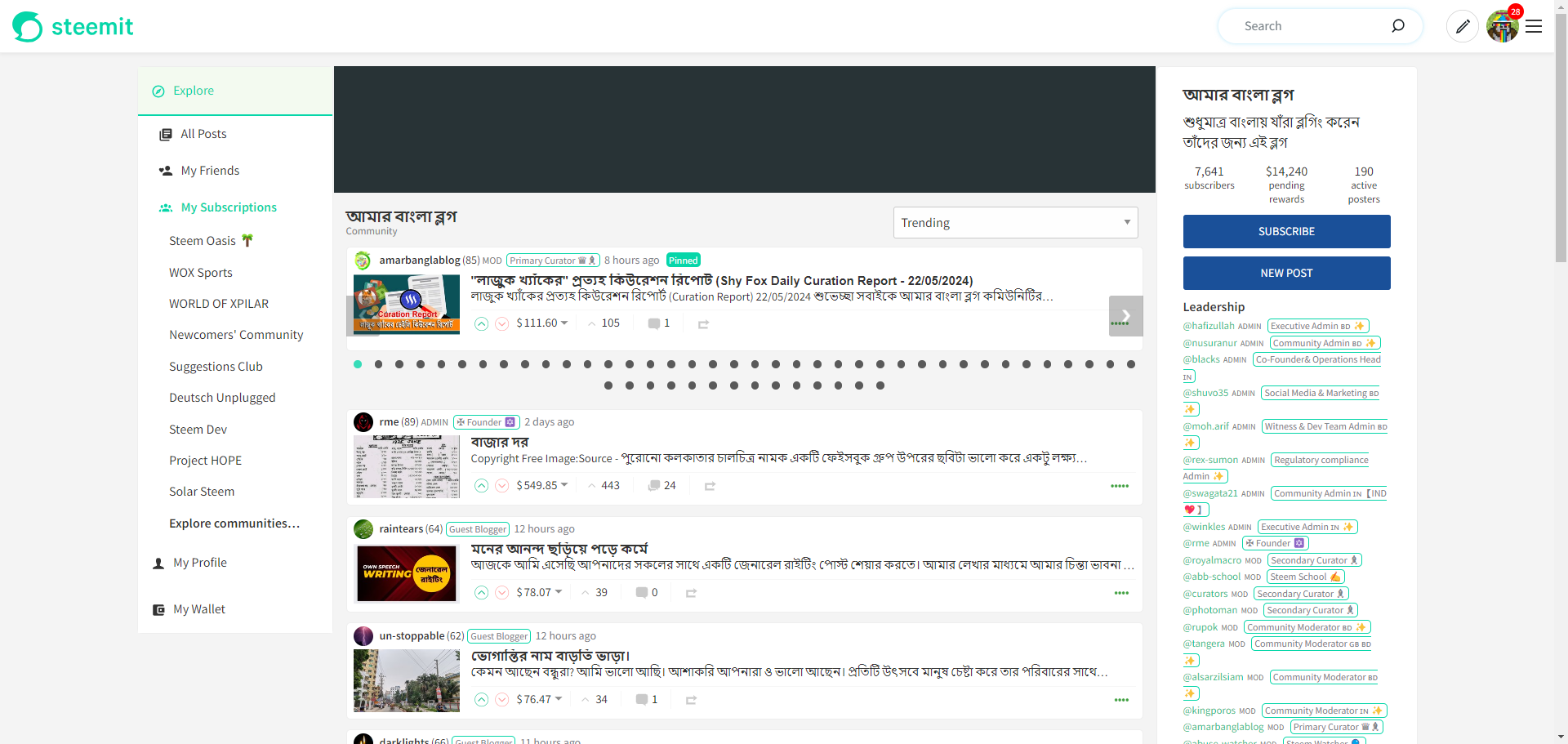
I've found these objectives extremely challenging so far. I want to use the community's avatar and cover images to "jazz up" the screen, similar to how it's implemented on peakd.com - bringing the information that's currently in the top right into the cover image.
The cover image alone proved to be more difficult than expected (although the final solution is actually quite simple) and instantly brings a community page to life (when used).
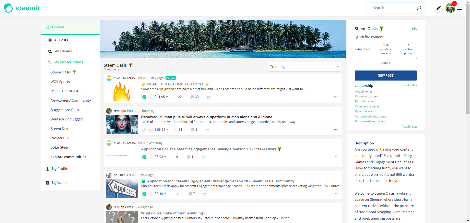
It's a 1st version so a long way to go but a good indication where my thoughts are heading.
__
Reduce the need to scroll past 100 pinned posts.
This also proved to be more difficult than it should have been. It was easy enough to separate out the pinned posts from the data returned for "Trending" and "New" options (they're not prioritise (i.e. pinned) for "Payout", "Muted" or "Hot) and subsequently wrap them in their own list. I was then able to easily wrap them in their own element with a "scroll" effect using overflow-x: scroll.
Unfortunately though, this introduced a vertical scrollbar where the Payout Information, Downvote Information, etc. was on the screen but invisible. Setting overflow-y: visible conflicted with the overflow-x property with either x or y being set to "scroll", automatically (and unchangeably) setting the other to "auto". I tried tons of solutions which either resulted in the aforementioned issue or the overlays being hidden within the wrapper.
After a huge amount of frustration, I discovered a simple solution. A new CSS class introduced in 2023 (which a lot of comments were rather negative about) of overflow: clip. The negativity stemming from the fact that it can only be used on x OR y, not both. For me though, the perfect solution.
So once again, huge frustration and much experimentation to eventually reach an incredibly simple solution.
After some time styling it up, adding in some navigation (no auto-scrolling carousel yet), it finally looks like this:
It still needs a lot of work, especially on mobile and I'd like to give the pinned posts a bit more prominence now that I've hidden most of them.
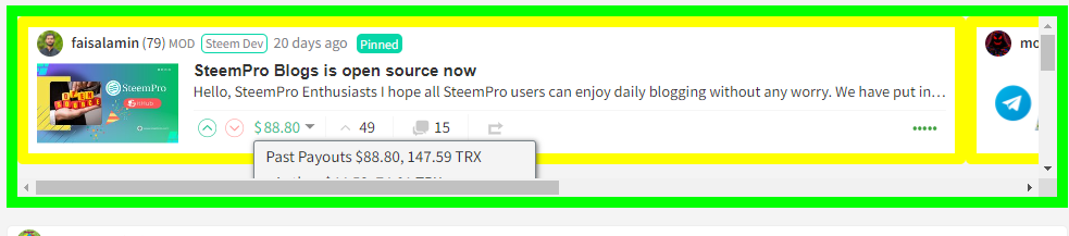
It works for an unlimited number of pinned posts (although obviously won't look great) - the biggest example I could find was 54 pinned posts:
It's instantly made a lot of communities much more user friendly and will hopefully discourage community admins from pinning everything just because they wrote it.
The progress is available on my dev. server: https://condenser-web-r64jisicxa-od.a.run.app/ and I invited you to have a look and let me know what you think of the general direction.
As I've mentioned, this is an early look and there's a lot of effort still required.