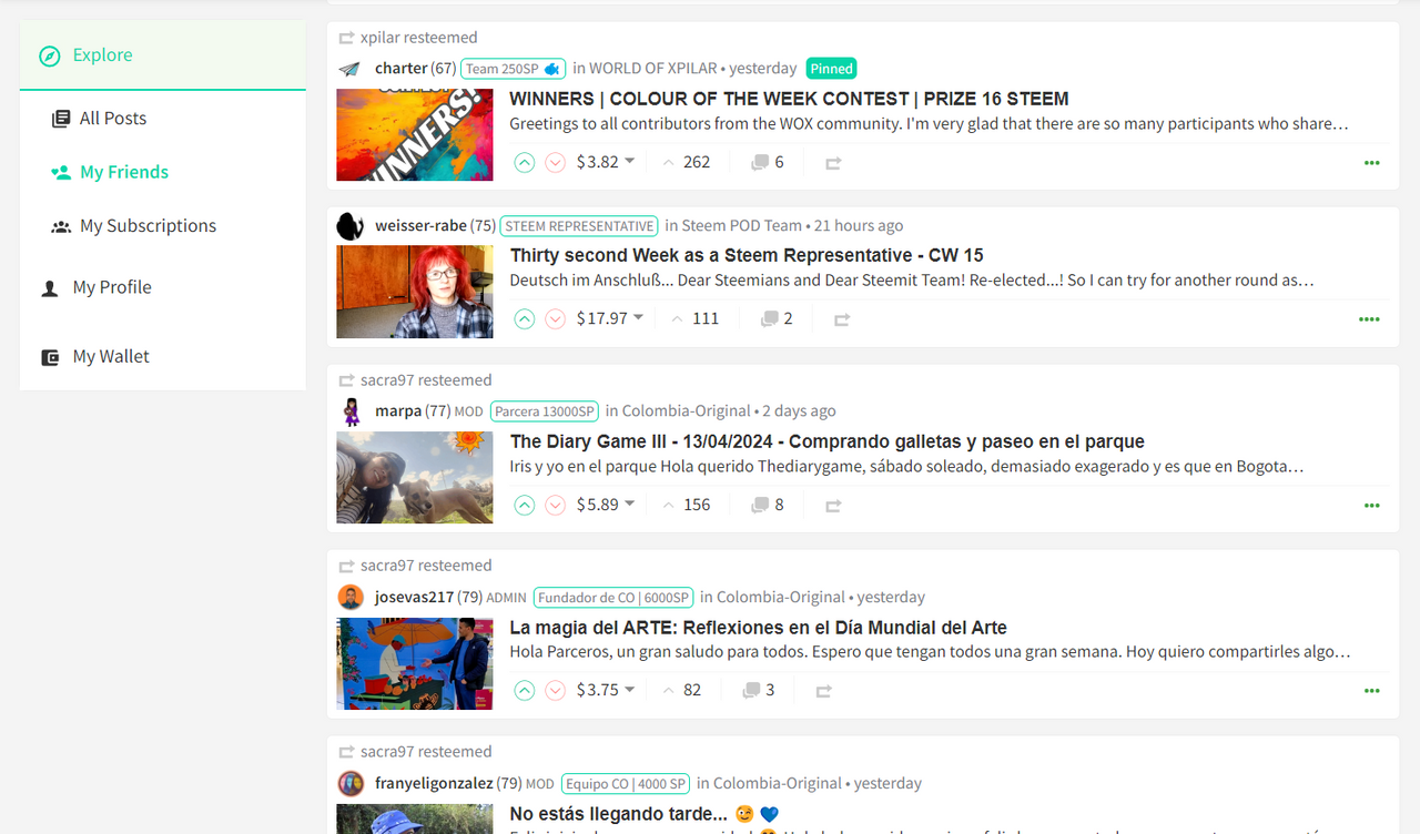
👉 VIEW THE UPDATED NAVIGATION 👈
I can barely believe it's been 2 weeks since my last update and I feel like it's been a very successful period.
I've been using the updated navigation for this entire period - on both my Desktop and Mobile devices which has really helped me to iron out a few niggles and get a good feel for its usability.
During this period, I've also refactored some sections of code to make them easier to understand and therefore more maintainable. In the process of doing so, I've reduced the navigation JSX file to just under 460 lines of code (including a handful of comments). For a bit of context, my previous update had 480 lines with less functionality and the Profile Header has 560.
I'm of the opinion that the code is structured in such a way that somebody else could pick it up and understand what it's doing without too much difficulty - I didn't think this when I last updated you.
So tell me Gorilla, what have you done?
1. Sticky Navigation on Desktop
This is something that I've been wanting to implement for a while and put off until the end. The simple solution of adding a CSS class of Position: sticky was perhaps optimistic and didn't work (presumably due to overflow declarations elsewhere which I didn't want to risk changing).
So I had to go "old skool" and implement a solution using JavaScript. In simple pseudo terms, I had to check the starting position of the navigation, see if the user had scrolled beyond it and then pin it to the top. When the user scrolls up far enough, unpin it. Of course, it wasn't as simple as this as I also have to check the window height and if the window is shorter than the navigation, I'd pin it to the bottom when scrolling down, and top when scrolling up. I also included transitions so that the navigation doesn't "jerk" as you switch between each scenario.
One thing that I felt was important with the implementation was avoiding the introduction of a scroll bar just for the navigation (which would've been an easier route) and the additional effort required was well worth it in my opinion.
I only completed my first implementation a few hours ago and in using for that short time, have made it a lot smoother. Whilst this is a subtle change, it's the difference between noticing something happen and not - and I believe that if you notice a User Experience, then it's probably not good enough.
You can view this for yourself by visiting this link:
https://condenser-web-r64jisicxa-od.a.run.app/@the-gorilla/posts
2. Log In Overlay
Previously when a user wasn't logged in and they selected "My Profile", they would be redirected to the Login screen (https://steemit.com/login.html). Whilst this was functional, it was inconsistent with the experience if you clicked on the little pen icon to write a new post.
So I reviewed my implementation and implemented the Modal Overlay which also feels like a subtle but valuable improvement.
3. Other Bits
As I mentioned in my previous update, I needed to tidy up parent components and update the right sidebar - both of which I did alongside a general code tidy.
Whilst I've tested numerous scenarios and edge cases, it's possible that there is a scenario that I've not catered for.
Everything should work smoothly for scrolling up and down, navigating through pages and resizing the browser window - with the navigation pinning and switching between Desktop and Mobile view as things are adjusted.
What Next?
I'm nearing the point where I can submit this implementation to GitHub for higher powers to accept or reject. Whilst I'm fairly confident in its robustness, I'd greatly appreciate it if you can help me to get more eyes looking and using this update...
👉 VIEW IT HERE 👈
Then, my plan is to write a long, detailed post explaining the code, which I can reference in a comment within the component. This will allow the coders amongst you to review what I've done and anybody working on Condenser in the future will know where to look (and know who to ask if they have any questions).


