I've often thought long and hard about how to apply color and how to express different values in a way that is consistent with life. The practice of doing still life studies as well as painting outside has given me all kinds of grief! This is not an easy subject to take on. I hope that by opening a little window into how I try to think about color will provide a perspective and a lens for you to approach your own studies with a little more confidence.
I won't be going over drawing fundamentals but if you need help in developing a good eye for perspective and basic drawing skills I highly recommend you head over to @jorgevandeperre's page. @jorgevandeperre is putting together a very well thought out approach to handling drawing basics, practice, perspective as well as shadow and light and how to express form. Making things look 3D is a difficult subject already so if you're just starting out I suggest you start there!
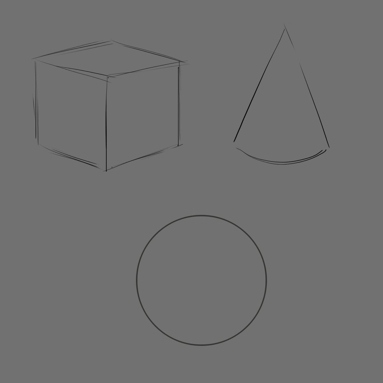
For most things it's good to start out with a sketch. I've laid out a few basic shapes that are good to understand. The cube, sphere and the cone can be found in most things and can be used to build just about anything you can think of.
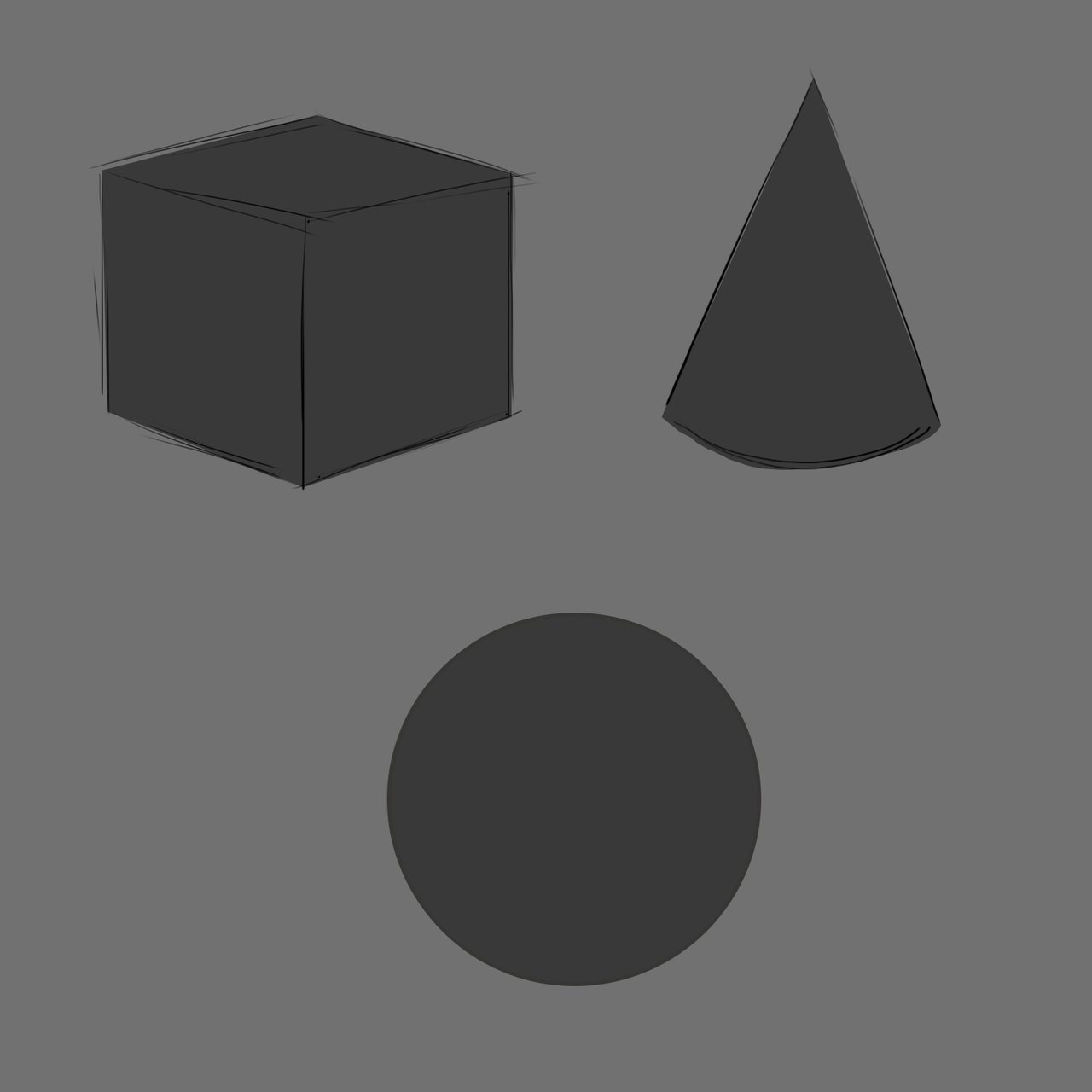
It's at this point I like to use the lasso tool in photoshop to fill in the shapes I'm using.
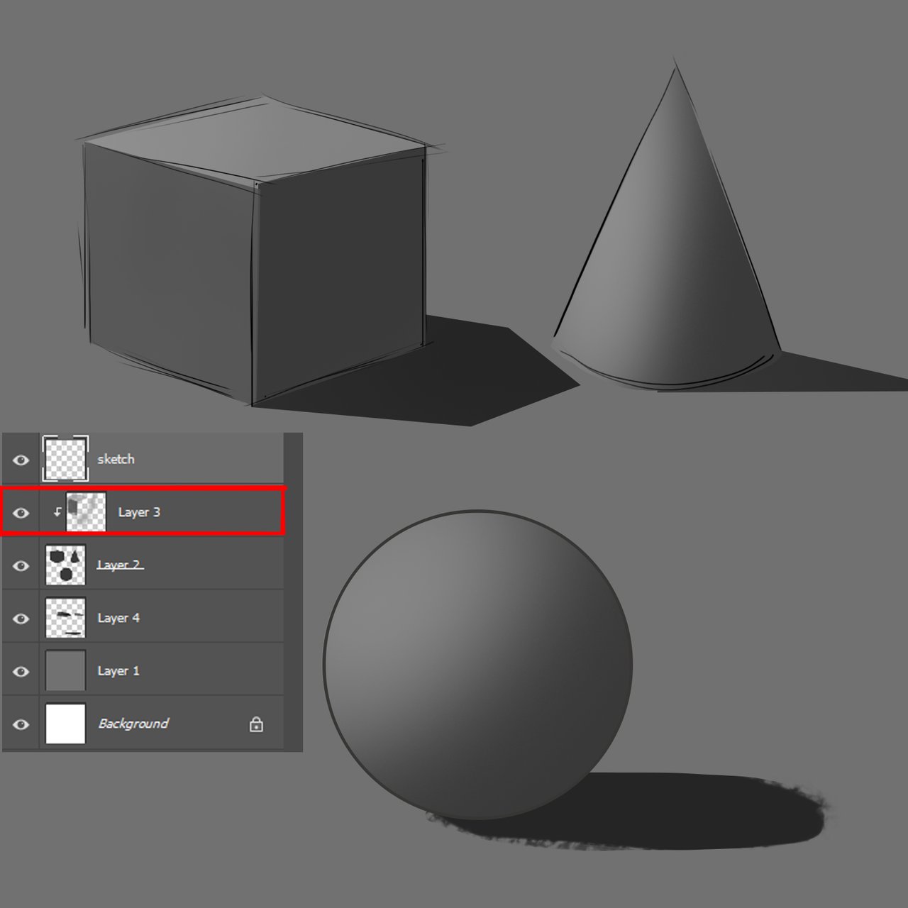
One of the neat features in most drawing software is the ability to use the previous layer as a clipping mask. Holding "alt" or the "option" key on Mac will usually allow you to turn a new layer into a clipping masked layer. This means you can paint away without going outside of your previous shape. If you are unfamiliar with clipping masks a quick search will bring you lots of 1-2 minute videos on how to do this yourself. I've added a layer below the shapes with shadow shapes.
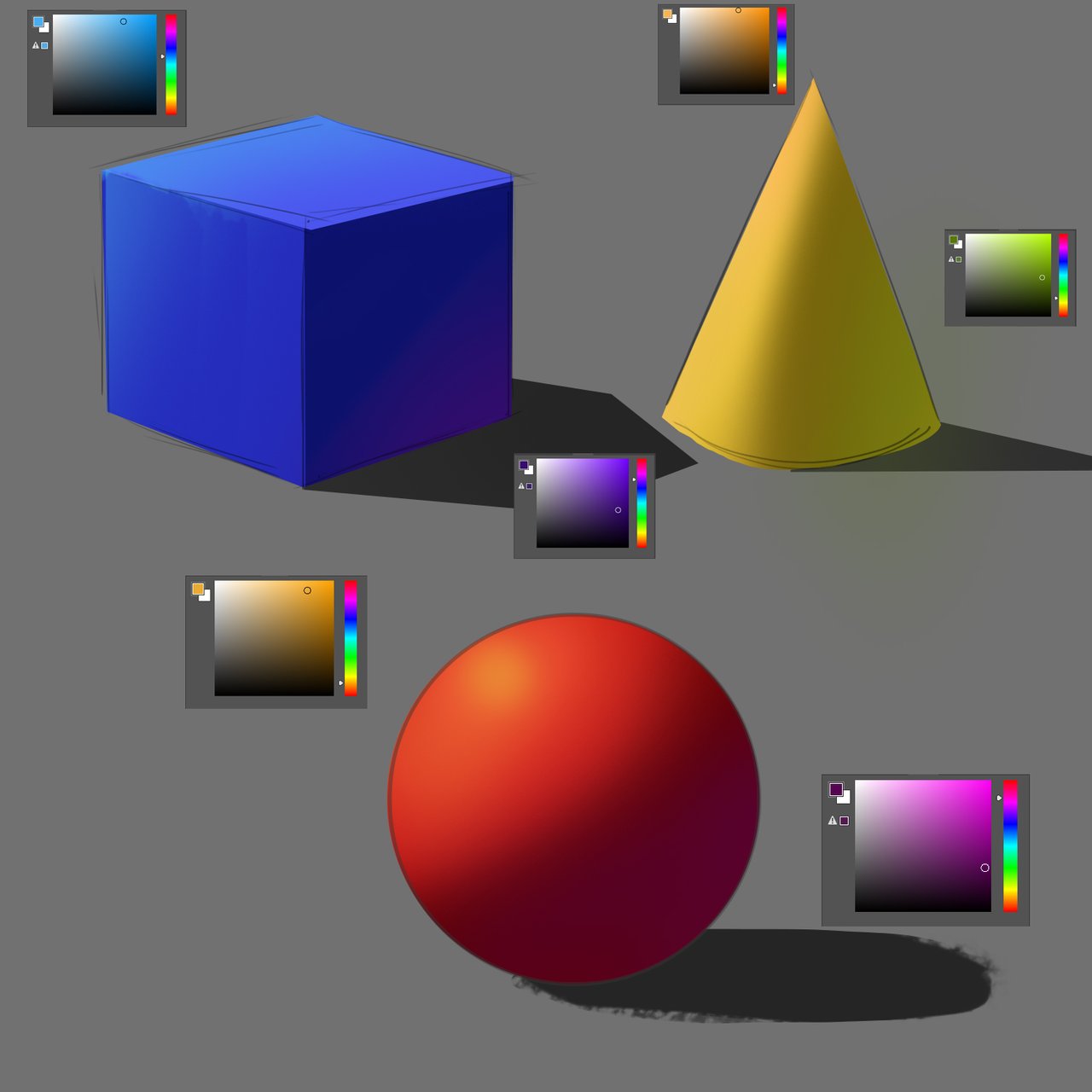
Let's get into it! I've filled each shape in with our primary colors. This is the starting point for any color study. If you've watched any other artist paint you'll notice that lots of artists love to start with their basic flat color. This is the color of the thing without any light or shadow.
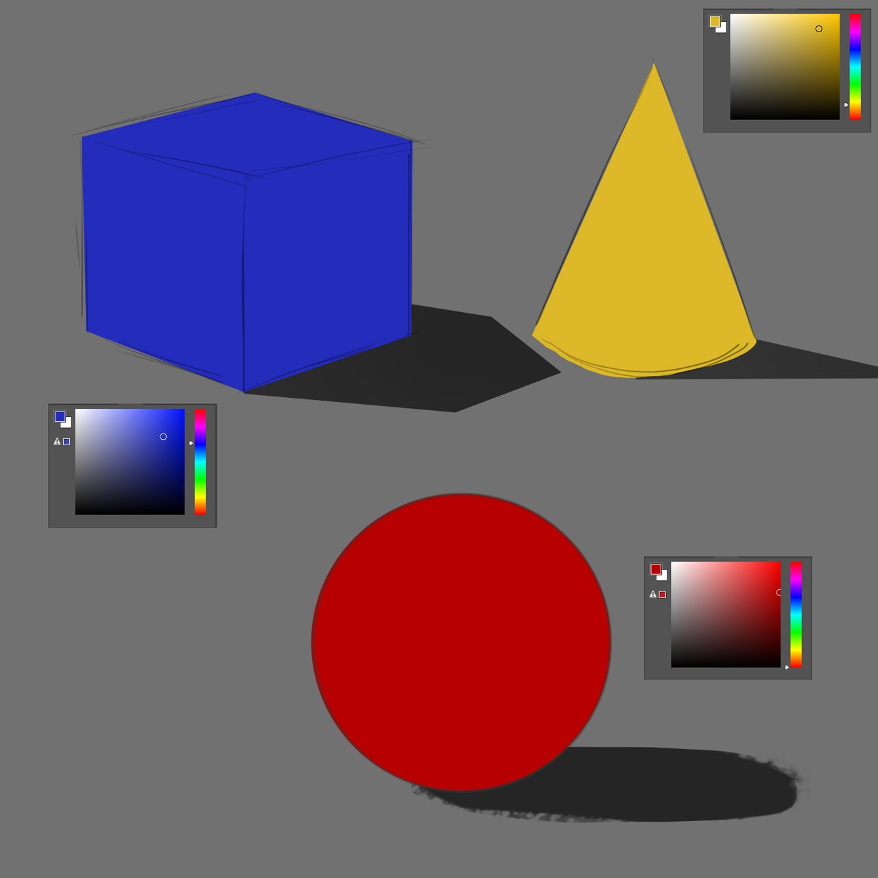
To express the light and shadow side of the object I use a general rule of thumb. From the BASE color, I'll go about halfway to black to get my SHADOW side and then about a quarter of that distance toward white to get my LIGHT side. Now that's pretty believable, but let's take a small step further.
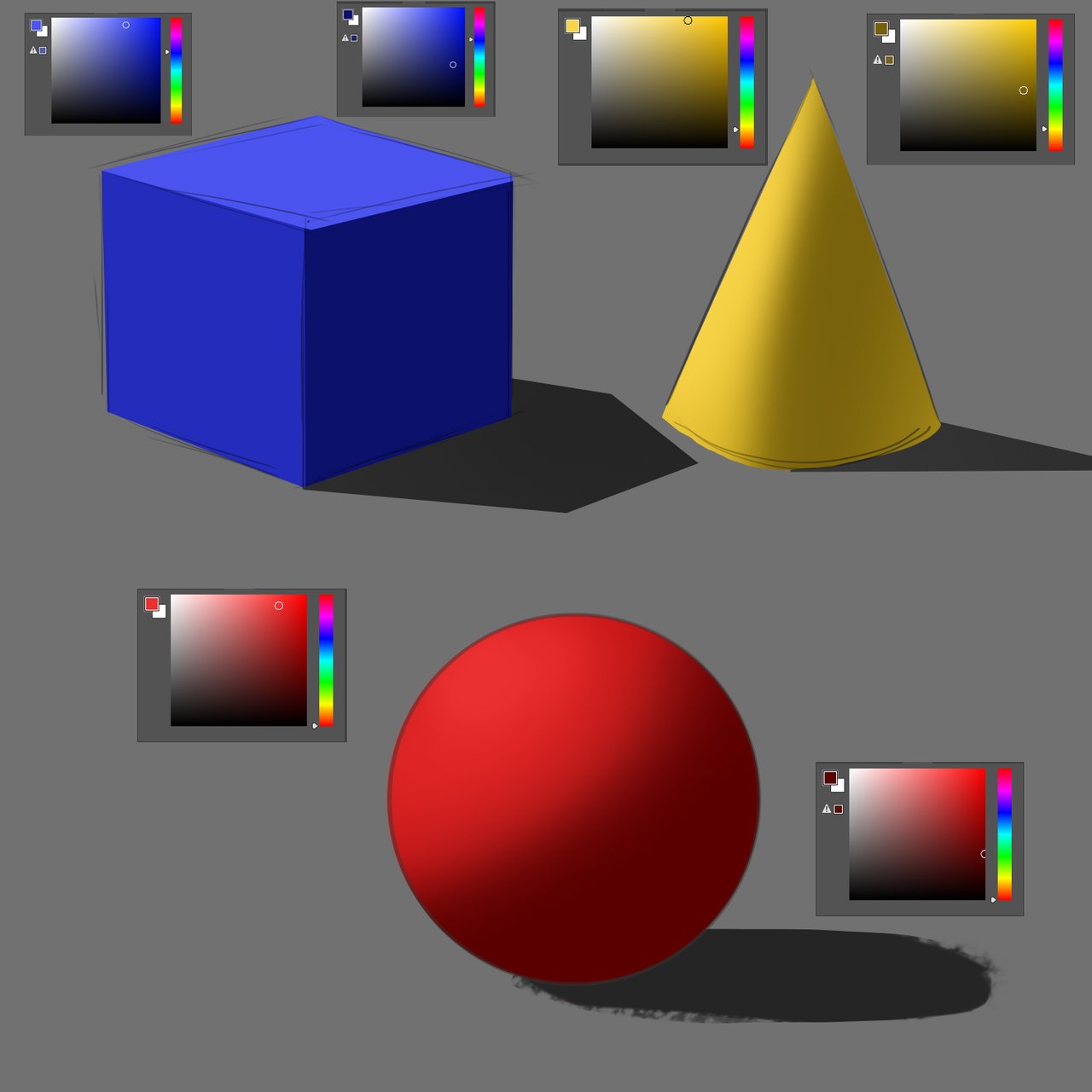
I've often talked about color relationships in my paintings and this is one of those opportunities to add nuance and interest to your piece. I've decided for this piece that the light effecting the shapes is warm. Well this gives us options! On the LIGHT side of the shapes I'm going to move the color slightly toward a warmer color. With the red ball that means moving slightly toward the yellows. On the SHADOW side I will move the color slightly toward a cooler color. In that case we're heading into the magenta zone.
The ending result with each shape is that the objects still read as their primary colors but with the addition of more color range we're adding a heck of a lot more interest. By subtly shifting the colors we're starting to create that lively buzz that comes from the relationships between colors.
This is only the start my friends. I will be working on some basic studies to get more comfortable in expressing color and light on different objects. I'll try to keep things simple in explanation and we'll have fun with it!
If you need help getting started I highly recommend you head over to @jorgevandeperre's blog and start following along his lesson plans. @jorgevandeperre has over 20+ exercises to get started and is even giving out rewards to students who complete homework!