Hello my dear Steemians,
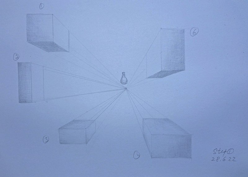
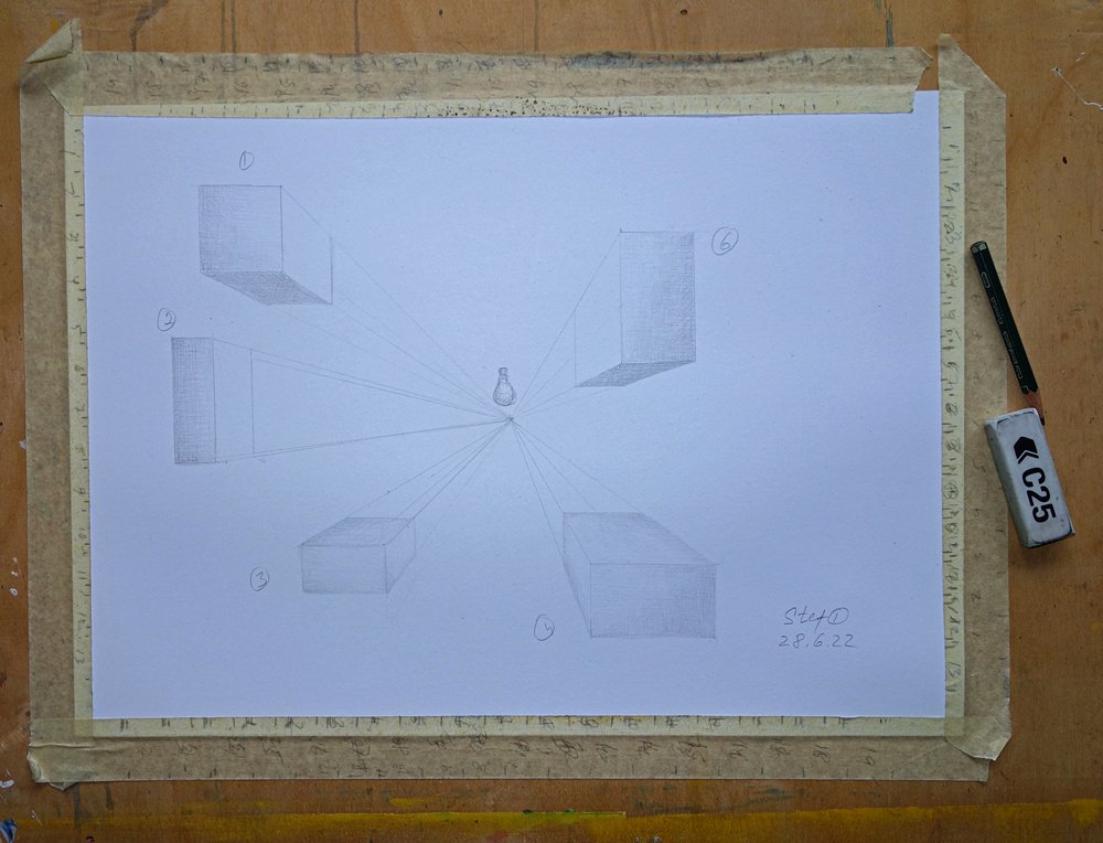
Today I wanted to go through this homework by @jorgevandeperre drawing with one point perspective. As always it seems to be very simple and I am pretty sure anyone can say that they can easily do it. But once we start working we see one or another difficult areas. That is why I have numbered my geometric figures but also the center I decided to choose as the light source and drawn a little light bulb
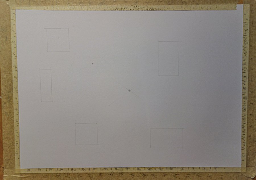
You can see that the photo is not really good captured and also it is very light drawing, but I will explain a bit. I have marked the middle of the sheet as center and drawn the objects all around it.
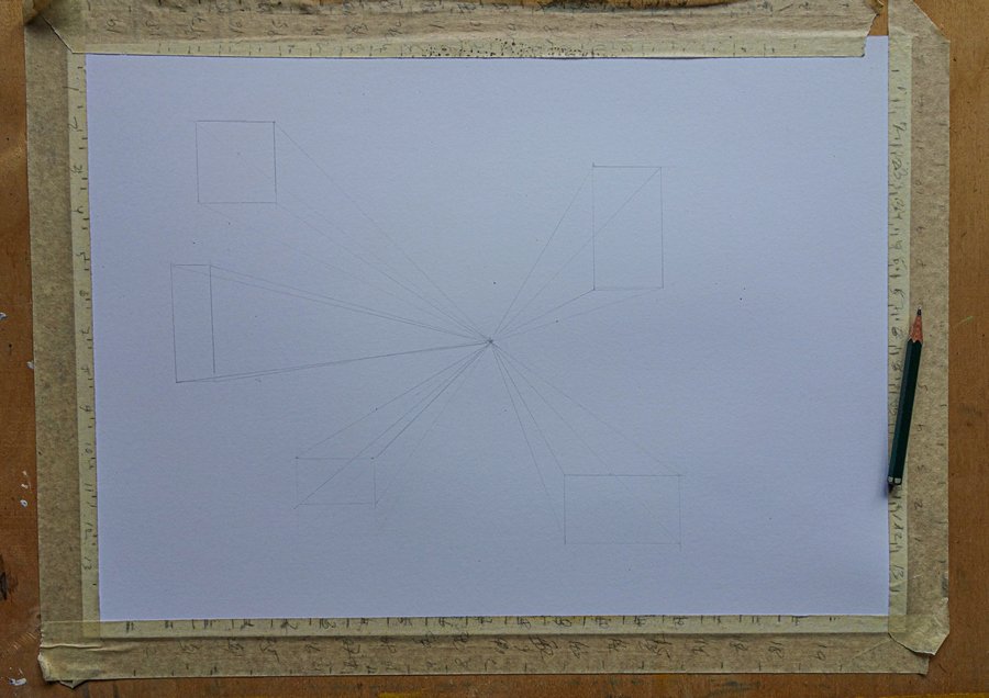
Now, I have connected the objects with the centre of my perspective point. Once it is done I created other walls but then decided to do hatching so that we can see objects as real objects
I like how the object 6 (actually it should be 5) is done, I decided to do dark lower side and the inner side is highlighted with light source. The front is slightly shaded and the outer border more than inner due to close location to light source, for me it looks good
Number 4, I struggled a bit with shading it and now when I look after putting it in computer I think the top should be more lighter than the inner side, because it is close to light. Am I correct Jorge? I think in general the whole square is looking almost same shading and front wall seems to be something wrong with the value of shading there. But can't figure out what.The same with number 3. I think I have the same mistake in both of them.
I like 1 and 2 equally, but there is not much contrast so both looking a bit boring. Is there any way to make the looking better?
Hope I can get the comments from Jorge and would be great to hear your opinion what and how can I improve myself in this exercise.


