
I've had a busy few days (and am away for the next few days) and don't really have time to write this post so apologies if it's shorter than usual. Hopefully the substance behind the latest addition to the new front-end will more than make up for it.

To start with, I'll say that I didn't write this with the intention of it "competing" with @starlord28's #club5050 tool (available here).
As part of the new interface, it makes sense for a user to be able to quickly get a snapshot of another Steemit user and I'd like to make each user's profile page a lot more than what they've posted and commented. I'd like to include lots of user statistics - things like support networks, content tag clouds, favourite authors, biggest fans, etc. and I decided that the first stage to this would be to include some power-up and transfers statistics - building upon the work that @starlord28's done and providing additional in-depth information.
An introduction to the interface
The idea is that there are essentially 3 categories:
- Power Up (what are people doing with their Steem)
- Transfers In (where is their Steem coming from)
- Transfers Out (where is their Steem going).
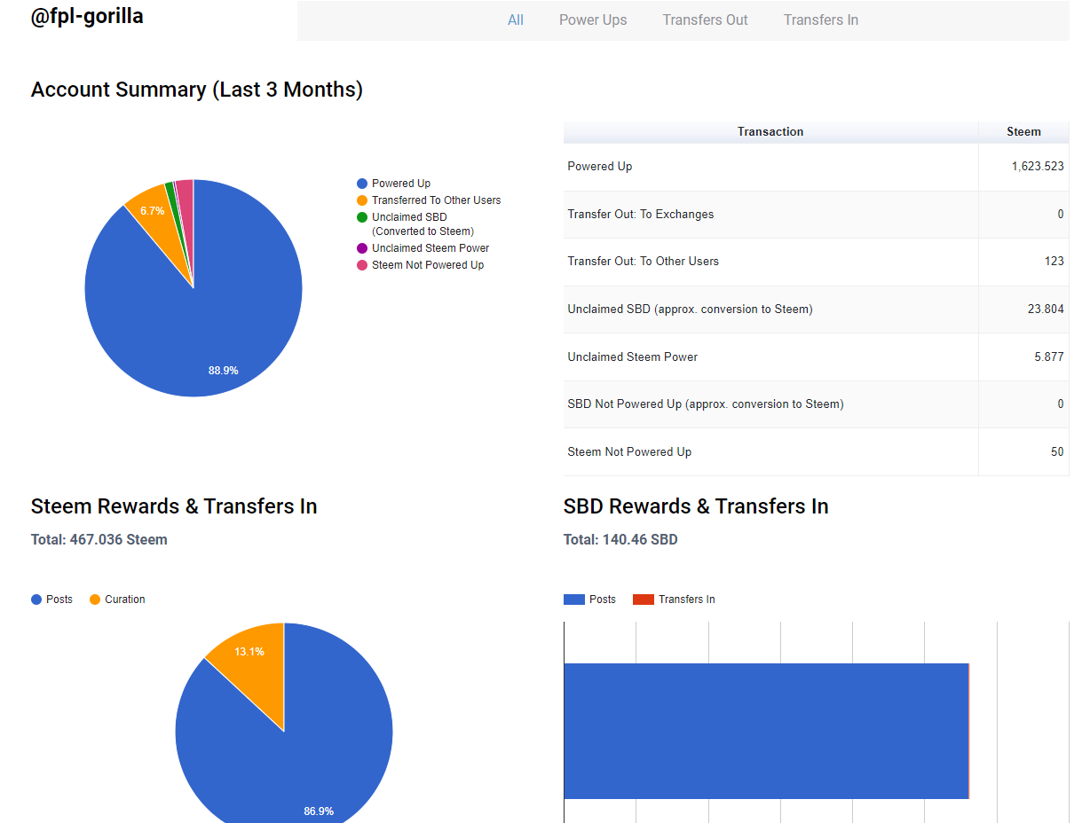
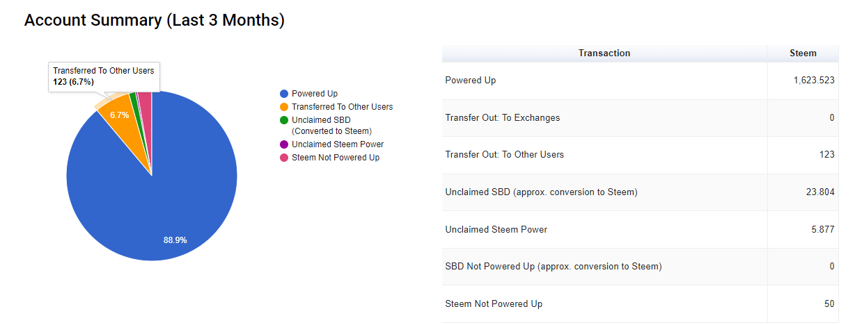
This is all summarised in a Pie Chart so that (for example), if a user's club status is being considered - you can see how much has been powered up and how much is being "held back" for whatever reason. One thing I noticed when I uncovered a scam recently was that users were neither powering up, nor withdrawing so that technically, they appeared to be in #club100 whereas they weren't "buying into" the idea behind it (plus, they were scamming so did what they needed to).
So this gives a clear indication of what's being powered up and in my mind, 3 months is the #club period so this is what I've used. My intention is to provide alternative timeframes that you can toggle between.
How does it work?
In one sense, it's quite complex because there are a lot of factors to consider. In addition to this, rewards aren't made solely in Steem but also in Vests and SBD so a conversion is required - which involves a dynamic exchange rate.
Historic exchange rates aren't available at the moment so some of the figures are approximations - I believe that the percentages are fairly accurate though.
I've gone off on a bit of tangent - how does it work?

The first stage is to retrieve all of the rewards that a user has received for a specific time period. This includes author rewards, post rewards, curation rewards, savings rewards, producer rewards and a couple of others which are included in the code but not currently active (liquidity rewards and proposal rewards).
Some of these are made in SBD and some in Vests so I split them out, total them up and convert the Vests to Steem.
These transactions make up the bulk of what you see in the Steem/SBD Rewards sections at the bottom of the screenshot.
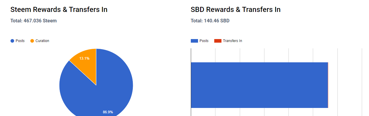
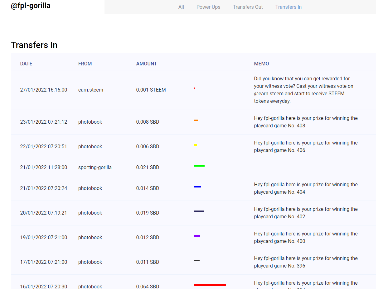
In addition to this, I retrieve all of the "Transfers To" the user under review and once again, total up the SBD and Steem components to this. These are included within the bottom 2 charts and details can be seen under the "Transfers In" tab next to the username.
I've tried to make it all look pretty with rainbow colours.
Once I'd retrieved all of the "money in", I retrieve the users "Trades" to see how much SBD they've converted to Steem and Vice versa. Whilst I'm not displaying this information to the interface, it proved useful to help validate some of the calculations I do later.
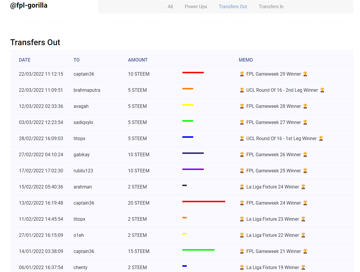
The next step was to see what money's "going out" so similar to the "Transfers In", I looked at the "Transfers Out". I've created an array of exchanges (which is currently incomplete) so that I can differentiate between money directly leaving the platform and money going to different users. This can be see in the top pie chart and table under "Transfers Out: To...".
I also included details of this with another separate tab titled "Transfers Out".
I then looked at how much Steem was "powered up" via the "transfer_to_vesting" query which is once again included in the top chart and table.
The final pieces of information that are included are unclaimed rewards and SBD and Steem sat in the user's wallet which completes the picture as to what a user's doing with their Steem after they've earned it.
Quick recap:
- All Rewards and Transfers In
- Trades
- Withdrawals and Transfers Out
- Powered Up
- Unclaimed and Unused Rewards
When putting the data into the top pie chart, the SBD is converted into Steem using the current internal market exchange rate so that every value is comparable.
I almost forgot... I mostly use Google Charts to make it look nice

This is slightly longer than I'd expected. If you'd like to play with it in a live environment then you can visit http://steemit.lovestoblog.com/index.php and click on a username underneath a post or alternatively, follow this link - http://steemit.lovestoblog.com/clubstatus.php?author=fpl-gorilla - and change the "author" after the "author=" in the query string.
Please let me know what you think.