With our blog growing as well as it is we think we're about due for a logo. Can you believe we're approaching 800 followers? We are excited to share our journey with you and even more excited that nearly 800 of you want to come along for the ride!
Aimee has been busily clicking away and muttering something about vectors under her breath for the past few days. We still think it's a work in progress but thought we'd run the first draft by you guys for some feedback. So, what do you think?
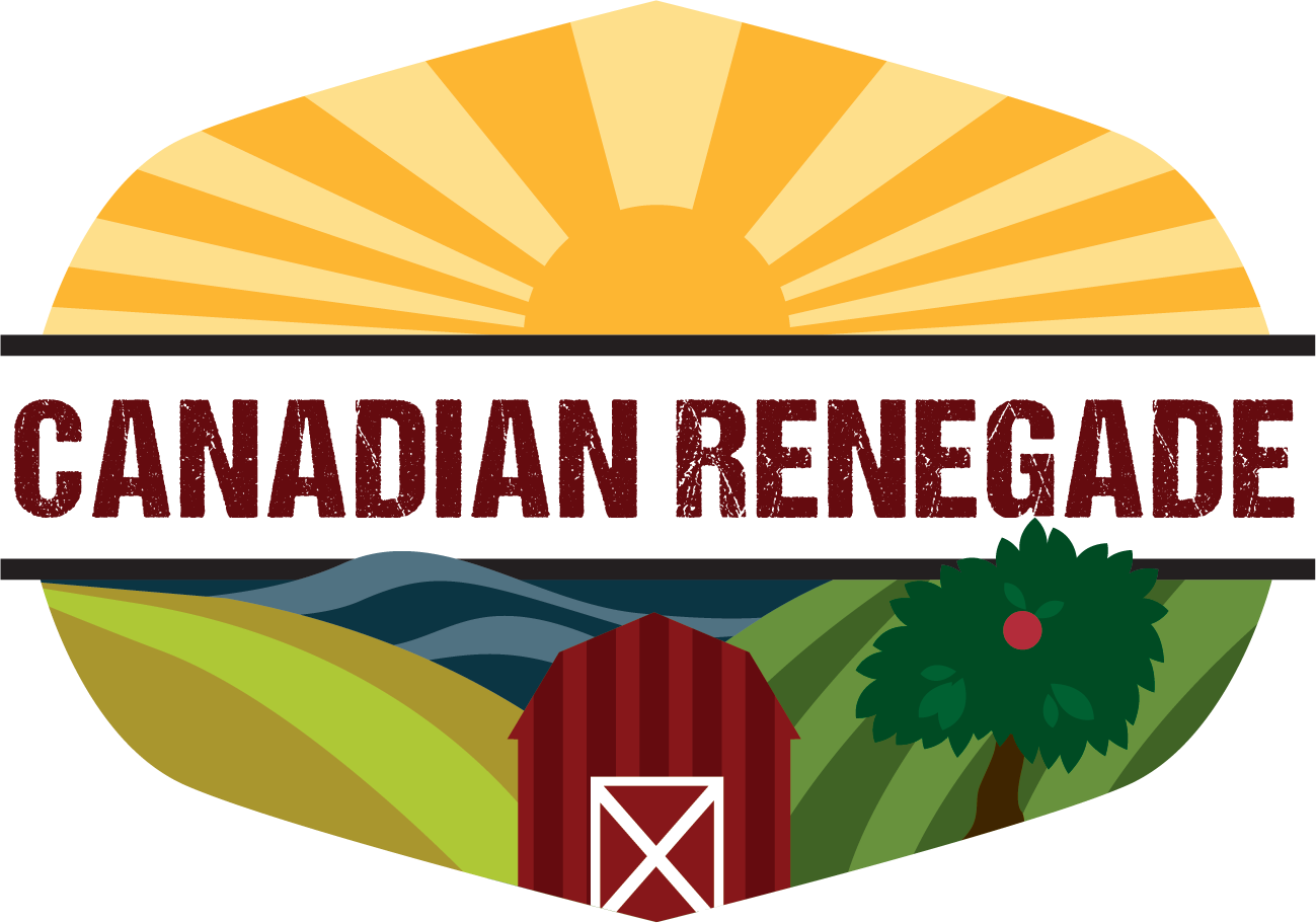
Aimee and I have been brainstorming different elements for months now so we'll share a bit about the process. For those of you who have been following along you'll notice that there is no tiny house in the illustration even though that project has made up the majority of our content thus far. The reason being, our tiny house was just a stepping stone in our journey and we are planning to build a larger home on our new homestead.
If you've been reading our more recent posts you'll have noticed a few permaculture plants have been featured. I feel like this is my real passion and the logo reflects the new direction we're headed.
Aimee incorporated two different fields that symbolize both pasture and crops. The apple tree signifies edible landscaping, and the barn represents livestock.
If you're wondering what the heck waves have to do with farming, the answer is, a lot! Water is an essential element of life and we plan to harness it passively by adding swales and ponds to our land.
Of course we couldn't forget a brilliant sun because it is the source of energy for everything in this solar system. Aimee was also mindful to keep the elements bold and simple so they wouldn't get lost when the logo was reduced in size.
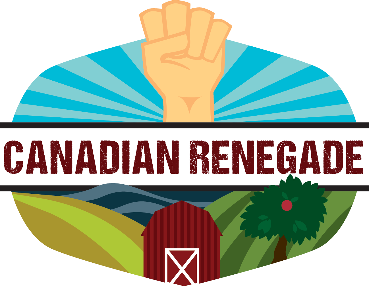
Originally, we wanted to work in a symbol that represented our renegade lifestyle, but that's where we got a little stuck. We tried including a raised fist, a common icon for revolution, but we were worried that people might not make that connection, or even worse, it might give the impression we were shouting white power. Plus, I just thought that it looked a bit awkward.
We toyed with the idea of having the fist holding a plant or a trowel but then would it no longer be obvious that it also stood for revolution? Or it might look like a plant was ripped from the ground!
 This is the first iteration that included the fist.
Well, now that I've covered all the elements, what are your thoughts? Do you think the logo represents us well, or are we off the mark? Are there any elements you were surprised to see or think are missing? Do the colors appeal to you? We really want your feedback!
P.S don't forget to view the logo in Night Mode. I think it looks bad ass!
