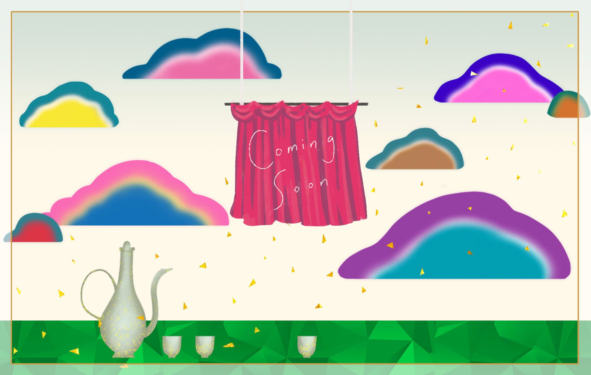
Hurrying up for the coming project, the first introduction post is prepared! And I make use of the banner elements and rearrange into the cover image. Added some gold foil, not full of the image, but like falling leaves/petals. Make it a bit grand. If using leaf or petal, it seems will crash with the colourful clouds. The curtain area is the logo and designed by @perlia, a girl who loves literature and writes very delicate articles. The calligraphy is provided by our handsome AA @aaronli xD
Also the profile banner, as with different UI and browsers, the display will be different :( I can only make a seamless image for temporary use.
計劃進行得如火如荼,今天用上了BANNER的元件來拼出首文自我介紹的封面。加了像落葉/花瓣的金箔,有點華麗(開張嘛)。而且加花葉好像會跟彩雲相撞(眼花)。布幕後是LOGO,是喜歡文學的一位STEEMIAN PERLIA所計設的,而「詩」字則是鼎鼎有名的帥哥AA所題。另外還預備了個人主頁的背景圖。可惜在不同介面和瀏覽器上,所顯示的範圍都不同,只好做一個無限重覆的乾淨背景圖來稍作點綴^^;
自介背景圖


