
Following on from my last post on this subject (view post here) I wanted to follow up with some graphs that illustrate the payoff pattern of my introduceyourself post over a 48 hour window.
For illustration, I'm using the payout data from my first post which earned me an author reward of 70.3SBD. I want to demonstrate in this post how a typical post reward develops over the first 48 hours of its progression.
The first graph shows the cumulative development over the first 48 hours after the post was published.
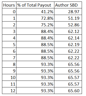
The table directly below the graph shows the data displayed on the first graph but for the first 12 hours only.
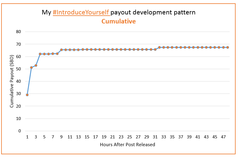
You will see from the graph that most of the final payout (72.8% or 51.19SBD) was earned in the first two hours. The graph becomes much flatter after this indicating much lower hourly reward increments.
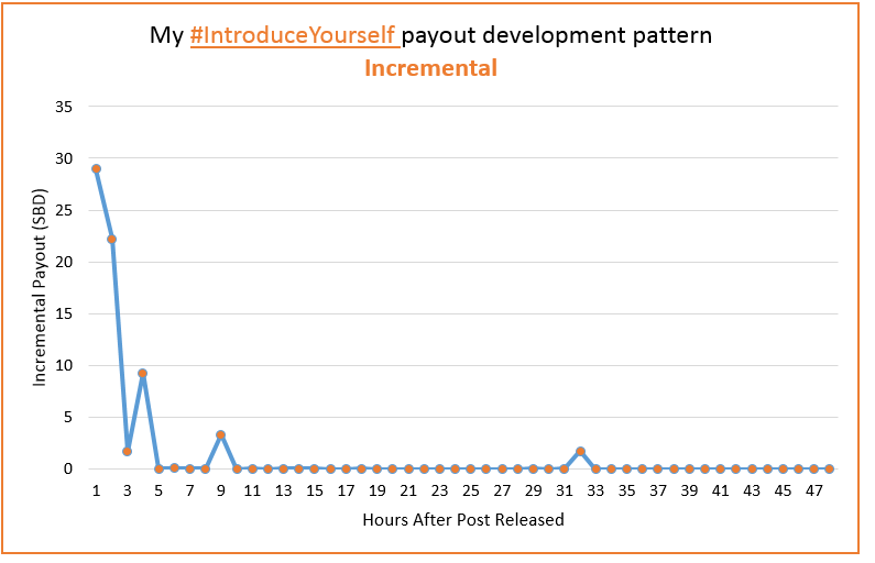
The hourly increments (increase to reward pot each hour) is shown in the second graph. This graph shows that while the increments become sparser after the first few hours, significant increments can arise many hours after the post is released.
Concluding comments
This post illustrates the general post reward pattern of quick development with slow progression after 2 hours.
It should be pointed out that this is not always the case. It is not impossible for a voter with significant voting power (a "whale") to upvote or flag your post many days after its release. However, the fact is that exposure to your post declines significantly after the first hour or two and it is this effect which causes the pattern we are seeing in the above illustrations.
Thank you for reading.