We've all heard it before: Blue and Green make people feel calm, yellow is associated with happiness and red can either mean "danger!" or love and passion.
But what's really behind Colour Psychology - do certain colours actually influence our behaviours or emotions?
The controversy about colour psychology
There's quite a lot of controversy surrounding colour psychology - some people/psychologists/marketers believe in it, while others say it's just a hoax.
Although there have been several (successful) studies conducted on this topic, there is one big factor that always remains: personal associations.
As much as researchers test people's emotions around certain colours, they will never be able to measure the personal associations of people with one color.
So while most people might feel calm when seeing the color blue, someone might feel anxious because they've had a traumatic experience in the ocean in the past.
That being said, multiple studies have shown that certain colours really do impact people's behaviours, emotions and decisions.
Poker Study
One example is a poker study from 2012, conducted in the Netherlands.
The participants were playing poker. When given red chips, they were more competitive and bet more, compared to regular chips. When asked how they were feeling during the game, participants answered that they were feeling stronger.
When playing with white or blue chips, the players tended to fold more and do less risky moves.
Colour Psychology in Advertising and Branding
Advertising is probably one of the most important areas related to color perception.
After all, every store wants to attract the most revenue from its customers, so why not make use of colour psychology!
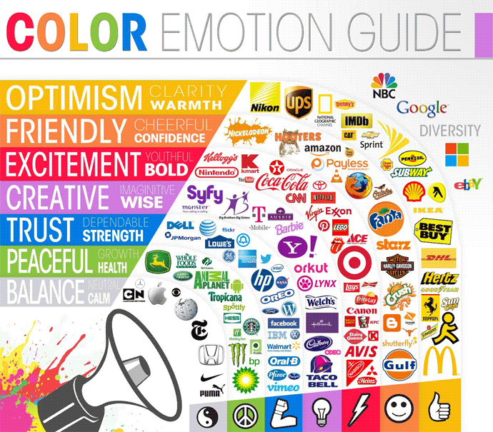
And every brand wants to establish a positive image in people's minds, so they're very careful about choosing which colours to use in their logos.
In general, the same principle applies that everyone has perosnal associations with colours.
Nevertheless, there are a few things that advertisers can keep in mind when choosing colours.
Probably the most important thing to note here is "perceived appropriateness" - meaning how well the colour "fits" the brand. Countless studies have shown that consumers are more likely to purchase something if the colour "fits" the product. A sunscreen lotion for example will probably never be packaged in red, but rather in yellow, orange or even blue to be associated with the sea.
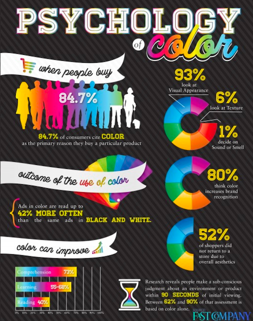
Researchers found out that 90% of snap judgements about products can be based on colour alone - showing that colours really do influence us.
Now, let's take a look at some colours and their different effects on us!
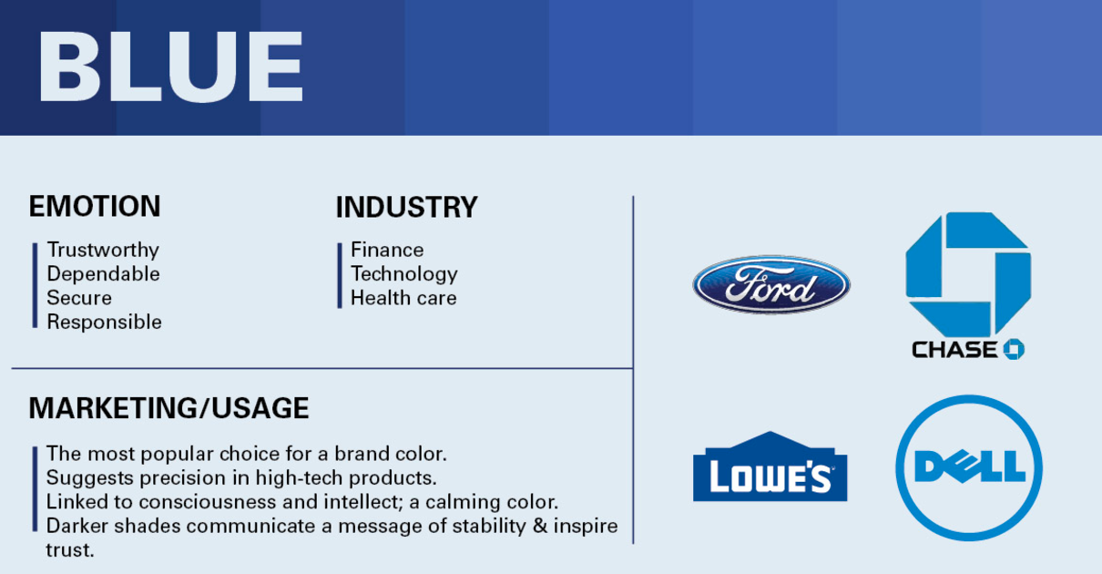
1) Blue
Blue is the most-liked colour by both genders, making it the most-used colour for logos and branding. It's the most accepted colour and a pretty safe bet for branding.
Blue is also nicknamed the "colour of the mind", it's associated with Intelligence, Harmony, Security, trust and loyalty.
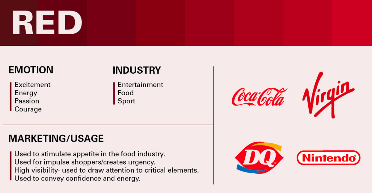
2) Red
Red has the longest wavelength and is therefore considered a very powerful colour. It's highly visible and associated with strength, boldness, energy, confidence, power, passion, excitement and courage. It's also often used in the food industry because it's said to stimulate the appetite.
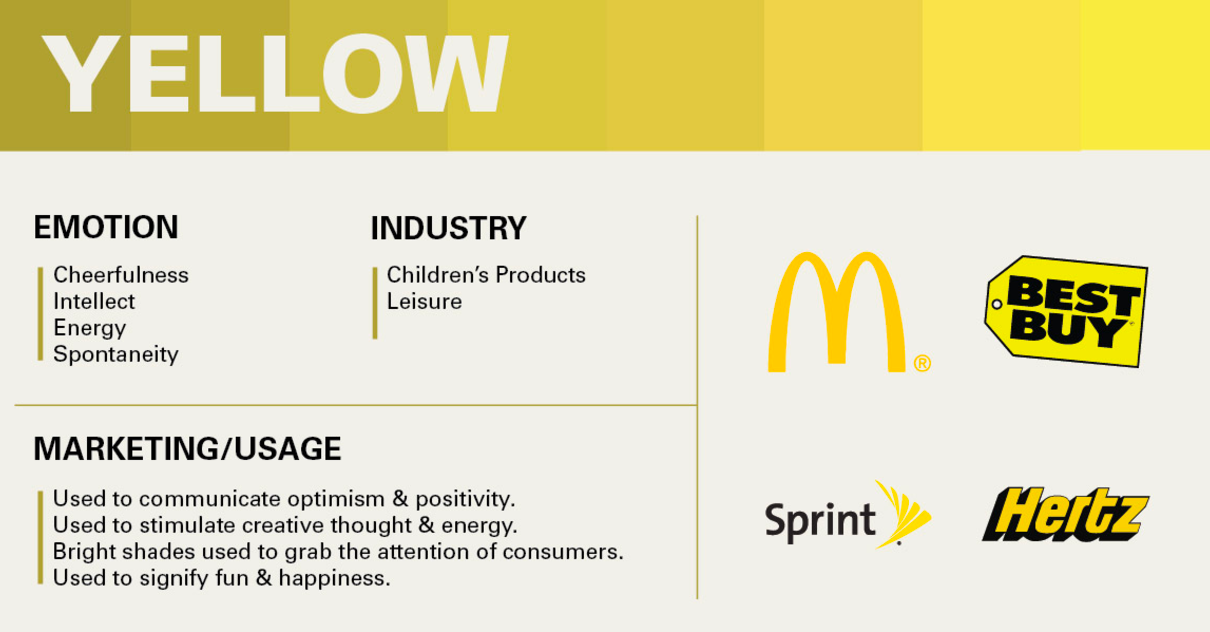
3) Yellow
Yellow is the ultimate happiness-colour - it's associated with sunshine and a good mood!
Yellow represents optimism, energy, enthusiasm, warmth and clarity.
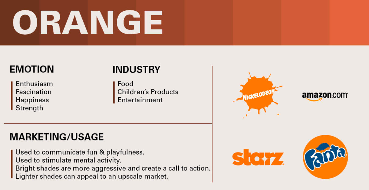
4) Orange
Orange has similar associations to yellow - orange represents fun, energy, happiness, warmth, spontaneity and friendliness.
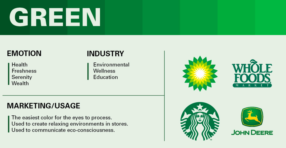
5) Green
Green is of course mostly associated with plants and the environment - you've probably all heard of "green-washing", purposely making stores or products in the colour green to give the consumer a feeling of eco-consciousness and health.
Green is associated with nature, wellness, peace, growth, balance, prosperity and freshness.
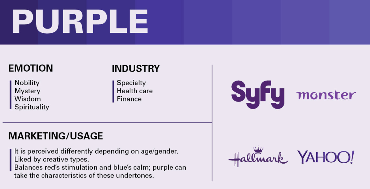
6) Purple
Purple and violet have the shortest wavelengths. They are often used to display spritiuality or creativity.
Purple is associated with wisdom, mystery, fantasy, compassion, imagination and wealth.
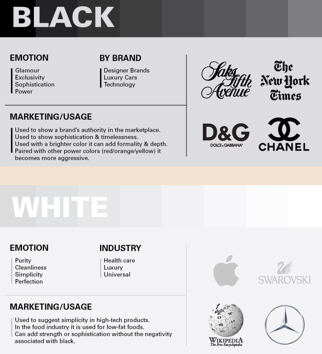
7) Black & White
I will combine black and white because they are obviously the most neutral colours. Therefore, they represent seriousness, but also balance.
White is associated with peace, clarity, simplicity, purity and innocence.
Black on the other hand represents sophistication, power, elegance, formality and professionalism.
Have you ever noticed the effect of colour psychology? Which colour do you feel most attracted by?
Images: 1, 2, 3, 4, 5, 6, 7, 8, 9, 10, Sources: 1, 2, 3, 4, 5, 6
- Instagram -

© Sirwinchester