Hello Creative Steemians,
In general, we always see well-known artists who in their works light their colors in a much more intense and strong way, although, possibly and in most cases they use more expensive and better quality drawing materials that we do not always have that leaving all the work to the material is also the proper way to use them which will make a difference in our work.
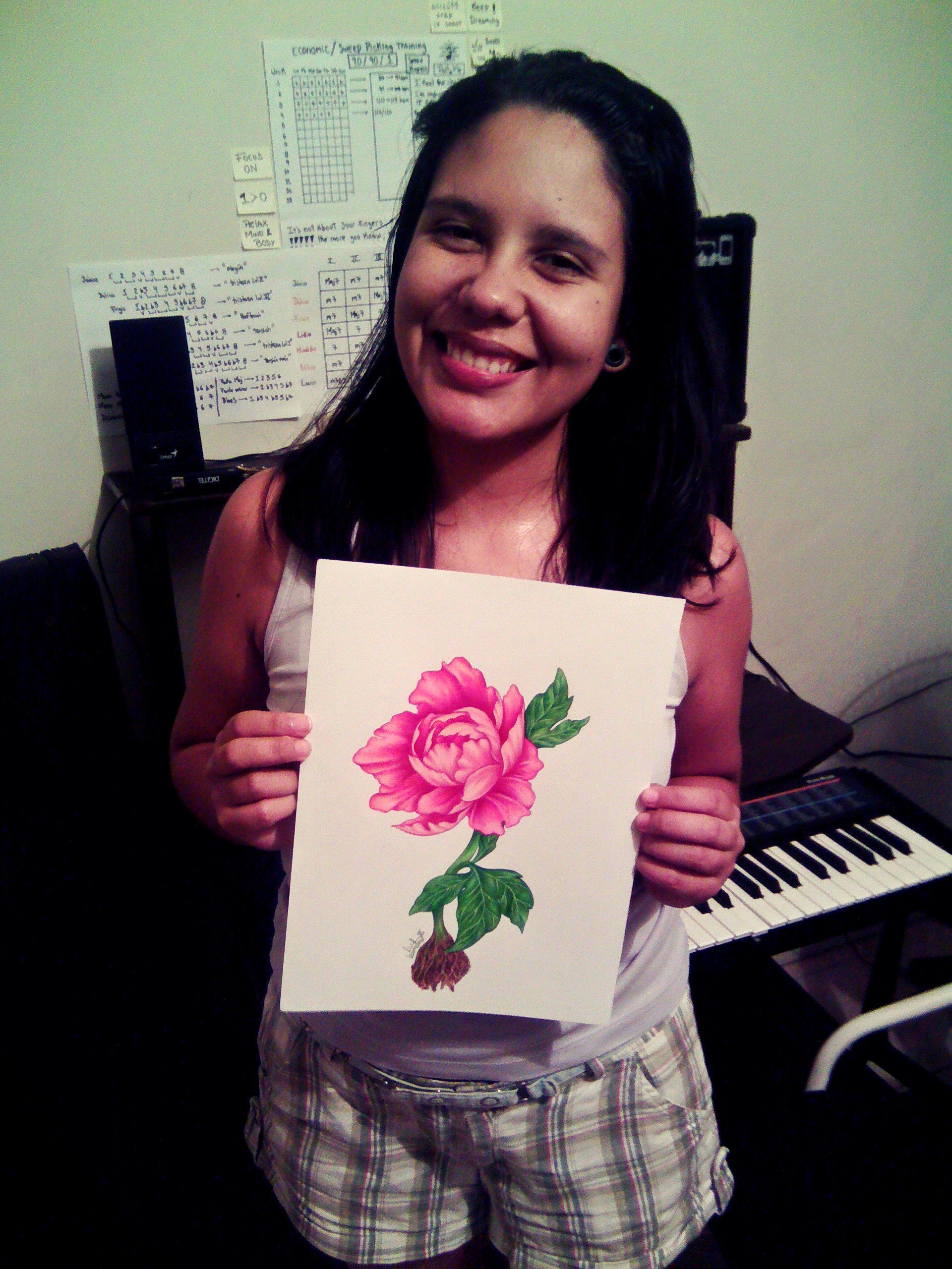
Here I share this technique to make better use of our colors which can be used with two different materials, which in turn will give a very good finish. I hope it is very helpful, I tried it and really found very good results compared to how I had been working with the color pencils.
Without dwelling much on this, let's go step by step of this drawing.
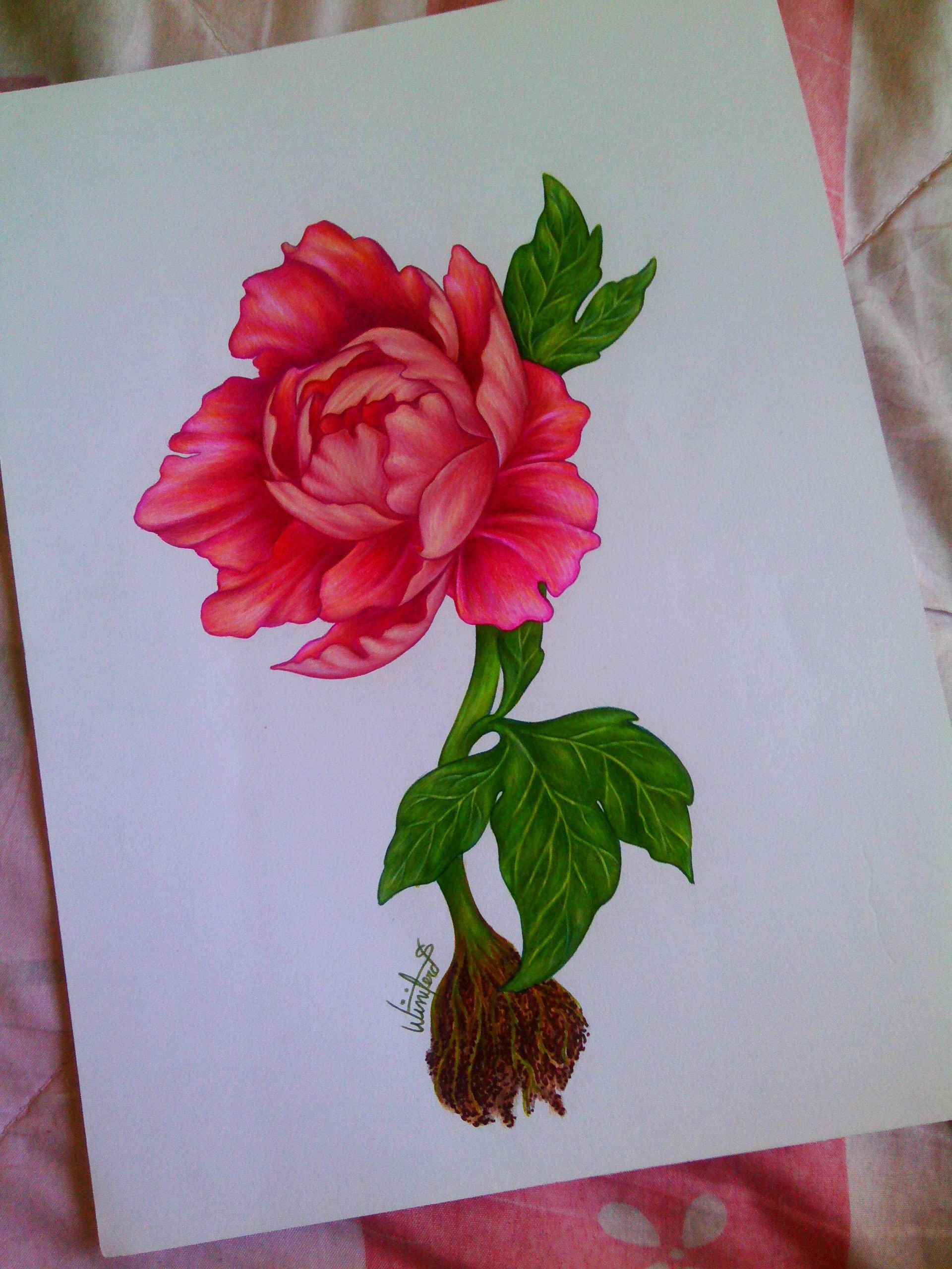

The materials used to make this drawing were the following:
- Pencil, eraser and eraser.
-Color markers, in this case I use a Stabilo brand.
-Color Pencils Faber-Castell brand. However, I recommend Prismacolor more because they are softer and more pigmented.

Now I share, that the real secret to achieve this result is the use of a base layer of color that serves as support for the nuances of it. From what I have seen, the best materials for this technique would be the use of watercolors or markers.
Although, you do not have a special paper for watercolors I do not recommend the first option because with the use of them the paper is damaged a lot, it will not allow you to apply a lot of color with the pencils and it is more likely that you will break the sheet and ruin your drawing. For not having paper for watercolors, I tried the second option using the color markers.
Use the markers that can be more like your colors and choose a medium color between them, then paint the entire section in question.


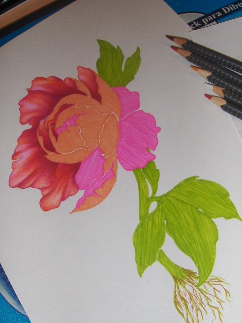
Here you have to be very careful in the way you use the markers because usually when you pass one over the other often leave a beta between the passes, try to pass it as close to each other as possible without touching the part that already you have painted to make it look more uniform and equally, paint in the same direction and as it is more convenient for your drawing.
In this part do not be scared by the gaudy that you can come to seem, then you will color with colors. So do not worry.
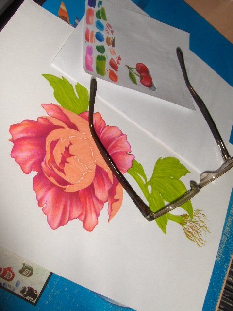
Now with this base of color placed, now if you can let your imagination run using all the colors and tones you want.
If you can appreciate, the sheet that I have to use it as a "palette" and use it before starting to do some small color tests, to know if the color would really look above the base of the marker, I also recommend them that they do it to avoid that there is some mistake that could damage their drawings.

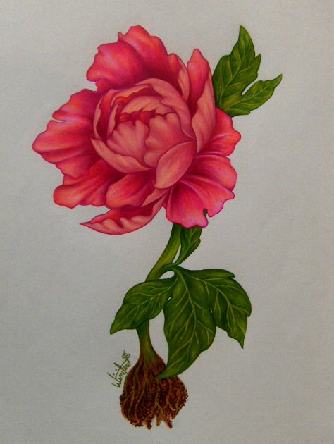

To finallizar, I would love to share a small speedpaiting which recorded to show them better technique used. I really hope you like it, it is the first video of art that I record and edit, soon I will be sharing with you more tips and videos of art.

Follow my art on my Social Networks:
- Facebook: https://www.facebook.com/Winizart/
- Instagram: https://www.instagram.com/winizart_/


